
This is a post in a series of twenty-one videos and articles I’m writing to give insight into a new editing and retouching process I’ve been working on over the past few months. I’ve taken twenty-one previous images from my catalogue and have been playing with them in photoshop and lightroom, adding a new visual style to the previous edit. I’ve also decided to make some short explainer videos talking about and detailing my new creative process in regards to these older images. Our personal style always changes and evolves as we continue the creative journey, and so it has for me as well. I hope you enjoy these small insights into my current retouching look and can walk away with something, anything, be it ever-so-small, and apply it to your own photography and creative process. Enjoy!
https://www.youtube.com/watch?v=0qBQhTZb0m0
For this first video I thought I would start with an image I made for one of my favourite clients, the OPUS Hotel in downtown Vancouver. They are one of the cities best “design” hotels and put a lot of care into the entire visual aesthetic and look of their property. The guest rooms, foyer, lounge and common areas all have a specific colour theme unique to each, and were designed by a prominent interior designer in Vancouver. The look is very modern yet tastefully done, without extraneous design features sometimes seen when a designer tries to be overly trendy.
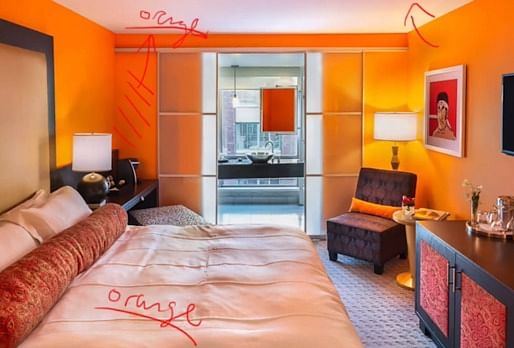
The OPUS have been fantastic clients of mine since 2013 and usually ask me to shoot and reshoot rooms and spaces whenever they redo them or when new images are required. The shot in the video is featuring one of their standard queen sized rooms, done in a very bright orange colour. Since every room is a different colour scheme all the decor is chosen to match, with this room being no exception. The muted black and grey furniture provides a perfect counterpoint to the intense orange. It’s very bright but not jarring in the slightest and is actually strangely relaxing.
For the new retouch shown in the video I’ve gone over some of the following points and new changes I made:
I’ve left some out here but do watch the video where I talk about my edits in a little more depth. I also use an overlay and red annotations to show and explain exactly what edits I applied to which area and the thinking behind them.
Also a big thanks to the OPUS Hotel Vancouver for having me and for always being such gracious clients. It’s a great place to stay so for more information about them have a look at their website which can be found at http://vancouver.opushotel.com/, and be sure to check back soon for more of my 21 For 21 series.

A place to inform, discuss and display current architectural photography and to connect with lovers of digital photography and design. Showcase architects and their work through the display of skilfully crafted, beautifully artistic photography. Discuss and exchange ideas on photographic trends and techniques as they pertain to the architectural industry.
No Comments
Block this user
Are you sure you want to block this user and hide all related comments throughout the site?
Archinect
This is your first comment on Archinect. Your comment will be visible once approved.