ok guys, I've been trying to find images of this ( i just drove by it yesterday) here in LA. Cant' find any!
Has anyone seen this? On the corner of Robertson and Olympic (almost in the city of Beverly Hills, but more than likely not) this odd looking (cool i think) new gas station canopy structure.
Looks like a triangulated model that leapt of the pages of rhino (or should I say screen) and is built!
I am trying to see if I can sneak out of the office and snap some shots. If I do, I will post.
Anyone who find the images on line can post as well.
What does this structure say about the importance of gas stations/driving in our lives? Nothing good, I think. I think it's fine to make a gas station look a bit better than average---I think the modernist approach would work perfectly on gas stations---but this looks like a shrine to the pump, which concerns me.
When I moved to the midwest and knew that my days of living a downtown car-free walking lifestyle were over, I applied for and got a BP card.
I have to side with BP on the comments brought up in the article - no, gas is never going to be entirely "clean", but the ways it is brought to us can be cleaned up, and improving the gas supply and use system in small steps while actively pursuing alternative technologies is commendable.
From those crappy few pics, the canopy looks pretty dang cool!
Oh and that reminds me: Steven Ward, if you are reading this: did you hear the NPRstory yesterday about how organizations for the vision impaired (blind) are lobbying to make hybrid engines noisier, because they literally cannot hear when one is going by?!?
totally agreed rationalist.
As for this being an homage to the all encompasing problem of the environment....Im not sure I really believe that.
At the end of it all...I guess I just find that taking of risks, rather than putting up the same ole crappy ass gas station and canopy system is worth it all. But I could be wrong.
Will still try to get some better pics taken today. Maybe now during lunch!
It's a huge waste. I just think that people are generally too quick to say, "oh, this building's getting old, let's build a new one." It would be interesting to see if any of the construction waste was actively reused, and if schemes were explored which at least preserved the structure of the existing station.
so wait- conscious design (and even better, consciousness OF design) finally seeps into another decidedly ugly but ubiquitous facet of our built environment, and architects and designers are complaining about it?!?! because the gas station is still going to sell gas?!?!? Are we as a profession supposed to pretend that gas stations don't exist? Shall we boycott restaurant and bar designs to pretend obesity and alcoholism don't exist? How bout those evil consumerist retail spaces?
fro is right. In fact its a bit lame when a bunch of sensible archinectors start behaving like burnt-out hippies criticizing everything new and unusual to be not environment-friendly and not sustainable.
I wish people would realize that no gas stations were being replaced and no new buildings were going up, we would be soon all out of jobs.
I dont mind the building, at least they are trying to educate people by drawing attention to themselves, even though it has more marketing implications than environmental. I wish they would also sell some alternate fuels, but i bet thats coming soon.
The ethic come down to personal beliefs, but nonetheless there's nothing lame about calling what I believe to be a cynical PR move what it is. Had BP had been interested in actual sustainability, they just would have left the thing as it was an added PVs and a new sign. Or sold biodiesel (which still isn't great) like a dozen other gas stations in LA. But they didn't. The project wasn't even BP's idea - Ogilvy (their Advertising and PR firm) came up with the green gas station idea to deal with the negative publicity generated by the Alaska spill.
In short - though in terms of sustainability it may be better than the non-sustainable stations that they build (and will continue to build) all across the country, it surely doesn't deserve any commendation.
I will say it is nice that they hired an architect. Good for them.
If they are using the money they make selling fossil fuels to fund ways to end our dependence on fossil fuels, thus funding their own demise, isn't that more commendable than ignoring the fact that fossil fuels are not a long-term solution for any oil company?
Isn't making people who use a gas station aware (of good design and) of alternative (and unavoidable) futures a good thing?
The article says BP just gave $500 million towards solar research - should they have better spent that money in building new but dependable technology oil rigs in pristine wilderness?
I'm not here to proselytize that BP is the perfect mega corporation. But something said over on the 2010 thread is applicable here: isn't it better to take small steps in the right and more cautious direction than to just throw up one's hands and say there is no perfect solution so we might as well just keep doing what we are doing with no care that it exists on an extremely destructive and limited time frame?
I will definitely concede that they could have done a lot worse, and that other companies do worse every day. The investment in alternative fuels is great, though I have to disagree with the reading of that as "funding their own demise". The way I see it, they realize that the demise of their current product is immenent, and are trying to ensure their continued existance by exploring the broader energy market so they'll have something to fall back on when that day comes.
Regardless, I am perfectly willing to enjoy the fruits of the labor, whatever motivation it may have behind it.
I have worked on retail site designs for BP and other petroleum companies for several years. This was the only project where they hired architects and not designers. I know I don't have to explain the difference to you guys.
Janosh: This station was BP's idea. Ann Hand, the woman quoted in the article, came up with this idea and carried it all the way through to completion. Ogilvy holds the account for PR and adverts, they do not influence facility design. Coming up with the phrase "Beyond Petroleum" was Ogilvy. Designing and branding a facility was not.
Actually it does deserve commendation, maybe not for the design but for initiating a new model.
rationalist: In the beginning they were going to retain most of the facility. But from what I've heard, that didn't happen.
Post more pics when you get them! I've only heard talk about this for about a year now and would love to see more!
Great to know kix....thanks. I must say whilst I do see rationalists concerns and agree with a few, I have to say that you make a good point. Initiating a new model. I'm down for that!
Yes, rationalist, you said what I couldn't get into words - the petroleum side of the business' days are limited, so they are researching ways to remain in the energy supply busines that are not petroleum. And thankfully they are focusing on more sustainable technologies, not squeezing oil out of shale.
Hey, turns out I like it a lot better aesthetically from a distance. There was something poncy about that first picture posted, like it was a gas station pretending not to be a gas station? Anyway, thanks for the pics squirrell-meister!
Wow - in context, it truly looks wierd. Not bad, necessarily, but definitely new. Those are the kind of shots you will never see in an architecture magazine!
Thank you so much for going out on your lunch hour and doing this, squirrelly - it's a great treat to get to see this project from the eyes of a real person.
Oh dont mention it. I was joking with a co-worker as she accompanied me there quickly during lunch that I was chuckling because when I saw it for the first time yesterday in the rain (yes it was raining and quite hard I might add, here in Los Angeles) that it just looked like an unrefinded model from rhino or some 3d software.
When you see it up close, it has it's moments, and also (sightly) portions where the panels (triangulated and probably laser cut) were not fused correctly, esp at the top where possible water intrusion will occur unless they fix it!
Somebody got their gas station into my video game!
Its a little bit Tronnish for my tastes, but at least its interesting - and I'd like to see how that roof drains too.
Here in Chicago at the corner of LaSalle and Clark Streets there's also a fairly well designed BP (although given its age, I am assuming its changed hands a few times.) I hope that the company decides to keep architects in mind for future service stations, and even, e-gads! design locally!
Thank's guy's --- the more I see of polymesh surfaces , the more I think about what a waste, what about the internal spaces where do this surface-thinking end ; when will it ever bring the strong simple structure that mean a cheap house, a strong house and something that everyone can grasp and make -- like 3D-H.
ok, here's a complaint i have that i don't think has been addressed in this discussion yet. this thing is obviously different than any gas station building/canopy that we've seen before, but the article talks about the pr dept, some grad student critic, a sierra club member, but NOTHING about a designer!
this thing didn't drop out of the sky! someone thought long and hard about it and had to make a lot of difficult materials decisions. it's a detailing nightmare.
in the course of working through the old newspaper adage - who what when where - shouldn't the architect be at least a small part of the impt 'who's? honestly, we're not just talking about it because it has a low-flow toilet, after all, but because squirrelly went by, saw it, and said 'what the...?'
looks like it could have maybe been something these guys would come up with: plasma
Yes you are right it is probrely quite unfair with the critic and true this is different and just manufactoring the panels will be a logistic nightmare.
Still anyone who spended a few hours with a modeling program will reconise the 3D-faces and understand these or shuld I say this structure , exactly as how I explained this as a surface structure, A structure emagined as a polymesh shapen into this form , a structure where the strength depend on the surface only -- or so it looks.
Very very different from 3D-H , but sorry to say Steven, not very much a revolution, as these tortured polymeshes as you know, been here since the computer offered them from the start --- space vectors ,Dome structures , poly meshes ; all to act just the surface omiting the very structure to hold them in the air.
Now you proberly say "well it seem they can hold themself in the air" but try emagine a bit bigger structure and a few floors beside a few walls , then surface is not enough and then come either the compromise or the paragime shift , -- while these polymeshes already been here for atleast 30 years --- ; when the surface is not strength enough will we then fiddle something underneath to hold them in the air ,something hidden in the massive volumes they cover or will architects and designers go the next step and jettison fragile polymesh structures and ask real structure generated by the computer, instead of thin surfaces and space vectors ?
BP - a new Gas Station prototype?
ok guys, I've been trying to find images of this ( i just drove by it yesterday) here in LA. Cant' find any!
Has anyone seen this? On the corner of Robertson and Olympic (almost in the city of Beverly Hills, but more than likely not) this odd looking (cool i think) new gas station canopy structure.
Looks like a triangulated model that leapt of the pages of rhino (or should I say screen) and is built!
I am trying to see if I can sneak out of the office and snap some shots. If I do, I will post.
Anyone who find the images on line can post as well.
no pics there, though it gives some good info about the construction of the pump
a link with some crappy pics
i think some flickr pics might be available
you may be able to shine shit...but at the end of the day it still smells
I bet the best part of you ran down the crack of your momma's a** and ended up as a brown stain on the mattress!
i'm gonna drive by it and see how much they're selling gas per gallon...
What does this structure say about the importance of gas stations/driving in our lives? Nothing good, I think. I think it's fine to make a gas station look a bit better than average---I think the modernist approach would work perfectly on gas stations---but this looks like a shrine to the pump, which concerns me.
It looks like a shrine to facetted geometry.
When I moved to the midwest and knew that my days of living a downtown car-free walking lifestyle were over, I applied for and got a BP card.
I have to side with BP on the comments brought up in the article - no, gas is never going to be entirely "clean", but the ways it is brought to us can be cleaned up, and improving the gas supply and use system in small steps while actively pursuing alternative technologies is commendable.
From those crappy few pics, the canopy looks pretty dang cool!
Oh and that reminds me: Steven Ward, if you are reading this: did you hear the NPRstory yesterday about how organizations for the vision impaired (blind) are lobbying to make hybrid engines noisier, because they literally cannot hear when one is going by?!?
A bunch of people were invited to submit qualifications for this thing, but ditched out because of the ethical implications.
The design that was built is by Office dA. C- for PV panels mounted horizontally.
I also have trouble reconciling these two quotes from the article...
"Everything we have on this site is about reuse" -Ann Hand, senior vice president for marketing and global innovation at BP
"the eco-friendly station....replaces a slightly run-down Thrifty station that served customers"
How can something be "about reuse", if it is ripped down a building that was only slightly-run-down?
Good point on the building replacement, rationalist.
Better than building on a greenfield, but yes, tearing down one thing to build another has its problems in terms of sustainability.
totally agreed rationalist.
As for this being an homage to the all encompasing problem of the environment....Im not sure I really believe that.
At the end of it all...I guess I just find that taking of risks, rather than putting up the same ole crappy ass gas station and canopy system is worth it all. But I could be wrong.
Will still try to get some better pics taken today. Maybe now during lunch!
It's a huge waste. I just think that people are generally too quick to say, "oh, this building's getting old, let's build a new one." It would be interesting to see if any of the construction waste was actively reused, and if schemes were explored which at least preserved the structure of the existing station.
so wait- conscious design (and even better, consciousness OF design) finally seeps into another decidedly ugly but ubiquitous facet of our built environment, and architects and designers are complaining about it?!?! because the gas station is still going to sell gas?!?!? Are we as a profession supposed to pretend that gas stations don't exist? Shall we boycott restaurant and bar designs to pretend obesity and alcoholism don't exist? How bout those evil consumerist retail spaces?
.........
my comments in no way apply to the reuse conversation occurring here whilst I frothed at my keyboard. and yes I'm a little cranky this year
fro is right. In fact its a bit lame when a bunch of sensible archinectors start behaving like burnt-out hippies criticizing everything new and unusual to be not environment-friendly and not sustainable.
I wish people would realize that no gas stations were being replaced and no new buildings were going up, we would be soon all out of jobs.
I dont mind the building, at least they are trying to educate people by drawing attention to themselves, even though it has more marketing implications than environmental. I wish they would also sell some alternate fuels, but i bet thats coming soon.
I enjoyed your frothiness immensely, FRO. And agree - this project (and BP as patron) has a lot of merit, some problems, yes, but overall I like it.
The ethic come down to personal beliefs, but nonetheless there's nothing lame about calling what I believe to be a cynical PR move what it is. Had BP had been interested in actual sustainability, they just would have left the thing as it was an added PVs and a new sign. Or sold biodiesel (which still isn't great) like a dozen other gas stations in LA. But they didn't. The project wasn't even BP's idea - Ogilvy (their Advertising and PR firm) came up with the green gas station idea to deal with the negative publicity generated by the Alaska spill.
In short - though in terms of sustainability it may be better than the non-sustainable stations that they build (and will continue to build) all across the country, it surely doesn't deserve any commendation.
I will say it is nice that they hired an architect. Good for them.
If they are using the money they make selling fossil fuels to fund ways to end our dependence on fossil fuels, thus funding their own demise, isn't that more commendable than ignoring the fact that fossil fuels are not a long-term solution for any oil company?
Isn't making people who use a gas station aware (of good design and) of alternative (and unavoidable) futures a good thing?
The article says BP just gave $500 million towards solar research - should they have better spent that money in building new but dependable technology oil rigs in pristine wilderness?
I'm not here to proselytize that BP is the perfect mega corporation. But something said over on the 2010 thread is applicable here: isn't it better to take small steps in the right and more cautious direction than to just throw up one's hands and say there is no perfect solution so we might as well just keep doing what we are doing with no care that it exists on an extremely destructive and limited time frame?
I will definitely concede that they could have done a lot worse, and that other companies do worse every day. The investment in alternative fuels is great, though I have to disagree with the reading of that as "funding their own demise". The way I see it, they realize that the demise of their current product is immenent, and are trying to ensure their continued existance by exploring the broader energy market so they'll have something to fall back on when that day comes.
Regardless, I am perfectly willing to enjoy the fruits of the labor, whatever motivation it may have behind it.
when shrub was elected gas was 1.46 a gallon.
I have worked on retail site designs for BP and other petroleum companies for several years. This was the only project where they hired architects and not designers. I know I don't have to explain the difference to you guys.
Janosh: This station was BP's idea. Ann Hand, the woman quoted in the article, came up with this idea and carried it all the way through to completion. Ogilvy holds the account for PR and adverts, they do not influence facility design. Coming up with the phrase "Beyond Petroleum" was Ogilvy. Designing and branding a facility was not.
Actually it does deserve commendation, maybe not for the design but for initiating a new model.
rationalist: In the beginning they were going to retain most of the facility. But from what I've heard, that didn't happen.
Post more pics when you get them! I've only heard talk about this for about a year now and would love to see more!
wow really Vado, fuck! that sucks!!
ok kids, im uploading now to flickr......pics should be available in a short bit....will come back to post!
Great to know kix....thanks. I must say whilst I do see rationalists concerns and agree with a few, I have to say that you make a good point. Initiating a new model. I'm down for that!
OK here we go kids....enjoy.
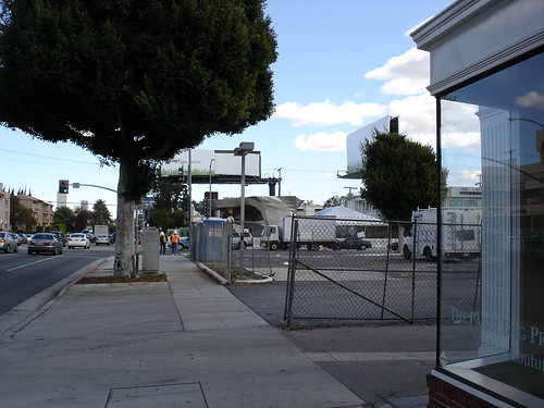
Walking up to it:
(making sure this size is good - before posting the others)
Yes, rationalist, you said what I couldn't get into words - the petroleum side of the business' days are limited, so they are researching ways to remain in the energy supply busines that are not petroleum. And thankfully they are focusing on more sustainable technologies, not squeezing oil out of shale.
ok not bad, here come the rest:

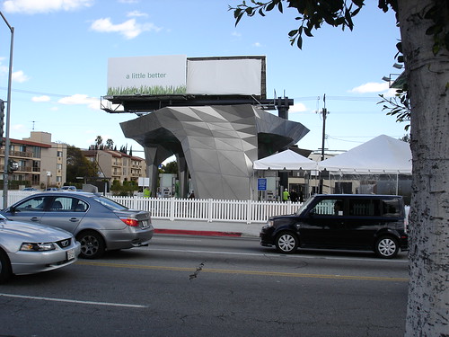


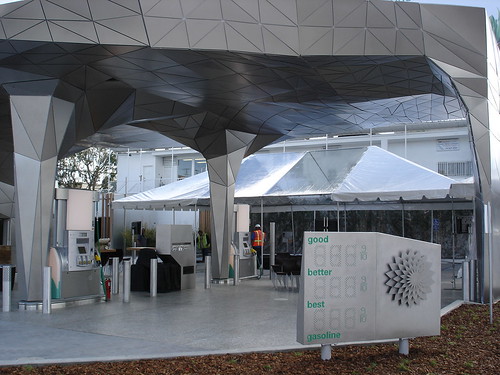
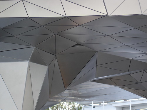


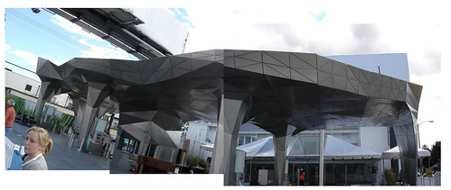
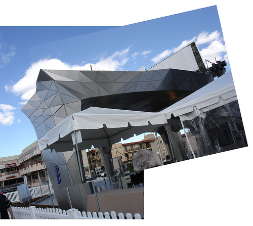
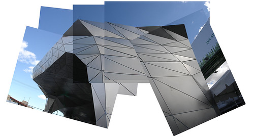
From the Mobile across the street
[img]http://farm1.static.flickr.com/168/400150875_9100732715.jpg?v=0
Reminded me of Gaudi for some reason:
Hope you all like (or enjoy for your own purposes)
Cheers
And (hope this works) if you guys wanna see them closer or bigger, here is the link to my flickr site/space etc:
BP Gas Station
Hey, turns out I like it a lot better aesthetically from a distance. There was something poncy about that first picture posted, like it was a gas station pretending not to be a gas station? Anyway, thanks for the pics squirrell-meister!
nice pics squirrelly.
Aside from the politics, I like it - its upping the bar for gas station design.
Wow - in context, it truly looks wierd. Not bad, necessarily, but definitely new. Those are the kind of shots you will never see in an architecture magazine!
Thank you so much for going out on your lunch hour and doing this, squirrelly - it's a great treat to get to see this project from the eyes of a real person.
Oh dont mention it. I was joking with a co-worker as she accompanied me there quickly during lunch that I was chuckling because when I saw it for the first time yesterday in the rain (yes it was raining and quite hard I might add, here in Los Angeles) that it just looked like an unrefinded model from rhino or some 3d software.
When you see it up close, it has it's moments, and also (sightly) portions where the panels (triangulated and probably laser cut) were not fused correctly, esp at the top where possible water intrusion will occur unless they fix it!
but overall, it's not bad......
I wonder if there is pee all over the bathroom walls?
not quite yet mdler, as it's not even open for service yet.
you guys might be able to see the other element in the pics that's quite out of context....that being the white picket fence around it. Funny!
They should charge double to advertise on that billboard.... from one angle, the whole building's pointing directly at it!
Kix - duly noted. The B.I.G. guys I was talking to were taking credit for it - probably just confused attribution.
they should've talked to me: hot-rod architecture would have been perfect!
and the picket fence definitely made me chuckle.
i think the picket fence should stay. and the tents.
did they only bother to mess with the canopy or is the building all googlymoogly too?
is there a condom machine in the bathroom?
cant...look...away...faceted grometry...ahhhhhhhhhhdicccted...why god, why!?!?
I think it looks pretty fucking weird.
Somebody got their video game in my gas station!
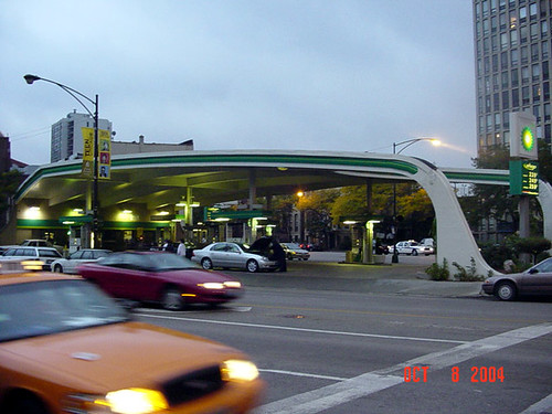
Somebody got their gas station into my video game!
Its a little bit Tronnish for my tastes, but at least its interesting - and I'd like to see how that roof drains too.
Here in Chicago at the corner of LaSalle and Clark Streets there's also a fairly well designed BP (although given its age, I am assuming its changed hands a few times.) I hope that the company decides to keep architects in mind for future service stations, and even, e-gads! design locally!
poor old Exxon must be wondering how BP attracts sustainable cred while selling effectively the same product...
love the white picket fence
hahaha, i love how after all that crazy geometry the pump still looks the same!
Thank's guy's --- the more I see of polymesh surfaces , the more I think about what a waste, what about the internal spaces where do this surface-thinking end ; when will it ever bring the strong simple structure that mean a cheap house, a strong house and something that everyone can grasp and make -- like 3D-H.
What is 3D-H? Is that BP's Danish subsidiary?
it was just a matter of time....
ok, here's a complaint i have that i don't think has been addressed in this discussion yet. this thing is obviously different than any gas station building/canopy that we've seen before, but the article talks about the pr dept, some grad student critic, a sierra club member, but NOTHING about a designer!
this thing didn't drop out of the sky! someone thought long and hard about it and had to make a lot of difficult materials decisions. it's a detailing nightmare.
in the course of working through the old newspaper adage - who what when where - shouldn't the architect be at least a small part of the impt 'who's? honestly, we're not just talking about it because it has a low-flow toilet, after all, but because squirrelly went by, saw it, and said 'what the...?'
looks like it could have maybe been something these guys would come up with: plasma
Yes you are right it is probrely quite unfair with the critic and true this is different and just manufactoring the panels will be a logistic nightmare.
Still anyone who spended a few hours with a modeling program will reconise the 3D-faces and understand these or shuld I say this structure , exactly as how I explained this as a surface structure, A structure emagined as a polymesh shapen into this form , a structure where the strength depend on the surface only -- or so it looks.
Very very different from 3D-H , but sorry to say Steven, not very much a revolution, as these tortured polymeshes as you know, been here since the computer offered them from the start --- space vectors ,Dome structures , poly meshes ; all to act just the surface omiting the very structure to hold them in the air.
Now you proberly say "well it seem they can hold themself in the air" but try emagine a bit bigger structure and a few floors beside a few walls , then surface is not enough and then come either the compromise or the paragime shift , -- while these polymeshes already been here for atleast 30 years --- ; when the surface is not strength enough will we then fiddle something underneath to hold them in the air ,something hidden in the massive volumes they cover or will architects and designers go the next step and jettison fragile polymesh structures and ask real structure generated by the computer, instead of thin surfaces and space vectors ?
Block this user
Are you sure you want to block this user and hide all related comments throughout the site?
Archinect
This is your first comment on Archinect. Your comment will be visible once approved.