
ShowCase is an on-going feature series on Archinect, presenting exciting new work from designers representing all creative fields and all geographies.
We are always accepting nominations for upcoming ShowCase features - if you would like to suggest a project, please send us a message.
Grace Restaurant will open a new downtown location in the rectory of the decommissioned St. Vibiana's cathedral. As part of the adaptive reuse, the client wants to build an addition on a triangular piece of property adjoining the rectory.
Sander Architect’s proposed design for the addition uses their hybrid house concept to create a cost-effective building that includes a new kitchen on the first floor with additional cooking facilities and a private chef’s table on the upper floors. On the first floor will also be a to-go counter for walk-up orders.
↑ Click image to enlarge
The existing condition of the triangular site for the proposed addition.
↑ Click image to enlarge
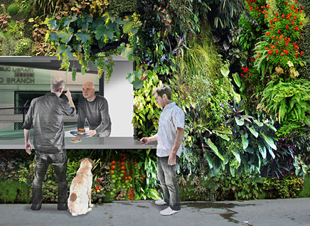
The to-go counter, at the apex of the triangular building, is accessible from both sides and its location next to the Chinatown library makes it convenient for foot traffic.
The chef / owner Neal Fraser described his hopes for creating a kitchen garden on an adjoining lot in order to grow his own produce. Architect Whitney Sander proposed that, in addition, the new building be sheathed in a vertical garden using edible plants. This could be as simple as a vertical herb garden and as complex as a vertical vegetable garden in the spirit of the recent trend for growing the tomato plant as an upside-down hanging plant.
↑ Click image to enlarge
The vertical garden of the "Building you can eat" for Grace Restaurant could be planted with anything from herbs to fruits and vegetables.
Sander Architects vertical garden will be developed with specialists in garden walls to determine the ideal plants and develop a growth-cycle appropriate for the restaurant menu and the Southern California weather.
Passers-by will literally be able to pick fruits, vegetable and herbs from the building. Sander Architects call this concept 'The Building You Can Eat.'
↑ Click image to enlarge
Location of the triangular site next to the Rectory of the decommisioned Vibiana Cathedral.
↑ Click image to enlarge
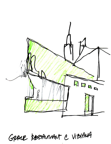
Original concept sketch by Whitney Sander for the "Building you can Eat" for Grace Restaurant.
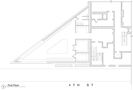
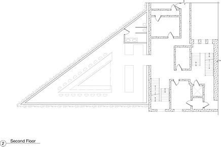
Design for this project began with an initial concept sketch and developed with floor plans and renderings to demonstrate how the concept would appear from the street.
Construction is scheduled for 2010.
↑ Click image to enlarge
First Floor Plan.
↑ Click image to enlarge
Second Floor Plan.
Hybrid House: part prefab, all custom™, the invention of Sander Architects, LLC, uses light-gauge frames made from recycled steel normally used for warehouse construction. These are then applied in a residential or commercial context to create the bones and sometimes the roof and the skin of the building.
Use of the engineered prefab frames of the Hybrid House system allows the project to be completely custom in both design and construction unlike other modular prefab homes which require homeowner and architect to work with pre-sized modules.
This system also distinguishes itself with the potential for soaring ceilings and large open-span spaces. The warehouse frames allow the scale of the interior spaces to be magnificent: Residence for a Briard has 28’ ceilings in the great room.
The system is very simple to erect. The general contractor on the Briard project had never worked with it before and he became an enthusiastic convert.
The prefab frames of the Hybrid House provide a great jumping-off point for sustainable projects thanks to the fact that they use recycled steel, use far less steel than standard steel construction and, as they bolt together, they can be unbolted and recycled at the end of the building's life cycle.
Sander Architects, LLC, is known for award-winning modern design, innovative use of materials, and strong leadership in the green movement. The office has completed dozens of buildings from Single-Family Residences to Office Buildings and Multi-Family Housing developments.
The firm’s 'total environment' approach has also resulted in the design of fixtures, sinks, lighting and furniture.
In the prefab arena, the Sander Architects brainchild, called HYBRID HOUSE, designs each house as part prefab, all custom™. This brings the efficiencies of established prefab manufacturers to their buildings, each one designed exclusively for the client. The HYBRID HOUSE approach is cost efficient, provides lower per-foot construction and allows a budget of any size to go much further. Sander Architects have used the part prefab, all custom™ concept in projects ranging in scale from 2000 to 8000 square feet in rural, suburban and urban settings.
A melding of art and architecture/interior design, the design approach of Sander Architects creates international award-winning buildings that have been published in books and major magazines around the world.
Creative Commons License
This work is licensed under a Creative Commons License .
/Creative Commons License
7 Comments
I'd be curious to see the planting plan...not sure how many edible plants can survive on a vertical surface. Cool idea though - like that to-go counter.
"Would you like insects with those fries sir?"
i second that first notion, photoshop and reality are miles away. The idea of growing things vertically requires too much water, not sustainable if that's the goal. The concept is too literal/ goofy. Another thing, what's up with quoting FLW? Seems outta left field compared to the rest. Did the guy in the fourth pic just urinate before looking at the dog, or is he staring the dog down after it just urinated on the tomato plant.
i know where to go if i go homeless/broke/hungry.
are they really going to build it?
uhh...i hope you like hobo piss in your california salad...and did that guy just pee outta his pants, 'tis a a pee poodle in the rendering. classic.....
nice appropriation of patric blanc's baroque vertical plantings in the renderings. the reality will be very different. oh, and grape leaves are smaller then a person's head.
I enjoy the concept, but I think the desired application's too impractical to be successful. I'd like to know why a restaurant would like a to-go counter; doesn't that take away from the notion of "fine-dining"?
Block this user
Are you sure you want to block this user and hide all related comments throughout the site?
Archinect
This is your first comment on Archinect. Your comment will be visible once approved.