
ShowCase is an on-going feature series on Archinect, presenting exciting new work from designers representing all creative fields and all geographies.
We are always accepting nominations for upcoming ShowCase features - if you would like to suggest a project, please send us a message.
The Soumaya Museum will be a state-of-the-art facility that will house a diverse collection of art when it opens by the end of 2010.
While museum buildings tend to opt for maximum functionality, in which case they are basically boxes or containers of art, or they are conceived as iconic buildings that represent a city during a particular historic moment.
The Soumaya Museum, however, was conceived as a sculptural buildings that is both unique and contemporary, yet serves to house a diverse collection of international painting, sculpture, and object art from the 14th century to the present, including the world's second biggest collection of Rodin sculptures.
↑ Click image to enlarge
Rendering of the proposed Soumaya Museum
From the outside, the building is an amorphous shape that inspires different experiences in each visitor, while inside the museum the varied topology reflects the diversity of the collection of art.
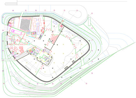
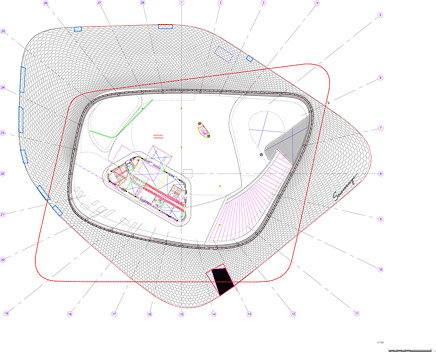
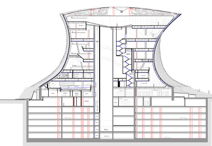
The shell of the building is constructed with steel columns of different diameters, each with their own geometry and shape, which offers the visitor a non-linear circulation. There are 20,000 square meters of exhibition space divided amongst five floors, as well as an auditorium, café, offices, store, multi-use lobby and storage space. The top floor is the largest space within the museum, and its roof hangs from a cantilever that creates natural lighting. The façade of the building is made from translucent concrete, a very airy yet solid material that allows light to filter in.
↑ Click image to enlarge
Floor Plan -1
↑ Click image to enlarge
Floor Plan 0 - Plaza
↑ Click image to enlarge
Floor Plan +4
↑ Click image to enlarge
Section
↑ Click image to enlarge
Current state at the construction site. The museum is scheduled to open by the end of 2010.
LAR / Fernando Romero
LAR / Fernando Romero is an architect and entrepreneur that started in Mexico on the year of 2000 as LCM pursuing a new direction in the architectural practice by generating unprecedented spaces, exploring uncharted geometries, developing the use of new materials and applying current building methods, as well as re-thinking the prevailing discourses. The office is continually engaged on international competitions, either by invitation or open participation. Since 2006 LAR (Laboratory of Architecture) is developing projects in the U.S.
LAR has been recognized with the following awards: (Global Leader of Tomorrow) in 2002 in the World Economic Forum (WEF), Red Dot Award: best of the best for Bridging Tea House 2006, Bauhaus Award 2005 for Villa S. March 2006, Pamphlet Architecture Prize to Fernando Romero for Translations, SARA Prize (Society of American Registered Architects 2005) for Ixtapa House, International Bauhaus Award 2004, Dessau, Germany. Semifinalist, 2004 Vanceva Design Award, U.S. Winners (Palmas Corporative Building), “If... Then” The Architectural League, Young Architects, New York, U.S., 2004. Winner 1st Prize FX International Interior Design Awards 2003 (Ixtapa House). Dedalo Minosse (Honorific Mention 2005) for Inbursa Headquarters, Miami Biennale 2003 e-Competition: “Possible Futures”, Metropolis Next Generation” with Hyperborder 2050 (book of the border between Mexico and USA) Semifinalist.
Creative Commons License
This work is licensed under a Creative Commons License .
/Creative Commons License
12 Comments
I have not been wowed by a project in a while... but the first thought when I saw the renderings was "wow"... can't wait to see how it looks when it's completed.
translucent concrete as the curvy-weavy facade --- WoW
another skin structure all but divorced from the building structure, like the seattle pub lib or biblioteca parque espana
designboom has a page with a structural diagram:
http://www.designboom.com/weblog/cat/9/view/5580/laboratory-of-architecture-fernando-romero-exhibition-at-carnegie-museum-of-art.html
I guess the ring beams in the steel skin/roof structure keep the vertical steel small in spite of the loads and the cantilevers...? 70% of the roof load (diagram says the core takes 30%, but the section doesn't show it extending up to the roof) and the entire conc. facade supported by members of the size shown in the section...? that would be wow.
youtube has a few different videos of it. this one:
http://www.youtube.com/watch?v=bNYJFpaCBis&NR=1
shows the skin as a sparkly translucent layer, I guess the translucent concrete plus artistic license, but I'm not clear on the layers. the section shows the steel supports inside the conc. facade, the rendering fly through shows the conc as the inner layer and the outer layer... two layers and an air space containing the steel?
Nice Object
this structure is just INSANE! great job!
Yaaawwwwwnnn... "insane structure" really!? since when is a simple tesellation an insane structure... It uses translucent concrete? Good, for like 8 years ago...
I really wished there was something interesting from Romero that did not bear the Koolhaas signature, so as to say romero is a decent architect on his own... not happening so far...
this is a good project.
you know... I like the shape, looks cool, the light coming through the translucent concrete is cool too, especially if it really looks like that. What amazes me is that this is a museum. The spaces are so random, it seems like the building was built and the architects said, ok where do we put the art. Even in the renderings its just thrown in in spaces where it doesn't seem appropriate. I guess we'll have to see when its.... built
I think iam.gmo's comments are unfair - That it has a certain "koolhaus" is un-refutable, as is the fact that it owes some of its heritage to FLW's Guggenheim. But that doesn't make it a bad building. Architecture has always referenced what has gone before. You can only improve by having studied what has already been done.
And while I am not a database of architectural projects, I can't think of a successful use of translucent concrete in such a fashion. This building when built will be one of those projects which shows 'what is possible' to those who so far have never dared.
Let's hope the finished product lives up to the expectations generated by the renders.
I agree with <subtect> would expected more, dialogue between interior (formal structure) and exterior (amorphous shape). the renders excellent, awazing!
This project reminds me of the Guggenheim (the original); a very sensible form, yet when it comes to the prime necessities and pragmatics of the space , it's troublesome. Maybe the placement of the exhibits that were shown in the video are not exact, but it gave me a strong impression that observing an exhibit in this building will not experienced to the full extent, since the architecture will partake in the exhibit.
Cool
Block this user
Are you sure you want to block this user and hide all related comments throughout the site?
Archinect
This is your first comment on Archinect. Your comment will be visible once approved.