
FreelandBuck is an architectural design practice based in New York and Los Angeles affiliated with Yale School of Architecture, Southern California Institute of Architecture (SCI-ARC) and Woodbury University. The office focuses on research and design, exploring the overlap between academia and practice.
This interview has been conducted via series of e-mail exchanges between Orhan Ayyüce, David Freeland and Brennan Buck on July 31 - August 6, 2012. After initial answers by David and Brennan, the responses were attributed to FreelandBuck.
Orhan Ayyüce- How did you you guys meet and decided to start an office?
David Freeland- We were classmates in graduate school at UCLA in the early aughts. Sylvia Lavin was the chair and there was a debate at the time between camps generally lead by Greg Lynn and Bob Somol. We absorbed both those perspectives - an interest in technology and complexity on the one hand and concern for the popular reception or accessibility of our work on the other. After graduating we went off in different directions, I was working for AGPS and Michael Maltzan in LA and Brennan teaching in Vienna in Greg Lynn's studio at the Angewandte. Five years later, we were both teaching and practicing and started working together, first on a competition before moving on to commissioned work.
OA- Sounds like a fair and balanced education. (laughing) No.., I mean it.. The way you put it, it is like having best of two things.. It is usually one way or another that sticks with the students. As I understand, you are not in the same city. Is that true? How does this impact your day to day operations? How do you communicate as you are working on a project? By any means necessary?
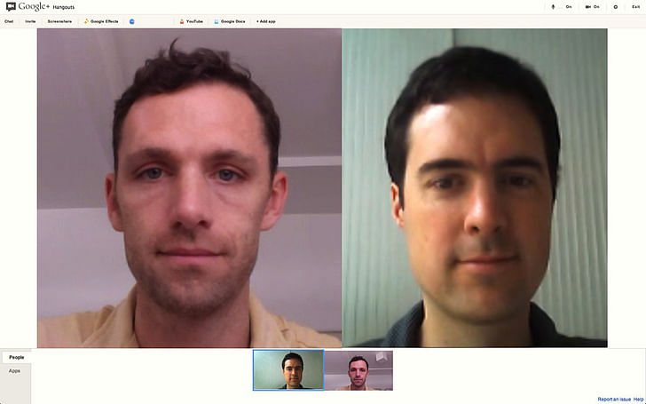
Brennan Buck- Having taught at a number of different schools, it's tough to create the right balance between sameness and eclecticism. People tend to assume that pluralism is inherently good, but faculty with perspectives all over the map will often have nothing to say to each other. UCLA at that time had strong opinions on display but enough common ground for the faculty to have coherent discussions. In any case, we were, in fact, pulled in different directions geographically and have been practicing from LA and New York from the beginning. Despite this, we collaborate on every project largely through video conferencing. We will often both be hand sketching or looking at the same digital models or drawings over long video conferences. At first the distance did produce some resistances given our experience working in more conventional office environments and the available technology, but we quickly worked through them. Touching back on our UCLA experience, David Erdmann and Marcelyn Gow of SERVO were instructors of ours who were interested in the novelty of this kind of collaboration, but for us its become intuitive and seamless.
OA- This studio structure with multiple locations and markets is really useful model in many fronts. Not only it makes possible to collaborate but also doubles up your contextual pool for possible commissions. I am also interested in finding out.., let's say constructing formal work in long distance collaboration format per se.
For example, a recent collaboration between artists Jeremy Gilbert-Rolfe and Rebecca Norton doing difficult paintings via telephone for their "Awkward x 2" project with a quote;
"The team’s technique is primarily focused on obliterating individuality; the result of the fusion is an energetic explosion of visual energy. Some are pink-hued and sensuous, others blazingly white.”
Do you ever consider making this kind of collaboration produce its own unique aesthetic?
Maybe I am veering off, but it's very interesting to me from the conceptual point of view. Otherwise it is a convenience which has been in practice for a while, using available tools of communication. Is there a specific architecture fed by this? How do you differentiate it as if you were together in the same place physically?
FB- We've never made media a specific investigation in the office in the way you are talking about it. But we would like to think that the nature of our collaboration is unique in its fluidity in spite of the distance. One effect of any design collaboration is that the process must be explicit, visualizing ideas through models, drawings, and imagery rather than internal to a single designer's thoughts. Unlike painting for example where there is a direct relationship between author and the work, authorship in an architectural project is invariably distributed. Media externalizes ideas for us and allows them to be passed around and toyed with as a painter might work with different brushes and techniques.
OA- OK. Let's go to something practical as in “practice”... How did you get your first built commission and what were the eye opening experiences specific to your particular practice, if any? For example: did you find unresolved or difficult areas where academic studies and research during interfacing the actual practice? How the things translated to somebody's business plan? IE: restaurants, kitchens, living rooms etc.. You might notice that this question is not as innocent as it seems.
FB- We were fortunate to have very open minded and engaged clients on our first built project - Earl's Gourmet Grub on Venice Blvd. They sought us out based on a previous cafe project that David designed so from the beginning, the conversation was about how design could produce a unique atmosphere that resonated with their food concept rather than just the pragmatics of budget and schedule. It was the client's first restaurant, and they wanted it to hold a valued, permanent identity in the community. Our academic work was essentially focused on the transition to practice - taking ideas about digital form and space and translating them into physical structures and material environments - looking at the feedback that happens during that process. So we were able to directly apply some of our competition work and academic research to the project. There was a kind of innocence to the process on both our and the client's part which opened up many possibilities. We owe a great deal to the contractor's experience as they were able to bring a level of craft to the project that elevated it beyond ordinary and made it possible to achieve the complexity we were after. There were some initial ideas that we had to part with, but by and large we discovered more as a team working on the transition into material from digital then we could have working on our own.
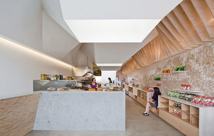
OA- How do you describe form making as your particular brand in which you resolve torques, topography, surface rotation, tessellation, other cellular organizations as programs, pentagons.., I think you bring up digital technology as an enabler for these formal exercises. Maybe you can talk about this now?
FB- We are still very interested in the values and ambitions of the earlier generation of digital formalists - that space does need not be defined by a stable grid of lines and planes but can be far more dynamic and engaging when defined by curved surfaces, torqued planes and shifting tessellations. So our primary ambition is spatial even if the means are formal. We are looking at form from the inside rather than the outside. In our aggregated cellular buildings like the Istanbul Disaster Prevention Center, there are no curved surfaces, but the spatial relationships from room to room produce a related type of instability. Each space is articulated separately but intricately nested with its neighbors. Twenty distinct environments bleed together and the scale, proportion and orientation of space is constantly shifting. This can have real social and political implications - affecting the way people inhabit the building and interact with each other.
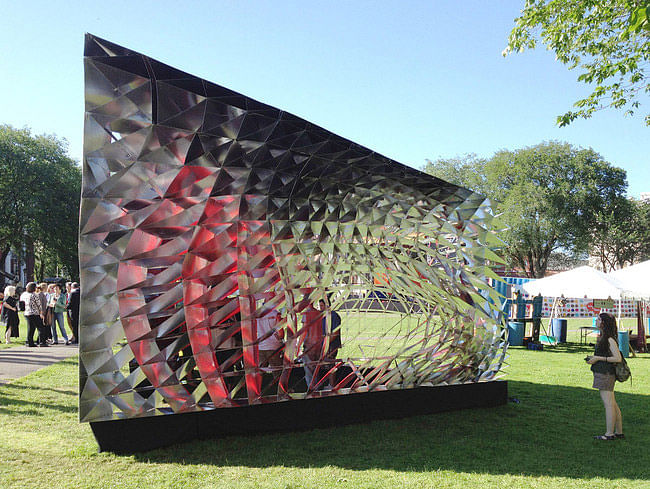
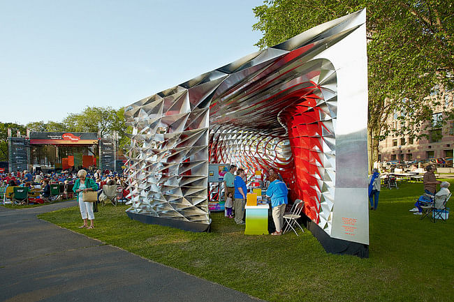
So although we are inspired by the implications of digital form, we are much more focused on physical properties like structure, light or sound. We generally start with those and then look at how they might correspond with the potential of our digital tools. For instance, the 'Assembly One' pavilion that Brennan just completed with students at Yale was driven by a folded structural system and the view or the project from a single point nearby on the New Haven Green. This led to tessellation and extrusion studies which were refined before the form or massing of the structure was even considered. The resulting spatial and visual pull through the structure is much more powerful than its presence as an object. Similarly David's recent Catenary Whorl installation with Woodbury students at the restaurant Little Bear in Los Angeles considered the scientific behavior and perceptual qualities of sound first through drawing, exploring how to create spatial subdivision and increase sound reflections. The lines are materialized as a canopy of thick cotton rope hung in spirals that undulates rhythmically through the space to reduce the reverberant sound field, transforming the atmosphere visually and aurally.
OA- Also, I am reading your "office" section on your website and with small adjustments, one can adopt the same description for an architect who hardly uses digital tool. Greg Lynn's “pipe” (?) house is really good. From one side goes in the material and the other side comes the house. Semi humorously, it is a very fluid process. It is the kind of nirvana for architecture's existing interface with digital technology and fabrication, robot made and endlessly variegated. What do you see digital technology doing in five or ten years? Do you see yourselves really onto something?
FB- The question of technology in architectural design for us has do to with orchestrating complex organizations and systems. No particular hardware or software is ordained as the modus operandi of the office, and in this sense, I suppose that digital process may not be entirely necessary to achieve these ends. However, right now there is much to be explored through digital processes, which are continuing to remake the discipline and practice of architecture. Complexity is not something new to architecture. Vitruvius lays the groundwork for a complex understanding of the architect when he refers to the architect as "homo universalis", a generalist. Venturi's introduction of complexity into architectural discourse was concerned with, beyond just semiotics, the capacity of architecture to respond to the increasing complexity of culture. Modernist techniques of systemization resulted in the flattening of difference and an architecture unable to respond to diverse and evolving social identities. We try with our work to produce meaningful difference and distinctive identity for our clients in a way that responds to contemporary visual culture and the evolving complexity of social organizations. Since much of our built work is small, these intentions play out at a fine scale, but the larger competition proposals are very ambitious spatially, and we hope they can break new ground outside of just a fabrication-based agenda.
OA- "The small projects can only get you so far." This, I was told in an advise moment by Ray Kappe, the greatest living "modern house" architect. I should have listen more carefully...
Most practices start small. However I think scale jump is an interesting moment in architecture. I think the scale jump moments of Frank Gehry and Morphosis are or can be interesting stories. In both cases, they became very distinct and branded with certain tectonic expressions. Kind of problematic in a limiting sense. Even though they can do mostly whatever they want, clients ask them for a certain look they know and they want to buy.
Since you have passed the threshold of making yourselves an operating architectural entity, and a very promising one at that, what would you advise to your peers who have not passed that threshold yet but thinking about it? How long they should think about starting up and at what point they should do it? Are there signs to that? I know there is no formula for this but what is your gut feeling?
If you ask me, people with skills and talent should jump into it and start doing it even if they have to get their food from the church and live in a cardboard box for a while. It is not that great to work for other people too long in architecture office even if they are a well known design office and have nice furniture in it. I don't care how collaborative they say it is, it is all hail to the chief stuff mainly and they get the credit that really matters.
Nowadays we have many more young design offices than before and that is great for new architecture of all scales.
Tell me more about your business operations... How good you need to be at business of architecture? Do you have a business plan? If you use the social media for promoting yourselves?
FB- I appreciate this question, but I don't think it can be asked without reference to today's economic climate. The architecture and construction industry has been uniquely impacted, and there is little precedent for growing start ups today. We know more small offices that have closed than have opened in the past three years. Given this, we feel fortunate to have been able to launch our practice at all.
In the past, speaking generally, the scale of commissions that a new office receives was related to experience prior to establishing the new practice; both the number of years the principals practiced in other offices and the size of those of offices. Offices that start right of school generally depend on teaching commitments or other occupations to help support the office, at least at first but maybe for the long term. Offices that start with some previous experience, say 5-10 years, have the tools to navigate the profession but not necessarily a set of contacts that allow them to pursue large scale projects. Then there are those that start offices on their own after a long history in practice and have the best chance of working at a large scale. The scale of commissions an office receives has a lot to do with when the practice is started in their professional careers. We were in the middle category which we hope disposes us to some flexibility in the scale of projects we pursue while admittedly having to forge out and take social and professional risks to find new clients.
Moving up in scale from where you start is challenging, as is shifting to new building types. We are not as familiar with Morphosis' or Frank Gehry's scale jump as we are with our own mentors. Michael Maltzan is a great example of expanding a practice not based on branding design but on a sincere commitment to a particular set of architectural interests. While Michael does have clear aesthetic boundaries, some are necessary for identity, his practice closely references his first commission, an arts school for a non-profit in downtown Los Angeles; a network of studio buildings lyrically composed around a central courtyard. Our initial collaboration, Stack, for the Art Pavilion competition concretized the core values that we've been talking about. Another mentor, Greg Lynn, clearly set out an architectural 'project' that he was interested in conceptually and aesthetically. This has grown and changed over time, but each successive project serves as a medium to explore a larger trajectory of principles and techniques. We also try to bring strategies and values to each project rather than hoping to elicit them purely from the particular site or circumstance we are dealing with. So that would be our advice for those considering starting a practice; understand the implications of your professional experience and be clear about what architectural values you are trying to proliferate in the world. Making work, regardless of the scale, is imperative. You could say this is our five year plan; we are in year three, the next five years are not as clear.
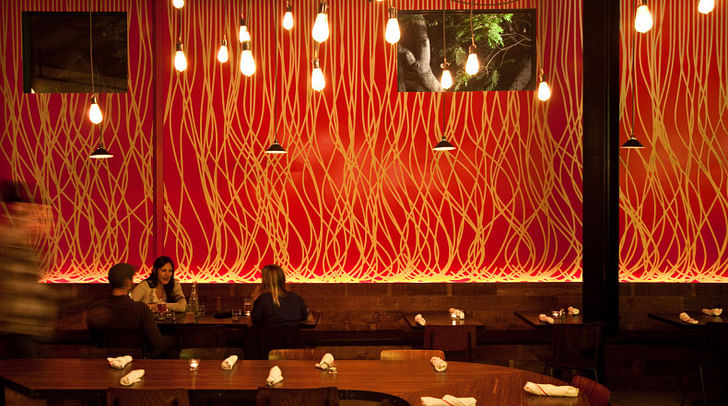
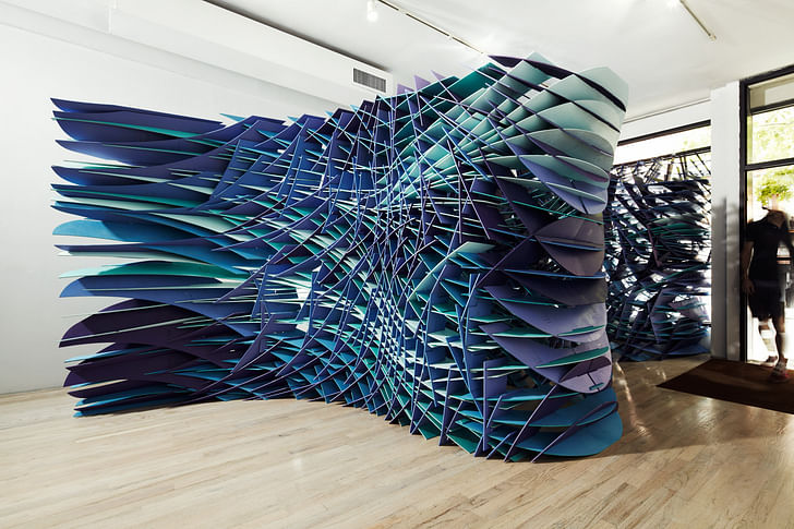
OA- Finally, let's do this; Can you talk about two recent projects you guys completed. One is Maximiliano Restaurant in Los Angeles, and the other one a gallery installation in New York, SLIPSTREAM.
In what ways they are related to one another and inform each other from the design belly? Or don't and operate autonomously?
FB- The two projects are quite different in program (a commissioned restaurant interior in Los Angeles vs. a gallery installation in New York) but share some similar ambitions. Both are large rooms where we added specific insertions meant to polarize the space - to turn neutral volumes into spaces with competing orientations and light conditions.
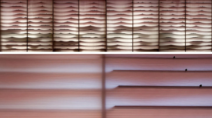
The design for Maximiliano, beyond dealing with the necessities of restaurant operations, relies on the articulation of select surfaces to create a dining atmosphere infused with color and evocative of the rich and refined menu. The large mural on the large south wall creates a strong graphic and spatial identity, evoking the rhythmic yet varied shapes of handmade pastas. Descending over a door to the patio is a deep porous soffit that undulates over the bar, filtering natural and artificial light and housing the restaurant's wine collection. About 100 fins are rotated and cut away at the back to create shifting patterns of light and color as you move around the dining area, a bit like Op-Art by artists like Carlos Cruz-Diez.
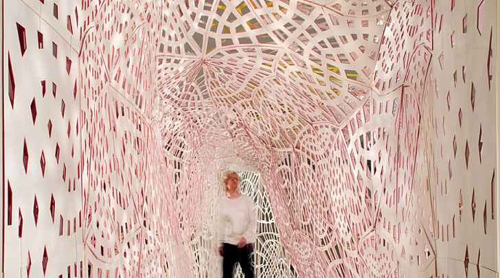
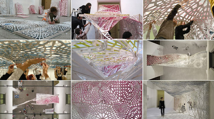
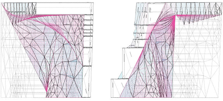
For the Slipstream installation, we were able to focus more on structure and defining multiple, interrelated spaces, but were still interested in a graphic strategy extended to three dimensions. We have been interested in extruded and 'egg-crate' type construction for a few years - both for the optical effects produced by their depth and for their expediency in making curved spaces and surfaces. At the same time, almost all the egg-crates we had seen are single-scale, orthogonal grids, undermining dynamism of their forms (Jürgen Mayer's Metropol Parasol for instance). So when we came across Lebbeus Wood's very unstructured 'Slipstreaming' drawings of flow last year, they looked like structure to us. The installation is a single digital drawing of two sets of vectors extruded through the Bridge Gallery in New York and cut away to produce a series of interrelated spaces. As a single linear extrusion, it is completely visually porous looking in through the storefront window but opaque when viewed laterally, from one space to another. The dynamism of the vector drawing combines with the undulation of the walls in plan to produce a space defined primarily by flow and motion even though nothing actually moves. Structurally, the moment connections of an orthogonal egg-crate are replaced by variable, redundant connections and triangulation - the whole thing is lightweight but very rigid.
Both projects work the transition from 2-d into 3-d differently, engaging the graphic as spatial and complexities of three dimensions as inevitably reduced into two. The planar based design techniques present in both projects allow us to fold fabrication and representation into the design process, establishing a degree of control, measure, and effect that exists both digitally and physically. Whether a building or an installation, physical form and space test the potential of digital process to invent new dynamic and engaging environments, a feedback loop that informs subsequent projects regardless of scale.
OA- Thanks, this has been informative, and we should continue in five years.
FB- Thank you. It's been a pleasure to think through these questions. You've not seen it, but it's inspired a behind the scenes dialogue between us that's been fun.
A long-time contributor to Archinect as a senior editor and writing about architecture, urbanism, people, politics, arts, and culture. The featured articles, interviews, news posts, activism, and provocations are published here and on other websites and media. A licensed architect in ...
4 Comments
While I was studying for my undergraduate in Architecture at Woodbury University in Burbank California, my second year design architecture studio was tough by David Freeland and it was one of the best and inspiring experiences of my life. I am now starting my graduate studies at USC for Advanced Architecture and Real Estate Development and have to thanks professors like Mr. Freeland. Great work and thanks a million.
Best regards,
Jason Muller
Slipstream is now for sale in an e-bay auction.. link.
More on Slip streaming, from Lebbuswoods
http://lebbeuswoods.wordpress.com/2010/12/18/slipstreaming-2/
current bid for slipstream is $11.50 with $1100 shipping ... just because you dreamed and theorized and made it does not vaildate it. That being said, Maximiliano seems quite nice.
Block this user
Are you sure you want to block this user and hide all related comments throughout the site?
Archinect
This is your first comment on Archinect. Your comment will be visible once approved.