
Under the Skin is a review series that focuses on existing buildings in Los Angeles. Each review selects one finished building, whether newly built or long-time-standing, and takes an in-depth look at it in order to get under its skin.
For the third installment, we take a visit to Sepulveda Water Reclamation Plant, a remarkable experiment in glass skin architectural design, to look at the lasting and influential legacy of corporate architecture firm DMJM.
Sepulveda Water Reclamation Plant (currently the Donald C. Tillman Water Reclamation Plant)
Built: 1984
Architect: Anthony J. Lumsden of Daniel, Mann, Johnson, and Mendenhall (DMJM)
Location: 6100 Woodley Avenue, Los Angeles, CA
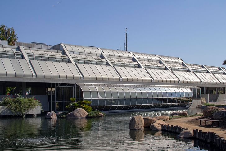
Any building that houses the Starfleet Academy in the Star Trek universe, as the Sepulveda Water Reclamation Plant does, has to be doing something right. In that fictional, enlightened future, it serves as the training grounds for new officer recruits. Photoshopped into Marin County, where it’s framed by the Golden Gate Bridge, the building seems almost classical in its sense of balance and repose. Utopian in its implications, the image it proposes of a future world remains suggestive and uplifting in spirit, while still being comfortably rooted in its foundation. The building is spaceship architecture surrounded by a well-kept Japanese Garden.
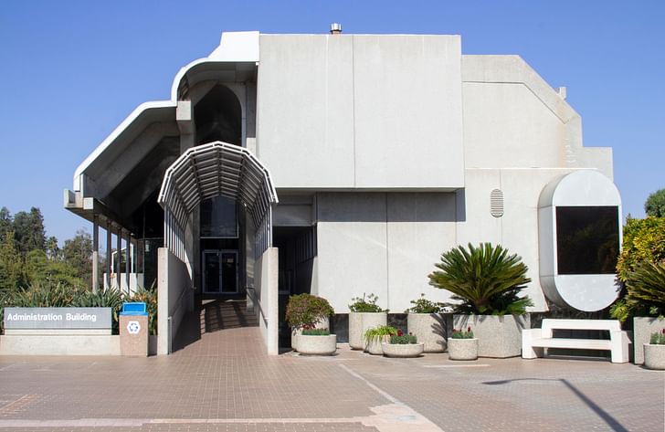
The building itself is best understood as a horizontal extrusion of its curved profile. It’s a long bar with a short elevation, basically a capped-end covering a dynamic, elongated section, which remains operative as a contemporary sectional diagram. Underneath the sloped surfaces facing the garden are a double-height space that holds the visitor entry, a lobby, as well as a display area looking over said garden. The opposite side of the building faces the industrial plant and houses the plant’s offices in a more rectilinear volume.
The building is somewhat beguiling if you only see it from the garden (which is the main viewpoint in searchable images), but the horizontal windows and sloped sides sell the effect of a building-as-spaceship that’s just landed in a lush landscape. It’s almost as if its walls are about to open up, sliding sideways, or maybe hinging upward, like doors on a gigantic flying Delorean.

In reality, this style, and approach to glazing, represents decades of Anthony Lumsden’s work in developing and realizing the idea of a building’s outer surface as a membrane, or skin. He took to calling this a “nondirectional, non-gravitational enclosure” that reduces the effect of traditional gravity-oriented visual aesthetics. It’s an idea that seems to owe as much to the aerospace industry as it does to minimal art or industrial design, where the skin loses any reference to tectonics.
He took to calling this a “nondirectional, non-gravitational enclosure” that reduces the effect of traditional gravity-oriented visual aesthetics
Together with Cesar Pelli, Lumsden was arguably the first architect to develop and explore the idea of a building’s outer layer as a continuous membrane. While this idea might be instrumental in both architects’ work, of the pair, Lumsden was the one to really push the design implications of such a reconceptualization, as evidenced by this building as well as in his designs for the unbuilt Beverly Hills Hotel.
If, like me before looking into this building, you don’t know who Anthony Lumsden was, a bit of background might help illuminate his importance as a late-20th Century architect. Lumsden came to Los Angeles in 1965 at the behest of Cesar Pelli. The two had worked together at Eero Saarinen’s office in Michigan, and Pelli, who was hired to lead design at DMJM (“dim-jim”), brought Lumsden out to work under him. Shortly afterward, when Pelli left to become a partner at Gruen Associates, Lumsden took over as the principal for design. DMJM was a large corporate office, one of the first integrated architecture and engineering firms in the country, and built its reputation initially by providing transportation-related engineering services. (Later, it would eventually sort of morph into AECOM.) In their roles as design directors during this period, both Pelli and Lumsden enjoyed a considerable amount of freedom in designing the firm’s projects, as long as they stayed on budget. This is why Lumsden is typically called out and credited for the designs of buildings he produced, despite the fact that he was part of a larger corporate firm. It’s a fascinating model, where one person was able to marshal the resources of corporate practice toward a specific design agenda and achieve exceptional results.
In their roles as design directors during this period, both Pelli and Lumsden enjoyed a considerable amount of freedom in designing the firm’s projects, as long as they stayed on budget
In 1966, both were also involved in the design for the Century City Medical Plaza building, which was one of the first buildings completed when Twentieth Century Fox converted their old studio backlot into a new neighborhood, Century City.
That building marked the first time facade mullions were flipped to create a glass membrane that created a continuous and dominant surface over the exterior of a building. It was a distinct departure from the curtain wall towers of the East Coast, where the mullions projected outward on the exterior of the building. The curtain wall maintained the effect of a visual tectonic, where mullions act as slender stand-ins to their column and beam counterparts.
Both the Lever House and Seagram Building have curtain walls with exterior-facing mullions that reinforce the structural articulation of the facade, for example. Additionally, the difference between that approach and Lumsen’s glass membrane concept is the loss of articulation or differentiation at the top, middle or bottom of the facade.
Pushing this idea further, Lumsden, as he does here, took to extruding cylinders horizontally and then combining them, in what seems to be a proto-Boolean operation, to create a more or less continuous skin. His rationale was that it’s easier to produce variability in section than it is in plan, where clients and budgets have much more rigid demands.
In plan, the building is organized into two halves (split hot dog, not hamburger). The side facing the garden provides for various publicly accessible spaces, while the other half, facing the water reclamation plant, is made of offices and other private functions. In one of the building’s more courageous moves—and perhaps as proof of the success of the building’s larger function—the pond that separates the building from the garden is actually brought inside the structure. Just past the visitor lobby, in the building’s display area, the floor transitions to a kind of elevated walkway where you stand over water—and koi fish—to look out at the garden.
It’s quite an astonishing moment. Los Angeles architects especially love to talk about blurring the distinction between interior and exterior, which more often than not, involves a basic approach, like telescoping doors or using a patio like a living room, but in this case, the effect is very real. You know you’re inside the building, and yet, with the pond on either side, you’re denied the sense of a complete enclosure. It undermines the building’s phenomenal enclosure.
It seems Lumsden, in addition to being an architect, was also a designer in the most complete sense of the word. In an interview with A+U magazine, for example, he said that “one aspect of an important building is its contribution to the next of its kind.” It’s a relevant view here.
Reconceptualizing the skin as a non-gravitational surface requires other building systems to be similarly reconceptualized, as well. Especially in this case, where cylindrical geometry is oriented horizontally rather than vertically, the approach has considerable structural implications. To observe a structural detail of the building’s horizontal, cylindrically-extruded glazing is to see the DNA of more recent projects that utilize irregular geometries, as well. In a way, this detail preempts the digital design environment, which is, of course, by its very nature, non-gravitational. I’m thinking most clearly of the Fondation Louis Vuitton, and the structural detail for the connection of the exterior sails. This glazing-to-concrete structural detail Lumsden used in the Sepulveda Water Reclamation Plant can surely be seen as a precursor to Frank Gehry’s approach at the Foundation Louis Vuitton.
Up until now, I haven’t made mention of the building’s program, mostly due to the fact that its architecture creates such a strong identity distinct from its function. It’s just as plausible that it could house a futuristic school, as Star Trek would have it, instead of what it actually holds, which is the visitor center and offices for a wastewater recycling plant.
The complex processes blackwater—the collected drainage from the sinks, toilets, and showers of Los Angeles’s San Fernando Valley. The solid waste is separated out and sent southward, to the larger Hyperion Sewage Treatment Plant near El Segundo. (Interestingly enough, that was also designed by Lumsden when it was upgraded in the 1980s.) For people in the area curious to know more about the recycling process, you can actually tour the plant side of the facility by setting up a visit in advance.

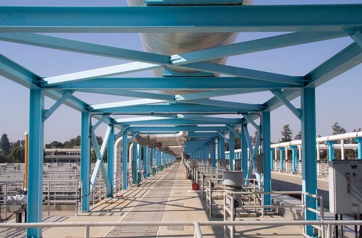
The Plant has its own beauty. Its physical makeup differs from the Building in that it is not informed so much by design itself as it is by kits of (large) parts—pipes, beams, columns, etc.—and the physical adjacencies needed to complete the multi-step process of water recycling.
What makes this project utopian in spirit is that its architecture is, in fact, a celebration of its base function. That its form is futuristic and uplifting—literally pulling away from the ground—is an embrace of the quiet efficiency of a closed-loop way of thinking. Our biofluids get diluted, cleaned, and recycled back into the larger world. Lumsden once told The Los Angeles Times, for example, "I feel it's more mature and sophisticated to develop a kind of style that doesn't hide what goes on inside these places and find a way to turn that into interesting architecture."
I feel it's more mature and sophisticated to develop a kind of style that doesn't hide what goes on inside these places and find a way to turn that into interesting architecture."
The three parts of this facility are all distinct—The Building, The Garden, and The Plant—but they work together in unison. While most of the recycled water from the plant is sent into the Los Angeles River, some is steadily filtered into the pond, and also used to irrigate the Garden, creating a more biodiverse microclimate.

Author’s Note:
The Japanese Garden was designed by Dr. Koichi Kawana and is open daily to the public.
You can learn more about the wastewater treatment process here.
A+U, A Monthly Journal of World Architecture and Urbanism published its March 1975 (Number 51) edition on the work of Anthony Lumsden. From an interview with him there, I’ve included quotes of his, and also referenced the article by Michael Franlkin Ross, DMJM Design: An Appraisal.
Patrick is a Los Angeles-based designer, writer, and educator. He has practiced architecture in Los Angeles and at Sea Ranch, and has taught design studios at SCI-Arc. He currently teaches at the Woodbury University School of Architecture. As a contributor to Archinect, he has written Under ...
No Comments
Tony Lumsden had a strong influence on SCI Arc students with drawings and buildings like this. Best curtain walls ever also.
Block this user
Are you sure you want to block this user and hide all related comments throughout the site?
Archinect
This is your first comment on Archinect. Your comment will be visible once approved.