

Arthur Elrod, the noted Mid-Century Modern interior designer, is widely known for his eye-popping, colorful, and groovy designs, but what can we learn from his monochromatic works? Stylistically eclectic, formally complex, and materially decadent, these works hold valuable lessons that, upon further inspection, make great precedents for contemporary design explorations.
Why? Because Elrod anticipated a now distinctly contemporary form of eclecticism that combines the curatorial approach of discerning taste with a no-holds-barred, cabinet of curiosities-centered sensibility that relies on color and materiality to seemingly tie together new and traditional spaces and objects alike. While Elrod’s colorful works are sure to wow, this approach is more effectively appreciated through the subtlety of his monochromatic designs, where Elrod manages to work in surprisingly explicit ways to undermine the notion that Modernism was founded on newness alone, and to erode the idea that design has to be monolithic in order to look good.
The approach would not be out of place in today’s architecture and design studios, where a similar sensibility has become a necessary fact of life.
As chronicled in Adele Cygelman’s recent book Arthur Elrod: Desert Modern Design, Arthur Dea Elrod was born in rural South Carolina and studied for a year at Clemson University as a textile specialist before leaving to find work in Atlanta as a department store decorator. After working there for another year or so, Elrod decided to head west to California, where he landed at the Bullocks Palm Springs department store’s home furnishings department.
As Elrod arrived in Palm Springs in 1947, Bullocks Palm Springs was the only major department store with a home furnishings department in town, and so, it fell on Elrod to deploy his exceptional taste and skill as a designer to fashion brand-new residences into lived-in and comfortable accommodations for the city’s newest residents.
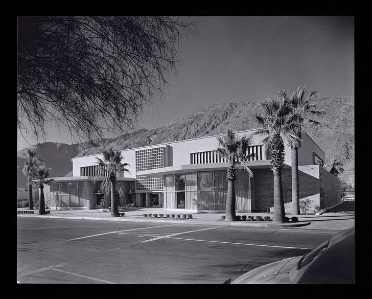
As market-driven developers sought to differentiate building tracts from one another, they hired some the best-known residential architects of the time, and often, young designers and decorators like Elrod to outfit model homes using local department store wares. In the early part of his career, Elrod acted as an influencer of sorts, creating marketable interior designs that not only fashioned modern desert architecture for everyday use, but also moved inventory. Quickly, Elrod’s designs for Bullocks Palm Springs-outfitted homes gained a following as his knack for using color and a curatorial approach for mixing new furnishings with antiques and other found and inherited objects matured.
Working for leading department store W. & J. Sloane in San Francisco years later, Elrod took a transformative foray into lighting design when he created a highly-influential interior installation highlighting lighting technology advancements by General Electric. GE’s Diamond Jubilee of Light exhibit at the San Francisco Museum of Modern Art from 1955 featured Elrod’s conceptual Celestial Room, a pioneering work in the use of can lighting, fluorescent dimming technology, and integrated lighting controls, among other innovations.
Elrod made a triumphant return to Palm Springs in 1956 to start his own interior design practice. Working his San Francisco connections to bring brand-name furniture and other luxurious products and textiles to the thriving desert communities, Elrod and his business partner and co-designer Hal Broderick, became decorators-to-stars who worked with Lucille Ball and Desi Arnaz, Walt Disney, and many others over the years. Elrod also partnered with some of the era’s best and most prolific architects, including Paul R. Williams, A. Quincy Jones, Edward Fickett, and, perhaps most famously, John Lautner.
As the decades wore on, Elrod’s decorating style changed with the times. A sensibility that started off embracing the subtle hues and old fashioned values of the early 1950s gave way in the 1960s to bold colors, experimental materials, and softly-contoured furnishings. By the 1970s, Elrod’s pallet had grown to include shag carpeting, endlessly long sectional sofas, and bold, contrasting prints.
As Elrod’s success marched forward, his clients grew more sophisticated, as did their individual tastes in art, antiques, and other furnishings, which Elrod worked tirelessly to accommodate with his designs. As America entered the Pop Art era, Elrod’s designs took a strikingly conceptual turn, as well, embracing the slick contours of finish fetish art and anticipating the cocaine-fueled decor of the 1980s. And though Elrod had engaged in some subtly monochromatic projects before, it was during the late-1960s and 1970s that this abstract turn reached its peak.
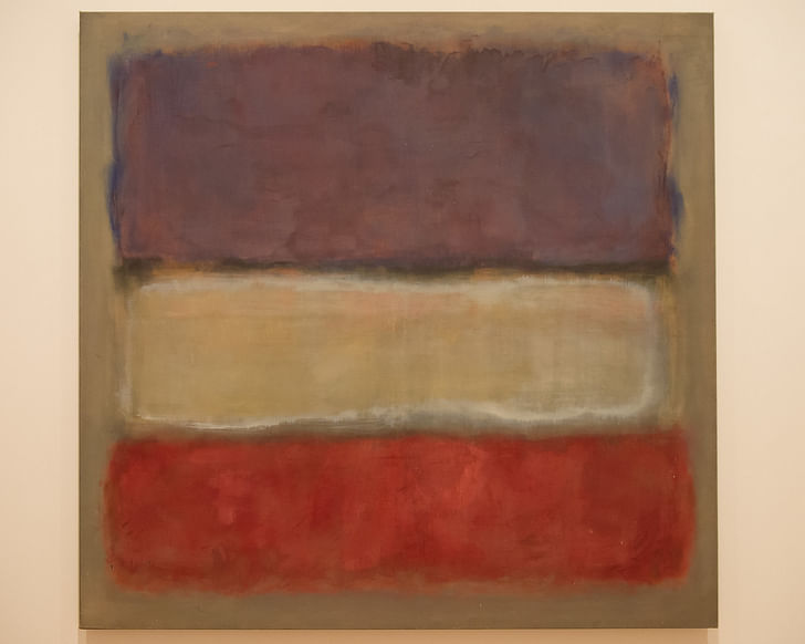
Below are five lessons that can be learned from five of Elrod’s later works. In these projects, Elrod deploys a monochromatic sense to create subtle masterpieces that use gradients of similar colors to organize space and explore new forms of materiality, while still conveying a sense of palpable opulence and domestic comfort.
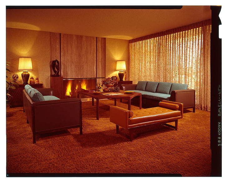
Tennis Club Hotel, 1967, Palm Springs, California.
The Tennis Club Hotel represents a transitory example of Elrod’s developing monochromatic sense. Developed as a model condominium interior for new William F. Cody-designed sports and leisure complex, the design is one of many demonstration projects Elrod took on that works methodically through rich gradations of brown, tan, caramel, and ochre to evoke a sense of old-timey classiness. Those might not be architectural terms necessarily, but the designs here point toward a salient fact that Elrod would articulate again and again: Furniture, color, and textiles can be used to completely reposition the architectural qualities of a space for the better.
The outlines of the space—a generous window wall, integrated fireplace, and squatly-proportioned ceilings—are thoroughly a product of post-World War II building traditions. But where one might expect newness, Elrod delivers a classic mood. Painting with an earthy palette that includes rust-hued carpeting, chocolatey leather sofas, and walnut-colored ceramics, the designer is able to make the economical space appear bigger and more venerable than it actually is. A flush-mounted fireplace and sliding glass door convey that the space is modern and new, while the Scotch-tinged furniture and finishes give those elements a sense of seriousness that would be at home in any boardroom of the time.
Handwoven drapes balance the harsh exterior desert light, as well, complementing the warm glow of the fireplace, its marble surrounds, and the symmetrical lamps arranged beside it. At the center of the room, a hexagonal coffee table and a trio of leather-bound sofas ground the formal sitting room while a peripheral rubber tree and an eclectic array of ceramic elements peppered throughout the space lend a bit of whimsy to the otherwise staid condominium. The effect is one where the architectural elements of the space dematerialize and become a backdrop for the social or business interactions that likely took place here.
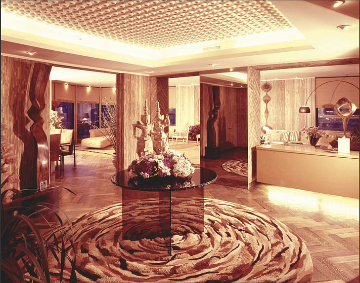
John and Eunice Johnson Apartment, 1972, Chicago, Illinois.
In Chicago, where Elrod worked extensively as a designer for some of the city’s most notable and wealthy residents, the John and Eunice Johnson Apartment stands out as another tour-de-force of brown, beige, cream, and white elements. Except here, the architecture, relatively subdued already, is entirely overtaken by the materiality, symbolism, and visceral power of each of the different elements that make up the space. In this project, Elrod plays with the power of reference and intertextuality to code multiple levels of meaning into the home’s design.
Designed specifically for the iconic African American publishing power
In the living room beyond, a looped wire sculpture by Ruth Asawa and artworks by Pablo Picasso and Marc Chagall reference and complement the naturalistic forms of traditional African sculpture, leopard-print chairs, and zebra-print throw pillows. Wall-to-wall carpeting, patterned wallpapers, and concealed lighting elements lend a contemporary 1970s flare to the apartment, which, because of the status of its owners and the skill of its decorator, is unmistakably of its time.
Here, Elrod works across mediums, juxtaposing ceramic pieces designed by Picasso, an artist whose early works were influenced by African Bantu cultures, with actual works of African sculpture. Not only that, but the spaces are filled with more direct references, as well: Leopard print throw pillows, snakeskin dining chairs, and a zebrawood coffee table inlaid with brass hearken to the flora and fauna of the African continent, coding the space with color, symbolism, and materiality all at once. The effect, like in many of Elrod’s works, was to create a sense of modernity through the juxtaposition and collection of various objects and materials from across times and genres, an effort that here, is guided predominantly by the brown and beige tones his clients requested.
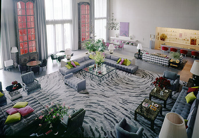
E. Hadley and Marion Stuart
At 13,000 square feet in size, the E. Hadley and Marion Stuart
Built of grey slate and granite, the home is chock-a-block with formal sitting rooms, decadent bedrooms, and hallways wide enough to park cars in. The mansion is also anchored at its heart by a 50-foot by 72-foot living room outfitted in cool grey and lavender tones where the clients could not only live casually according to over a dozen formal and informal seating arrangements, but also, show off their stunning collections of rare coins, pre-Columbian artifacts, gems, minerals, and other archeological specimens in gigantic 18-foot armoires.
Elrod, by including an inset, down-lit bar, floor-to-ceiling expanses of window walls, and a massive grey-blue-and-ash-colored carpet in the space, breaks down the 30-foot-tall living room into more manageable zones. Here, raspberry and lime accents enliven the room, adding a sense of scale to the oversized furnishings and finishes. Meanwhile, the super-scaled armoires, lined with pink wallpaper, lend a seemingly-otherworldly quality to the space that, because of the subdued color palette surrounding them, stand out amid the exquisite, tasteful clutter.
Here, Elrod uses lavender-kissed fields of gray to frame overall spaces that become more intimate as specific architectural and furniture elements use color and form to suggest different types of inhabitation. The result creates an interior landscape made up of wall-less rooms where furnishings and areas of color shape space, and where lighting, either from the windows, the bar, or the various free-standing lamps, defines how and when those spaces are used.
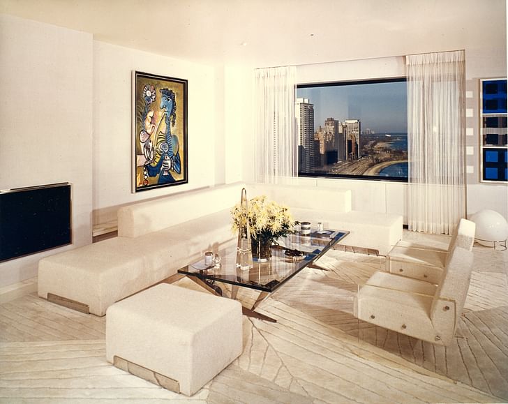
Sigmund E. Edelstone Apartment, 1972, Chicago, Illinois.
The final two projects are both residential designs for Sigmund E. Edelstone, the Chicago industrialist and philanthropist who got rich developing “Perfect Match” touch-up automotive paints. As such, color was also extremely important to this client, though in a very different way. For the highly conceptual Chicago apartment, Elrod and Broderick crafted a series of luxurious themed rooms hand-in-hand with Edelstone as he traveled the world collecting new works of art to fill the space. And so, a red, purple, and white Rothko painting in the dining room was matched with tan and chrome rounded seats and a circular table, while Picasso’s Red Nude painting was hung in the master bedroom as a compliment to striped red and white bed.
In the living room, the relationship between the elements is more subtle, where Picasso’s Woman with Pipe presents splashes of blue, yellow, and gold. To suit the painting, Elrod crafted an all-white, linen-walled room where a textured carpet designed by Bill Raiser creates jagged off-white planes of slightly different hues, depending on the grain of the carpet fibers. On this surface sit a collection of plush white chairs outfitted with lucite armrests and a matching long white sofa and ottoman with chrome accents. At the center of the room, a blue-glass table supported on a chrome frame mirrors the view from the apartment overlooking the city and Lake Michigan, which, in this context, appear somewhat flattened, like a large-format photographic print.
In each of the rooms, Elrod develops a clear formal and visual hierarchy for the spaces based predominantly on monochromatic arrangements that use materiality, texture, color, and form to achieve an artful balance.
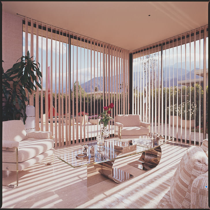
Sigmund E. Edelstone Condominium, 1973, Palm Springs, California.
The Sigmund E. Edelstone Condo in Palm Springs is a monochromatic masterpiece that, unlike the previous example, embraces the exterior landscape while also directly showcasing the influence of the Pop Art, minimalism, and finish fetish art movements of Southern California on interior design.
A super-sized Palm Spring condominium that Elrod adapted for Edelstone, nearly every wall in the home is designed and outfitted to show off a specific work of abstract art. GIant slabs of Idaho travertine make up the floors of the unit, for example, creating the appearance of a refined and monolithic surface that is complemented throughout by white and tan fabrics, clear glass tables, lucite furniture elements, and countless chrome steel accents. Here, a monochromatic mood is expressed both in the colors of the various elements and as a material quality inherent to the reflective stainless steel and transparent glass elements.
In lower right corner of the photo above, a double-sided, L-shaped sofa frames both the formal sitting room pictured and an interior drinking nook flanked by a built-in fireplace and large-format abstract artworks. A high-class application of vinyl vertical blinds if there ever was one, the desert patio-facing home opens up seamlessly to an art-filled vista populated by a bright red Alexander Liberman sculpture and the San Jacinto Mountains beyond.
In this project, the physical qualities of experimental plastics and metals reflect and distort their surroundings, creating dynamic planes where space takes on an otherworldly dimension. Here, instead of creating symbolic references, the materials serve to create a sense of visual ambiguity that lends the space a sense of modernity that perfectly compliments the high-gloss artworks of the time.
Through the designs of this space, Elrod brings home an idea that guided many of the works he completed throughout his career: Material, color, surface, and form are, in a way, all sides of the same coin, and when each is positioned in balanced, fruitful opposition to the others, beauty results almost by default.
Antonio is a Los Angeles-based writer, designer, and preservationist. He completed the M.Arch I and Master of Preservation Studies programs at Tulane University in 2014, and earned a Bachelor of Arts in Architecture from Washington University in St. Louis in 2010. Antonio has written extensively ...
1 Featured Comment
Thanks Antonio. One reason for my writing the book was to shift the focus away from midcentury modern architecture to the interiors of the period, especially in Palm Springs. So this is a very refreshing and welcome review that I hope opens the door to conversations about how great interior design complements and enhances great structures. One of the most frustrating things about my research was finding so few Elrod interiors intact. His work deserves the same level of respect accorded the architecture.
All 2 Comments
that house in idaho is ridiculous. it looks like a theme from the sims. you could fit a mcmansion in the living room. impressive effort to make it feel kind of cozy though.
this was fascinating. it's nice to see interiors recognized as a legitimate part of architectural design, despite the frequent disparaging remarks in the forums here.
Thanks Antonio. One reason for my writing the book was to shift the focus away from midcentury modern architecture to the interiors of the period, especially in Palm Springs. So this is a very refreshing and welcome review that I hope opens the door to conversations about how great interior design complements and enhances great structures. One of the most frustrating things about my research was finding so few Elrod interiors intact. His work deserves the same level of respect accorded the architecture.
Block this user
Are you sure you want to block this user and hide all related comments throughout the site?
Archinect
This is your first comment on Archinect. Your comment will be visible once approved.