
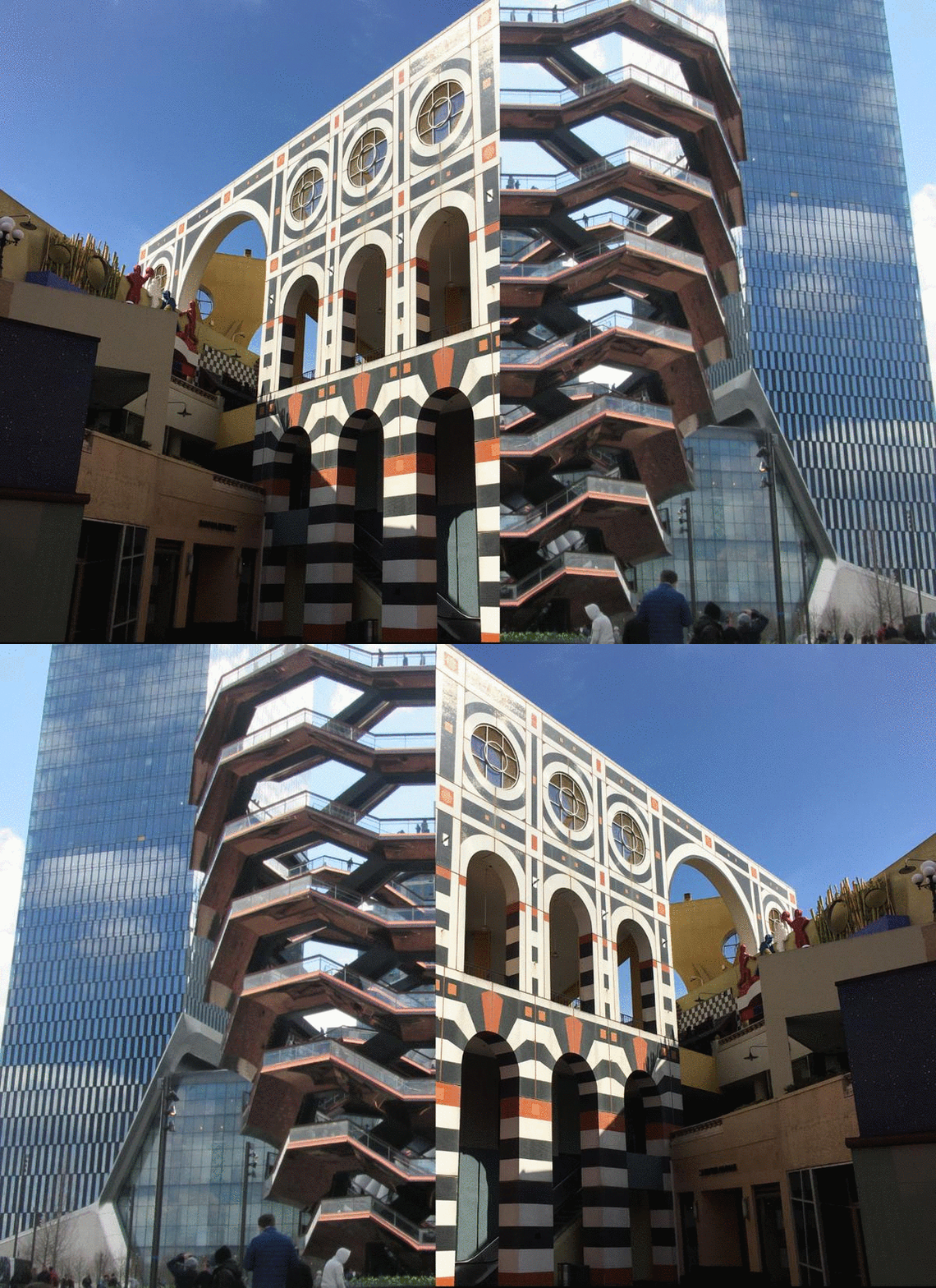
One is brand new, the other, at the end of its life. One is a place for shopping, the other a place for selling oneself. One, a facsimile of the city, the other, a rejection of it.
However unalike they might seem, Jon Jerde’s soon-to-be-demolished Horton Plaza in San Diego and Thomas Heatherwick’s recently-completed The Vessel in New York City have much in common.
Let us count the ways.
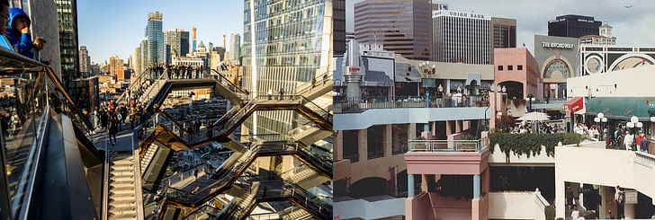
Both are prime examples of commercial architecture.
Both are meant to be experienced as destinations at the center of the city.
Both are self-contained worlds designed with their own specific internal logics.
Both are empty, filled with space rather than stuff.
Both represent architect-led attempts to create instant urban context.
Both are synonymous with developer-driven urban regeneration.
Both function as promontories from which to see the city.
Both also contain inwardly-focused courtyards.
While much ink has been spilled regarding the so-called “death of retail” over the last few years, as the recent opening of New York City’s Hudson Yards—and the overwhelming critical and popular reception for it’s marquee attraction, The Vessel—shows, commercial architecture thrives nonetheless, only in a slightly different form.
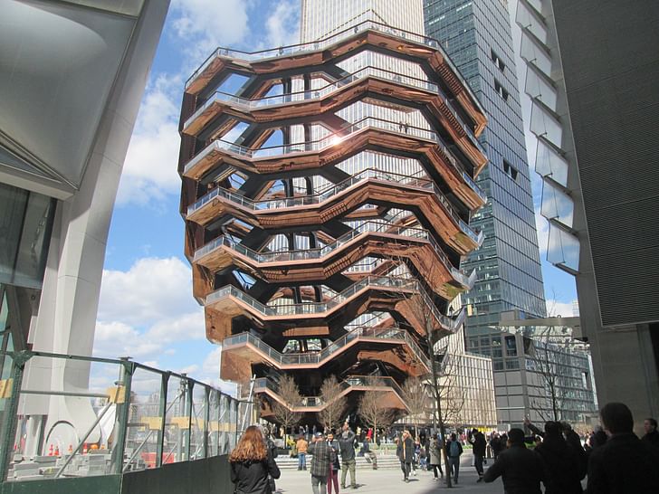
Designed by British architect Thomas Heatherwick, the 150-foot-tall, $180 million object anchors Hudson Yards as a “public centerpiece” for the development and the shopping mall that lies at its core, an effort to, according to the architects, “create something meaningful” on the site of a new, high-end urban neighborhood.
But what does it mean to use iconicity as a way of creating meaning at Hudson Yards? Though The Vessel is monumental in its scale, is it a monument?
Not really. The structure is not necessarily a monument in the conventional sense, anyway, mainly because its form does not carry any overt meaning beyond a few tangential and convenient references. Unlike the Statue of Liberty, for example, The Vessel does not represent lofty ideas like freedom, refuge, or openness personified in super-scaled human form. The Vessel also carries little to no narrative value in its geometries, and makes little effort to reflect any societal values or norms in its configuration, materiality, or urban arrangement.
Unlike the Eiffel Tower, The Vessel is not meant to overtly represent jaw-dropping technological feats, either. Shaped out of custom-fabricated steel modules wrapped in copper sheathing, The Vessel’s true material configuration is repressed rather than exposed. Don’t come here looking for exposed bolts, delicate trusses, or spindly frills. Instead, the few steel elements that are exposed are painted smooth with coats of black paint. The remaining materials all either float off of the steel chassis on a series of concealed arched ribs, or, as in the case of the concrete pavers that line every horizontal surface on the structure, sit on metal clips raised above the base material.
Instead, The Vessel is designed as an attraction, a “sculpture” that embodies the values of commercial real estate, an enterprise geared toward capturing attention and profit as completely as possible. And like much of the art created today, The Vessel is best understood as an expression of commerce outright, as an object that facilitates retail transactions, and a work that exists to conceal the flow of capital behind gleaming, photographable surfaces.
As a structure that exists in the service of retail, The Vessel represents a purpose-built work of commercial architecture. This status makes it, because of its size, newness, and notoriety, a representative of the contemporary state of shopping: largely empty, expensively-finished, and perfectly primed to fall out of fashion.
Experiencing The Vessel in person—or on Instagram—can be a sensational quest, but one that ultimately falls short. The views of the glassy midsections of the surrounding towers pale in comparison to what it feels like to see from the top of other monumental structures, for example. While, with nowhere to sit and the constant, awkward hum of people taking pictures of themselves and each other filling every space, The Vessel can feel impersonal and cold. Scaled just-so to allow one or two people at a time to walk up and down each of its 154 flights of stairs, it’s hard to feel either totally alone or inexplicably intertwined with a sense of shared humanity here.
Instead, The Vessel exists in an omnipresent state, directing our attention to itself and to its surroundings while providing little relief otherwise. The sculpture is best experienced fleetingly, as a promontory, a place from which to see into its interior and to look over its surroundings as you dodge other onlookers.
And though tickets are free and nothing is technically for sale at The Vessel, that doesn’t mean you aren’t buying something while you’re there. As they say, if it’s free, then you are what’s for sale. And that’s generally true here, though in a somewhat inverted form: People come to The Vessel not to buy, but to sell themselves, to project, to capture, to disseminate their experience of leisure into cyberspace. The Vessel is a mall without the shopping, a space that exists to be lived in vicariously.
In fact, perhaps the most significant aspect of The Vessel is that it is best experienced not in person, but online, by scrolling through your feed, by, as so many of the people there can likely attest, personalizing a photo and posting it.
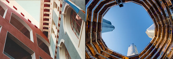
Horton Plaza is built using stick-framing, drywall, and stucco.
The Vessel is built from steel, copper, and concrete tiles.
Horton Plaza exists to get you to buy stuff.
The Vessel exists to help you sell yourself and your lifestyle.
Horton Plaza is designed to be experienced on foot, in motion.
The Vessel is designed to be experienced online.
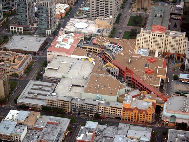
Jon Jerde’s Horton Plaza in San Diego, on the other hand, represents a titular example of commercial architecture from a previous era that is also very much a work of art.
A 6.5-block mega-mall complex built in 1985, Horton Plaza’s reason for existence is a bit more direct than that of The Vessel, though it is no less existential.
Inspired by Jerde’s travels throughout the old cities of Europe, Horton Plaza is organized into a facsimile of a hyper-real urban experience, and is designed to delight the senses and the wallet, alike. Created during a perceived cultural nadir in American urbanism, the complex anticipates the type of developer-driven urban renewal that Hudson Yards typifies today.
Like The Vessel, Horton Plaza was successfully designed as a spectacle used to lure a dispersed populace to what was at the time a very much in-the-works downtown. And it did so through a union between its brand of ecstatic, larger-than-life, historically-literate paper mache architecture and shopping. Where the coral- and cerulean-colored oatmeal stucco walls razzled, the shops, each articulated in a different mode, dazzled. As a figure-ground, Horton Plaza is largely figure, a thick, solid super-block building punctuated singularly by a diagonal courtyard that beams through the center of a concrete bunker wrapped in parking. The parking decks, with inlets and outlets on each major boulevard bounding the site, open directly onto the shopping courtyard without mediation: Drive in, walk out, shop.
The first built example of Jerde’s so-called “experience architecture,” the three-story shopping mall is designed to totally transport the occupant. Like a meandering High Street smashed into an Italian hill town, the engrossing complex features an untold number of storefronts arranged behind crooked corners, within colorful inlets, and just passed framed views. Bright colors and discordant materials pop into every vista, a fractured sensation results. Paths jog to create seating areas while building elements zig to create thresholds and storefronts zag to reorient the body. Balustrades, of varying profiles and dimensions, can be found all over the place; Engaged columns and pilasters, too. Staircases appear and disappear under silver pressed-tin ceilings in one corner, while in another area, the walkway becomes a ramp that spans between levels. Built before the Americans with Disabilities Act was enacted, the ramp is a bit too steep for code, much like the hilly streets of Rome or the areas around Montmarte. Walking through Horton Plaza is a work out for the body and the senses alike: the heart palpitates, your memories race, our heads spin.
Though the complex is now entirely devoid of commercial life, every storefront is still a star here, a character wrapped in any number of commercial styles. It’s not uncommon to see mediterranean-inspired, DeCon-lite, and Streamline Moderne storefronts all one after the other. For Jerde, this heady mix was very much the point.
But although experience reigns, this too, like The Vessel, is a work of surface architecture. That’s because Jerde’s conceptual inventiveness found its ideal expression not through permanent, static tectonics, but via a limber material palette stocked with cheap stick-frame construction and sheet-based finishes. Like many architects of the 1970s and 1980s, solidity did not matter so much to Jerde, but symbols obviously did, and he worked to shape largely disposable materials to make those symbols come to life.
Today, empty, cold, and way out of style, the Horton Plaza feels a lot like The Vessel. Except that here—despite the colors, the classical frames, and engaged columns—it is now possible to have a moment of peace, to marvel at the mosaic-wrapped facades, to admire the rusting copulas, to imagine what once was, as joyful ambient music echoes mournfully through the former retail courtyard.
In this way, so too is Horton Plaza representative of the contemporary state of shopping.
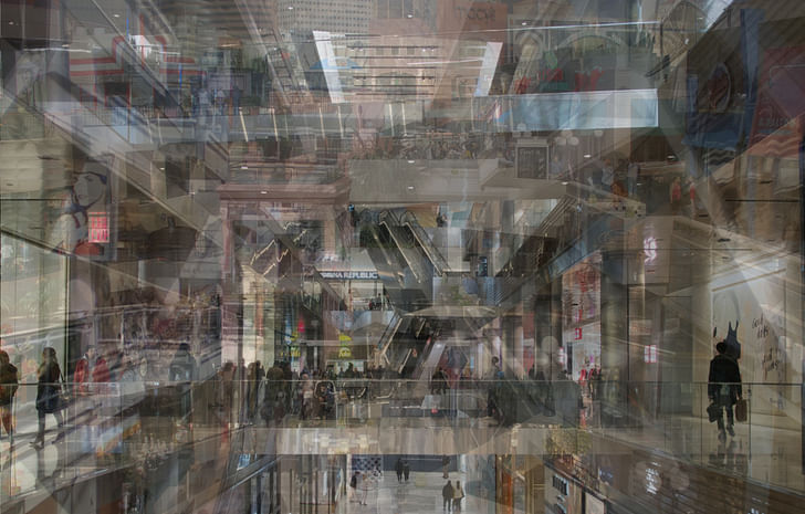
One irony of contemporary times is that while the world’s eyes—and cameras—are trained on The Vessel, plans for repurposing Horton Plaza are quickly taking shape largely out of sight.
Ever a work of commercial architecture, Horton Plaza will not be torn down in the conventional sense, but instead, will be upgraded and repositioned. The dramatic facades will be wiped away and replaced. Where moulding once reigned, clear glass will now take its place. Arches will give way to metal panels, pilasters to black steel. An old body will remain, its bones simply wrapped in a new guise: slick, cold, and boring.
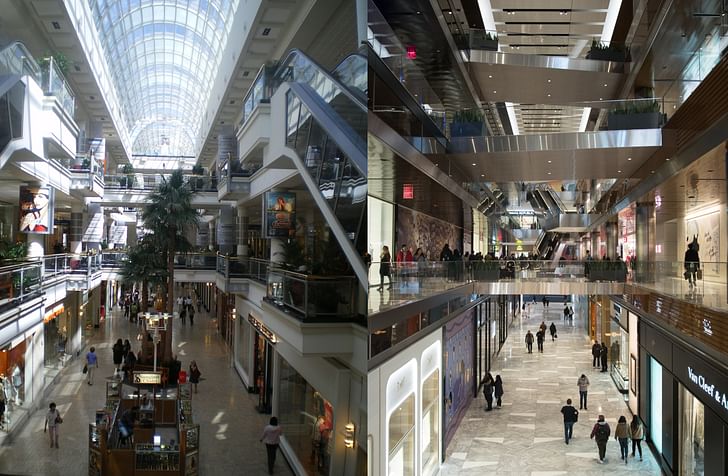
Horton Plaza is not the only one, of course, some of Victor Gruen’s seminal suburban shopping malls are also undergoing radical transformations that stop short of total demolition. As dying malls are going out of business left and right, Gruen’s former plazas are being refashioned as neo-suburban transit-oriented development districts, as tech office parks, and as university campuses. Whereas Jerde’s invigorating Horton Plaza blazed its own trail as an act of defensive urban acupuncture, it now toes the line and responds to the market trends that it in many ways helped create. In a way, Horton Plaza is a victim of its own success, as the urban regeneration it was designed to spark has overtaken it and rendered the cloistered mall type functionally obsolete.
The unresolved fate of these structures begs the question: What happens when temples to commerce cease to draw a flock? Can we expect contemporary commercial architecture to have any real longevity? What becomes of purpose-built commercial spaces when consumption patterns change?
As architecture and the act of shopping have grown more integrated, each has become more disposable. Enslaved to the flows of capital, cyclical, transformable buildings have become the norm. Perhaps Horton Plaza is a type of archetypical example in this trajectory, the original manifestation of an on-brand architecture so specific that it could only go out of style.
Horton Plaza reminds us that architecture that is purpose-built and fixed is always in danger of outliving its intended purpose. The Vessel reminds us that the phenomenon of architecture-as-spectacle is going strong.

The Vessel and its attendant mall—The Shops & Restaurants at Hudson Yards—learned a lesson from Horton Plaza, however: physical separation. Spectacle and shopping, ripped apart, might perhaps be able to exist on their own no matter what happens to the other.
In a way, Horton Plaza, as it is repositioned, will be ripped in two, as well. In the future, we will talk about two Horton Plazas, one, an image and a memory, the other, an object with ever-changing physical form. Neither state will be beholden to the other.
At first glance, it might not seem like Horton Plaza and The Vessel have much in common, but they do.
Antonio is a Los Angeles-based writer, designer, and preservationist. He completed the M.Arch I and Master of Preservation Studies programs at Tulane University in 2014, and earned a Bachelor of Arts in Architecture from Washington University in St. Louis in 2010. Antonio has written extensively ...
2 Featured Comments
A drugstore, Macy’s , Robinson’s, an Optician, a clothing shop, and a Post Office faced the sidewalk on Broadway Circle. A Cobbler, a sundry shop, and a Hotel opened onto First Avenue. A Pizza Restaurant, the Balboa Theatre, and an apartment building lobby opened onto Fourth Avenue. It wasn’t perfect, but neither was it fatally flawed.
Excellent article, Antonio. I'm old enough that as an architecture student I made a pilgrimage to the newly-opened Horton Plaza and these reflections of yours on how they compare are wonderful. Very moody.
All 7 Comments
I watched Horton Plaza being built , and I can assure the readers it was built using concrete, steel, and metal studs. This glaring error makes the rest of the article suspect.
If you're going to insist on observable facts that are verifiable over specious claims propping up a thin argument, you'll never end up with a good, 'critical' online essay, Mister.
"...stick framing, drywall, and stucco" doesn't preclude concrete, steel, and metal studs. But thank you, Technically Correct Man.
putting different lipstick on a pig without Jerde’s amazing talent? — yeah, that’ll work. Horton Plaza was a literal block buster smack in the middle of the worst section of a dying city — they plopped a suburban shopping center into the middle of a ghetto and because of Jerde, it became the most successful shopping center in the country — sparking a complete revival of the city — but its design did not intregrate with the city, even when meeting city streets — I do not remember a single storefront opening onto a city sidewalk — terrified of “those people” so typical of white America caused by zonng laws — redecorating in slick moderne is not the answer; an architectural redesign is — one that integrates the entirety to make San Diego into the city it deserves to be — the location is fabulous; it should be the center of the city — without my kind of insight, they should mercifully have a BBQ.
A tightly enclosed medieval street is a lot like a goofy stair to nowhere? This is what happens when you think within a conceptual framework and disregard the lived on of all physical objects.
A drugstore, Macy’s , Robinson’s, an Optician, a clothing shop, and a Post Office faced the sidewalk on Broadway Circle. A Cobbler, a sundry shop, and a Hotel opened onto First Avenue. A Pizza Restaurant, the Balboa Theatre, and an apartment building lobby opened onto Fourth Avenue. It wasn’t perfect, but neither was it fatally flawed.
Wait, when did Heatherwick become an architect? I thought he was an artist that worked with a team of architects.
Excellent article, Antonio. I'm old enough that as an architecture student I made a pilgrimage to the newly-opened Horton Plaza and these reflections of yours on how they compare are wonderful. Very moody.
"One irony ... is that while the world’s eyes—and cameras—are trained on The Vessel, plans for repurposing Horton Plaza are quickly taking shape largely out of sight."
Isn't that apples and oranges? The built object of one and the planning process of the other?
Block this user
Are you sure you want to block this user and hide all related comments throughout the site?
Archinect
This is your first comment on Archinect. Your comment will be visible once approved.