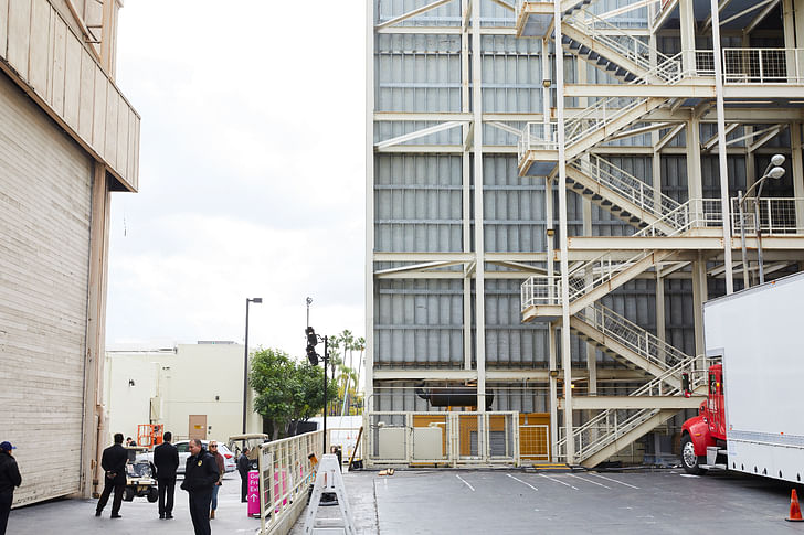

The inaugural Frieze Art Fair Los Angeles, held on the famed Paramount Studios Lot, proved to be a success in numbers and figures. But what did the event suggest about the current states of art and architecture, and what did it suggest about the future of cultural events in the city often overlooked for its sprawl?
There has been a significant amount of speculation about the viability of the Frieze Art Fair in Los Angeles. The notable event, which has pooled more than 70 galleries from around the world, has succeeded in New York and London in previous years, while other, smaller cities have proven to be accommodating hosts for similar happenings (consider the Venice Biennale and Art Basel, for example). But as a city with subpar public transportation and a loose network of gallery districts, how could Los Angeles possibly make for a good host?
As I observed while attending the event during its inaugural debut, Los Angeles might well have been the most appropriate host for Frieze in its 16 year history. Where else, I thought, would the unique demands of contemporary art fairs, which have increasingly relied more on market forces than artistic intuition, find a home than the Studios at Paramount Pictures? Just as the scenery, paintings and props developed on the famed property have long served as the backgrounds of Hollywood classics, so too did the art chosen for the Frieze Art Fair function more as set design than individual works demanding attention.
The galleries were divided into booths along three long hallways under a tent like structure designed by local architect Kulapat Yantrasast of wHY Architects. And just as the scenery, paintings and props developed on the grounds of Paramount Pictures have long served as the backgrounds of Hollywood classics—and just as the art chosen for the Frieze Art Fair functions more as set design than individual works demanding attention—so too does the architecture perform as little more than a clean and inoffensive shelter.
This is, of course, not the first time gallery architecture has been asked to lower its voice for the art it contains: Hal Foster, Brian O’Doherty and other art critics have spoken about the ‘white cube’ gallery that became commonplace in conjunction with the minimalist art movement of the 1960’s. “A gallery is constructed along laws as rigorous as those for building a medieval church,” O’Dorherty once wrote. “The outside world must not come in, so windows are usually sealed off. Walls are painted white. The ceiling becomes the source of light. The wooden floor is polished so that you click along clinically, or carpeted so that you pad soundlessly, resting the feet while the eyes have at the wall. The art is free, as the saying used to go, ‘to take on its own life.”
The art representing each of the 70 galleries, meanwhile, seemed to have been chosen and displayed in much the same spirit as one finds in contemporary retail interior design. Consider the recently opened Dover Street Market in Los Angeles: artists including Warren Muller, Lyn Dillin, Bjorn Dahlem and Stuart Haygarth have installed their work in the trendy department store as backgrounds and literal armatures for books, apparel and other merchandise. An observant customer might see this conflation as a cheapening of the art rather than the elevation of the merchandise, not least because the artist do not receive visible credit for their contributions. Though each piece at Frieze is complemented with a name, date and material palette, descriptive texts are decidedly withheld.
With the art and architecture both out of the way, what is “free to take on its own life,” in O-Doherty’s insight, are the visitors themselves. My observations may have been a consequence of reviewing the fair on the first day—a moment for the press to come face to face with the people most closely associated with the galleries represented—but it became hard not to notice how little attention the art and architecture were truly receiving. Art and architecture provided the perfect setting for the life unfolding in front of them just as brownstone façades and speedwalking extras set the stage for a Manhattan crime thriller.
As the abundance of things to do and people to see took precedence during the short-burst four day event, the first year of Frieze Los Angeles was a valuable precedent for considering the future of large-scale art events in the city. Perhaps more of them will inspire improvements in the elements which made Los Angeles such an unlikely setting for the art fair in the first place. V. Joy Simmons’ reflection that people “showed up and showed out” for the Frieze Art Fair means that Los Angeles can embrace a future more invested in the arts; on its own terms, at least.
1 Comment
The building in the header image is the Paramount Film and Tape Archive
and was designed by Wes Jones and Peter Pfau while they were with Holt
Hinshaw Pfau Jones. Wes Jones directs the Graduate Architecture Program
at USC
Block this user
Are you sure you want to block this user and hide all related comments throughout the site?
Archinect
This is your first comment on Archinect. Your comment will be visible once approved.