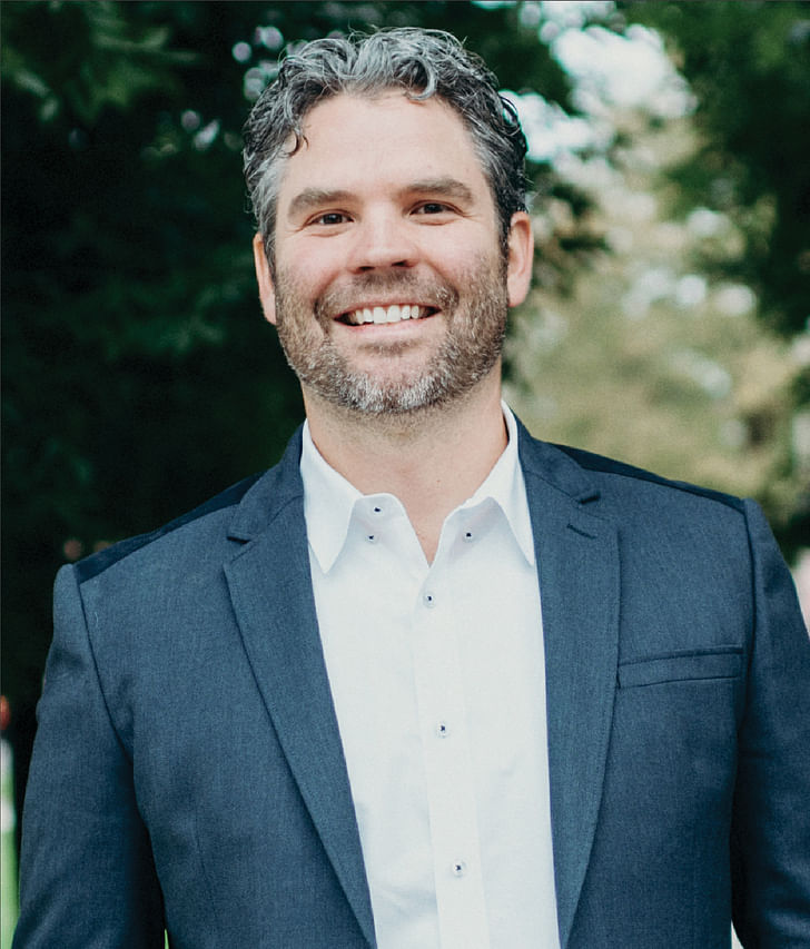

A year ago, Joe Jacoby took over his father's Utah-based architecture firm, but the small practice is still churning out the kind of large-scale, passionate projects they've become known for. For example, the team recently completed the C. Mark Openshaw Education Center, an educational facility for the Utah Schools for the Deaf and the Blind that caters to blind and visually impaired, deaf-blind, and deaf and hard of hearing students.
Despite a sizable portion of our population reporting visual and hearing impairments, our buildings and urban spaces typically aren't designed for them. To look at the alternative to this, we talked with Joe to see how his firm rendered accessibility through their architectural work, bringing a new perspective to the meaning of good design.
How many employees?
We have 7 full-time employees, and 2 part time employees.
What motivated you to start your own practice?
The practice was originally founded by my father, Robert Jacoby, in 1976. My brother and I ended up joining the firm as part owners and principals in 2005. As my father was planning to retire in 2017 and my brother was discussing to pursue his passion in furniture design, I ended up buying both of their shares and became the sole owner of the company—I have been president for just over a year now.
Having your name on the door forces you to take special care of the products and designs you put out in the world. Our clients have noted that they feel like a part of the family, reflecting on the level of personal attention and care that they receive.
Though a small firm, you specialize in rather large projects. How do you maintain your size with such a large output?
As a smaller firm competing with much larger firms for the same jobs, we have no option but to be a well-oiled machine. Every individual here not only has to take on multiple hats, but also has to be incredibly efficient and proactive within those multiple roles. Our architects and designers who design and document projects, are the same team who market and help with business development. This brings a level of consistency that our clients have come to enjoy—they see the same team from start to finish.
Also, because of our size, we’re very selective about the projects we go after. We have been fortunate to pursue, and land, projects that are highly specialized and interesting to work on. Since we only take on a few larger projects at a time, it also allows us to give our full attention, care, and innovation to the design process. Obviously all of this relies on a high level of communication and collaboration; both internally with our design team and consultants, and clients/user groups.
One example is the recently completed Utah Schools for the Deaf and Blind. Given the unique nature of the project, how did you approach the specificity of the brief?
The building literally shaped itself, through intensive workshops with the school, their leadership, their staff, and the deaf and blind community of Utah. We listened carefully, and were there to facilitate the process. There are not too many buildings with this combination of spaces, so we relied heavily on collaboration with the school as they are the experts. After completing an intensive program book with a list of spaces, adjacencies, resources, and technical data, it became clear how this complex puzzle needed to be resolved from an architectural perspective. To put it simply, we took all of the specialized features and techniques that they already use in their educational practice, and found opportunities to convert them into large scale architectural features. The building and all of its parts, is now acting as a teaching tool—every square inch, from the classrooms, to the hallways, to the lobby, to the gym, to the courtyard, etc.
What sort of research went into this and were there previous buildings and examples that helped inspire the design/scheme/program etc.?
We had previously designed educational facilities for the deaf at other institutions, which was preceded at that time by visiting some of the top deaf education facilities in St. Louis. Since we had not yet designed a facility for the blind, we decided it would be useful to fly to Denver and visit the Anchor Center, a top blind education facility.
The challenge was creating a facility that would serve these two totally different populations with entirely different needs
The challenge was creating a facility that would serve these two totally different populations with entirely different needs. We met frequently with USDB’s administration and teachers, the local deaf community, the local blind community. With much care and research, we eventually came up with a creative unified solution, where the entire building served as a teaching tool to both the deaf, and the blind, using the principles and guidelines we learned along the way. The result is not only technical and filled with specialized infrastructure, but overall the experience is joyful, colorful and filled with light.
What were some techniques used/features incorporated to create an effective environment for people with varying sensory and physical needs?
As a design team, we used empathy techniques, like trying on goggles that simulated a variety of visual impairment conditions. One thing we noticed in this study was how bright glowing colors contrasting off of darker backgrounds were the only features noticeable. So we took this concept at a building-size scale. We created multi-story staircases with red translucent glass to act as beacons for the entrances and guidance while navigating the interior. The red staircases and red clubhouses which are all in line with each other, just exude a sense of energy and vibrancy while serving to help the visually impaired, and anyone else, navigate their way into and around the building. It’s a distinguishing feature that really sets the building apart.
When we toured their various existing facilities, we noticed that some of the therapy equipment used for students with physical disabilities was stored away in small closets. We got the idea to bring these items to the forefront. We created what we ended up nicknaming the “clubhouses.” These were bright rooms located just off the gym on the main floor that were covered in red glass on the exterior, housing therapy spaces and equipment. Designing these rooms in this way meant that the children receiving individualized therapy could still feel connected to the rest of the building instead of feeling more isolated as in the previous space.
We also installed tactile panels in the walls for blind students to run their hands across to assist in navigation. The panels vary in texture depending on which classroom they are leading to so that students know which class is coming up. It turns out that the deaf students love running their fingers across these panels just as much! We also installed lighting in the floor and used contrasting colors in the flooring materials to help guide the visually impaired.
One feature directly related to the deaf and hard of hearing, we designed the building layout around the idea of Deaf Space. Deaf Space is, essentially, the realization in design that those who use sign language need to be able to see each other clearly to communicate. If you build a structure with a lot of segmented offices and rooms, Deaf people are at a disadvantage because they have a more difficult time communicating. We ended up using a lot of glass and open floor plans so that people across various parts of the building could still communicate with each other using sign language. So, for example, someone in the administrative conference room could sign down to someone in the gym. The glass and open spaces had the additional benefit of creating an airy, naturally lit building that just brings a sense of joy to the school.
There is a central open courtyard that acts as a sensory/experiential play area enclosed by the two wings of the school. The play equipment was carefully and specifically chosen to cater to the needs of both deaf and blind children. Some of the equipment creates vibrations while other equipment caters to touch, such as water pumps and a sand pit. A tactile garden was also included using plants that offer children a unique experience with plant texture.
Are there any specific details the team was particularly passionate and excited about?
Many of the spaces were designed to serve dual functions. For instance, the performance stage can serve a performance with an audience in the gymnasium (which the gymnasium converts into a theater with drop down partitions and motorized bleachers for the audience) or the stage can work in reverse for an outdoor performance with a mini amphitheater created by sloped green terraces. Another example of dual functionality is the cafeteria for the children, also serves as vocational training and life skills demonstration kitchen training to the community as a whole.
We also integrated “truth” windows throughout, which were illuminated openings into mechanical or electrical or elevator shafts so the students could see the various infrastructure that makes up the building.
Do you think what was learned on this project will change how you design other buildings going forward?
Actually, Our firm is currently working on USDB’s next school in Springville, Utah. Since we had recently completed their last school, the lessons learned were fresh, both in our minds and the school’s. There are many features that are positive, and translating directly into their next school building, but also many opportunities arose to make things better and more functional. In many cases, it was about simplifying a system that was overly technical, that they realized they were not quite using to full capacity. In some cases, it was about accommodating flexibility - removing the division of blind classrooms and deaf classrooms, and creating a super classroom that serves both populations as their student numbers are different every year. In some cases, it was about enhancing something that the students really enjoy. For instance, they love the tactile wall panels that they navigate between classrooms. So we are taking that idea to the next level with a massive board-form concrete tactile wall that is acting as the spine of the new building that is lit up with skylights above.
On this next school design, We have had just as much fun coming up with creative ways to improve learning environments as in the first. We’re using bold color and open spaces again to continue facilitating the positive feeling and ease of communication associated with the first school.
No Comments
Block this user
Are you sure you want to block this user and hide all related comments throughout the site?
Archinect
This is your first comment on Archinect. Your comment will be visible once approved.