
From the Ground Up is a series on Archinect focused on discovering the early stages & signs of history's most prolific architects. Starting from the beginning allows us to understand the long journey architecture takes in even the most formative of hands and the often, surprising shifts that occur on its journey. These early projects grant us a glimpse into the early, naive, ambitious—and at points, rough—edges of soon to be architectural masters.
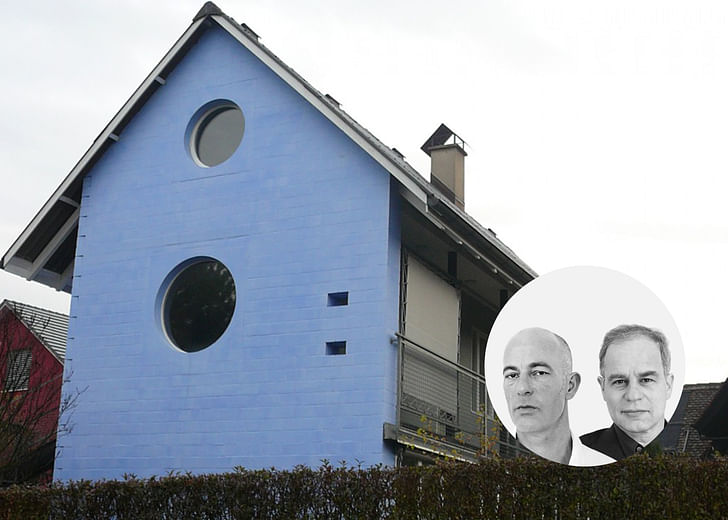
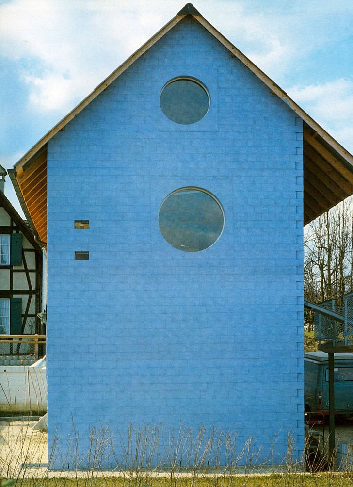
Before the Tate Modern and the Bird's Nest, Herzog & de Meuron found themselves working on a small blue spot of suburban experimentation. The Blue House was one of Herzog & de Meuron's earliest works and is still referenced within the office's discussions of their early canonical works. The project itself is a commissioned home by an art collector in the early 80's and is the first attempt into the material and image-making playfulness that would come to index the future decades of Herzog & de Meuron's work and ethos. The house plays with traditional means of suburban identity but at the same time, produces a singular identity with its deliberate off-ness that allows it the freedom of play and untraditional details while still allowing it to be a part of the typology that surrounds it.
The visual clues and manipulation of materials create a grammar that helps us to work through and index Herzog & de Meuron’s architecture both historically and currently.
While its use of an untraditional color brings the house out of the continuous rhythm of monotonous whites and grays, it also allows the building as a whole to be solidified, indexed and measured; it stands out by standing alone.

Once the blue-ness is absorbed into our visual curiosity, the nuances of the architectural detail and its ornamentation come forward. The typical rectangular volume is deformed by the curvature of the northern wall, which bends out, away from the street. The pitched roof is slightly lopsided, its asymmetry gently competing with the arc of the wall and sheltering the southern façade (which is far more delicate and permeable than expected), unfolding onto the partially walled garden through a fully glazed wall and loggia-style balcony.
Once the blueness is absorbed into our visual curiosity, the nuances of the architectural detail and its ornamentation comes forward.
This playful or naive appearance of the dwelling facilitates a sense of familiar yet estranged domesticity. The use of images, or the constructed estrangement, is consistently found in almost all of Herzog & de Meuron’s early work. The image operates as a medium or guise for creating knowledge through the viewer’s emotional response to the architecture – through memory and reminiscing. The visual clues and manipulation of materials create a grammar that helps us to work through and index Herzog & de Meuron’s architecture both historically and currently. It is through this approach that Herzog & de Meuron’s work is related to Aldo Rossi's influence and his general reverence and rebellion to traditional vernaculars of architectural conventions and their familiarity.
Anthony Morey is a Los Angeles based designer, curator, educator, and lecturer of experimental methods of art, design and architectural biases. Morey concentrates in the formulation and fostering of new modes of disciplinary engagement, public dissemination, and cultural cultivation. Morey is the ...
No Comments
Block this user
Are you sure you want to block this user and hide all related comments throughout the site?
Archinect
This is your first comment on Archinect. Your comment will be visible once approved.