
ZELLNERandCompany is an award-winning design firm based out of Los Angeles. Run by Peter Zellner, the firm has become best known for designing several notable public and private art galleries but has recently scaled up the size of their work, taking on several masterplanning projects.
We spoke with Peter back in January as part of our Small Studio Snapshot series, in which he discussed his practice's vision of "develop[ing] as an independent studio that punches above its weight while remaining open to other forms of collaboration." We caught up with Peter to discuss this process and recent growth in output.
Let’s begin by discussing your firm’s recent growth in output. You are currently working on larger scale projects in both Boston and the Los Angeles Arts District.
I think I may have alluded to it in the last interview, with reference to trying to keeping the studio “…as small as possible while doing work that is as big as possible.”
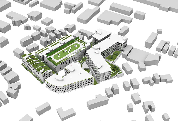
My feeling has been, for some time, that a nimble small office, say of 3-6 people, can handle most of the crucial work, from planning through design development, that would normally be generated by a larger practice. This can be achieved by taking advantage of working within an “expanded field” of consultants and therefore allowing the studio to act as much as traditional designers as orchestrators of design. This was the goal for the high-density urban development project shown here. We worked as a small team to develop a thorough logic and reasoning to deliver 400 dwelling units, five buildings, a 250 parking garage structure with three major public spaces under the rubric of something like urbanism not just land improvement.
The project is for a transit adjacent, primarily non-family, high-density residential development in Boston. The design was executed, fully planned and laid out in a little over 8 weeks by 4 key people including myself, Nicola Montuschi, Francisco Trejo and Samuel Rubio. We had some part-time support earlier on lent by Jinwen Yu, Tim Chen, Marjorie Bonnet and Iliya Muzychuk. A previous high level neighborhood master plan was worked on by Tianlei Guo, Yingtao Tao and Yessenia Juarez. So in total about 11 people worked on it but usually in small teams of 2-4 people. I think this is something pretty unheard of, because normally it would require a bigger team operating over at least half a year. With a very small core group led by Senior Designer Nicola Montuschi, we successfully assembled and coordinated a bigger multidisciplinary consultant team to develop cost management, traffic impact analysis and transportation design as well as comprehensive community planning and economics. To this we added our own voice—bundling urban and architectural design, landscape architecture and art and open space concepts into the mix.
We hoped to do something beyond what a developer led effort might create. What we focused on, in addition to maximizing the dwelling unit count, was the quality of the public spaces developed around the independent buildings. We thought of open space not just as an amenity for tenants but as a way of allowing the city to flow in and out of the site. Nicola (who was a post grad thesis student of mine at SCI-Arc in urban design and has since taught urbanism at FSA with me) is also a landscape architect by training. So I was lucky to collaborate with him because we were able to fold landscape and public space design concepts, including a public art strategy, early on into the architectural expression.
We hoped to do something beyond what a developer led effort might create.
What we developed and what we delivered, I believe, is very different than what I had done previously in private practice, at ZELLNERPLUS. If in the past, the focus was on creating freestanding buildings or interiors for art display, here we tried to work through the creation of an urban community through the staging of a series of architectural set pieces, objects tied to each other by a shared, public ground. Prior to this effort, at AECOM, I had initiated and master planned a 15 acre Los Angeles urban development with a group of architects that included Monica Ponce de Leon, Neil Denari, Edwin Chan, Patterns, Brooks + Scarpa, Pentagon, Hitoshi Abe, Jimenez Lai, Paul Preissner, Lorcan O’Herlihy, Andrew Kovacs, Jennifer Marmon, Kevin Daly, Roger Sherman, Alfonso Medina and others. That project really served as a model for the Boston development. For the AECOM effort we set up the street and open space networks and created unique blocks and zoning envelopes for each architect to work on. The goal was to parcelize the development so that phases or even blocks could be entitled and sold individually with each architect or a group of architects. Then, at AECOM, we left them alone and focused on designing a few set pieces including a tower, a museum, some housing and creative office space. The result was something like a collage or the application of the Dadaist concept of the exquisite corpse to an urban site. Some of that thinking was carried forward on the Boston project to get a handle, let’s say upstream, on how the development goals could be aligned with an urban design and architectural design agenda that was more than just a description of a client’s financial goals. What we aimed for at AECOM and later in Boston was to create a sort of archipelago effect, with the “fluid” being an urban environment capable of flexing to allow individual “islands” of architecture to stand alone while communing a bit with other staged architectural events.
Specifically, we tried to create the possibility at this early stage of work, essentially a Planning Development Area application like a Specific Plan Overlay, for multiple voices to be expressed across the site. We synthesized this because we had to develop the work without other partners but one goal moving forward would be to bring in other architects as collaborators on this or another similarly scaled effort. That said, this ended up being an experiment to see if a small team, working sometimes at full capacity and at other times at part time capacity, could do the work of a larger office or studio within a compressed time frame. I think we succeeded.
We want to think that the results are largely indistinguishable, if not better than, what you would produce in a larger practice, at least for this stage of the work. I also suspect that there are certain efficiencies that come from having a small team. We willingly let go of some work outsourcing key visualizations to Ekoo Media, a wonderful group in Bogota, Columbia who I was introduced to while at AECOM. They assisted not only with the renderings but gave us valuable feedback on many aspects of the design including materials and color schemes. What I hope this all speaks to is a different or alternative business model for small offices. It’s not one that relies on leveraging the immediate manpower at hand to do production work on smaller scale projects cheaply. Instead, what we attempted was take many of the skills learned from working in larger practices and align that with a much more intimate way of working. We ended up being as much designers of directors/managers/producers of the project. Identifying consultants, speaking with the city, meeting with the mayor, attempting to provide a vision for the client was all thought of as a way to move beyond just maximizing unit counts an FAR in order to start thinking of effort as a kind of activated urbanism. We think that by using new tools and having a new attitude it is possible for small offices to begin to engage with this scale of work, shifting our thinking from individual object design to designing settings, networks and urban arrangements.
Specifically, we tried to create the possibility at this early stage of work, essentially a Planning Development Area application like a Specific Plan Overlay, for multiple voices to be expressed across the site. We synthesized this because we had to develop the work without other partners but one goal moving forward would be to bring in other architects as collaborators on this or another similarly scaled effort. That said, this ended up being an experiment to see if a small team, working sometimes at full capacity and at other times at part time capacity, could do the work of a larger office or studio within a compressed time frame. I think we succeeded.

What do you think having a smaller office take on a project like this can offer a client, as opposed to going to a larger firm?
Well, I think we are certainly cheaper in the end but I am not sure that is a satisfying place to operate from. Beyond that we bring certain assets to clients that usually don’t come with small studios. Personally I trained up in several larger offices where I had the opportunity to work on large to very large-scale efforts. At Gensler within the Consulting group I worked on a things like a long-range strategic master plan for Jet Propulsion Laboratory. At Davis Brody Bond I worked on the first master plan for Ground Zero after 9/11 with OMA and several campus plans along the eastern seaboard. At AECOM I was also fortunate enough to collaborate with Americas Architecture lead Ross Wimer on several 1 million square foot plus projects. His influence on my thinking around large-scale projects was very important. Academically, my interests have been focused on cities and urbanism. 20 years ago at Harvard I was part of the Project on the City with Rem, this is still reflected in my teaching. When I was at SCI-Arc I ran the SCIFI urban design program with David Bergman for five years, so I have always had an abiding interest in doing larger projects or a predisposition to looking at architecture through the lens of city making. This semester, my USC my grad students are working on growing and extending Venice, Italy in order to encourage economic growth and fight rising sea-levels.
Did you have to change the way the firm work in any sort of dramatic ways or do any restructuring?
You do learn quickly why developer architects tend to repeat certain aspect...not everything can be invented at once.
I think there is still a lot of tweaking needed to get the business model working more effectively and profitably. As I’m sure my team would agree, the Boston effort was a pretty intense experience because there was a lot of learning on the job. If we were to do it again, there are certain things we would do differently. We over-delivered and extended the schedule a little, we actually did more work than we were asked to do which may have contributed to our own delays. So, aligning ambitions with what is realistic both in terms of effort and the resources you have on hand is a new goal. It was a little bit of trial by fire and while we survived, there are many things I think we can fix moving forward. My main take-away was this: cc of their work, systematizing production if you will. You do learn that you need to have certain components standardized in order to survive the process. Whether it’s an automated parking concept or a normal parking structure or a structural solution, not everything can be invented at once. There are prototypes. There are certain things, also, that I think are repetitive in cities, that is to say generic, in a good way. This might sound heretical but I think that it is ok to call that part of your architecture. When you start a project at this scale, it is good to have those elements as placeholders so you don’t have to work through them as original or new pieces. From there you can decide what needs to be really original and what can settle down as a sort of a background or backdrop piece.

You also mentioned the office is working on another larger project, an office building in the Los Angeles Arts District. Can you expand on that?
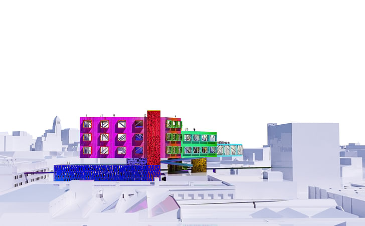
Yes this is the second version of a study for an elevated 75,000 – 100,000 GSF creative office building in the Los Angeles Arts District. It literally flies over its site, preserving the existing urban fabric below while creating a spectacular urban element above. The concept is to develop an architectural structure that hovers between new and old, ground and while proposing an alternative model for densifying Los Angeles. We want to frame the texture of LA’s historic fabric without adding density on the ground. For us, it is as much a development speculation as it is something to be presented to the city as a new way of inhabiting LA. The idea of tearing down what is there seemed wrongheaded to do but we did originally look at tearing down, or rather, removing one of the existing buildings on the property in order to add a 12-14 story tower. We quickly found out that to meet allowable FAR you would end up with a very small floor plate and a poor core-to-ratio perimeter ratio. So then, I had the idea of turning that tall skinny volume, in a way, on its side. By stacking it on a couple of standard high-rise cores and stabilizing it with a diagrid truss matrix we can cantilever out from those points of support maximizing rentable square footage. Basically, the goal was to produce a building “up in the sky” that would normally sit on the ground: a long span, column-free creative office space. Going up also allows us to slide an automated parking structure underneath the vacant portion of the site in order to preserve other activities on the ground without adding surface parking. For the owners, I think it creates a unique opportunity to have a one of a kind building with views of the downtown skyline, the LA River, the mountains, even all the way down to Long Beach. For the potential tenants, the free plan allows them to figure out how to occupy it as a kind of open campus. And for the city the project adds something that hovers between being an urban sculpture and a re-territorialization of the ground and the street, something that reflects the client’s ongoing sponsorship of urban art.
Have you had any difficult convincing your clients let a practice of this size take these projects on?
No, not especially. I think once you sign a contract the assumption, right or wrong, is that you know what you are doing. If there are bumps along the way, maybe it has to do with the fact that we don’t always deliver what we are told to do or if we do, maybe it’s not as cookie cutter as it could be. There is a tendency to repeat certain things in production heavy offices because there is efficiency to it from both a creative and financial perspective. This is not a criticism of larger corporate practices. We tried to marry, instead, an artistic voice with an understanding that the market, and not the developer, is what often creates the pro forma. So, we did take a lot of the client driven metrics very seriously and we did try to figure out how costs and construction methodologies and financing might impact our architecture. In this case we also got into full-fledged structural development and simulation with NOUS Engineering, we did help model backend rentals and return on investment and we did take the possibility of addressing adverse community push back around new developments seriously enough to propose leaving everything on the ground mostly in place. I think we showed the clients what this thing is, not just architecturally, but as a physical and financial entity. How it operates functionally, as a financial and urban concept, is as interesting to me as its design. So, I suspect, if you can marry these different ways of framing the world—one which has to do with the delivery of things, of production schedules, and financing i.e how things get paid for and if they get to live in the world—if you can attach that to a focused architectural point of view, or a singular idea around how design can integrate itself in the world, than one may be onto something new.
No Comments
Block this user
Are you sure you want to block this user and hide all related comments throughout the site?
Archinect
This is your first comment on Archinect. Your comment will be visible once approved.