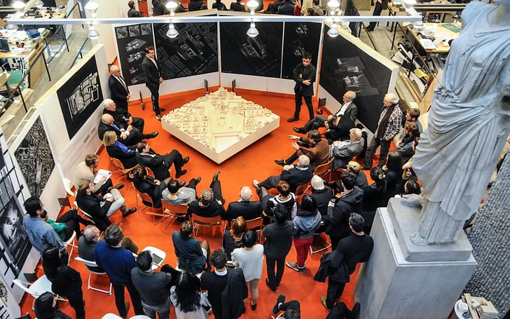
It’s 4:30 in the morning, and you are just heading to bed after polishing your latest project. The client meeting starts in three hours and you have yet to go home, change, and come back to whip up a quick presentation. What you don’t realize in the wee hours of the day is that excellent design will get you nowhere without a compelling presentation. How do we convey our façade intention to a client who has never heard of a detailed wall section? How do we convince government officials to allow the development of air rights above a listed building? How do we demonstrate to our future employer that we are the candidate of their dreams?
Ultimately, even if the project is developed to construction standards (in our head), if it appears weak to the eyes of the reviewer, it will undoubtedly be a no-go.
The main piece of advice is, as always: take your time, and plan ahead.Stubborn as we are, we think that the last two hours we put in after midnight will make our work stand out far more than those eight weeks of process. The reality is, those two hours – and potentially the six hours before then as well – are far better spent preparing how best to convey those past two months of work to the rest of the world.
In that spirit, this piece discusses six key steps to whipping up the perfect presentation, be it for the idealistic professor or for the nightmare client. The main piece of advice is, as always: take your time, and plan ahead.
1. TONE
Who is your audience, and what are their needs?

A good presentation knows its audience. Does your presentation need to be ultra-technical, or can you afford the odd bit of humor? A good rule of thumb is to judge by technical propensity, or how much granularity your audience wants to see. Understanding industry An audience will rarely process the entire content of a text-heavy presentation, and therefore calling out key points reinforces your argument and allows people to focusbackground helps as well. For instance, designers often prefer spiced-up presentations whereas technical clients might place a heavier focus on corporate templates and hard facts.
Once you have decided the general tone of your presentation, you must determine your ideal image-to-text ratio. Although this depends on your personal style, it is worth reverting to the Middle School writing technique of “show, don’t tell”. Unless you have scheduled a four-hour meeting to go through a technical specifications deck, you can almost always replace text with images and bullet points. However, if it’s essential to have a text-loaded slide, make sure to distinguish important points by changing color or font style (bold usually works best). An audience will rarely process the entire content of a text-heavy presentation, and therefore calling out key points reinforces your argument and allows people to focus on what you have to say.
2. TOOLS
This will largely depend on whether you go with slides or printed boards.
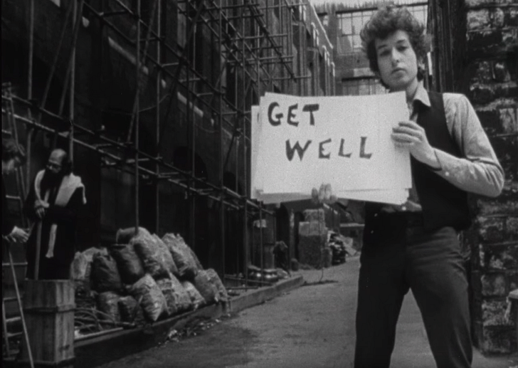
Determining what kind of presentation you want will lead from the audience – then you can assess which software tools to use. Adobe InDesign is arguably the best tool for creating slides that can be exported as a PDF slideshow. It lets you link heavy renders and vector drawings, while keeping the file size to just a few megabytes. Microsoft PowerPoint does a similar job, but doesn’t offer as much flexibility. If software is not your forte, you might want to opt for more user-friendly online options such as Prezi and Emaze.
Printing boards requires another approach, and Adobe Illustrator is the master for this. You can create separate, custom-sized art boards that export as individual PDFs, and can be arranged on the screen to see how your pin-up will look like. Ultimately, you want to navigate your pinned up presentation at ease, knowing how to move swiftly across boards to drive a point home.
3. LENGTH
Mies van der Rohe had it right – “less is more.”
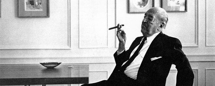
Before pushing toward the deadline, you must determine how much time you have to present. How much time do you need to explain each phase? What is the attention span of your audience? Apologies to Robert Venturi, but when it comes to presentation length, more is an absolute bore. It’s essential for you to create a hierarchy of content that gives you the flexibility to choose when you can stick to an elevator pitch, and when you’ll need to dig deeper.
4. CONTENT
A word of warning: be selective.
It’s essential for you to create a hierarchy of content that gives you flexibility for when you can stick to an elevator pitch, and when you’ll need to dig deeper.Having set the tone, you must outline exactly what you want to say. Done well in advance of the deadline, deciding on precise content will both frame the presentation and streamline your work in preparation for it. Will you focus on the process, or on the outcome? Will you place a heavier emphasis on concept, or on development? Designers often go through countless iterations of a product before being satisfied with it. The client does not want to see every variation of a doorknob detail, or the incremental change in a museum’s floor-to-floor heights.
In deciding on content, make sure to include the pieces that help strengthen your case, and avoid distracting or dissuasive elements. For instance, if you want the client to focus on the atrium of the proposed museum lobby, exclude slides about the bathroom details. How does the atrium enhance the building? How have others done it? How is yours better? Answer all of these questions well before the deadline and you will begin to understand not only what you want to present, but also what deliverables you should work toward.
5. ORGANIZATION
Take a deep breath. It’s time to put it all together.
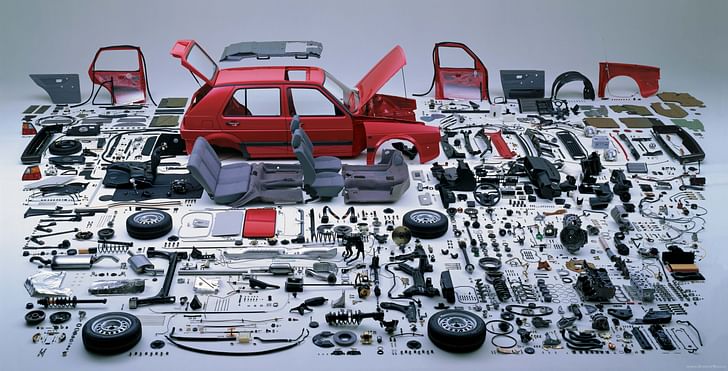
First things first: make a storyboard. This will save you time and help frame the discussion. The storyboard should have three main parts: the introduction, the juicy bits, and the key takeaway. What idea, or story, do you want to grab the audience’s attention with? Whatever you choose should set the stage for what you will elaborate on throughout the presentation. It should be brief but riveting.
To keep things interesting, you’ll need to diversify your subject enough to make it “juicy”. As you think through the storyboard, keep the end in mind. What do you want your audience to talk about after they leave? Move from general ideas to specifics in order to substantiate the ideas you introduced. Last but not least: design a final slide, something that can stay up on screen throughout the discussion or Q&A session. You want to keep it simple, and not too specific. Going full circle to where you started, having the freedom to draw upon points across your case to strengthen the conversation.
6. FORMAT
Reduce the noise.
If the audience has trouble finding the basic premise in your presentation, you’ve lost them before having started.You’re nearly there, but before starting it’s worth setting a formatting template to make your life easier further down the line. You want to reduce noise from your presentation to help it flow – think about a consistent color scheme that suits your content hierarchy (it can’t hurt to read up on color theory!). Make the presentation easy to follow by having fixed margins and guidelines for indentation. Align your content; check that your fonts are consistent throughout; and don’t over do it. For text, choose a maximum of three different types: one for headings, one for text, and one to spare—think captions, quotes, annotations. If the audience has trouble finding the basic premise in your presentation, you’ve lost them before having started.
A FINAL WORD (and an intro to Part II)

Now you have a full toolkit on how to create the best visual presentation. Thinking about the points above before getting to work will make sure everything falls into place in a compelling way. More importantly, it will prevent you from running around like a headless chicken the night before it’s due.
If there is anything more crucial than creating a polished visual deck, it’s presenting like your life depends on it (part II to the Presentation Guide will have you covered there). Hit "Save," email yourself the file in case an overnight flood does away with your hard drive, back-up your files, close your laptop and walk away. Make sure you get enough sleep, shower, and brush your teeth… the hard part is done and now is the time to shine. Look for our guide through the performance
Architect turned social impact consultant. Fascinated by untapped innovation and chaotic cities. Interested in the role of design as a catalyst for development. Loves discovering unexpected interactions between people and place. Originally from Bogotá, Colombia; has lived in the US, Italy ...
2 Comments
Good.
This is very helpful, thanks.
Block this user
Are you sure you want to block this user and hide all related comments throughout the site?
Archinect
This is your first comment on Archinect. Your comment will be visible once approved.