
ShowCase is an on-going feature series on Archinect, presenting exciting new work from designers representing all creative fields and all geographies.
We are always accepting nominations for upcoming ShowCase features - if you would like to suggest a project, please send us a message.
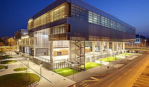
At a place that at the time of the competition had no urban characteristics, Igor Franić of studio za arhitekturu (SZA) took into consideration the strongly stressed orthogonal matrix of Novi Zagreb, from where he continued to develop the project. For Franić, the context is the entire Novi Zagreb, both in the sense of the heritage of modern city-planning culture and the area with specific ambiance characteristics, which to a great extent marks the large, even gigantic scale of the architecture of open spaces. Public spaces are almost brutal in their articulation; these are mostly elements like platforms elevated over the parking lots and access plateaus in front of buildings, derived from infrastructural solutions. In Franić’s project, it is possible to identify the acceptance and the development of the existing morphological models and spatial properties of Novi Zagreb; in it, he uses the program, but also the symbolic capital of the Museum as the means by which he achieves detachment from neutrality of the surrounding built landscape in terms of meaning.
↑ Click image to enlarge
Zagreb Museum of Contemporary Art
Franić’s project generates “its own city-planning” within the borders of the parcel and forms an ample square that slowly rises towards the large “hovering” mass of the Museum which covers the open public space. The relationship of the wide access cascades, the grand “neo-classicist” porch and the building itself reminds of Schinkel’s Altes Museum in Berlin. This is an architectural scene on metropolitan scale, which is rare in Zagreb. The monumental dimension of the colonnade is in logical proportion with the scale of the building, but also with the wider context, while the mass covering the porch contributes to dramatic impression. In the dialectics of symbolism of architectural elements and tectonic culture, Franić’s peristyle is a kind of transitional shape between the neo-constructive and rhetorical characteristics of the Ionic order at the entrance to Zagreb Stock Exchange by Viktor Kovačić and the neighbouring Vitić’s pavilion No. 40 along the Zagreb Fair, where a strong concrete construction on the gables is the principal architectural motive, logically corresponding with construction demands. In his solution, Franić intended to reconcile both poles – the symbolical characteristics emerging from rhythmical order and the simple logics of a hyper-dimensional ordinary concrete skeleton, which resulted in a specific crossover between representativeness and architectural rationality.
↑ Click image to enlarge
Zagreb Museum of Contemporary Art
↑ Click image to enlarge
Zagreb Museum of Contemporary Art
↑ Click image to enlarge
Zagreb Museum of Contemporary Art
↑ Click image to enlarge
Zagreb Museum of Contemporary Art
↑ Click image to enlarge
Zagreb Museum of Contemporary Art
The entire ground floor of the Museum is open to movement, conceived as an extension of the square with the main entrance, restaurant and library, each with a separate access. The glass envelope of the ground floor is not unified, but diversified, which indicates different amenities. The entrance area with the large info-desk and a hall for lesser exhibitions shows modest proportions, it is intentionally non-monumental, without pronounced spatial attractions; we experience it as juxtaposed to the powerfully articulated porch. It is obvious that the ground floor is the place of transition between public city space and museum halls. There is only an indication of two routes of movement towards the permanent and the temporary display respectively, spatially indicated by the arrangement of the beginnings of staircases. This spatial sequence is unambiguously just a preparation and a part of the scenario of movement suspense and experience of the building before entering the exhibition halls. Actually, we are still underneath the museum.
↑ Click image to enlarge
Zagreb Museum of Contemporary Art
↑ Click image to enlarge
Zagreb Museum of Contemporary Art
↑ Click image to enlarge
Zagreb Museum of Contemporary Art
Franić formed the body of the building as a geometrically very simple solid of approximately square ground-floor plan, whose cross-section is “folded” in the form of a meander. The configuration of the exhibition space directly emerges from this cascading cross-cut, so that the museum develops in a series of linear stretches vertical to the lateral, meandering profile of the structure. The basic direction of the spaces is defined by the sequence of x-axes parallel in relation to the entrance porch, whereby their format changes with progression, i.e. translation of the floor and the ceiling within y-coordinates. These stretches show different heights and interrelations, and between them flow the terraces or the areas beneath the body of the building, so that along the y-axis exterior and interior spatial segments interchange. The reference to Julije Knifer, imposed by the form of the meander, should not be read in the literal, sense of fetishist adoption of a formal motive important for the tradition of Croatian abstract art, but in the sense that both for Knifer and Franić the rhythm of relational changes between “full” and “void”, “positive” and “negative” is important.
↑ Click image to enlarge
Zagreb Museum of Contemporary Art
↑ Click image to enlarge
Zagreb Museum of Contemporary Art
↑ Click image to enlarge
Zagreb Museum of Contemporary Art
The body of the building is perforated by three vertical intrusions, of which two are also visible from underneath, while one skylight reaches the underground level. In its basic geometric scheme, spatial organization is simple; it is always of the same length on the x-axis, fixed through the matrix of an entirely consequential system within a square grid. In spite of pure Euclidean geometry, the manipulation with x-y-z axes is basically not founded in a logical or immediately readable spatial system, but it is rather a series of specific situations and a variation of relations inside-outside, up-down, and wall-transparency-translucency. In this progression, the first perception and the attempt at understanding the spatial configuration of the structure leaves a somewhat mystic impression, as if it were a series of individually conceived sequences that have obviously emerged from a series of interconnected geometrical operations and the same module, but we lack the feeling of entity. The Museum does not have a spatial focus on purpose, but it is designed as a spatial non-hierarchical equation, which also does not have a fixed or entirely readable trajectory. Namely the movement through the Museum can take different routes, so that the two main massive concrete stairs – one that services the permanent, the other the temporary display – are supplemented by “auxiliary” steel stairs and the escalator in the temporary display space. Such organization encourages the visitor to individually and actively investigate the exhibitions and discover his own way through different periods and media.
↑ Click image to enlarge
Zagreb Museum of Contemporary Art
↑ Click image to enlarge
Zagreb Museum of Contemporary Art
↑ Click image to enlarge
Zagreb Museum of Contemporary Art
Unexpectedly, light is not admitted into the interior from the lateral sides of the meander, but on the contrary, through horizontal stretches that run along the body of the building on the y-axis and vertical intrusions in the z-axis. Although natural light is not zenithal, it always reaches the interior indirectly, through interstices, atriums, and stretches set high above the ground. The exhibition space is introvert and directed at the exhibits, although the outer space is not entirely excluded from the overall impression, for example at the point of the linking “bridge” that connects the middle and the northern fold of the meander. Roof terraces are also accessible through two large exterior stairs that can also function as open auditoriums.
↑ Click image to enlarge
Site plan
↑ Click image to enlarge
Ground floor plan
↑ Click image to enlarge
First floor plan
↑ Click image to enlarge
Second floor plan
↑ Click image to enlarge
Third floor plan
Exhibition spaces are not articulated either as a classical series of “white cubes” or as entirely open, fluid space, but rather as a series of relatively large halls of different configurations, divided into subspaces specifically adapted to micro-situations of the permanent display. The lateral sides of the meander are not intended for exhibitions, so that in the western part, along the large glass wall, an informal “rest area” is set up. Behind a screen visitors can “detach” themselves from art and enjoy the view towards the Većeslav Holjevac Avenue. The eastern stretch is occupied by offices and other auxiliary rooms. Like programmed mini-towers, two vertical blocks with autonomous usage routines rise through the core of the structure: the block with a restaurant that stretches from the ground floor over the first floor to the roof terrace and the block that contains the library. These amenities will also be used outside the opening hours of the Museum, which contributes to the variety of its contents. “Full” functional vertical blocks, together with elevator batteries, are juxtaposed to vertical “void” intrusions of skylights-atriums. The variety of program contents is enriched by the hall for lectures, screenings, and performances that also has an independent, outer entrance.
↑ Click image to enlarge
Longitudinal section
↑ Click image to enlarge
Longitudinal section B
↑ Click image to enlarge
West elevation
↑ Click image to enlarge
South elevation
↑ Click image to enlarge
3D construction system
↑ Click image to enlarge
Detail of the entrance hall
↑ Click image to enlarge
Detailed longitudinal section
↑ Click image to enlarge
Segment of the west facade
The Museum is marked by refined design details on a micro-scale. The main stairs are L-shaped at the point of gradual and slowed-down transition from the ground-floor to the first floor and continued as straight stretches in the direction of the principal x-vectors of the exhibition area. The view towards the entrance porch and the square is from the exhibition area opened only at the strategic point of the access staircase’s end. On a fully defined body of the building, particular “traces” of inner structures are left on the exterior, like the bottom view of the escalator or the secondary stair under the northern fold of the meander.
↑ Click image to enlarge
Detail of the east facade
↑ Click image to enlarge
Detail of the west facadet
Igor Franić
Born in Zagreb in 1963. He graduated in 1989 at the Faculty of Architecture in Zagreb. During his studies, he worked in Munich, participated in student conferences throughout Europe. After graduation, he lived and worked in London. Runs his own design office since 1996. He works at the Faculty of Architecture, University of Zagreb, as assistant professor in the subject Architectural Design VI and VII. He was awarded at numerous architectural competitions, participated in several exhibitions at home and abroad, in response to his papers, guest speaker at lecture series.
Creative Commons License
This work is licensed under a Creative Commons License .
/Creative Commons License
4 Comments
Construction manager gave me an impromptu tour of this building while still under construction. It is indeed an interesting and quite large building. Really like the roof/events space that isn't really shown in photos. Nice work.
nice project, but boy is that a lot of text...
sorry, but this looks more like an office building from the outside, and why does the whole thing need to hover above the ground like it's trying to escape or land from space? i love tetris too, but geez.
i do like the drawings...nicely done.
@aveclaudenum,
it hoovers in order to form public spaces below the volume. they have already been used for different types of events, including fashion shows (image 15).
Block this user
Are you sure you want to block this user and hide all related comments throughout the site?
Archinect
This is your first comment on Archinect. Your comment will be visible once approved.