
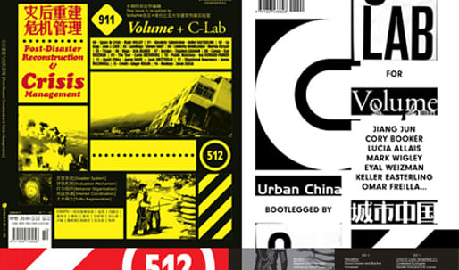
Founded in 2005, Urban China is the only magazine devoted to issues of urbanism published in and about China. In addition to offices in Beijing, Shanghai, and Guangzhou, the magazine has a network of correspondents and collaborators around the world who work under the guidance of its Editor-in-Chief, Jiang Jun, to meld elements of photojournalism, geography, architecture, graphic design, anthropology, statistics, and historical research together in an investigation of how cities, particularly rapidly developing cities, function today. Urban China investigates these complex issues with a unique sensibility that infuses serious, multidisciplinary data collection and analysis with a genuine sense of wide-eyed awe, channeling data streams of seemingly unrelated information into digestible narrative webs. Each boldly designed, graphically rich issue of Urban China is dedicated to exploring a single, rigorously researched theme, such as “Chinatown,” “Migrating China,” and “Urban Images and Text.” In articles, interviews, photographs, and visually compelling diagrams, each issue’s pages brim with an exuberant air of possibility mixed with melancholic reflection. Urban China expresses a joy in analyzing the world anew, finding fresh ways to map it, and in that mapping, showing us the unheralded and unknown connections and relations that shape the way cities and lives are continually made and remade. via newmuseum.org
As part of an ongoing collaboration between Urban China and Volume, the Columbia Laboratory of Architectural Broadcasting (C-Lab ) has produced a bootleg issue of Urban China 31 - Post-Disaster Reconstruction and Crisis Management . The Bootleg, which has been given the title Crisis: Urban China Bootlegged by C-Lab for Volume , is the impetus for (and the primary subject of) the following three-part interview, which was conducted via email with the magazine's editor Jeffrey Inaba (C-Lab), and its managing editor Gavin Browning (C-Lab). Also included is a statement by the Bootleg's designer, Glen Cummings (MTWTF ). The Bootleg accompanies an exhibit titled Urban China: Informal Cities , which was previously installed at New York's New Museum , and which is currently on display at LA's Hammer Museum , through July 19. The third and final installment of Urban China: Informal Cities will be on display at Chicago's Museum of Contemporary Art in the Fall of 2010.
Scroll to read all the interviews, or select one of the following links for a direct jump:
Part 1 - Urban China
↑ Click image to enlarge
Urban China issues 11 (Street Ecology) and 22 (Chinese Education)
Cameraphone snapshot by author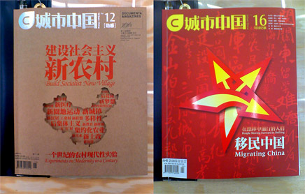
↑ Click image to enlarge
Urban China issues 12 (Build Socialist New Village) and 16 (Migrating China)
Cameraphone snapshots by author
Aaron Plewke: When did you become aware of Urban China? What were your initial impressions of the magazine?
Gavin Browning: I had been aware of Urban China for some time, and first and foremost felt that it was a beautifully designed publication. But content-wise, it's obviously difficult to get a full impression without having full English translations of the texts. Luckily, I had a chance to work personally with the magazine and its editorial team last summer on the first of a three-part collaboration between the magazine and C-Lab. Jumping in, there were a lot of lines to read between, and I was really excited to collaborate with them. The issue that resulted, "Urban China 31," became the foundation for a lot of what appeared in the bootleg issue, and when it came time to "bootleg" them (on occasion of the exhibition "Urban China: Informal Cities") we had a lot of material to work with, and also a great relationship with Urban China.
It's interesting to read both Urban China 31 and the Bootleg side-by-side, just to see how ideas evolve within different design sensibilities, over a period of time and as current events unfold. For example, even the word "crisis" had a different set of connotations in the summer of 2008 then it had taken on by the time we were putting together the Bootleg in early 2009, and I think the content of both issues reflect that.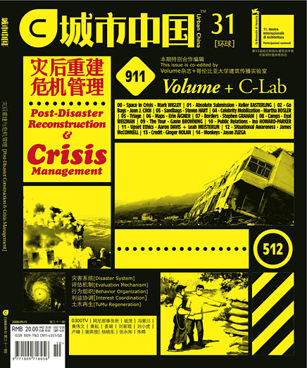
Urban China 31 (Post-Disaster Reconstruction and Crisis Management)
Jeffrey Inaba: I had seen Urban China on trips to Beijing and it was clear that its agenda was and is still now to examine architecture from a political point of view. Judging from the graphic content (their sanguine photographs of Chinese industrial landscapes, urban development, poverty, migrant labor, ethnic minorities) it was fascinating to see that despite the difficulty of doing so in China, they were exploring charged issues. As Gavin mentioned, since the magazine is not entirely translated into English, I was intrigued to find out what their point of view was. That was the first impression. After meeting them and learning more about their editorial work it was inspiring to discover that they have a deep understanding of the complexity involved in a country of that size advancing so fast. They have committed themselves to being an active participant in this era of economic expansion by taking on difficult subjects and providing constructive insights from the perspective of the nation's interest. They have been an important skeptical voice countering the pervasive optimism about globalization and its associated values in China and abroad. The more lasting impression is that they are concerned about how the architecture profession grows and that it doesn't focus on facilitating private wealth accumulation and Westernization at the expense of overlooking the country's social development. Working with UC on the Bootleg helped us to appreciate this even more, and hopefully readers will get a sense of their project.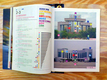
Urban China interior spread (The Physiognomy of Government Buildings)
Cameraphone snapshot by author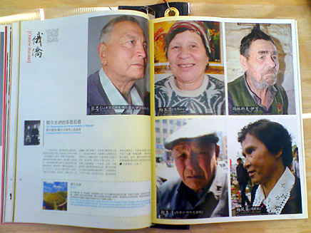
Urban China interior spread (Chinese Russian)
Cameraphone snapshot by author
Urban China interior spread (Cities in Policies and Slogans)
Cameraphone snapshot by author
AP: Now that Urban China has assembled 5 years worth of material on contemporary China, what are your thoughts about its editorial objectives?
GB: One great thing about both the magazine and the exhibition (which is now at the Hammer Museum in LA, and will then move to Chicago) is how complicated information is distilled and graphically conveyed, so that you don't necessarily need to have mastered the Chinese language in order to get their message. Part of that seems to be, for me, a stated or unstated understanding of urbanism as something that is not confined to state borders. So a lot of what you find in the magazine deals with transnational relations and urban phenomena, and then just as importantly, how these dynamics can be visually expressed in new and different ways.
JI: I don't know exactly what you're asking. If you're wondering what its future goals are, you need to ask Jiang Jun. If you want to know what I think of its editorial aspirations, and what they ought to be doing in the future, then I would say my opinion on that is irrelevant. It's more important that people see just how adventurous, unassuming, critical, generous, harsh and open-minded they are willing to be.
AP: Jeffrey, I think your last sentence addresses what I mean to be asking--that is, Why is Urban China worth a closer look? In an era where architecture has become increasingly global--as a practice and as a community--what can be taken from UC's regional approach and applied to an editorial project based in another location?
JI: I am not sure their approach is regional, and it doesn't seem important that their approach is applied elsewhere - however positive in the short term that may be. Their benefit is not that their editorial sensibility can be reproduced elsewhere but that it is so independent in its thinking compared to other publications. Part of this is that the project is historically and culturally specific. Over time it has become even stronger in that regard. And as it continues to do so, the gift to all of us is that their assessment of the professional context from their intellectual perspective will help us to better form initiatives for ourselves.
↑ Click image to enlarge
Urban China issues 07 (Made in China) and 30 (Collective Movement)
Cameraphone snapshots by author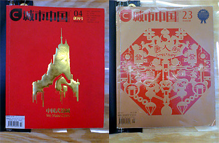
↑ Click image to enlarge
Urban China issues 04 (We Make Cities) and 23 (Chinatown)
Cameraphone snapshots by author
AP: How did C-Lab and Volume begin collaborating with Urban China?
JI: We really like their magazine a lot. And Jiang Jun is one of those rare persons who is exceptionally informed about policies by foreign states as they apply to China, and about domestic policy debates related to urban development and architecture. He also knows a ton about a wide range of things like the implementation of planning principles and guidelines, foreign NGO operations, development aid. You can see from the magazine, he loves how architecture intersects these things.
We like the magazine so much that we wanted to make a bootleg of it similar to the way a fan bootlegs concert music of his favorite band to share w/ others. We wanted English readers to get a sense of what they're about. They work in such a fluid and poetic way that they also wanted, given the time constraint, the Bootleg to be the by-product of working in a really improvised manner - basically that it would be the remainder of quick exchanges of material back and forth between UC and C-Lab, and that the unresolved and awkward moments would be just as valuable as the intended editorial content. You get a sense of this exchange, and the quickness of working in this manner in the design of the publication. The design by Glen Cummings and Dylan Fracareta is a departure from both UC and Volume. It was done in a super short amount of time. In the layout some images are scans of scans, others are subtle detailed photographs, others look like scientific diagrams drawn for textbooks, others are kooky illustrations.
Part 2 - Bootleg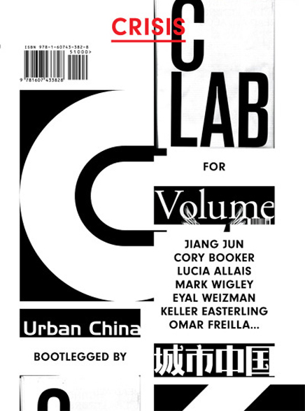
Crisis: Urban China Bootlegged by C-Lab for Volume , Cover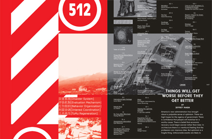
Crisis: Urban China Bootlegged by C-Lab for Volume , Inside Cover, Index, and beginning of Jeffrey Inaba's Editorial Statement
AP: I'd like to continue to focus on the 'bootleg' concept for a moment.
From my point of view, the issue is convincing as a bootleg tape for several reasons:
Other than expressing Volume's fan-like appreciation of Urban China, why is the bootleg format an appropriate vehicle for the Crisis issue's content?
GB: Those are great readings of it’s visual and textual cues. In terms of how the format informs the content, it’s helps to remember that much what is being discussed carries extreme urgency. Most crisis management-devices are not polished design objects, or well-known for their aesthetic merit. They’re quick, effective, iterative and/or easily deployable. So in this issue, Steven Hart provides a short history of sandbags. They're one of the most basic but also the most effective, affordable and flexible tools available to manage an array of crises -- from protecting structures from surging rivers to creating ad hoc shelters. And the proof of that is that they continue to be used, but their design doesn't evolve. Other topics in this issue, like refugee camps (Manuel Herz ; Eyal Weizman), rebirth brick (Liu Jiakun) or walls in occupied Iraq (Haifa Zangana) reflect this urgency, and I think the quickness of the bootleg format only reinforces it.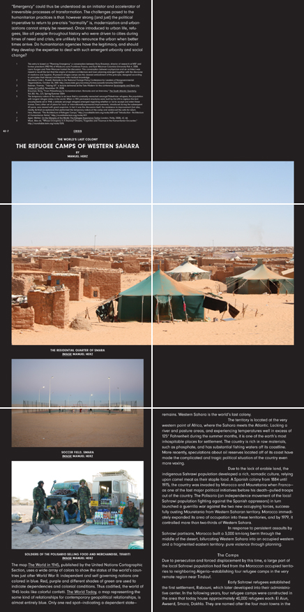
The World's Last Colony: The Refugee Camps of Western Sahara , By Manuel Herz.
Pages 42-7 through 47 shown here (article continues through page 51-3).
White lines added to show where pages break, and how content flows from page to page. Refer to the Design Statement by Glen Cummings, below , for further explanation.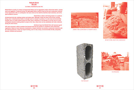
↑ Click image to enlarge
Rebirth Brick , by Lia Jiakun, translated by Gao Yan. Pages 20 through 21.
Elsewhere, New York Times Graphics Editor Erin Aigner – she started there in 2005, and one of her first assignments was to make maps during Hurricane Katrina – discusses disseminating spatial information to the public as crises occur in real-time. She says that she makes new maps “as long as we can get new information, and as long as there’s something new to display.” Now, the maps at the Times do happen to be beautifully done, but the point is, it’s an iterative process. Elsewhere in the issue, New York City Office of Emergency Management GIS Specialist James McConnell discusses the importance of situational awareness in the practical handling of an urban crisis. For him, the maps that will be used by rescue workers in the field – showing who lives in an area, what languages they speak, how many buildings in that area are residential, and of them, how many units are in each one, for example – facilitate the type of inter-agency conversations that effectively deal with crisis scenarios. He says: “successful emergency response begins with a map.” These are two examples of crisis management that deal with visualizing and disseminating data as quickly, accurately and efficiently as possible during moments of duress, and the Bootleg is trying to mirror that.
JI: Yes, they are great readings of the design. In Mark Wigley's essay he describes crisis as the state when preparation plans and responses do not work. Unlike an emergency, a crisis is when all forms of recourse fail. It is an environment where there are no known effective actions. He writes about this uncharted territory in spatial terms, saying that a crisis is a threat 'not just inside of space, but is actually an extreme challenge to the space itself, from the scale of the individual psyche ... to that of an institution, a city..."
We thought the bootleg idea worked well with this notion of crisis because it is a format that is open-ended. By its very nature it doesn't have a clear narrative. It is piece meal. It's richness comes from its makeshift quality - all of the contingencies of its assembly. It is a threat to the integrity of the produced album. This open framework seemed well-suited to addressing crisis since by definition at the given period of its occurrence it is impossible to define. Crisis is open-ended. There isn't a coherent narrative to explain the unfolding events. In the editorial organization, we accepted the fact that we could describe elements of varied crises but that it would be premature and beside the point to try to give an overview definition of it. In the design of the layout, we were inspired by these aspects of the bootleg and this sense from an editorial standpoint that crisis is formless. Yes, as you mention, the material is sort of dumped into one long spool, a stream of content-ness. The design tries to maintain the integrity of the organizing logic accepting the fact that it challenges a sense of overall coherence: text, images and streams of thought are severed and then reattached. It's as much a document in crisis as a publication about crisis.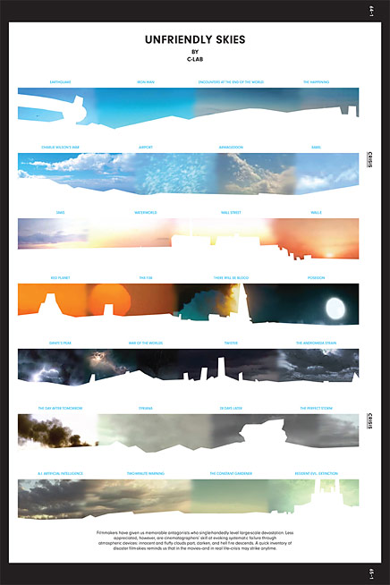
Unfriendly Skies , by C-Lab. Page 64-1 through 65-1.
The next issue of Volume will explore the art of explanation. And in particular the ways that a problem is defined, the context that it is situated in, the facts marshaled to support it's claims and the solutions that are rationalized based upon it. These elements come together in Storytelling. And at this particular point in the meltdown, there are a lot of stories being told. We present common narrative techniques, forms of reasoning, the use of illustration and their similarities to devices used in children's stories like fairy tales.
AP: As much as I am enjoying it, when I first flipped through Crisis at the New Museum book store in New York, I couldn't help but wonder why it had to be a $16 magazine as opposed to, say, a less polished (and less costly) newsprint publication, or perhaps a copy paper 'zine of some sort. Were alternative [physical or digital] formats considered?
GB: No, a digital format was not considered, and I think it had to be a magazine. The reasons for that being in the title: it's a bootleg of Urban China , done by C-Lab, for Volume . So it’s an entirely new publication, but one comprised of residues and reinterpretations of another. Reading it, I think you’ll notice that a lot does differ from other issues of Volume -- from the paper stock to the price (it’s about half the cost) to the design strategy that Dylan and Glen devised.
JI: Working in a range of media is important for us. Some work we do has a product that is physical and others are digital. Selecting a particular medium for a project is part of its conceptualization. With this particular one, print made sense since it's a bootleg of an original (UC) that is print-based. In that respect, we wanted it to see how the genre of a bootleg could be pushed to extremes. We really like publications as designed objects: the use of color, the play in image quality, the choice of paper, the weight, the 'flip-ability' of print matter. All of those are things were considered to develop the bootleg idea.
Glad you regard it as polished. We didn't use high-end production methods. Various treatments with relatively low-cost materials and processes were used. We tried to see what kind of range of color we could get out of a cheap coated paper. At the same time, we wanted to test how much depth within the grey scale could be achieved for the black and white sections with the same paper. The printing method was also pretty basic - one step up from ink-jet printing. And with the printing vendor, we contacted places located in countries heavily hit by the financial crisis to see if we could get a good price. It turned out all the places in Iceland even after their banks failed wanted more than ones in NY. We ended up working with a great printer in Korea. Their currency dropped something like 30% against the dollar. In other words, we experimented with a number of options to get the cost down while trying to achieve a particular object quality we were after.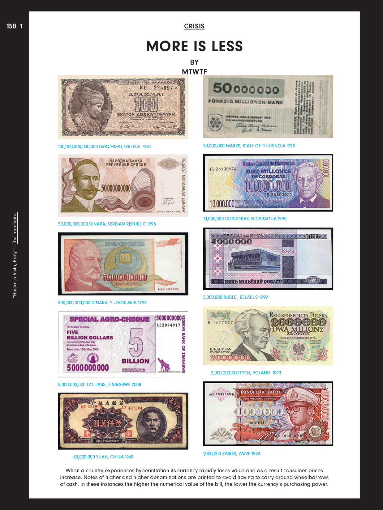
More is Less by MTWTF. Page 150-1.
INTERLUDE - MTWTF Glen Cummings Design Statement
It's always a pleasure working with Gavin and Jeffrey because they want the visual design of their projects to do some real work. In this instance they wanted the Crisis issue's visual design to exemplify and amplify the "bookleg" spirit of the project.
Dylan Fracaretta and I met once with the team and then began designing. Our first impulse was to compile a set of gestures that would allow us to format the content in a "Bootleg style" -- Bootleg being a premature and exuberant form of communication, a half-cooked transmission full of awkward and enthusiastic urgency. We designed two preliminary directions, but they both felt somehow inauthentic.
Discussing our preliminary directions with Gavin and Jeffrey led us all to realize that we didn't have to simulate the look of a bootleg publication, because we were actually making one. The challenge was to make our real urgency visible somehow. We decided to use our own production problems -- a very short deadline and late-breaking content -- to determine the design.
We developed a system where content was typeset and formatted when it arrived, without considering its place within the magazine, and then put away. At the last minute Gavin and Jeffrey ordered the articles and then we simply "poured all the content into the empty magazine container" and considered it done. We ignored page breaks, and the relationship between articles. We didn't concern ourselves with conventions like starting articles at the top of pages, or centering their images on a page. We just took those concerns off the table, and just let the content flow, jumping from the bottom of one column to the top of the next until it all ran out, much the same way a laser-printer might print a lengthy email with a dozen attachments.
There were also articles that were delivered in page-sized chunks. It seemed disingenuous to break these articles apart so they could work like the others, so these content chunks appear where they can and the main content just snakes around them.
The scheme produced more than a few moments that surprised us. We hoped that readers would recognize the the issue's awkward moments as a visual language that resulted from an enthusiastic and un-fussy publication design process.
Part 3 - Crisis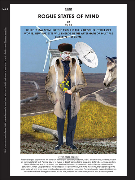
↑ Click image to enlarge
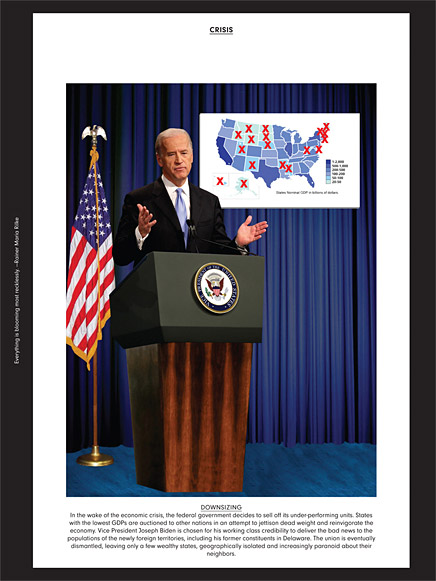
Rogue States of Mind , by C-Lab. Pages 140-1 and 144-1 shown here (article includes pages 140-1 through 144-1).
AP: Urban China 31 was given the title [or theme] Post Disaster Reconstruction & Crisis Management, but the Bootleg's title is simply Crisis. Why is that? Gavin, I think you allude to this in an earlier response where you state, "even the word crisis had a different set of connotations in the summer of 2008 then it had taken on by the time we were putting together the Bootleg in early 2009..." Is it purely a result of the fact that the Bootleg was created in the wake of a widespread financial crisis (compared to the catastrophic earthquake that preceded UC31), or are there other reasons why this content--half of which initially appeared in UC31--is being framed differently?
JI: That's a good question. We're grateful that you noticed. The disasters during the past 18 months have been so varied if you look back from the earthquake in China to the ongoing meltdown – and Madoff and the pandemic threat in between. Rather than try to offer some kind of premature overview of these dramas under a singular overarching theme like Crisis, we have been chronicling each locally. UC31 and the Bootleg record individual occurrences – they report on varied incidents rather than a summary assessment of our times. And to cover events in this way, we are using means at our disposal: the regular issue of UC, the self-initiated Bootleg, and the upcoming issue of Volume. That said, there are multiple contributions about one instance in each of the three. In UC31 several dealt with the question of social mobilization in the wake of the natural disaster in Sichuan. Both in design concept and with some of the content, the Bootleg considered the collapse of faith in official forms of exchange. When the mechanisms of exchange go kaput then sharing, borrowing and trading can occur in unofficial, alternative ways. (The most literal example of borrowing is, as you observe, the material bootlegged from UC31.) The upcoming issue of Volume, entitled Storytelling, again, documents numerous acute conditions ('wayward' migration, misplaced faith in technology and journalism's fate). As the title suggests, several pieces consider how these conditions are in turn explained. For any one of our current challenges, what is the stated dilemma, context, motive or ensuing set of events? And most importantly, how does a problem’s formulation determine its proposed solution? What we propose is that while learning the truth is important, so is the ability of fiction to elevate fact. Perhaps the way we will eventually understand our era is through narratives that distort, pervert and animate reality? It will include pieces by Neil Denari, Bjarke Ingels and Dean Simpson; interviews with Lewis Lapham, Nicholas Lemann, Jay Rosen, Catherine Hardwicke, Tom McCarthy; illustrations by Dave McKean and Roger Dean; a report from Warren County–home to the US auto industry; plus storybook architecture, and a fairy tale about an ostrich family and one about finding a home.
GB:In order for us to authentically respond to changing times and threats, the trilogy had to evolve. Yes, UC31 was motivated largely by the Sichuan earthquake, even though lots of other topics are investigated within, and yes, the Bootleg might have been largely influenced by the economic crisis. But there are overlaps in content and approach. In his interview in both UC31 and the Bootleg, Stephen Graham discusses the mutability of borders during moments of crisis. He recalls SARS and how airport security and new technologies of surveillance were used to fortify State boundaries, stating that "crises breed new attempts to draw borders, they breed a language which stresses a sense of exposure an a sense of anxiety, and a sense of being exposed to new threats and new mobility which is easily translated into a semi-racist politics of demonizing beyond the border." Look at the international hysteria around swine flu. It turned things momentarily upside-down in a way that was completely disproportionate to the actual public threat posed, and it operated geographically: bringing up reactionary conversations about trade and immigration in the case of the US/Mexico divide. I think that if a publication -- or in this case, three publications, over the span of a year or so -- is going to interrogate crisis, then it's framing devices need to be as flexible and adaptable as the sandbag or the set of maps that I mentioned earlier. And just as importantly, I think it needs to be aware of the ongoing manipulation of these devices for political ends. The third and forthcoming installment of the trilogy acknowledges this specifically, because it investigates ways in which stories of our precarious world are being told.
Get the Flash Player to see this video.
var s1 = new SWFObject("http://xm-dev.com/archinect/feature_89770/flvplayer.swf","single","436","320","7");s1.addParam("allowfullscreen","true");s1.addVariable("file","http://xm-dev.com/archinect/feature_89770/feature_89770_bootleg_movie.flv");s1.addVariable("image","http://files.archinect.com/uploads/ai/aiu_feature_89770_bootleg_movie.jpg");s1.addVariable("width","436");s1.addVariable("height","320");s1.write("player1");↑ Click image to play video
Crisis: Urban China Bootlegged by C-Lab for Volume . Video provided by C-Lab.
Creative Commons License
This work is licensed under a Creative Commons License .
/Creative Commons License
Aaron Plewke is an associate at Deborah Berke Partners. He designs and manages projects in all sectors, distilling each client’s needs into unique, transformative solutions. Aaron began practicing architecture in 2005 and has worked in Florida, St. Louis, and New York, on projects ...
4 Comments
Very Nice, AP.
I take it you caught the exhibit while in Chicago recently?
Thanks Nam. The Chicago exhibit isn't happening until Fall 2010. I did have the pleasure of seeing Informal Cities at the New Museum in NYC. It was extremely interesting to check out multiple issues of Urban China. As Gavin says above:
One great thing about both the magazine...is how complicated information is distilled and graphically conveyed, so that you don't necessarily need to have mastered the Chinese language in order to get their message.
The UC editorial crew excels at creating impressive graphic representations -- and reading the Bootleg (with its English translations of content previously published in UC) goes a long way toward illuminating the nature of the content within UC. Reading the Bootleg, you can't exactly fill in the blanks (for issues other than UC31), but you do get a sense for how the concepts or themes of each issue might be investigated.
Wow, look at these amazing graphics. I love how universally appealing it looks and yet how very Chinese it feels.
I'm from Italy and "Urban China Bootlegged for Volume by C-Lab" is fantastic! Very good job! But how did I purchase Urban China? Please help me. Thanks
Block this user
Are you sure you want to block this user and hide all related comments throughout the site?
Archinect
This is your first comment on Archinect. Your comment will be visible once approved.