
ShowCase is an on-going feature series on Archinect, presenting exciting new work from designers representing all creative fields and all geographies.
We are always accepting nominations for upcoming ShowCase features - if you would like to suggest a project, please send us a message.
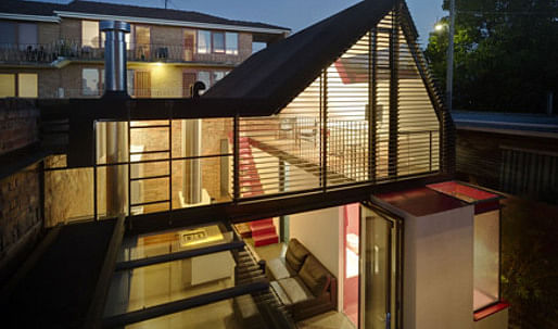
Emerging from behind its high boundary wall, the distorted roof form of Vader House interrupts the symmetrical roof line typical of Fitzroy, and breathes new life into this Victorian Terrace.
The extension is a framed steel skeleton which envelopes the unusually high masonry boundary wall built prior to height restrictions, reclaiming it into the interior. The roof then responds to site setbacks which result in a distorted and subverted answer to regulations. This produces high folded internal planes, allowing double height ceilings, a mezzanine level and spacious interior.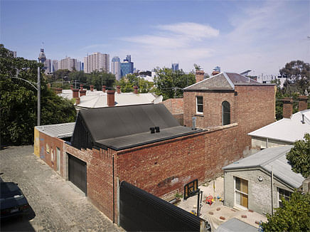
↑ Click image to enlarge
The building embedded in its Fitzroy, Melbourne neighborhood (Click on this and all of the images to get a detailed view)
The Eastern and Western facades of the extensions are encased in a shield of louvres. These peel back to reveal a folded internal environment of soft colors framed by exposed steel beams. Playfully splashes of deep red enliven the interior which is occasionally punctured by windows allowing a cinematic light to dance over the internal workings of the Vader House.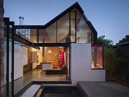
↑ Click image to enlarge
View into the building from inner courtyard
The refined material and colorful palette of the extension, wrapped in a heavy roof form distinguishes itself from the dark masonry clad terrace from which it emerges. These two opposing forms are united by a transparent glass corridor along the Northern boundary wall, framing an outdoor courtyard.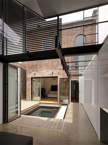
↑ Click image to enlarge
View into the inner courtyard
Strategic planning located the courtyard at the heart of the site, allowing both the terrace and extension to have direct contact with this outside space. It creates a central demilitarized zone that allows activities from the surrounding living spaces to spill into. This courtyard ensures that the entirety of the site is utilized.
Definition between these internal and external environments is barely distinguishable. Transparent bifold doors allow for constant physical and visual interaction, between these environs. The extensions is at once inside and out.
The courtyard’s location also provides abundant natural light and ventilation into both the terrace and extension, importantly decreasing reliance on mechanical heating and cooling systems.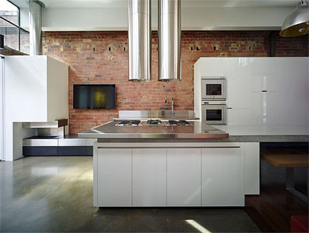
↑ Click image to enlarge
Kitchen island
The open and seemingly simple nature of Vader House later reveals itself to be one of complexity and ambiguity.
Many elements of the design prove to serve multiple functions. The bold stair case becomes part of the kitchen joinery, the louvres act as light control as much as privacy screening, and the boundary external wall doubles as the internal kitchen wall.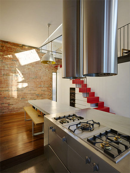
↑ Click image to enlarge
The kitchen area flows into the dining area
The extension is created out of components that appear to have fallen at the eastern end of the site in a tetris like manner. Unexpectedly a random tetris piece has lodged itself deep within the walls of the original building.
This floating block provides the master bedroom with a en-suite reflecting its downstairs companion, fusing the terrace to the extension and giving a glimpse of what one will experience as they move through the site.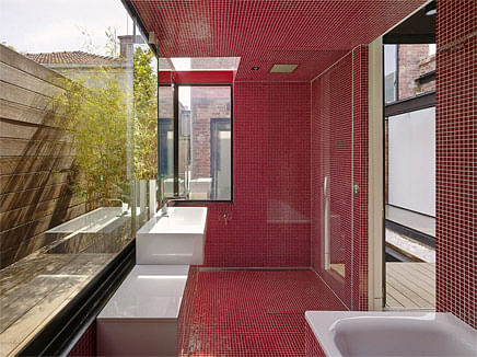
↑ Click image to enlarge
Bathroom
The anatomy of Vader House also extends far below the site. The timber deck in the courtyard doubles as a retractable deck, when pulled aside reveals a hidden spa, right at the very heart of Vader.
Similarly the timber floor boards in the extension form a trapdoor that when opened exposes a cellar, extending far beneath Vader. When these doors are opened, they alter the nature of their spaces significantly, providing the extension with a dynamic and chameleon - like interior.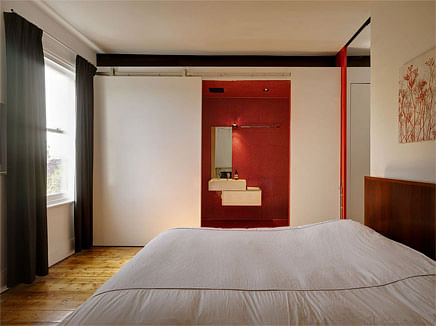
↑ Click image to enlarge
Master bedroom
The lack of formal zoning of the extension reflects a desire to make this space a versatile, and thus economical solution, where multiple programs are able to symbiotically co-exist. This flexible design, accompanied by its carefully composed material and color palette, results in an extension that will adapt to function, clients desire and most importantly the demands of
time.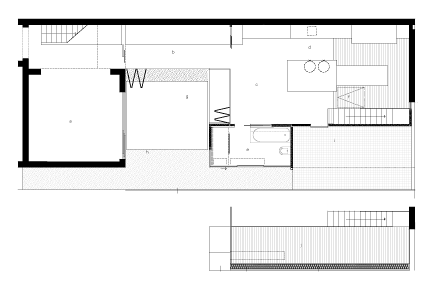
↑ Click image to enlarge
Ground floor plan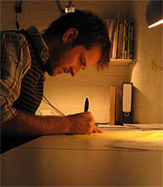
Andrew Maynard Architects
Named in Wallpaper Magazine's Architects Directory, an "annual guide to the world's most innovative practices", Andrew Maynard's design practice is quickly becoming recognized as an emerging force on the architectural scene. Since Andrew Maynard Architects was established in late 2002, it has been recognized internationally in media, awards, and exhibitions for its unique body of built work and its experimental conceptual design polemics.
Archinect UpStarts: Andrew Maynard
Creative Commons License
This work is licensed under a Creative Commons License .
/Creative Commons License
7 Comments
Purty..
I love how from the outside, the building is almost nothing but solid walls, yet inside it's very difficult to tell where the courtyard ends and the interior begins. Very nice.
where the fuck is darth vader
hello
When can I move in?...............EXQUISTE:
3 a: marked by flawless craftsmanship or by beautiful, ingenious, delicate, or elaborate execution <an exquisite vase> b: marked by nice discrimination, deep sensitivity, or subtle understanding <exquisite taste> c: accomplished , perfected <an exquisite gentleman>
the hanging beam is a masterful move.
I found Andrew Maynard a true inspiration, for his inovation and craftsmanship. Pity he doesn't employ many people.
Great. Very Japanese ...really tight work.
Block this user
Are you sure you want to block this user and hide all related comments throughout the site?
Archinect
This is your first comment on Archinect. Your comment will be visible once approved.