
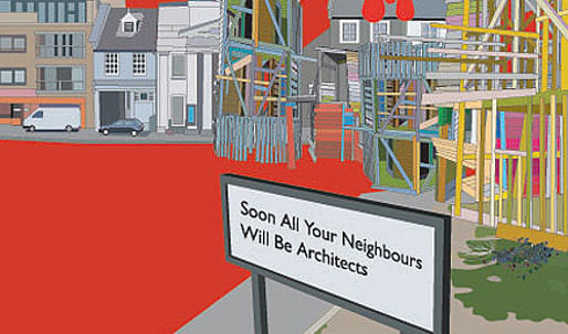
Archinect is here to out Nils Norman : he is not what he first seems! The London-based artist has gone undercover, infiltrating the fields of architecture and urban planning, to subvert the ways we approach our cities.
I met Nils through Fritz Haeg , who was in town building an Edible Estate for the Global Cities exhibition at the Tate Modern. Nils had also been commissioned to produce an installation for the show, transforming London street furniture into radicalized signs of gentrification, security paranoia and ecological disaster. It was disarming to find an artist whose work was so fierce is actually of such gentle character. This seems to be part of what enables him to enter the world of developers and planners, and through artistic subterfuge convince them to take satire seriously and embrace his Utopian visions of public space. I teased him that, in the process of adopting our language, customs and behaviors, he accidentally became one of us. But by positioning himself firmly within the sphere of the artist, his work is permitted the freedom to truly demonstrate new possibilities while critiquing the status quo. --HR
Could you talk about your research on Bohemia and urban renewal?
I've been looking at the history of bohemian artist movements to find a possible place of dissension. Is Bohemia still a place where artists can experiment and develop strategies outside the mainstream? The normalizing effect of the market makes this now almost completely impossible, and [bohemia] has been instrumentalized by people like Richard Florida , who make direct links to 'creatives', bohemian lifestyles and a new class of urban entrepreneurs through city regeneration. Where can alternatives be developed, where is it possible to drop out and develop new languages and codes? Maybe those spaces just don't exist anymore.
Gateshead Hoarding, 2005. "A landscape portrait of Gateshead, a deprived area of North England that is in the process of being regenerated, using culture as the main strategy of renewal."
And you are adopting the graphic language of urban planners to create Utopian proposals in search of those spaces of dissension?
The Utopian proposal is a tool that I use to critique existing structures and situations. I incorporate a lot of different things, like permaculture and urban farming, to exploit them in a way that folds them back into larger propaganda. I try to reproduce the planners' language as a way of infiltrating their world, and critiquing it as well. It's a way to go undercover -- to get inside, to get the attention of those people so I can address them and talk to them. It's worked, actually -- it's worked too well. It has come to a point where I spend more time with planners than artists. Which I actually really enjoy, since I find the art world pretty dull right now. In terms of architecture and urban design, it seems like there's more important things happening.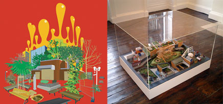
Left: Hey Rudy!: A Phantom on the Streets of Schizz, 2004. Right: Proposed Redevelopment of The Oval, Hackney E2, London. Renamed: Let the Blood of the Private Property Developers Run Freely in the Streets of Hackney, 2003.
So your intended audience is planners and architects?
It's urban planners, architects, but also the general public who might just think that my work is the work of a slightly naive designer-- a bit of naivete and madness. I find that [physical] models always draw people in - they peer into the details - but then start to realize that what they're seeing is not what they thought. That's what I really enjoy about subverting this language.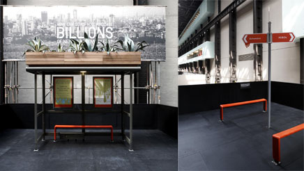
Global Cities, Tate Modern, London, 2007.
But as for these models -- whenever I see you exhibit in a gallery I have this sense that your work is clamoring to get out in the world. Like the urban signpost at the Global Cities exhibition, pointing to ASBOs, Bohemians, International Curators and Planet of Slums. I was thinking: how would this shift people's behaviour if it were positioned at an urban intersection? Instead, it was in a corner of the gallery -- you couldn't even walk in three of the directions.
I see the works as models. They're not real signs or bus shelters, but models or tropes. Indicators for another place or space.
I've tried to construct an interdisciplinary practice whereby I could do more fanciful Utopian proposals in a gallery or museum, but also push the working boundaries of these institutions with real projects. Previously I took a more hardcore position, where I wasn't interested in doing super-real things, but as I've gotten older I've become softer to understanding how it's actually quite possible to push people to think about the way they work, and that is quite important to me.
One of the things that made me realize this was the Geocruiser, the traveling library and greenhouse that was built just by chance. I was commissioned by an institution in Cambridge, UK to propose a public art project. I thought they would never find the money to make this vehicle. But a year later they phoned me up and said they found the money from the Arts Council. So, after they'd spent a year fund-raising it seemed kind of churlish for me to turn around and say, "Well, no - I'm not going to do it!" We went ahead, and it became this very successful public sculpture that toured around Europe, from museums to gardens to schools and town halls. And that actually made me think about how projects can be made real.

The Geocruiser, 2002.
What does it mean to approach projects like the playground in East London or the bridge in Denmark, from the role of the satirist? Are you calling attention to urban problems through these projects, or are you just trying to make good public space?
I'm hopefully trying to do both. To create a critique by making something through artistic channels, using different budgets, different decision making structures and different design processes to reveal another methodology. One that is not just driven by a need to make a quick buck or develop some awful power or status position. I always wonder why architects see themselves in this old-school "genius creator" kind of role, much more than most of the artists I know do.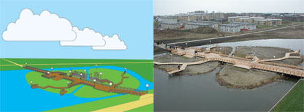
The 80m Trekroner bridge, island and lake for the new town of Roskilde, Denmark, 2005.
That bridge you designed feels like the birds-eye planners view come to life.
Someone actually told me they liked it because it seemed completely un-designed. I'm not sure that was a compliment! I gave them this drawing in Illustrator, this Tin-tinesque sort of drawing, and they just made the bridge.
Well, at least it's become a nice place, where before there was really nothing. There was really no one there when I was first invited, because it was a new town in Denmark. So there was no community to work with -- but I worked closely with the urban planning department, had long discussions about materials -- sourcing non-tropical hardwoods. So, even though I feel that sometimes public art projects can become a form of pollution, this worked out well.
As designers we've all experienced the shift from making Utopian proposals -- generally our student projects -- to dealing with the constraints of designing real projects -- budget, client, codes and general resistance to change. Have you found yourself repositioning your critique after navigating these constraints, or has it reinforced your ideas?
I think designers and architects should return to those student projects! I just met a Spanish artist who proposed a new project - it's a bit macho but could be interesting - he wants to punch every Spanish architect he meets in the face! To try and wake them up! It's a rather primitive form of critique but I think it encapsulates a frustration people have with what's going on in our built environment. Why should all these public spaces be privatized? Was anyone asked if they wanted another ridiculous mall in their neighborhood? But to answer your question - I think that it's done both. I'm now more aware of the compromises and processes involved when considering larger urban projects but that, in a way, makes not doing anything even more valuable.
A lot of your proposals navigate independent economies, rather than participating in the existing structures.
I try to do that as a way of not necessarily saying that you can be independent - because I don't think you can - but to reveal how we are dependent, like Swift does -- a way of critiquing the state or structure that you're living in.
Look at this in relation to Non-plan , an architectural model by Cedric Price in the late 60s. He proposed taking an area in the suburbs, and removing all the regulations and building codes, so that there were no restrictions as to what you could build. The people who lived in that neighborhood could build whatever they liked. This had a mixed reception, because many people saw it as a very conservative thing to do -- it's sort of all about the free-market and deregulating an area, taking away state control. London's Docklands took on a similar profile -- and developers really took it over. But the Non-plan was more of an anarchistic idea, where people would work locally together, not developers, but individuals within walking distance.
But really, we're going the other direction -- privatizing public space. How does this influence your research on security design -- what you term Urbanomics?
That's an ongoing archive -- I've been doing it since 97 -- it's more of a seminar, I don't really use it in exhibitions. It's about the design of control, and how your use of a space is controlled by the way it is designed. My interest of that comes from Mike Davis' City of Quartz but also William H. Whyte's analysis of mid-town Manhattan in the 50s, early 60s. He made these amazing time-lapse films looking at how people use public space -- construction workers, office workers, street vendors. And from his research - they developed bum-free seating and security measures. This was the opposite of his intentions -- he was trying to understand how these spaces work so as to enrich [the public realm.]
From The Urbanomics Archive, "an ongoing photographic research archive of street furniture, designs, parks and architectural features that are put in place in order to deter or prevent unwanted activities that occur in urban spaces." A selection has been published as a book, The Contemporary Picturesque, Book Works, London 2001.
Most of the examples in the Urbanomics archive are surfaces, materials, applications. But now, with surveillance, do you think it's becoming a less visible kind of control?
Downtown Manhattan to me seems like an experimental hotbed of security design. One of things I saw recently, were these [bollards], designed by the landscape architecture firm Rogers-Marvel . They look like conceptual minimalist art-pieces, but they're meant as barricades to block cars from coming in. Instead of temporary structures, security structures have now become completely permanent and - as a result - are making the fear of what might happen permanent as well. There's now this collapsible concrete in Battery Park City to stop cars and lorries from driving off-road in the public space. This material was actually designed for airport runways, so that if a plane went too far down the runway, it collapsed in the pavement.
Sounds like urban quicksand.
Yes, well they call them Tiger Traps, so it has this sort of Safari element.
An adventure playground in Mummelmansberg.
Your other set of documentation -- on adventure playgrounds -- explores an alternative model, where children are given space to build their own worlds. What happens when children conceptualize the space they're in?
The history of adventure playgrounds began in the 30s, as an institutionalization of children playing on their own in building sites and bomb sites. It was originally called "junk playgrounds" in the early modernist housing estates. In Denmark, the landscape architect C. Th. Sorensen designed special areas in which children would be allowed to play with maybe one playworker or supervisor. The playworkers would just be there to hand out hammers and nails, and let the children get on with what they wanted to do with the junk that had been dragged there. Within the seclusion of earthworks (there was a perimeter of earthbanks) they would build their little towns.
In England, it was different, because they didn't really build houses so much as swings and roundabouts, so it became something of a different language. But that sort of impulse for children to build there own structures is an interesting model for how public spaces could be thought about.
There's a really nice essay by The Copenhagen Free University that says, whenever children enter into public space they reveal its limitations. Colin Ward also talks about that in "The Child in the City." Children are really good at disrupting public space and the regularity of it and revealing what's wrong with it. So for me adventure playgrounds became an interesting paradigm for looking at public spaces and how you can think about them in some other way.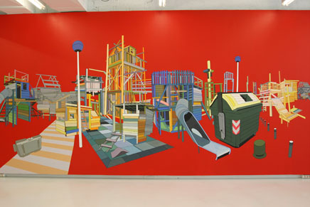
The Factory Floor, 2005.
Creative Commons License
This work is licensed under a Creative Commons License .
/Creative Commons License
5 Comments
definitely a must read!
thank you and thanks to mr norman...
priceless.
Great interview and interesting work! Thank you.
@ Ether,
I propose that this "mach Spanish artist" do it,
Starting with Calatrava....
Great Nils!
I was also struck recently by these buried pissoirs in Soho London that rise from underground at 11 at night, just in time for all the beer-drenched boozers leaving the pubs to have access to a place to piss - an ingenious operation, but also, in its functionality eliminating the excesses of night-life, and the staining of public space which might be read as a kind of informal mark-making, a sign of useage that reveals the city according to its dark corners, quiet alleys, and other spots to take a leak (of course, in rather unhealthy ways...).
Well, just a thought...
Cheers!
Block this user
Are you sure you want to block this user and hide all related comments throughout the site?
Archinect
This is your first comment on Archinect. Your comment will be visible once approved.