Tokyo, JP
HDI - a search for an authentic experience at work.
What does an authentic workplace look like? Designing an authentic office is not an easy task. Just like the terms “artist”, “poet” or “great lover”, these are titles that are given or need to be earned rather than being self-assigned.
Our attempt in creating an authentic workplace started off with our WorkVitamins methodology. This methodology was created by me, Martin van der Linden, principal of van der Architects, when I was an assistant researcher at Waseda Univeristy in 2001 here in Tokyo. I believes that architecture can be a catalyst for change in innovative environments, and this methodology - called “WorkVitamins” - is based on this idea.
The methodology has four steps. The first step is called INITIATE and sets the tone of the direction of the project by creating a Shared Workplace Vision. For the HDI project the vision was to create a work environment where we would deconstruct the idea of an office as a static space with fixed seats. This might sound like nothing really new as Free- Address or Hot-Desking has been around for maybe over two decades. We wanted to create a work environment in which there would be specific spaces that during the course of a work day would support the specific, changing tasks of the employees. Thus during the second phase of our WorkVitamins methodology, called ANALYSIS, through questionnaires, observation and follow-up interviews we started to be able to understand the various, very specific, working-space needs that the employees of HDI had. This enabled us to formulate a new set of spaces that would allow the employees to perform their changing tasks through-out the day. In this way the employees are constantly moving through the workspace, letting the nature of their tasks decide which seat would support their task best.
Thus we created four distinctive zones with a diverse set of spaces for specific tasks ranging from individual to group work, and from concentration to collaboration.
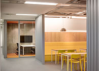
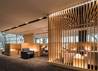
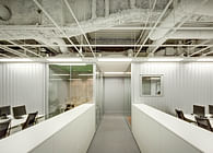
On the far right, along the building wall we added semi-enclosed booths for work that requires concentration and privacy. Five height-adjustable tables are enclosed with sound absorbing wool-cement boards. An indicator
van der Architects - HDI -press release - April 2017
light in front of these booths acts as a simple reservation system. The booths feature double flat-screens and are used by the staff for writing reports, preparing payroll, or document review. One of the booths has back to back seats for collaborative work.
In the centre of the space we placed three large worktables. These tables are mainly for individual processing-type of work which requires little interaction with other staff nor concentration.
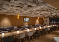
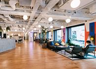
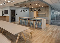
To the left of the space is a collaborative area. Most of the office is in a neutral white-grey colour palette but the collaborative space deliberately been coloured in green, with green walls, a green floor and green ceiling. A mix of seating gives the employees the choice to either sit individually in comfortable sofa’s, or in small groups either along the back wall on a bench with chairs in front of them or in dinner-type booths that can accommodate four. There is also a higher counter with stools which are very popular for quick meetings.
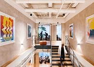
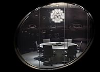
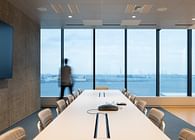
A client meeting room in a 3/1 proportion defines the client entrance space. Placed under an angle it points on the left towards a glass meeting room, while narrowing towards the right where it cuts off the view of a pixelated full height wall-print which continuous behind it into the collaborative area. The client meeting room is clad in Mortex concrete. Glass doors on both sides allow for views as well as access from the meeting room into the collaborative space. Two more smaller meeting rooms are placed close to the client entrance.
At the other entrance staff are small lockers and coat closets. Three well-insulated phone booths are placed in front of the lockers. Around the corner there is a semi-enclosed team meeting room for teams working on projects.
A Workplace Vision and the WorkVitamins methodology have created an office based around an analysis and a break-down of the specific activities that are performed by this specific company. In the end the design provides a variety of work settings. But the design for the HDI office is still an office, it is not an office disguised as a playground or a playground disguised as an office. Not that there is anything wrong with an office designed as a playground, but that’s not what this specific office is about. Authenticity at work does not come from design,
van der Architects - HDI -press release - April 2017
design by itself means nothing. As the architect it is not up to me to say that the users are having authentic experience in this office but the combination of understanding the need for a diverse work setting in combination with a strong conceptual vision of how people can rather than should work might contribute to some sort of authenticity at work.
Martin van der Linden
A video of the design process, the construction and some post-occupation interviews can be viewed here: Part 1 https://www.youtube.com/watch?v=0Oed_IfDdt4 Part 2 https://www.youtube.com/watch?v=FYV5ydFSwHc
Part 3 https://www.youtube.com/watch?v=0TTgBT2J_zU
Project Name: HDI, Tokyo Office Programme: Office interior Project size: 540m2 Materials: Bolon, Mortex, cement wool. Furniture: Knoll, USM Haller, Herman Miller. Client: HDI
Architect: Martin van der Linden Project team: Ayumu Ota, Yuko Kawakita Design period: Jan 2016 - March 2016 Construction: May - June 2016 Contractor: SPD Meiji Photography: Yo Masunaga
Post scriptum The photographer of this project is Yo Masunaga. Yo’s father was a famous graphic designer, best-known (at least by anyone in Japan) for the creation of the Peko-chan mascot for the Fujiya chain restaurants. Although Peko-chan looks like a girl with pigtails, it seems that the Masunaga senior based Peko-chan on his son Yo, our photographer (now in his sixties).
Status: Built
Location: Tokyo, JP
Firm Role: Design - Project Management
Additional Credits: Contractor: SPD Meiji
Furniture: Knoll Japan
Photography: Yo Masunaga
