Vienna, AT
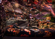
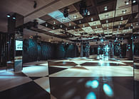
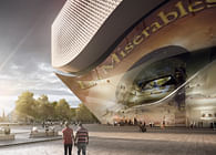
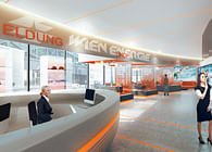
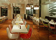
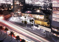
The cafeteria and the restaurant Comida y Pan and Comida y Luz are set in the “Executive Building”, which was designed by the Spanish architects NO.MAD.
As part of the selection procedure we were commissioned by the Comida-Crew to develop and create a project idea. When this happened, the architecture of the building was already completed and the rooms for the cafeteria and the restaurant were appointed.
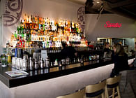
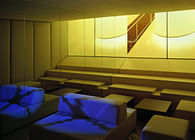
Because of that the first thing we did was to focus on the space dedication again. So the flat roof on the 6th floor became a smoking terrace and the WC facilities planned on the Ground Floor became a private room. Previous door frames were used as bottle racks, which separate the private booth space from the rest of the cafeteria and still maintain a connection by being mostly transparent. It was also important to place user-specific logistics such as the kitchen and the bar as well as refrigerators and storerooms. This was not that easy because of the already implemented building service system and the tight corset of the reinforced concrete construction.
The sobriety of the predefined rooms was impressive and looked more like the rooms of a sacred building than the rooms of a restaurant. From our point of view and the one of the client, the guest rooms – the profane rooms – should be more comfortable and appealing. The balancing act of the design was on the one hand to incorporate the unique architectural specification of the premises and on the other hand to combine the specific wishes of the client.
Other challenges were the concrete surfaces, the high-ranking guest room in combination with the low room of the bar area on the ground floor and the unconventional layout specification and the development of the smoking terrace on the 6th floor. Very important was the dealing with the extravagate facades, which have different sized and different high and wide arranged windows. Due to the existing poor room acoustic, other acoustic measures were set, which at the same time form the layout of the room.
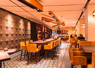
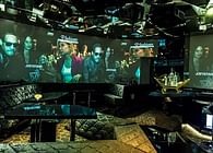
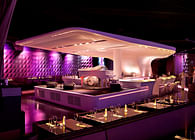
It’s the acoustic panels whose tetris-like arrangement is formally inspired by the design of the outside façade. In return of the prevailing gray of the concrete surfaces and the floors in the foyer, we decided to run the floor, the materials of the furniture and the acoustic panels on the walls in a darker color. A darker color gives the room a better fit to its limits. The choice of coloring – dark inside, outside light – is also based on the choice of the color of the building. As in the public spaces of the building, we also used mirrors to blur the boundaries between inside and outside, room and illusion. Streetart and graphic elements frame the rooms additionally.
During the project phase we and the client have decided to design both rooms, the restaurant and the cafeteria, very similar – the only significant difference is the difference concerning the light objects. Even though the rooms have a very similar design, the visitor experiences a completely different world by entering them both. In the restaurant on the 6th floor you are able to experience the Prater and Vienna city from above – and in the cafeteria on the ground floor you are already in the middle of it.
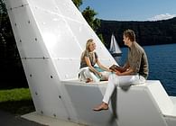
The bright design of the large white lamps in the garden should not only serve as symbols for recognition, but also invite the guests from afar to stay.
The white wooden set up and the 4 Meter high, oversized table lamps are inspired by the establishment of the Vienna Prater and works as a subtle reminder of the near surrounding.
Status: Built
Location: Welthandelsplatz 1, 1020 Vienna, Austria
Firm Role: Designer
Additional Credits: Images: Markus Kaiser
