New pedagogy and new architecture
While teacher-centred teaching, conformity and confinement still prevailed in the classroom of Wilhelm Busch's Master Lämpel, today the focus is on flexibly usable spatial concepts and informal learning areas in the spirit of a modern pedagogy geared towards individual encouragement. A symbiotic interaction of architecture, organisation and pedagogy is the result.
Learning and living spaces used all day and inclusively
Schools have developed into all-day and inclusive learning and living spaces. The new schools need spatial concepts that can be used flexibly. For this purpose, the big school is divided into several small organisational units, the small schools or clusters. This organisation in clusters makes it possible to create semi-autonomous social-spatial units in large schools, which are manageable for pupils and teachers and allow a sense of home to develop. These pedagogical objectives lead to new architectural requirements. Architecture becomes a pedagogue.
Of course, there are also 'normal' classrooms but not exclusively. Lessons may also take place in other, informal areas: for example, on the large stairway with integrated seating levels in the foyer, in the courtyards designed as green classrooms and in the openable spaces at the end of each cluster area.
The Red Barracks served as inspiration
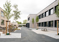
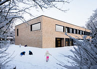
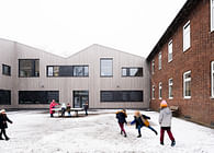
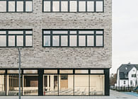
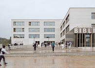
But one thing at a time: The new elementary school Grundschule am Jungfernsee in Potsdam is located in the listed surroundings of the Rote Kaserne (Red Barracks). In order to preserve the visual axes of the historical site, the height of the new building was limited to two storeys and the choice of the clinker façade is based on the monument ensemble.
The Rote Kaserne is not just a direct architectural neighbour but a clear reference for the envelope of the new school.
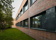
The red colour of the clinker façade built of a water-struck brick with an irregular surface texture is enhanced by red mortar according to the motto "if we do red, then we do it properly". The façade thus appears altogether more homogeneous, yet without losing the shimmering, moving effect typical of brick. Depending on the façade area and the incidence of daylight, there is a subtle interplay of different shades of red, ranging from orange to deep red, and the joint pattern of the bricks laid in wild bond.
Bright and breezy.
Upon entering the new primary school, you step into a foyer flooded with light. The sun casts exciting shadows on the rough concrete walls. Looking through the school canteen, you can see the schoolyard, and next to the lowered gymnasium, long ribbon windows allow views of the outdoor area.
The visual connections ensure for easy orientation inside the building. Everything is visible at first sight. "...the central hall with the generous foyer and staircase area impresses with clarity and openness. The arrangement of the classrooms around the open inner courtyards and the open group rooms that are positioned towards the ends of each wing means that a high degree of flexibility and communication can be expected," states the jury minutes for this competition SEHW has won.
The centrally located spacious hall adjoins the main entrance. This hall serves as the main circulation area and is simultaneously a communication and meeting place for the schoolchildren; in bad weather, it supplements the break areas. From here, all parts of the building can be found quickly and are within easy reach. A multifunctional room adjoins the hall and can be used as a dining room and assembly hall, which merges seamlessly into the green outdoor area of the schoolyard.
On the upper floor, three clusters form the students' home areas. The rooms of each cluster are grouped around an accessible atrium with an attached learning island. The well-lit corridors ensure easy orientation and a pleasant quality of stay. In the centre of the upper floor, there are the teachers' rooms and the library with a media room next to the hall, complemented by common areas for breaks.
A school for everyone
The building concept is based on the step-free accessibility of all levels. In addition to people with physical disabilities, the building was made suitable for use by pupils with sensory impairments by means of an electro-acoustic system and high-contrast design of the circulation areas according to the multi-sense principle. The quality of use for all pupils, both disabled and non-disabled, was taken into consideration, and inclusion also in terms of attention, consideration and support within the community was regarded as a learning objective.
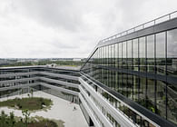
The exterior space is characterised by a high degree of permeability, with flowing transitions between activity and regeneration areas, flexible and multifunctional outdoor spaces, whose uses can also overlap, a close interlocking of interior and exterior areas and the provision of both lesson-related zones and areas of retreat. The three wings of the building figure ensure clear assignments in the outdoor area. To the north, the forecourt is the clearly defined prelude to the building and at the same time a new urban element at this location. The sealing of the outdoor space was limited to the necessary circulation areas.
Colourful accentuation and visibility of materials
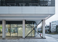
The new building was designed as a reinforced concrete skeleton construction with massive parapet elements and flat floor slabs supported by reinforced concrete columns. In the cantilevered area, the soffits and walls were clad with a dark curtain-type aluminium façade. The design of these areas is thus differentiated from the monolithic brick façade and lets them appear like sections of the volume.
The assembly hall, gymnasium, inner courtyards and atria were finished with post-and-beam façades as thermally separated structures with triple insulation glazing and solar control glazing. The windows are a manufactured in wood-aluminium construction according to the requirements stipulated by the German Energy Savings Ordinance (EnEV). Load-bearing walls and reinforced concrete floor slabs were designed as solid elements to be able to use them as storage masses for thermal building component activation.
The interior is dominated by a vibrant colour scheme and the materials used—fair-faced concrete in the central entrance area, smoothed with white paint in the other areas; ceiling elements made of cement-bonded wood wool; white partition walls; floorings made of mastic asphalt and linoleum—and the specially developed built-in wardrobes and cabinets.
Minimised energy requirements
Heating is supplied via the district heating network of the local utility company. The heating load requirement is minimised by the building envelope based on the passive house standard. The classrooms are equipped with a supporting ventilation system with an optimised air exchange rate of 11m³/h per pupil.
Status: Built
Location: Potsdam, DE
Firm Role: Architectural Designer
