Bolzano, IT | Berlin, DE
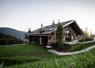
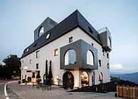
The monumental spaces of a 17th century monastery are brought back to life in Arco, Alto Garda, where noa* has transformed them into a unique hotel, while conserving the charm of the original architecture and its atmosphere of peace and meditation. In the garden, the spa is inspired by certain typical rural constructions, which can be found on the lakes shore.
To restore the majestic power and spiritual dimension of an old monastic centre and make its most distinctive elements the main features of a unique and charming hotel, was the mission pursued by noa* in the project to renovate the Monastery Serve di Maria Addolorata in the centre of Arco, situated at the northern tip of Lake Garda. This noble complex with its’ extensive garden, is encompassed by a high surrounding wall and dates all the way back to the second half of the 17th century. Half of the Monastery building, which also hosts a church and cloister, where nuns continue to live, has been left untouched and in 2020 work on the hotel project began in close collaboration with the Trento Office of Cultural Heritage.
“The majesty and rigour of the architecture, the long corridors, the vaulted ceilings, all of these features combine to give these spaces a real olde-worlde feel”, explains Francesco Padovan, the noa* architect that developed the architectural project.
The noa* project consisted of two main phases:
- The renovation and conversion of the monastery and its interiors into a hotel, achieved by creating common spaces (reception, lobby, breakfast room, bar area and kitchen) on the ground floor with the rooms mainly distributed between the first floor and the loft.
- The development of a new Wellness area within the lush garden: 500 square metres of relaxation rooms, treatment rooms, saunas and a wellness course with steam bath.
These interventions have resulted in a very particular hotel, as architect Padovan highlights:
“A refuge that takes you back in time, closely centred around the history and the particular features of this place. And where every construction choice, every material and detail, has been studied to draw on the majesty of the pre-existing context, exalting it and giving it new life”.
(RE)BIRTH
With its 40 rooms (including 2 suites), the Monastero Arx Vivendi - the name of the new hotel - offers hospitality in full harmony with the spectacular location.
From a design perspective the underlying idea was to maintain the typical monastery architecture, preserving the original design of the internal paths and extending its geometrical rigour to the new volumes, paying close attention to the choice of materials and colours.
“A design philosophy that guided us and helped us maintain the compositional, static and visual clarity that makes a monastery such a special place”, explained architect Padovan.
And that’s not all. The surrounding agricultural landscape also played an important role, inspiring the architecture of the light glass constructions that house the Wellness area and creating a symbiotic relationship between history and the land.
OLD SPACES, NEW FUNCTIONS
Completely enclosed by a 7-metre high boundary wall whose original appearance has been preserved, internally the monastery is distributed across three levels.
“It is a bit of a surprise to discover that the spaces on every floor are structured in very different ways”, observes Padovan. “The concentric spaces of the ground floor contrast with the majestic corridor of the first and then there is the mass of wooden beams in the loft. We paid close attention to this variety of environments, developing solutions that did not alter the various designs but which strengthened their charm and originality”.
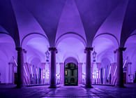
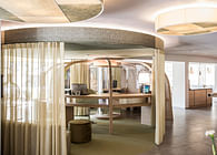
As such, the development of the common spaces on the ground floor emphasised the existing plan of the monastery - located along the central axis is the reception, the breakfast room and a reading room/lounge, all embellished with beautiful rib vault ceilings and surrounded by a long continuous corridor. The bar and kitchen are also situated on the ground floor. A suite with a private garden was also created on this level.
The scenery changes on the first floor where the majestic central corridor is lined by ceiling beams which stretch out to an impressive length of almost 50 metres. Here, the former monastic cells, aligned along the sides, were joined two-by-two to create larger rooms (from 22 to 30 square metres). In this way, in each room one ‘cell’ constitutes the bedroom, while the other hosts the bathroom. The old doors, in light wood, were all conserved on the external side, along the hallway, to maintain the striking spectacle of the entrances that dotted the long corridor. The first floor also offers one suite that was developed from the part of the building that originally hosted the wash rooms and bathrooms.
The second floor is no less striking. A large loft area topped by eye-catching trusses, which host two lines of rooms that open out onto a long central corridor. The restored wooden trusses pay homage to their original function. At the highest point of the roof, a skylight runs right along the length of the ceiling, not only illuminating the corridor but also the rooms thanks to the transom windows.
SALUS PER AQUAM
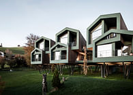
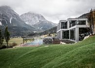
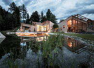
Newly-developed in the monastery garden, the spa consists of seven light glass and metal volumes positioned along a stone spine. The alternation of glass bodies and green courtyards creates an evocative pattern of advanced and set-back volumes.
“When designing this area our aim was to create a dialogue more with the surrounding agricultural landscape than with the monastery, a little too ‘powerful’ in architectural terms”, explains architect Padovan. “To do this we used very simple elements with strong structural clarity. The light metal framework, organised in pillars and beams, is inspired by the characteristic lemon houses of rural Lake Garda”.
The connecting spine - composed of a series of pillars covered in Vicenza stone, whose colours recall the pre-existing structures, and a horizontal architrave in pre-fabricated and sandblasted concrete - echoes the stone pilastrade of the raised channel that runs along the eastern side of the convent.
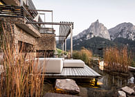
The wellness area includes a first relaxation area with loungers, a treatment area and a second relaxation area facing the ‘biolake’, a pool of natural water with dark blue tints. Next is a third relaxation area in an open gallery in the green courtyards, then the saunas (a bio sauna and a Finnish sauna) and a particular type of hammam or wellness course that revolves around a large heated dark stone.
PLEASANT AUSTERITY
“The design project was guided by our complete respect for the existing architecture. The design was adapted to the austere monastic spaces with tailored solutions, without compromising on comfort, functionality and contemporary aesthetics”, explains interior designer Niccolò Panzani of noa*, who oversaw the interior design project.
The original ceilings and decorations in the common spaces on the ground floor were conserved and restored. The dominant shades are white, grey and black, the historic colours of the monastery.
The concrete floors, are built over the original ones, with the exception of the corridor floor that leads from the main entrance to the internal garden, which maintains its original cotto covering after carefully restored. Following restoration and consolidation work, the walls and vaults were treated to create a rippled antique-effect plaster.
The reception stands out for its large stone desk, covered with granite and illuminated by a ‘shower’ of minimalist hanging lamps. Around it, is just the discreet presence of wrought iron chairs.
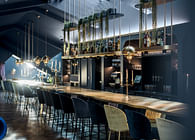
Just as tastefully understated is the large breakfast room, which is dominated by a long central table that recalls the ancient refectory and has smaller tables positioned along the walls. In the bar area and buffet room, a restored well and fireplace have been adapted into buffet islands
On the first floor the majestic central corridor, whose cotto floor has been rebuilt on the basis of the existing floor, has been deliberately left free of furnishings. All of the rooms share a very rigorous design, also in terms of the material choices: floors in hand-planed oak for the bedroom and natural-look tiles for the bathroom. Black has been chosen for the furniture, including that of the bathroom, standing out against the grey of the rooms. Everything is custom-designed, including the metal four-poster beds with black oak inserts.
The rooms in the loft adopt the same style, but with a few extra concessions to modernity - softer colours, padded beds for acoustic comfort and ceramic lamps.
In the wellness area the choice of materials and decor seeks to enhance the warmth and calming atmosphere of the rooms, distinctive for the warm tones of bleached oak, linen-effect textiles and cotton. Inside the spa everything is designed to generate a sense of calm and relaxation - from the milled wood panels that echo the stylised pomegranate design, symbol of the monastery, to the beds suspended like swings and the benches of the bio sauna, which encourage meditation and are reminiscent of a prayer room.
SOPHISTICATED SENSITIVITY
Once again, the architecture of the South Tyrol-based design studio conveys the expressive power common to all noa* projects. Beginning with the strictly artisanal furnishings and the naturalness of the chosen materials, like stone and wood.
“Our attention to detail and custom designs enable us to create unique, exclusive, ad hoc projects for our customers that are never repetitive”, underlines Niccolò Panzani. “But here, the exceptional location also helped shape our choices and restore that sense of peace and tranquillity that the monastery has safeguarded for centuries”.
Status: Built
Location: Arco, TN, Italy
Firm Role: Architects & Interior Designers
