New York, NY
Less than a year after designing the award-winning New York Flagship store for Innisfree, we were engaged once again by the Korean beauty brand to develop a new global retail concept and to create their retail design guidelines. To initiate the process, we traveled to Seoul to conduct interviews with the brand’s executive leadership and to lead a full day workshop with their in-house design team. Continuing our deep immersion into the brand, we explored Jeju Island to experience firsthand the lush volcanic landscape where the ingredients for every Innisfree product originate.
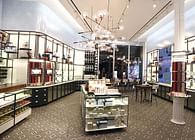
Armed with the findings from this adventure, we created an elevated and experience-driven environment for global implementation in multiple store formats. The biggest challenge facing this effort was the brand’s extensive product line, which can be overwhelming and difficult to navigate. This necessitated the development of a versatile fixture system with integrated wayfinding and a clear hierarchy.
To guide the overall design, we developed the concept of “The New Natural,” a set of principles focused on the creation of a simple and understated space through the deployment of honest and authentic materials, colors, and methods of assembly. This concept came to life in a design inspired by the ceramic workshop.
Inspired by the ubiquitous ceramic vessels that dotted Jeju Island, we took the ceramic workshop as the central point of inspiration for the interior fixtures. Historically, skincare and makeup products were commonly mixed and stored in ceramic containers and much like Innisfree’s products, ceramics are born of the earth and crafted from natural ingredients. The ceramic workshop is where natural earth, rock, and clay are transformed into beautiful functional objects.
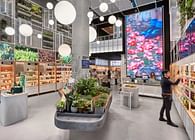
In traditional beauty retail, stock is hidden in closed cabinets; in a bakery or a ceramics studio, everything is on display. This led to the development of a fixture concept that displays the stock instead of hiding it away. Like in a bakery, where goods come fresh out of the oven and cool on the rack, waiting to be put out, browsed, purchased, and eventually consumed. The result is a design that celebrates density but organizes it. Flexible, modular, and endlessly browsable. A hierarchy of highlights break up the monotony.
The customer’s first impression of the store comes at the façade, which is composed of hundreds of custom handmade ceramic tiles, broken up occasionally by the sparkle of integrated lighting. The three dimensional texture of the tiles evoke the natural volcanic rock geometries along the coast of Jeju Island.
Upon entering the store, the customer first encounters the Curation and Promotion Tables, two sculptural forms, which anchor the space and act to introduce new customers to the brand, while drawing the attention of returning customers to new products and current promotions. These tables take direct inspiration from Jeju Island, both in their use of volcanic rock as a material and in form, acting as a literal island in the space to be approached and explored from all sides.
Inspired by traditional Korean Onggi pots, custom ceramic pendant lights are arrayed throughout the space on a grid below an open ceiling. Giving the effect of being in a simple, utilitarian space, as in a ceramic workshop, while the pendants themselves give an elevated effect due to their materiality and rich brown color.
Throughout the space, each of the custom tables and fixtures take cues from traditional workshop furniture. The washbasin is inspired by the utilitarian workshop sink with its deep wide basin and approach from multiple sides. Highlight fixtures throughout are inspired by the artist’s easel. Display tables are inspired by the classic temporary board over sawhorse tables of the woodshop. Movable storage cabinets sit on wheels under these tables.
As the customer continues into the space, they pass through the Skincare section of the store, which is clearly defined through color-coded wayfinding signals, and arrive at the Jeju Lounge, a flexible zone that can be used for classes and events or for more casual independent exploration of the brand and its products. Anchored by a full height three-dimensional digital screen, the space is occupied by modular furniture that can easily be rearranged to fit the desired use.
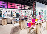
Turning the corner, the customer enters the Make-Up section of the store, which is visually dominated by the My Palette Wall, a full wall composed of product displays surrounded on all sides by a grid of ceramic tile inspired in color by the natural range of skin tones. The pixelated effect also mimics the product packaging which allows the customer to pick and choose a selection of colors that fit their preference.
Status: Built
Location: Gangnam-gu, Seoul, South Korea
Firm Role: Architect


