San Francisco, CA
The owners wanted to make a few updates that would open and brighten up the off-white and tan, dated and dingy interiors. They desired a more open space for their young kids to play and the whole family to hang out in. They also wanted to refresh the house to make it seem new and ready for a new generation to live in.
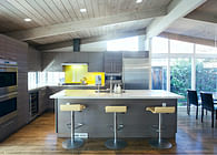
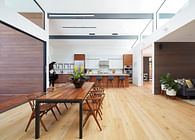
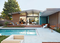
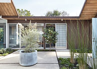
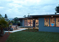
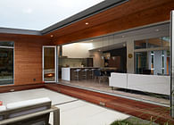
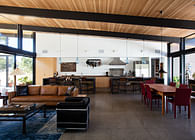
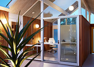
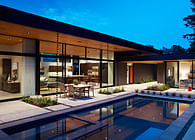
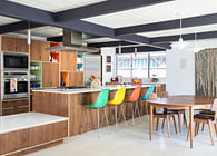
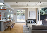
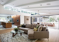
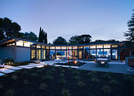
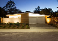
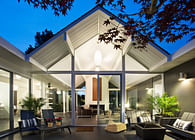
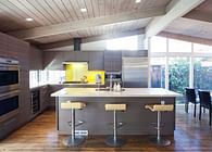
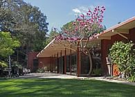
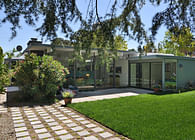
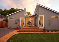
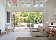
Many Eichler houses have been remarkably well preserved over the years, but this house was not one of the well-preserved specimens. The house was originally an atrium model Eichler, but the atrium had been filled in by a previous owner. They did a partial job, leaving the exterior doors and windows and walls in place around the enclosed atrium, so the layout was chopped up. We removed the glass doors and solid walls separating the enclosed atrium from the kitchen and living room to create one large great room space, and re-arranged the kitchen in the process. We used alignments and a clean, simple approach to achieve a calm and logical layout. Materials flow around the great room space to give an integrated feeling of the space. Some structural posts needed to remain to hold up the roof, but overall the space was opened up almost completely. The floor in the former atrium was leveled, and the plan freed up. While some families may desire separated spaces, for a family who wants to spend time together, this was the approach that worked.
In addition to combining the rooms, we freshened up the whole interior with new brighter paint and light wood flooring. The owners really wanted a fresh, bright, gallery-style space. They have artwork and furniture that provides color and interest against the neutral background. Lighter colors bounce light around and make the space feel larger and more open. The owners kept the ceiling boards and beams in the original Eichler style, and opted for white finishes and new appliances, cabinets and Caesarstone counters that pushed the bright vibe. The brightly painted space was brighter and cheerier, even though we didn’t add any doors or windows to the house. With the sunlight coming in, the space feels light and airy and warm.
Status: Built
Location: Mountain View, CA, US
Firm Role: Architect
Additional Credits: Klopf Architecture Project Team: John Klopf, AIA, and Angela Todorova
Contractor: Flegels Construction
Photography © 2014 Mariko Reed
Location: Mountian View, CA
Year completed: 2013
