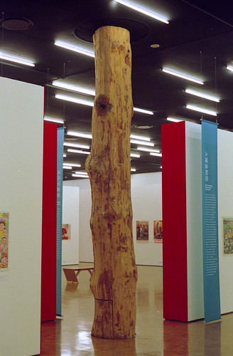
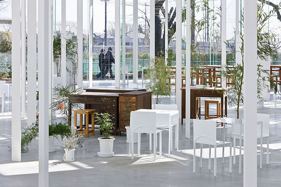
Hi in my studio im looking at the generic space, and how elements architectural elements such as the column can affect the way space is used. I started looking at Mies cruciform column as reductive element that generates different spaces, do any of you guys know any other great column designs that start enganging and producing the spaces they inhabit? Many thanks!
i'm a big fan of concrete columns made with soft forms, allowing the slumping of the concrete as it falls into place and solidifies to make the formal expression of the thing. don't recall any names right away, but there have been a few people experimenting with this, trying to work out the right form practices and the right balance of control/accident.
You might try looking at the 2 columns in Shim-Sutcliffe's Laneway House or those in Patkau Architects Barnes House, however, these examples aren't really generic spaces.
probably my favorite piece of modern architecture is corbusier's weber pavillion in zurich. of course you can't miss the structural expression of the superstructure, but i've always been more fascinated by the detailing of the little box underneath it. it similarly uses joined angles for both structure and window/panel frame details. i'm not sure it's quite what you are looking for, but i like to bring it up whenever i get a chance.
Junya Ishigami's KAIT workshop building uses over 300 uniquely sized columns to create rather loose boundaries of space; some are cast into the floor to support the roof and others are hung from the ceiling and tied to prevent lateral loads/ provide earthquake stability.
Don't forget the world trade center twin towers. The innovative curtainwall eliminated the need for interior columns of any kind.
The design didn't stand up to additional live load scrutiny though.
SOM pretty much invented the tube-frame structural system that has been in use since the '60's. All of the tube design variations greatly reduce the need for interior columns (not counting the core).
I was looking for something else and jumped into this columns solution that could remind also of Zaha Hadid or Rem Koolhaas Villa dall'Ava.
The picture instead is a house by Fernando Maculan and Pedro Morais near Belo Horizonte in Brazil.
I wanted to show you instead the steel columns used in Brazil in the 60s where the top part splits into two sections. You also have the very sculptural columns designed by Niemeyer
Mies Cruciform column, any others?
Hi in my studio im looking at the generic space, and how elements architectural elements such as the column can affect the way space is used. I started looking at Mies cruciform column as reductive element that generates different spaces, do any of you guys know any other great column designs that start enganging and producing the spaces they inhabit? Many thanks!
i'm a big fan of concrete columns made with soft forms, allowing the slumping of the concrete as it falls into place and solidifies to make the formal expression of the thing. don't recall any names right away, but there have been a few people experimenting with this, trying to work out the right form practices and the right balance of control/accident.
You might try looking at the 2 columns in Shim-Sutcliffe's Laneway House or those in Patkau Architects Barnes House, however, these examples aren't really generic spaces.
probably my favorite piece of modern architecture is corbusier's weber pavillion in zurich. of course you can't miss the structural expression of the superstructure, but i've always been more fascinated by the detailing of the little box underneath it. it similarly uses joined angles for both structure and window/panel frame details. i'm not sure it's quite what you are looking for, but i like to bring it up whenever i get a chance.


Kunstmuseum Bonn, by Axel Schultes
you may also want to look at ed ford's details of modern architecture for isometric drawings of the weber pavillion and other good examples.
study the ancient egyptian papyrus columns at karnak (respect!)
Steven, I'm surprised you like the bulgy sumpy concrete column work! I love it.
Names for that type of work: Mark West and Kenzo Unno, both via CAST, the University of Manitoba's Centre for Architectural Structures and Technology.
Antonio Gaudi's columns look them up.
Don't forget Minoan "upside-down" top-heavy columns.
Ito's Sendai Mediatheque
koolhaas' tree column at the kunsthal rotterdam...


wright's mushroom columns at the johnson wax administration building...
Don't forget architectural columns.
speaking of corb and cruciform 'columns', plan voisin:

Junya Ishigami's KAIT workshop building uses over 300 uniquely sized columns to create rather loose boundaries of space; some are cast into the floor to support the roof and others are hung from the ceiling and tied to prevent lateral loads/ provide earthquake stability.


Don't forget the world trade center twin towers. The innovative curtainwall eliminated the need for interior columns of any kind.
The design didn't stand up to additional live load scrutiny though.
SOM pretty much invented the tube-frame structural system that has been in use since the '60's. All of the tube design variations greatly reduce the need for interior columns (not counting the core).
I was looking for something else and jumped into this columns solution that could remind also of Zaha Hadid or Rem Koolhaas Villa dall'Ava.
The picture instead is a house by Fernando Maculan and Pedro Morais near Belo Horizonte in Brazil.
I wanted to show you instead the steel columns used in Brazil in the 60s where the top part splits into two sections. You also have the very sculptural columns designed by Niemeyer
Greetings
Smiljan Radic
or - here's a better one

Not so well known in US, British Architect -John Outram
Giant order..iconography, Kahn, services in column.
http://www.johnoutram.com/plarge/jrobr.html
Block this user
Are you sure you want to block this user and hide all related comments throughout the site?
Archinect
This is your first comment on Archinect. Your comment will be visible once approved.