Raleigh, NC
Location: Cameron Park, Raleigh, North Carolina
The project involved designing a modern, 1500-square-foot addition for a two-story, red brick, Georgian Revival-style house built in 1916 in a historic inner-city neighborhood with narrow lots and minimal set-backs between houses. The addition would become the primary hub of activity for a growing family and an ideal space for entertaining. Programmatically, it would include an open kitchen, dining, living area and a spacious master bedroom suite.
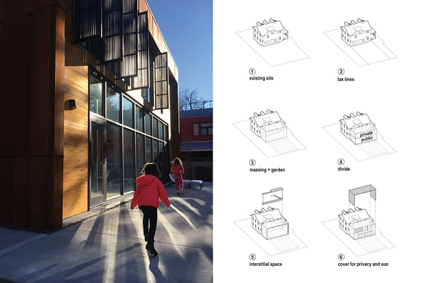
To uphold the general scale of this neighborhood and the manner in which the existing house has addressed the street for over 100 years, the addition’s mass is held within the outer planes of the old house, tucked against its rear elevation.
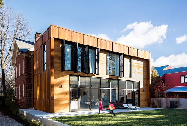
And unlike other proposals the owners had seen, the plan divided the public and private spaces between two stories rather than letting the new construction consume the majority of the property. As a result, the architects retained a generous backyard for outdoor play space.
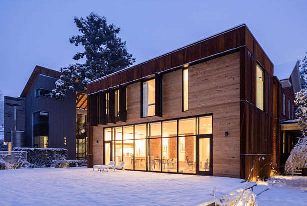
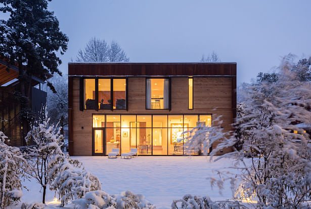
For the exterior walls, the architects chose Corten® steel because it is as durable as the old house’s brick veneer and it relates to its color tones. The natural wood siding at the rear elevation adds an element of warmth to the rugged steel, similar to the way in which the old house’s white wood trim creates softer edges against the brick.
How the existing house and the new construction linked together structurally presented the challenge. During design development, a sectional opportunity presented itself that would avoid a head-on collision between the old gabled roof and the addition’s flat one, and between the differing floor and ceiling heights: a slender, double-height interstitial space between the two structures.
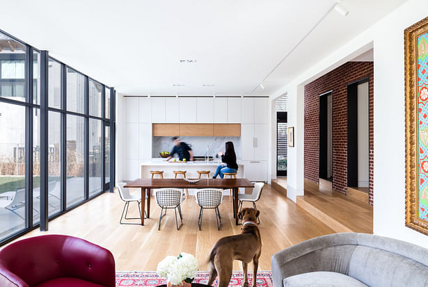
This innovative solution let the rooflines retain their individual character, created a gentle transition between floor and ceiling heights, and left the rear brick wall of the old house, windows included, intact. The brick provides a compelling textural contrast to the smooth white walls of the addition.
This double-height space marks the moment when the existing structure ends and new construction begins. To punctuate this moment, two tall, slim windows appear like exclamation points on either end of the space, letting sunlight spill through.
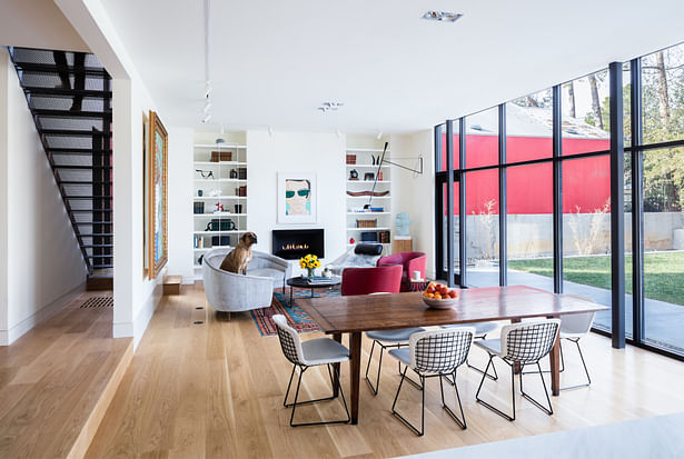
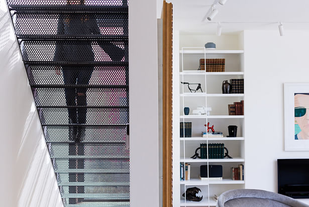
This transitional space was the logical location for an additional staircase at the back of the now-enlarged house (the original main staircase is located just inside the front door), which leads directly to the master suite on the second floor. To continue the transparency established in the addition, a local artisan fabricated a black perforated-metal staircase. A low glass wall fronts the landing.
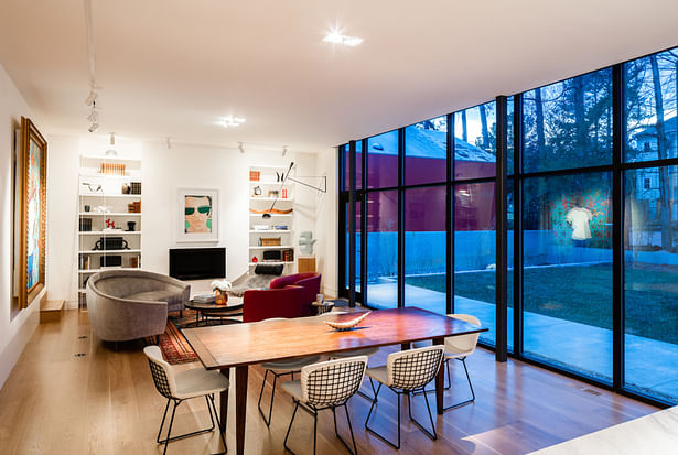
As with all traditional homes from its period, the 1916 house is a series of rooms whose purposes are contained within four walls. In contrast, the addition is a series of open spaces where functionality flows seamlessly from one into the other. Anchored on one end by the couple’s new minimalist kitchen and on the other by a fireplace between built-in display shelves, furniture placement alone defines the living and dining areas. Unimpeded by walls, natural light fills the entire space.
Directly above the “public” living/dining/kitchen on the first floor is the spacious, sun-lit master suite. Outside the master suite, adjustable louvered “fins” across the glazing protect the interior from uncomfortable glare.
A New Narrative
The addition responds to the intent of the old house and builds upon its existing narrative of family, heritage, fine taste, and social grace, Simultaneously, it introduces an entirely new narrative that tells the story of a more open, relaxed lifestyle with 21st-century amenities and attention to energy efficiency. Both narratives are articulated through materiality (brick and steel), form (a historic foursquare box and a simple, modern, rectilinear appendage), and spatial relationships created through floorplan.
As a result, the residence has been reinvented into a home that embraces casual, modern living without having to sacrifice any of the charm and character of the historic house.
And within the old, established neighborhood, the old house's venerable brick façade still greets the street as it has for 100 years, while the view from the mid-block alleyway behind the house reveals an unexpected expanse of rust-colored steel, natural wood, and glass.
Status: Built
Location: Raleigh, NC, US
Firm Role: Architect
Additional Credits: General contractor: Laney Brothers
Structural engineer: Kaydos-Daniels Engineers
Landscape designer: Bland Landscaping
Interior design: Sam Adams Project LLC
Custom casework: Dopko Cabinetry & Rosewood
Metal fabrication: Tactile Workshop
Photography © Keith Isaacs
All drawings and diagrams by Tonic Design
