Seattle, WA
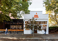
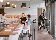
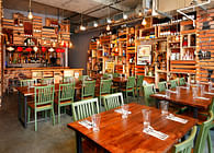
As it entered a new decade under new ownership, the beloved neighborhood Italian restaurant, Serafina, was in need of a refresh. Founded nearly 30 years ago, the restaurant has always aimed to echo the welcoming embrace of an Italian home, and had done so incredibly successfully, building a family of devoted regulars and eager first-timers. Best Practice created an updated space that felt exciting to newcomers and yet familiar to those who had grown to love the Seattle staple.
The design team began with the color palette –a refreshed version of the “Serafina red and green”– and updated the restaurant with new paint on virtually every surface. Along with color, Best Practice designed custom brass features that assisted in dividing up the large and disjointed space: a dark and moody bar in mostly black, a romantic dining room painted a mellow red, and a connecting solarium dining space painted a muted green.
Status: Built
Location: Seattle, WA, US
Firm Role: Designer
Additional Credits: Contractor - Choice Construction
Collaborators - Pillow Studios
Photography - Rafael Soldi
