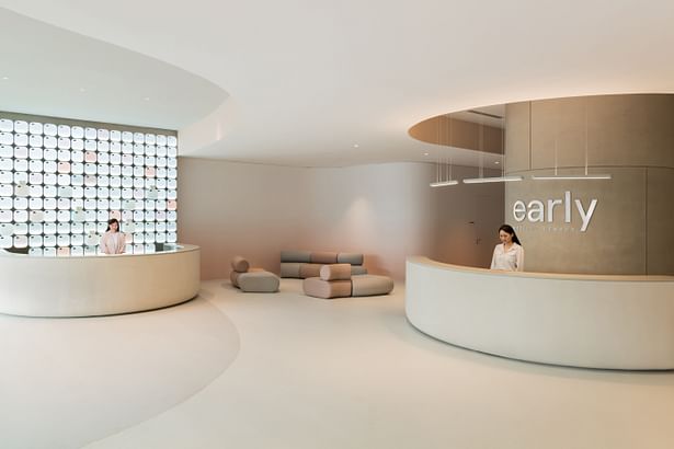

Studio Antimatter recently completed the design of Early Medical Centre, which officially opened its doors to the public in October 2022.
A project unlike any other we had attempted before, we sought to address the emotions and psychology around health screening. How can we create an environment of calmness and empowerment instead of apprehension and resignation? How can we encourage people to take control of their future through early detection and preventive healthcare via design thinking?
The answer was to design Early with the client at the heart. Our approach was informed by research into spatial and user experience by FARM, who also created the branding for the centre.
Conscious attention was paid to attenuating the anxiety people feel in healthcare settings, resulting in interiors that are replete with soothing elements such as gentle gradients, ambient lighting, sinuous lines, and bespoke furniture in soft, comfortable forms.
The design of Early Medical Centre is the synthesis of two essential elements: a client journey and a space. The journey is a discrete set of encounters, tests, and consultations designed in sequence to reveal a client’s health baseline. The space was a large, empty, rectangular unit broken only by a large set of central structural columns. Taking advantage of this spatial constraint, the centre was organised so that the client would move around the columns in a circular progression. Rejecting the claustrophobic corridors and spatial divisions of traditional medical facilities, client flow and circulatory experience were prioritised, walkways were generously sized, and auxiliary functions built around the central columns while medical programs line the space’s periphery.
Rounded corners and seamless surfaces complement this circulation. A gentle peach gradient climbs up the walls, evoking a sunrise and highlighting the smooth lines in the space. Notably, the dominant central column takes on a capsule shape. The capsule avoids the hard lines and sterility of typical medical spaces while eschewing overly-organic forms. It is both comforting and serious, light and solid. Throughout the space, this formal motif is employed at various scales, creating experiential continuity and a sensual satisfaction that awakens the mind and invites interaction.
The front half of the space is left as open as possible to permit flexible programming and reflect the transparency of Early’s mission. Instead of using partition walls or dividers to separate its programmatic elements, full-height cove ceilings together with sinuous lines in the flooring and dynamic lighting subtly zone each space. Custom designed furniture, including modular lounge seating, privacy chairs, and phlebotomy pods paired with matching nursing trollies are spread throughout the space. For each custom healthcare furniture element, great care was taken to ensure proper ergonomics, hygiene, and privacy while remaining mobile and compact enough to permit a full view of the space from any angle.
Materials selection was made with careful attention to sanitary and durability requirements, prioritising honesty of materials with respect to form and function without feeling overly clinical. This was accomplished through material, colour, and formal choices that destabilise expectations of a traditional medical facility.
A monochrome palette is disrupted by salmon coloured soffits and wallpaper to highlight the curves of the space, and stone accents provide a soothing texture at points of client-staff interaction. Once inside the consultation rooms, muted colour combinations and natural stone countertops provide a tranquil environment.
Before leaving, the client will likely stop by the most notable visual feature of Early: the pharmacy. Positioned to the left of the entrance, a grid of glowing drawers climbs towards the ceiling. Despite their unusual materiality, the drawers of Early’s pharmacy are actually inspired by traditional Chinese medicine hall cabinets, a subtle reference to the practice’s focus on proactive, as opposed to reactive, treatment. Using subtle colouring and gently curved drawer fronts, the pharmacy has a monolithic and compelling quality that draws attention and continued engagement.
Having travelled a full circle through the space, the client can re-enter the world better informed and ready to take their health into their own hands.
Early Medical Centre (completed in 2022)
- Located at: 2 Science Park Drive #01-19/22, Singapore 118222
- Area: 5500 square feet
About Studio Antimatter
Studio Antimatter is a spatial design agency founded by furniture designer and creative director Gabriel Tan in 2016. Combining the disciplines of interior design, furniture and lighting design, art curation and styling, materiality, tactility, warmth and clarity are some of the qualities we strive for in our projects. For us, furniture, light, objects and spaces are inherently connected, and are simultaneously considered during the design process. This results in spatial experiences that are sensorial and emotional.
About Early Medical Centre
Early Medical Centre brings together reputable doctors and leading independent wellness practitioners all under one roof, taking preventive care closer to the heart of everyday life. Early is powered by MiRXES, a Singapore-headquartered biotechnology company that translates research discoveries to deliver world-leading multi-cancer early detection. MiRXES has research, development, manufacturing, and clinical diagnostic operations in Singapore, USA, Japan, and China, as well as sales and distribution networks worldwide.
Status: Built
Location: Singapore, SG
Firm Role: Interior Architect