
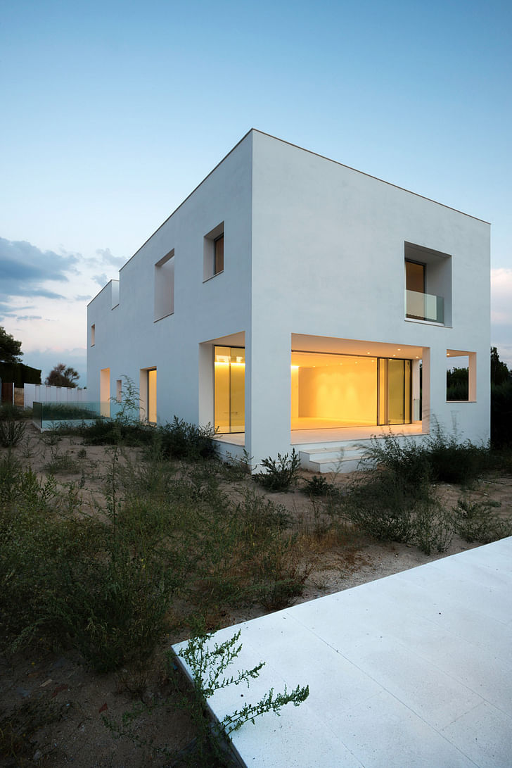
Bojaus Arquitectura’s Casa H is a modernist white cube, but it’s also not what you think it is. The cube is sometimes interpreted as a reflex towards neutrality, to get the spaces and the inhabitants within to speak for themselves. But Casa H isn’t arbitrarily a white cube; it’s the logically resulting form of rationalist, as well as aesthetic, concerns.
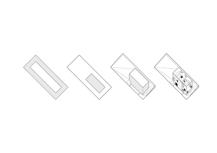
Casa H's form may not look naturalistic, but its relationship to the landscape is elemental -- even if that landscape is Madrid’s suburbia. The volume of the house takes into account all of the local housing regulations first, forming that white box, and then approaches personal interests like large windows that still preserve privacy, and multiple patios. Imagine it as an alternative suburban typology.
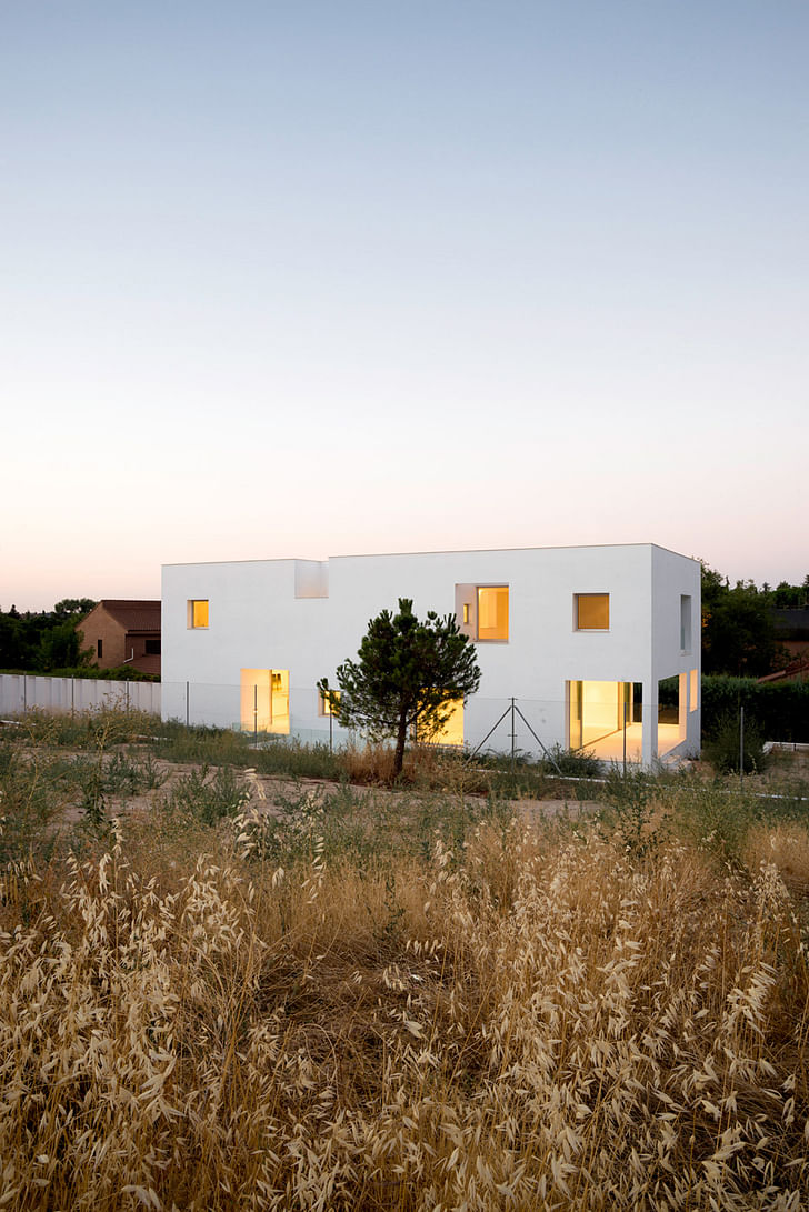
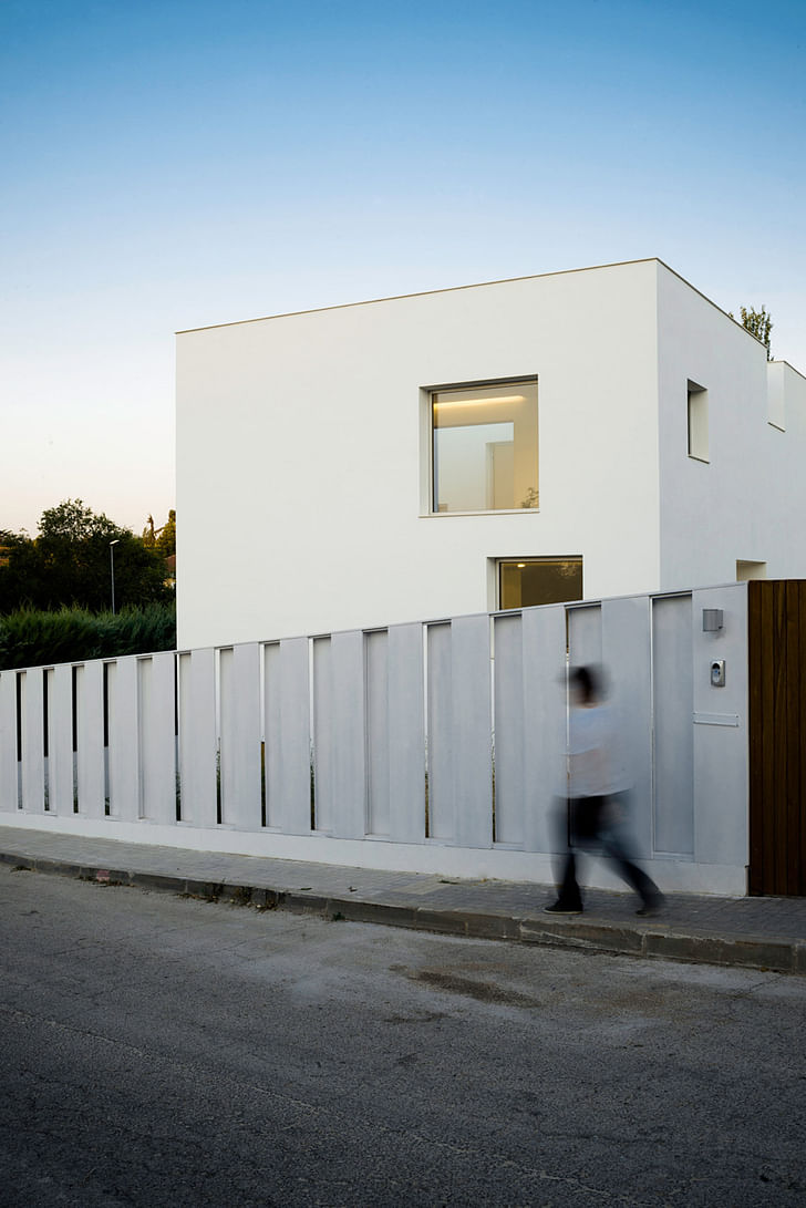
Casa H’s project description, courtesy of Bojaus Arquitectura, is as follows:
House H is located in a typical suburban area near Madrid, where the houses in small individual plots are often too close to each other. In this situation the challenge was to combine certain degree of privacy with the desire of opening big windows and merging interior and exterior in a continuous space flood by natural light.
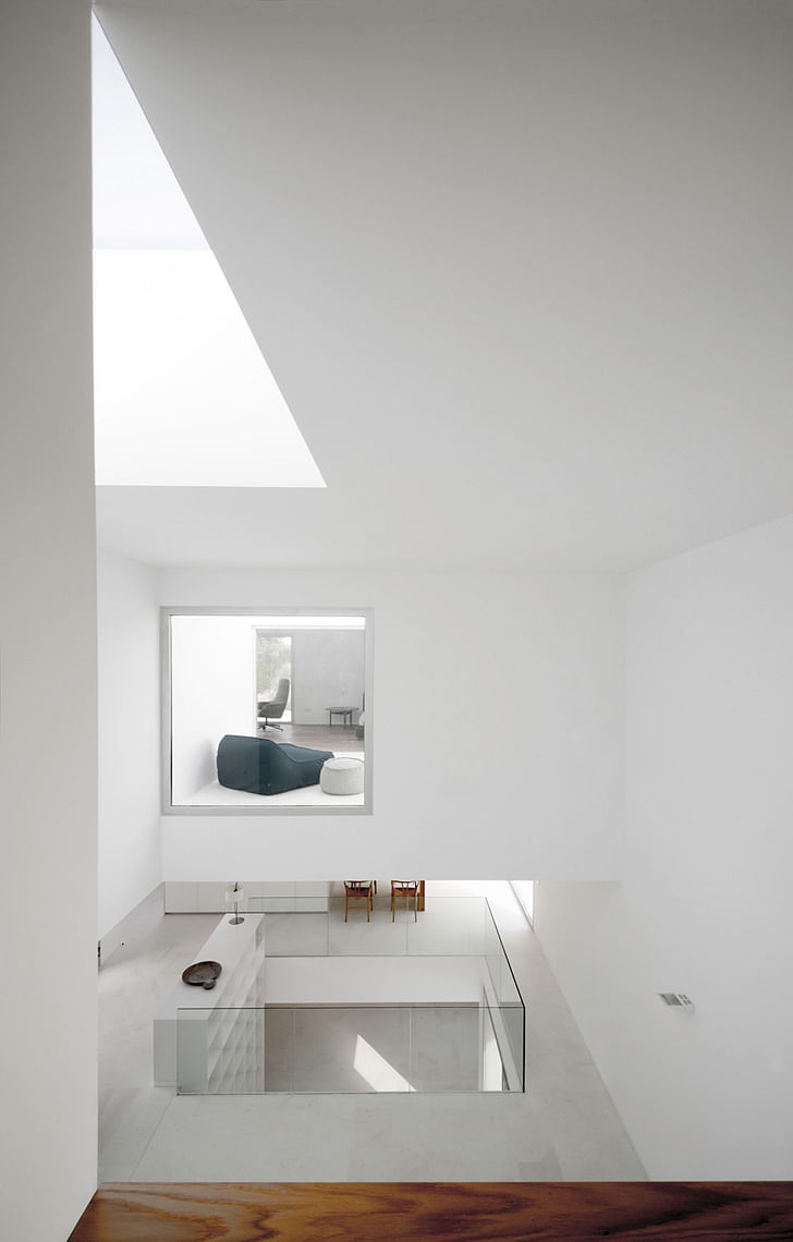
The proximity of the houses that surround the plot lead us to develop a system of voids, deep windows and patios which would allow these large openings without neglecting the equally important need of privacy.
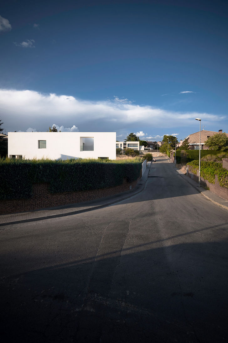
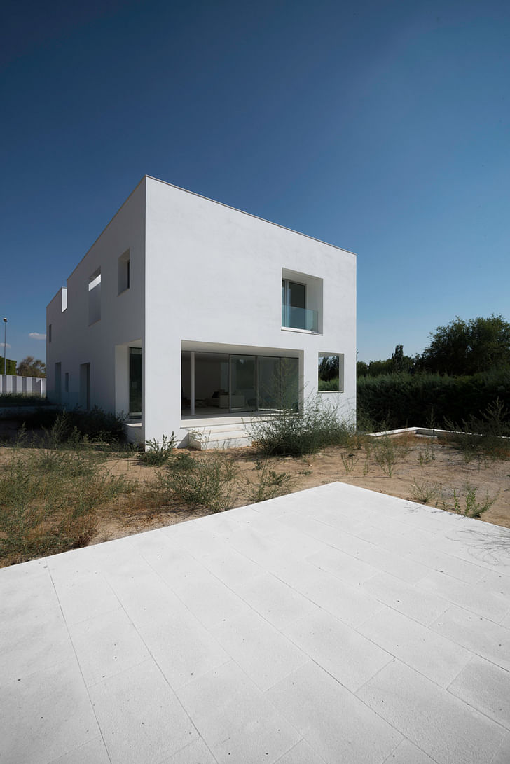
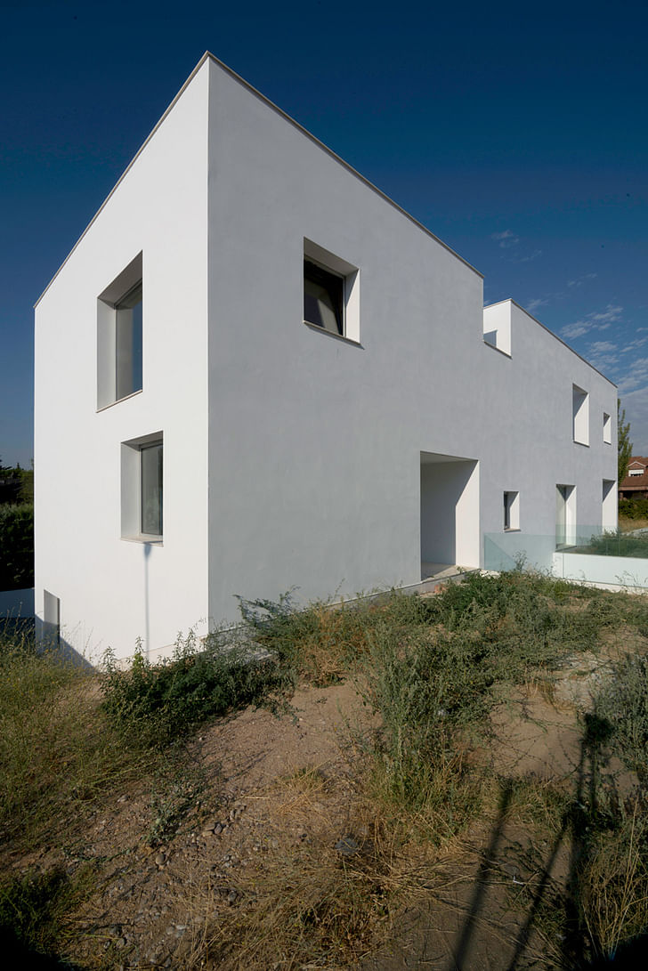
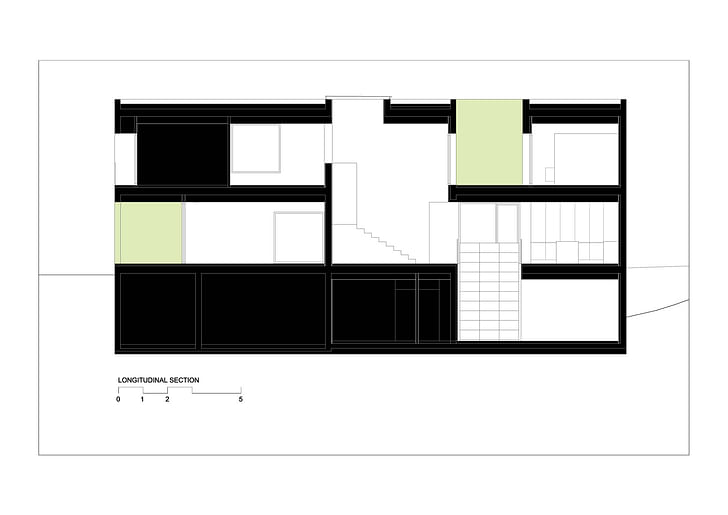
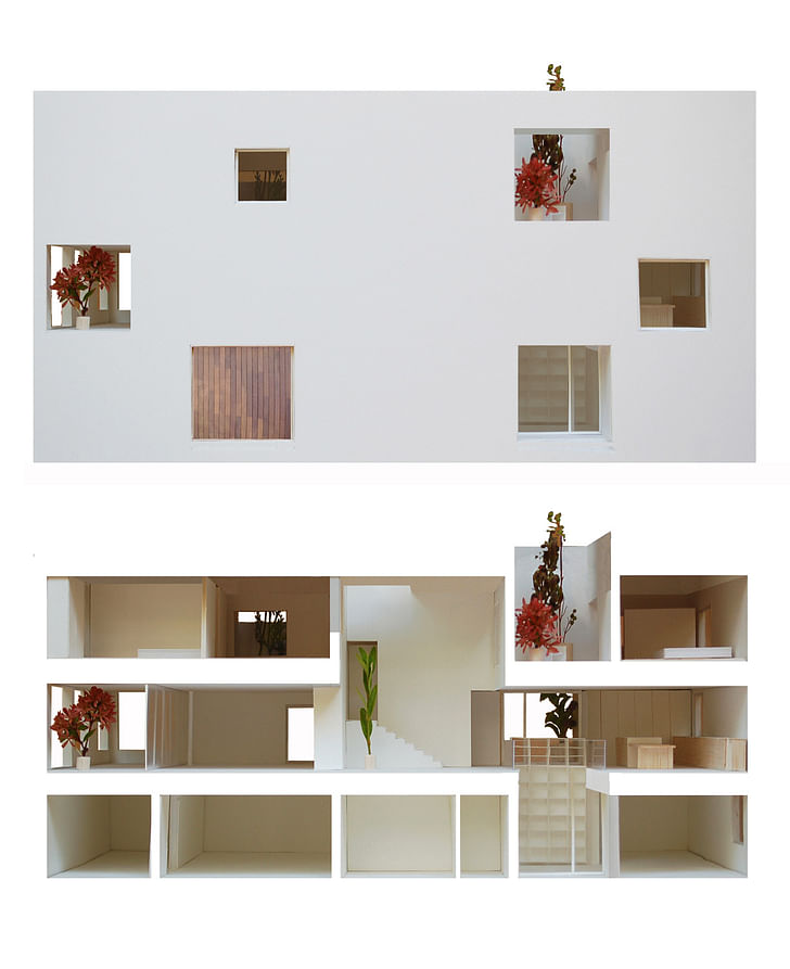
The volume is the result of the strict application of local urban regulations: maximum occupation, perimeter definition, alignments, maximum height... Then, we subtract the voids, porches and patios, to this maximum volume in order to accomplish the FAR (floor area ratio). The result is a pure simple prism (20x9x9 meters) drilled by big hollow voids which generate the interior space.
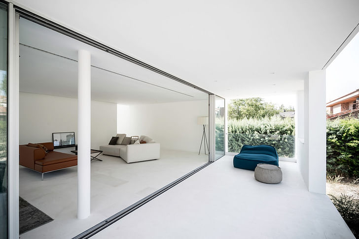
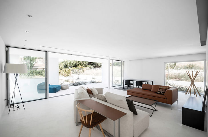
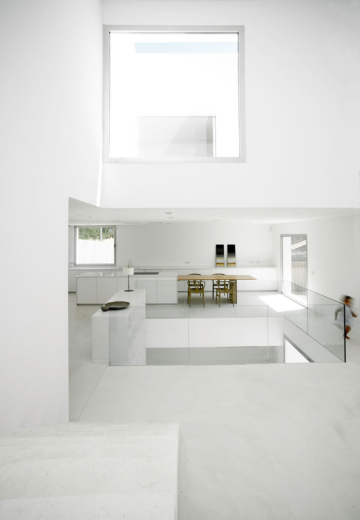
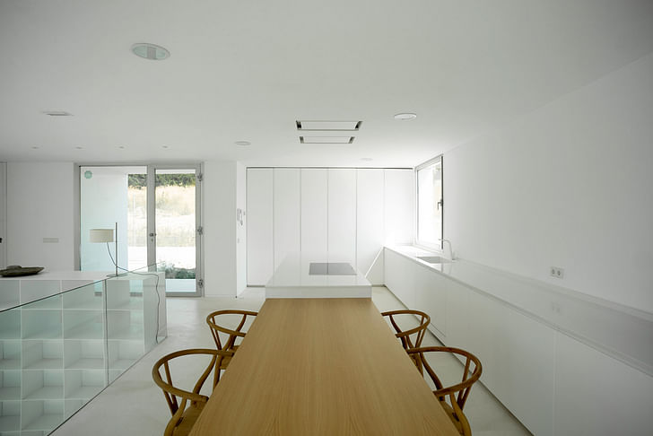
The main space in H House is an interior patio which, apart from connecting the diverse levels by the stair, organizes all the different rooms. The small pieces, bathrooms, closets, storage, toilet... are aligned in the north facade, building a thick wall with a high level of isolation. At the same time this layout reduces the length of the main beams simplifying the structure of the house and assisting the free organization of the principal spaces. All of them are related to each other visually through patios and voids, as it can be observed in the longitudinal section.
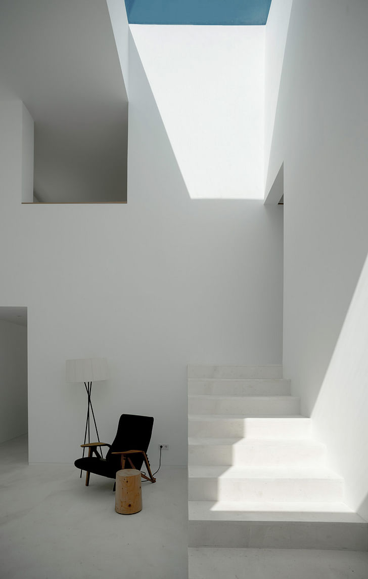
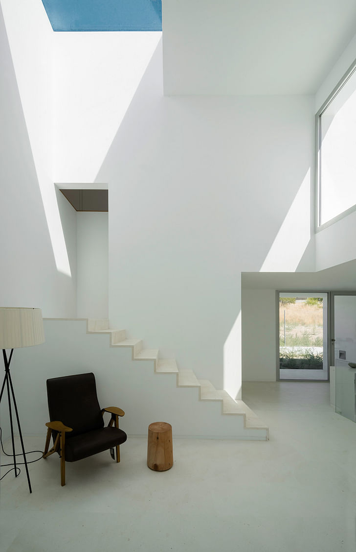
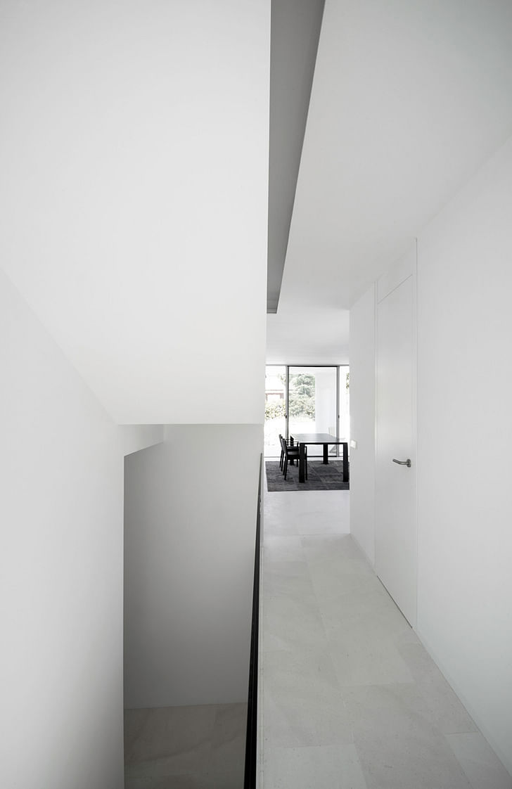
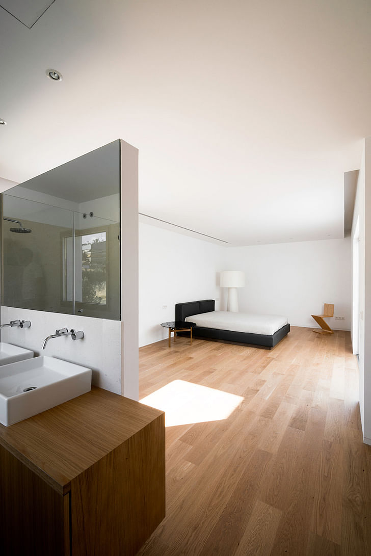
The program planned by the client was the typical on a traditional house of this characteristics. Nevertheless the conception of the different spaces demanded by the client and the relationship between them aspire to a freer layout where a more open and ambiguous functional scheme could be developed. the structural layout defines a cross banded scheme of fixed dimensions where the main spaces, living, kitchen, main bedroom, studio, secondary bedrooms group... are equivalent and interchangeable depending on the user’s needs.
Project Details:
Webpage: www.bojaus.com
ShowCase is an on-going feature series on Archinect, presenting exciting new work from designers representing all creative fields and all geographies.
We are always accepting nominations for upcoming ShowCase features - if you would like to suggest a project, please send us a message.
Former Managing Editor and Podcast Co-Producer for Archinect. I write, go to the movies, walk around and listen to the radio. My interests revolve around cognitive urban theory, psycholinguistics and food.Currently freelancing. Be in touch through longhyphen@gmail.com
No Comments
Block this user
Are you sure you want to block this user and hide all related comments throughout the site?
Archinect
This is your first comment on Archinect. Your comment will be visible once approved.