

From modernist icons to makeshift housing, Alison Moffett's incredible large-scale drawings share an architectural melancholy, exploring themes of contamination and entropy, idealized structures intersecting with the base elements of shelter. Archinect stopped by the studio of this London-based artist to learn more about the evolution of her work.
Your subjects explore these forces of nature run amok on buildings, whether simple shelters or modernist icons. Are your drawings - or is your process - subject to these same forces, or does the act of drawing give you a sort of control that doesn't exist in the built environment?
I think the drawings, not really the process, are chaotic. There are surprises, of course, which is always a good thing, but I am very much in control - and you can get away with mixing 2d and 3d spatially in drawing on a single plane.
What determines the drawing scale?
In the beginning, drawing in the scale 1:1 was very important to me -- to have the same scale as the person looking at the drawing, so that it's another world on the other side of the drawing plane.
Recently there was a smaller series of blocks that I drew 1:1 which were modeled after some diagrams my architect dad had made about permutations of form - blocks shifting across space in different directions. They were drawn lifesize - and then I scanned them with a 3d scanner so they became just the skin of the block - and then drew the scans superimposed on the original drawings of blocks. It's like having two different realities of the block on top one another, peeling away 2d information moving into another dimension of their own being. I don't think anybody got it! They were probably the least pictorial, most theoretical works I'd done, and so people had less patience for it.
Were your parents engagement with architecture early influences?
Yes, my dad is a practicing architect and my mom was a professor in architectural history. My mom's focus was Medieval architecture, later on specializing in wooden vernacular architecture in Poland and Russia. Supposedly, when they built the house I grew up in, she wanted vaulted ceilings and tiled floors, which my modernist dad couldn't handle.
Did you ever consider studying architecture?
No. Definitely not. My grandmother was an architect - she graduated from Auburn in 1937 and was the first female architect in the Southeast. She first studied physics and wanted to be an engineer - but that wasn't really an option for women at that time, so architecture was the closest she could get. My grandmother, my great aunt and uncle, my mother, my father - it just seemed like too many architects!
So were architectural themes always present in your work?
When I graduated from the Slade I was making large-scale 1:1 drawings - I wanted them to be unsettling, but I was frustrated - they were too emotional and feminine, based in fairytales, like people falling through the rabbit-hole of Alice and Wonderland.
I went home and started sketching my house, which was so much more dynamic and interesting to me. From these sketches I started making large scale drawings that took months -- my body of work for the year would be two drawings. The first one I made was called "Eco-House" in which all the laws of physics had broken down. The house was loosely based on contemporary eco-friendly house design, it was sort of tongue-in-cheek about eco-design trends and the forces of nature.
eco house ii
graphite on paper, 2006
What was your process? Did the drawings evolve over those months or was it a task of executing an initial vision?
I had a sketch I made up of the general building structure - and some sense that there needed to be cut-out pieces and debris, but it evolved over time. But drawings aren't like paintings - you can't just paint over another layer - you can erase them, but never completely.
Where did your work go next?
The next large drawing was about Chernobyl. I was looking at disaster sites and how major industry and hydroelectric power stations were these design symbols of the future, while the workers housing were these modernist tracts of housing blocks. Vulnerable under the leaking dams, the workers housing no longer represented a hopeful future. I made the drawing from the viewpoint of a modernist interior with this giant Chernobyl control panel and indigenous Ukrainian shed all intersected together. The title - "There is no return, farewell" - was found written in Cyrillic on a blackboard in Pripyat.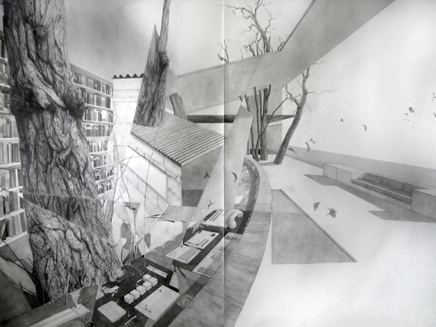
there's no return, farewell
graphite on paper, 225 x 300cm 2006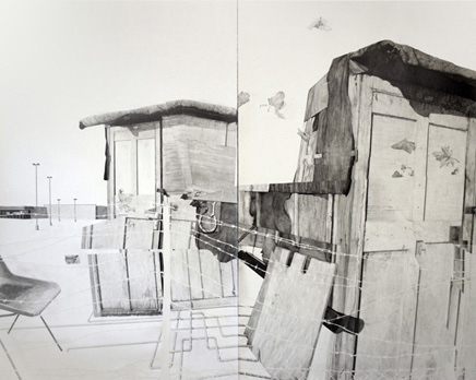
quarantine 2
graphite and collage on paper, 213 x 280cm 2008
Later on I drew iconic modernist houses on the moon - as journeying to the moon represented this same sort of futurist, Utopian view. But at the same time in history, there was the making of the atomic bomb and a choice between hope or complete annihilation. I found these terrible yet beautiful images of houses built to test the bomb. They were fast photographs: a still house, a huge black shadow, a bright light, and then a melted house. In the moon there's no atmosphere, so it has that same black shadow all the time.
domino house, le corbusier
graphite and ink on paper, 23 x 21cm 2008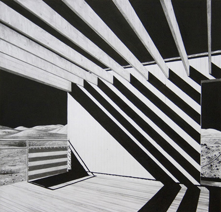
gropius house, walter gropius
graphite and ink on paper, 23 x 21cm 2008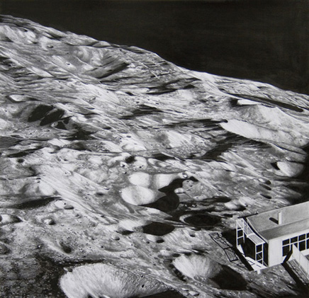
post-war housing, I.m. pei
graphite and ink on paper, 23 x 21cm 2008
That shed in your Chernobyl drawing has re-emerged in your recent work.
I started thinking about architecture boiled down to the basest thing - the universal idea of shelter. Shanty towns, garden sheds, allotment sheds, those little huts people fish out of - one room constructions that keeps the rain out.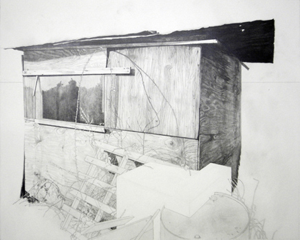
site no.14
graphite on paper, 36x45 cm 2009
site no.21
graphite on paper, 36x45 cm 2009
What were your references for the sheds?
I went to an allotment in NE London - it was very difficult to get in. I asked all these people with allotments and they all said no - they had major fences around them. I was trying to explain I'm just this girl that wants to take pictures, take nothing away - but they had had people break in and destroy things in the past. In the end I did manage to find one nice enough to trust me and got some very useful pictures.
site no.23
graphite on paper, 36x45 cm 2009
And now it seems like you've started working into those idiosyncratic details of the shed - the scrap, the debris.
I'm working on my second chicken wire landscape, which sounds a little silly, but I hope it isn't. Making them is honestly really boring, and very fiddly. The wire folds over itself to make mountains, becoming quite technical. I also made a sculpture with my partner Chris: two layers of chicken wire in a perspex box - two landscapes undulating but exactly the same, one painted white. The base of the box was black and shiny and reflected it once again. It was very challenging to make - and I loved it! The sculptures are deceptively simple looking compared with the drawings, but are much more consuming in many ways - it really was just two sheets of chicken wire but the process of making them was quite challenging. I like the idea nothing escapes the drawings but the simplest form which has managed to come into the third dimension.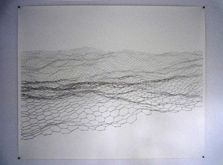
landscape 01
graphite on paper, 2009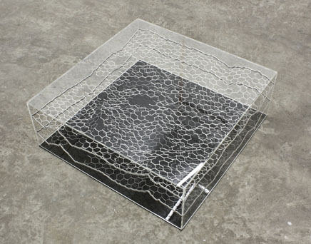
VASTITAS BOREALIS, AZ: 344 (W), EL: -27 (in collaboration with Chris Cornish )
perspex, steel, chicken wire, paint, 75cm x 75cm x 25cm 2009
You're now going back to academia to study architectural history. How do you think your drawings will evolve through this lens?
Well, I am hoping to go back to academia - that's the plan anyway. At the moment, it is just me, reading and looking at stuff. It would be nice to discuss what I am thinking, have more of a focus. But I've also started to shift the scale - the moon drawings were actually the smallest ones I did and I have been working smaller lately. The larger drawings can take months and while I love them its nice to be able to work through ideas faster, especially as the "research" becomes more solidified in writing.
Creative Commons License
This work is licensed under a Creative Commons License .
/Creative Commons License
2 Comments
I love this work, thanks for posting this!
The chicken wire projects/landscapes are very nice.
Block this user
Are you sure you want to block this user and hide all related comments throughout the site?
Archinect
This is your first comment on Archinect. Your comment will be visible once approved.