
ShowCase is an on-going feature series on Archinect, presenting exciting new work from designers representing all creative fields and all geographies.
We are always accepting nominations for upcoming ShowCase features - if you would like to suggest a project, please send us a message.
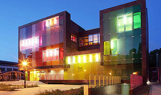
This building is not lacking in self-confidence. As proof, you only have to take the second left along the Avenue de Longchamps from the Les Côteaux tramway Station in Saint-Cloud. No sooner have you left behind a quiet row of smart private houses in the traditional millstone grit Parisian style with front steps and plane trees than you come face to face with an odd-looking building, imposing but also childishly simple, more cubist than cube-shaped, decidedly "flashy", evoking happy memories of a child's toy.
↑ Click image to enlarge
Photo: Stephan Lucas
An appealing, totemic building that you sense is designed for festive celebrations and young people, and that you might expect to find in Rotterdam rather than the über-bourgeois St Cloud neighborhoods. Even if it is only 300 meters away from OMA’s Villa Dalll’Ava.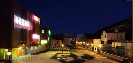
↑ Click image to enlarge
Photo: Stephan Lucas
With its cheerfulness and nonconformism, the building contrasts strongly with the urban development zone in which it's located, behind a new block of private apartments and next to neo-Haussmannian offices and a day-nursery in a similar style. It is with the facing 1930s infant school that it empathizes, extending the metaphor of the balcony courtyard, the passageways, the brick color and the forecourt. As for the 1970s infant school next door, it maintains an obvious affinity with it in terms of shapes, only to dynamite the whole lot.
All in all it's an odd little castle and cubist mountain, that owes its existence to the boldness of the Saint-Cloud Town Council, which has thereby acquired facilities that have revitalized its image and opened it to the most contemporary and positive architectural thinking.
↑ Click image to enlarge
Photo: Stephan Lucas
↑ Click image to enlarge
Photo: Stephan Lucas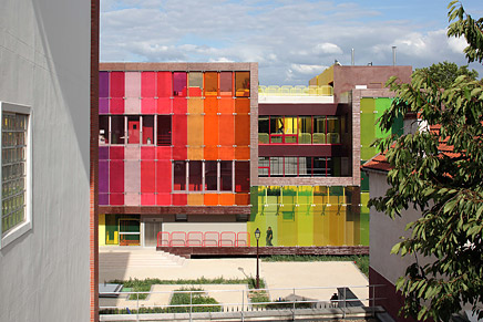
↑ Click image to enlarge
Photo: Stephan Lucas
Superimposed but not separated
This brief provided a real headache: how to accommodate two autonomous programs on a narrow plot of land. KOZ chose to:
The spaces are superimposed without being separated. They communicate via visual glimpses: you see each other on all sides, you 'feel' each other, you can easily find your bearings in a building with a spatially fluid but unfamiliar layout. Nevertheless, the functional and administrative autonomy of the two activities (separate entrances and different operational timetables) is respected.
↑ Click image to enlarge
Photo: Stephan Lucas
↑ Click image to enlarge
Photo: Stephan Lucas
A pure color scheme
The building uses color very openly and assertively, with a wide palette ranging from red to green, by way of yellow, pink and orange. These colors cover the facade in wide stripes. Inside, the same colors are systematically repeated, like stepping in an oversized graffiti. A color coding that helps you locate from the outside the areas created on the inside. A means of spatial orientation for young children. An echo to street culture codes for those who crawl on what is dubbed the coolest indoor climbing wall in France,or practice on the pop fencing rows below!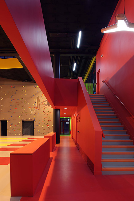
↑ Click image to enlarge
Photo: Stephan Lucas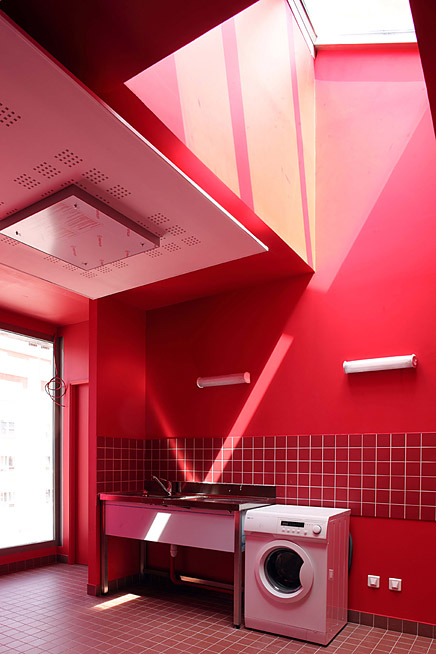
↑ Click image to enlarge
Photo: Stephan Lucas
Spaces to be filled
Over and above the pure functionality of the activities identified in the project, the architects placed great hope on the imagination and inventiveness of the occupants. That's why all corridors, access ramps and passageways, are wide and spacious, up to 3 times the regulation size. The ramp leading to the outdoor games and training area has been designed along the same lines. Due to its exceptional width, it provides an "additional" space and safely contributes to the strong physical and visual continuity between the Leisure Center's internal and external areas. Indeed, it was designed with the aim of making it useable for activities ranging from just running up and down to becoming a small sized outdoor theater. With no steps and surrounded by a 1.80m railing, it is a secure and private area where children can go alone in complete safety.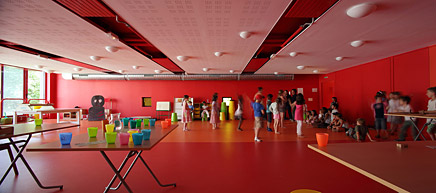
↑ Click image to enlarge
Photo: Stephan Lucas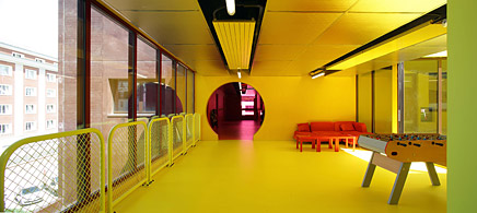
↑ Click image to enlarge
Photo: Stephan Lucas
A concrete ribbon
The building is a vertical piling of activity spaces (gymnasium, climbing walls, leisure center, outdoor area) wrapped in a ribbon of concrete providing unity to the whole. Concrete was the natural choice as it highlights the building's sculptural appearance while satisfying the requirements of:
The project is broadly made up of prefabricated concrete load-bearing panels. The molded and tinted reinforced concrete contrasts with the colored surfaces of the laminated panels.
↑ Click image to enlarge
Photo: Stephan Lucas
↑ Click image to enlarge
Photo: Stephan Lucas
Colored facades
The main facade is made of tinted glass with a color gradient from red to green. The other 3 facades are more homogeneous, albeit colored, too.
↑ Click image to enlarge
Photo: Stephan Lucas
A sustainable project
KOZ is part of the "environmentally aware" generation. The openings in the roofs and the glass facades bring maximum natural lighting everywhere to limit electrical consumption. Concrete was chosen for the reasons mentioned above but the preference was for prefabricated concrete, generating less waste and spill. The tinted glass facades provide good protection against setting sun and long-lasting color. And of course all hot water is solar heated.
KOZ
KOZ architectes was founded in 1999 by Christophe Ouhayoun and Nicolas Ziesel, both of whom:
KOZ is a founding member of the PLAN01 Architects Collective, created in 2001 with the Atelier du Pont, Bocabeille-Prégo Architectures and Philéas agencies. With PLAN01 they founded PLAN02, an in-house eco-design engineering office providing real time feedback and orientations for social and environmental responsibility in their projects.
KOZ creates non-typical, friendly and sensitive buildings that redefine public spaces and emphasize the diversity of their uses. KOZ champions architecture that is aware of context and creates surprise and "added value" in terms of function, by making use of residual areas that are easily adapted to stimulate the imagination of local residents, users and visitors.
KOZ regularly carries out wide ranging assignments, including project management, site management, auditing, signage, and furniture Work is organized in accordance with the tenets of precision and autonomy, placing value on skill and creativity. The team is made up of 8 to 12 persons – architects, computer graphics designers, liaison officer and manager. Everyone is involved in information coordination and participation in decision-making throughout the project.
KOZ makes good use of the synergy and experience of the PLAN01 agencies in a 600m2 workspace on the Paris Right Bank.
Creative Commons License
This work is licensed under a Creative Commons License .
/Creative Commons License
2 Comments
Nice job! All together, the use of color, geometry, and lighting really does bring attention to the kind od "users" of this architectural work.
This is so cool! I'd love to try and recreate this for my daughter's room.
The xylaphone looking likes at the youth center would be a great gift!
I went to a local store and they suggested using:
http://www.saviolighting.com/ET2-E53231-StarStrand-LED-Tape-p/et-e53231.htm
to create coloring changing affect (a def plus!)
Do you have any less expensive alternatives? (on a mother's budget).
thanks,
Stacey W
Block this user
Are you sure you want to block this user and hide all related comments throughout the site?
Archinect
This is your first comment on Archinect. Your comment will be visible once approved.