
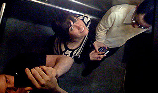
Working out of the Box is a series of features presenting architects who have applied their architecture backgrounds to alternative career paths.
Are you an architect working out of the box? Do you know of someone that has changed careers and has an interesting story to share? If you would like to suggest an (ex-)architect, please send us a message.
Archinect: Where did you study architecture?
Luke Bulman: I received an BA in Architecture from University of New Mexico and an M Arch from Rice School of Architecture.
Jessica Young: My BA in Architecture is from Lehigh University and my M Arch is from Rice as well.
LB: We met at Rice and collaborated on a few projects when we were there. Both of us held, at different times, the director of publications and exhibitions position, too, so Rice was really formative for us. In a lot of ways, the Rice dean Lars Lerup got us going. Our practice owes a lot to our academic backgrounds.
JY: Absolutely. We can say without a doubt that we would not be pursuing the kind of work that we are today without our experiences at Rice. That's where we learned the very valuable lesson that architecture can be a way of thinking, not just a profession.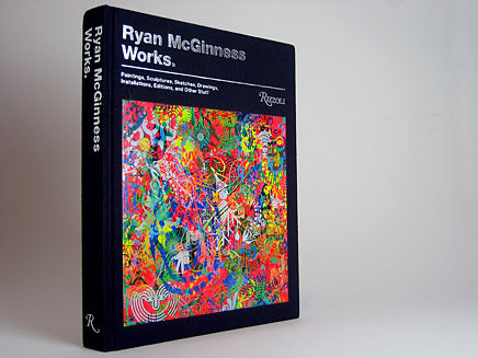
↑ Click image to enlarge
Ryan McGinness Works.
8.5 inches by 11 inches, 296 pages, casebound
Produced by Rizzoli
Ryan McGinness is an artist who also designs a lot of books (his book Flatness is God was one of our first graphic design books) so to work with him on his monograph for Rizzoli was a great experience. The book got around some of the typical monograph traps while taking advantage of the format in interesting ways. Most importantly, it combines process images and explanation in a way that doesn't fetishize the "personality in the studio" while explaining how things really get done. It's difficult for a monograph to strike a balance between ends and means, but this one does it pretty well.
Get the Flash Player to see this video.
var s1 = new SWFObject("http://archinect.com/travels/flvplayer.swf","single","436","347","7");s1.addParam("allowfullscreen","true");s1.addVariable("file","http://xm-dev.com/archinect/thumb/MVI_8812.flv");s1.addVariable("image","http://files.archinect.com/uploads/ai/aiu_MVI_8812.jpg");s1.addVariable("width","436");s1.addVariable("height","347");s1.write("player1");↑
Click image to play video
Ryan McGinness Works.
8.5 inches by 11 inches, 296 pages, casebound
Produced by Rizzoli
At what point in your life did you decide to pursue architecture?
LB: When I entered undergraduate studies I had a professor at UNM, Robert Walters, who was really inspiring. A real died-in-the-wool Modernist. It was a survey course, but he focused a lot on the 20th century and always presented architecture in a larger context of design and culture. So, we looked at Bauhaus typography, Futurist manifestoes, Beuys' sculpture alongside the built work of Mies, Marinetti's drawings and projects like Berlin Free University. It was a very visual approach with side-by-side slide comparisons, that kind of thing. That sort of broad thinking appealed to me a great deal. Studio courses, and the work culture that they promoted, really appealed to me too. I liked spending long hours in the studio. This was re-upped when I went to Rice for an M Arch degree, plus there was a very strong conceptual bent to Rice. I also recognize the influence of Bruce Mau and Sanford Kwinter who collaborated at Rice for 2-3 years. Bruce and Sanford's involvement in the school was a sort of experiment to see how design thinking could dismantle and reassemble typical seminar/studio formats. Sometimes these experiments were more/less successful, but there was a huge amount of risk-taking. I still like the idea "nothing ventured, nothing gained" that they worked under...
JY: Midway through my undergraduate studies I was asked to declare a major, the source of a great deal of anxiety for me. At the time I was trying to fulfill my lifelong dream of becoming a marine biologist, but I had just been introduced to organic chemistry and physics and I was in the process of coming to terms with the fact that perhaps I just wasn't cut out for a life as a scientist. I always knew I had some skills in different visual arts, both 2-D and 3-D, and was taking a great introductory design class for fun, taught by my academic advisor. He encouraged me to try an architecture studio. I followed his advice but went into the class a bit skeptically, holding onto a lot of preconceptions about what I thought architecture was, which were admittedly very narrow. My professor for that first studio and my mentor during the rest of my time in college, Tony Viscardi, changed all of that by introducing me to the conceptual side of architecture. As a true intellectual drifter, he always supplemented studio problems with all sorts of collateral, extra-architectural material and I remember being surprised by the stuff he would dig up and show us. I began to see architecture as something that was incredibly open as an academic pursuit. Being in the studio with a bunch of curious students, bouncing ideas around late into the night, finding ways of operating in complex situations, and the complete immersion into a given problem, was everything I had been looking for in the sciences, and then some. It was then that I decided –– this is for me. I went to graduate school immediately following undergrad and all of these things that appealed to me were emphasized more. I loved it.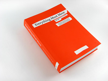
↑ Click image to enlarge
Everything Must Move
170 mm by 240 mm, 488 pages, flexibound
Published by Architecture at Rice
Distributed by Actar
Production by Regal Printing, Hong Kong
Thumb edited and designed Everything Must Move (EMM), on the occasion of the retirement of the school's dean for past 15 years, Lars Lerup. EMM looks back at the work and ideas generated at the school during that 15 year era and then looks outside to the contemporary metropolis in general, and Houston in particular, the site of much investigation at the school during those years. In many ways the book is an archival project, however as we built the book from the bottom up we constantly sought ways of infusing the archival material (projects, photographs, essays, conversations, etc.) from the last 15 years with new perspectives and projections –– we sought to keep the project "alive," poly-vocal and diverse.
Get the Flash Player to see this video.
var s2 = new SWFObject("http://archinect.com/travels/flvplayer.swf","single","436","347","7");s2.addParam("allowfullscreen","true");s2.addVariable("file","http://xm-dev.com/archinect/thumb/MVI_8581.flv");s2.addVariable("image","http://files.archinect.com/uploads/ai/aiu_MVI_8581.jpg");s2.addVariable("width","436");s2.addVariable("height","347");s2.write("player2");↑
Click image to play video
Everything Must Move
170 mm by 240 mm, 488 pages, flexibound
Published by Architecture at Rice
Distributed by Actar
Production by Regal Printing, Hong Kong
When did you decide to stop pursuing architecture? Why?
LB: Maybe I didn't really stop, I'm just pursuing the interest in another way. I may not design threshold details, or specify roof membranes (and really shouldn't because I was REALLY bad at it), but I feel like our office is fairly involved in architecture culture since we work a lot with architects and architecture schools. I also teach seminars at Yale School of Architecture and Barnard's architecture program, so there is still a lot of contact with architectural thinking in the academic environment, too. And while all that is true, we really aren't architects, we don't do buildings.
JY: I remember a specific moment when I realized that my affair with architecture had become more of a love-hate relationship. I was working at a large architecture office after graduate school and had been doing a lot of Autocad-heavy drawing of very repetitive details and such, and basically dreading going to work everyday. The office was in a downward spiral, people were being laid off, and the atmosphere in the office was somber. Without another project for me to work on, I was asked to begin developing an idea for the design of a book about the office's completed projects –– a task that was seen as "grunt work" for an intern-type who had time and was not necessarily in-demand for any other project. But I found this to be the most enjoyable thing I was asked to do at the office, plus I was really good at it, and suddenly I found myself loving architecture again. About a week or two later I was laid off from that job. When it became clear that the book wasn't going to happen, I bounced around a couple of freelance jobs for a few months, then went back to Rice to work as the director of publications and exhibitions in the architecture school. This is when I feel like I finally found architecture, or maybe I left architecture, hard to say. So, like Luke said, we're not architects, but maybe we still pursue architecture, just with a different focus.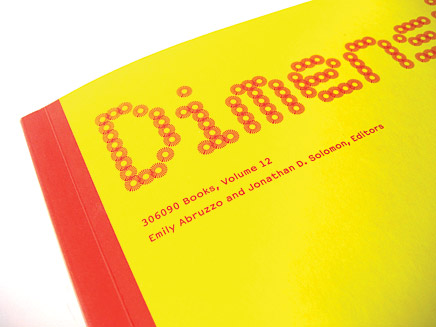
↑ Click image to enlarge
306090 Volume 12, Dimension (detail of cover)
Edited by Emily Abruzzo and Jonathan Solomon
7.5 inches by 10 inches, 224 pages, sewn paperback
Distributed by Princeton Architectural Press
Production by Regal Printing, Hong Kong
Material for 306090 is gathered from far and wide, creating real cross-disciplinary exchanges in volumes with changing themes. Last year, Thumb designed 306090 Volume 11, Models, and more recently we completed 306090 Volume 12, Dimension. The book follows a sequential organization of "one thing after another" which is both economically efficient and communication-rich. Portions of Dimension were set in OCRD, a typeface designed specifically for this volume, shown in one of its variations on the cover.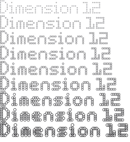
↑ Click image to enlarge
306090 Volume 12, Dimension (typographic study)
OCRD, the typeface designed for this volume of 306090, uses a common proportional structure defined by a series of modules, in this case rings. By manipulating diameter and stroke width of the ring, a variety of fonts may be produced.
Describe your current profession.
THUMB: We are graphic designers. Our office designs for private and public clients and also does some self-initiated work when we can find the time. A lot of the time we are working with printed materials –– books, posters, various ephemera –– at other times, we operate in three dimensional territory, such as exhibition design, signage, installations. Basically, we take ideas and information, often somehow related to architecture and urbanism, and figure out ways to communicate them in interesting and effective ways. Sometimes we develop content, but we also work collaboratively to develop projects.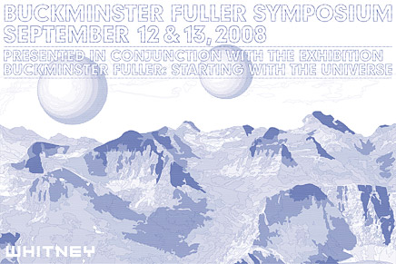
↑ Click image to enlarge
Buckminster Fuller Symposium announcement poster
Whitney Museum of American Art, 2008
24 inches by 16 inches
Production by Circle Press
Thumb developed an event announcement for this symposium, organized by the Whitney in conjunction with a major retrospective of Fuller's work, that transposes an iconic Bucky Fuller image using a palette of triangulated patterns. The use of pattern enabled us to pull a great deal of variety out of one color of ink and to produce different optical effects depending on reading distance.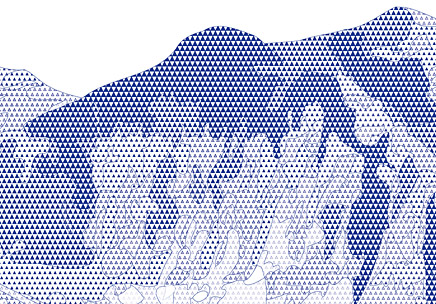
↑ Click image to enlarge
Buckminster Fuller Symposium announcement poster (detail)
What skills did you gain from architecture school, or working in the architecture industry, that have contributed to your success in your current career?
JY: I find myself reflecting on school experiences constantly. Learning to always think both systematically and conceptually about projects, and gaining an ability to see both the big picture and the tiniest details of a project simultaneously were perhaps the two greatest skills I picked up in school. Upon reflection I think these are two principles that really drive our current practice. Beyond learning an approach to thinking about design, architecture school taught me an important way of executing ideas. Robert Mangurian and Mary Ann Ray, who taught at Rice while we were there and were huge advocates of collaboration in the studio, used to say that two sets of hands can produce the output of four individuals, or something like that. The idea that collaboration could result in exponential increases in productive work was exciting and inspiring.
LB: The formal 2-3-4/d connections between architecture and graphic design can't be under-estimated. We sometimes refer to books as "thickened chunks of time" which is a very architectural, spatio-temporal concept. I can't imagine our practice without recognizing our architectural training.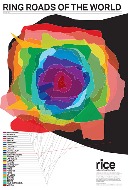
↑ Click image to enlarge
Ring Roads of the World
Rice School of Architecture, 2009
22 inches by 32 inches
Production by CPY, Houston
This poster is designed as a sort of calling card for Rice School of Architecture, located in Houston. We traced the paths of ring roads from 27 international cities to produce shapes, then layered them all at the same scale. As it turned out, Houston has the largest system of those we surveyed. (Beijing was second).
↑ Click image to enlarge
MIT Lecture Announcement
Fall 2008
31.5 inches by 6 inches
Production by Arlington Litho
Most architecture school lecture announcements find themselves posted on walls, but this one works differently: as a series of bookmarks. All events appear on a single perforated sheet. Each event in the lecture series gets an individual bookmark that may be removed and used as a reminder. And each event has its own pattern on the backside, adding to its "bookmark-ness."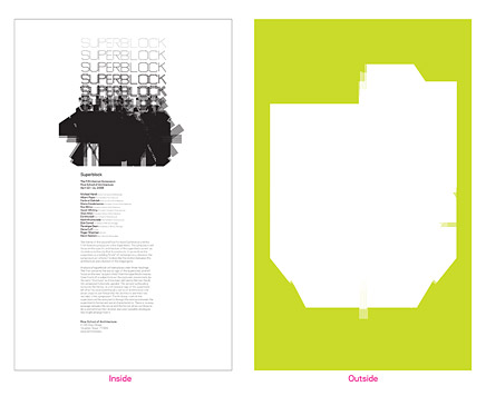
↑ Click image to enlarge
Superblock
Rice School of Architecture, 2008
17 inches by 27.5 inches
Production pending
Thumb designed this self-mailing poster for a conference, entitled Superblock, at Rice School of Architecture that has since been put on-hold. A series of sequential transformations of letter forms, in line weight and line type, generates a new shape that lacks any recognizable reference to its origin as a word. On the backside, where we take that resultant form out of context from the rest of the typographic evolution, the form becomes an icon of sorts for the symposium –– a super block.
↑ Click image to enlarge
New Geographies: After Zero (detail of cover)
Edited by Neyran Turan and Stephen Ramos,
Harvard University Graduate School of Design
8 inches by 10 inches, 160 pages, sewn paperback
Production by Regal Printing, Hong Kong
New Geographies assembles critical essays and projects in architecture and urbanism that focus on the developing effects of globalization and how designers may direct these forces. The design uses an assembly of light/glossy and heavy/matte papers, strict/script typography, and tactility/visuality. A "cloud," made up of multiple lines in various colors and types (shown here on the cover), began as an end slug marking the end of an article, but grew, expanding and contracting in density in order to affect pacing and provide a tool to navigate the journal. On the cover, the cloud is deformed by the blind embossing of the journal title.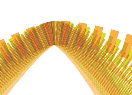
↑ Click image to enlarge
Untitled detail of a graphic identity project in-progress
↑ Click image to enlarge
WPA 2.0, an open design competition for working public architecture
cityLAB/UCLA, 2009
Graphic identity
Thumb produced the graphic identity for WPA 2.0, an open design competition organized by cityLAB, a think tank at UCLA's Department of Architecture and Urban Design that supports a variety of projects related to contemporary urban issues. The competition seeks innovative proposals that place infrastructure at the heart of revitalizing American cities. In this competition the notion of infrastructure is broad, and intended to be cracked open from its discrete functionality, so we sought ways of expressing that attitude in the design of the competition's identity. A series of icons were created for somewhat common typologies –– library, wetlands, worker housing, farmers' market, bus route, for example –– and were recombined into "mash-ups" that suggest new ways of thinking about the interactivity of these (once) singular entities.
Do you have an interest in returning to architecture?
THUMB: We don't have a desire to design buildings again, but because of our sustained interest in the architecture community we hope we'll always remain engaged in the industry somehow.
Creative Commons License
This work is licensed under a Creative Commons License .
/Creative Commons License
3 Comments
RIP Bob Walters. He was a great influence and mentor. And he liked a beer too.
Excellent work. Thanks for sharing this exciting practice with us.
Cheers,
Dan
mmm that ring roads poster is lovely.
Block this user
Are you sure you want to block this user and hide all related comments throughout the site?
Archinect
This is your first comment on Archinect. Your comment will be visible once approved.