
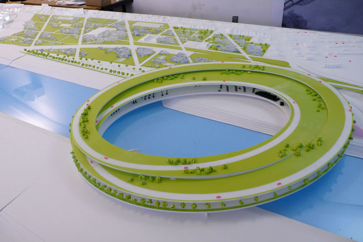
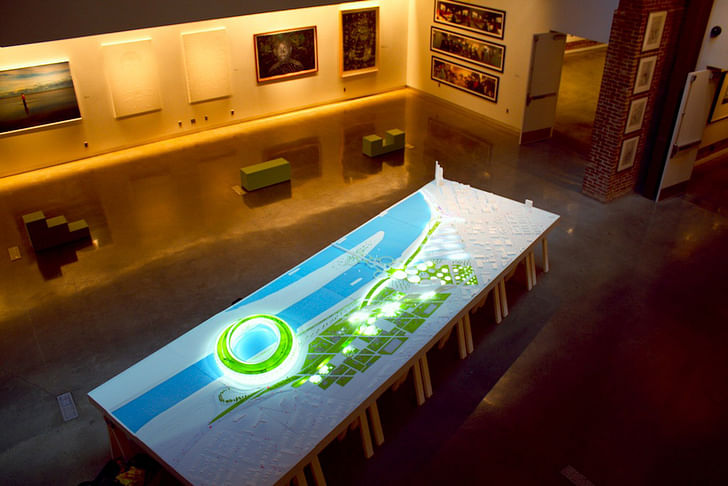
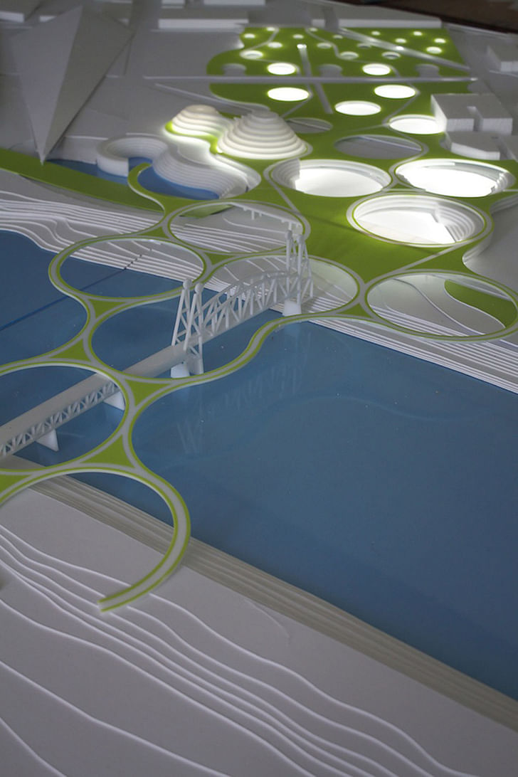
During the academic year 2008—2009, the College of Design at the University of Kentucky conducted a year-long research and design study of the Shippingport area in Louisville. The Shippingport area, located just west of downtown Louisville, has significant waterfront and extensive infrastructure and enormous potential for future development. Development has been limited, however, because the entire area is cut off from the rest of the city by the freeway. In fall 2008, students analyzed and made strategic design proposals for the Shippingport area intended to stimulate economic development and bring much-needed jobs. Proposals included a complex of business incubators and needed vocational schools, including a culinary school with a restaurant; a centralized hospitality complex; a network of pocket parks that connect to the existing Olmstead Park system; and a new Green Ford Motor Company Campus where a new line of hybrid and electric products would be designed, developed and built. In spring 2009, students developed some or all of these strategic proposals into infrastructural and building proposals.
On May 27, the day of the final review and exhibition opening, Archinect's Paul Petrunia discussed the project with JDS' Julien De Smedt...
How do you think the field trips to Oslo and Brussels contributed to the project?
I think that it allowed the students to see universes that are extremely different than the ones they experience every day in Kentucky, and even at the College of Design… in the case of Brussels, I had set up our office with a large joined table and laptops for the students as well as full access to our facilities…
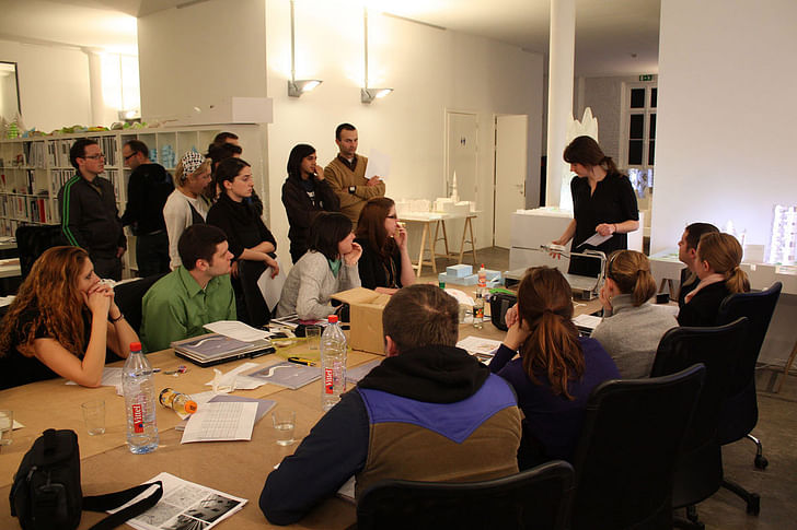
we also gave them a series of classes in practical tools such as photoshop, model making etc… the idea being that we would later on asked them to function on their project in the same that we do at the office.
Besides that they had much better beers in Brussels than they can in Lexington and I they went up a couple of days to Holland for even better ‘architecture’…

Was the project mostly developed at the master-plan scale?
Not really… mostly because the site, even though rather large, is concentrated on one neighborhood… or a chunk of the city of Louisville. We had more planning concerns in terms of the research prior to actual design…
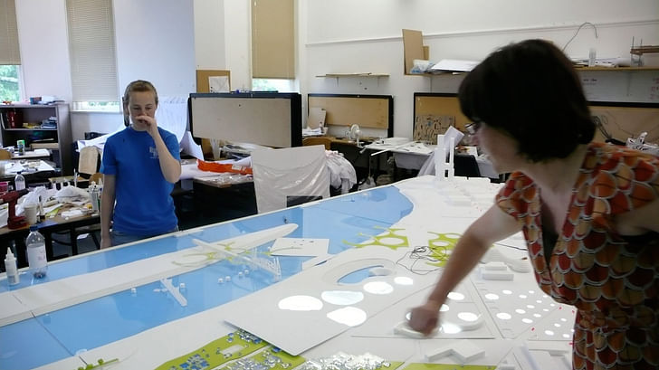
I led the design project on the second semester and had to catch up massively in terms of time available to do such a large project to the level of ambitions that was set up during the first semester… we even put more pressure on ourselves by continuing the research into a design-implemented research so that the mechanics of designs would be fully glued to the specifics of the site…
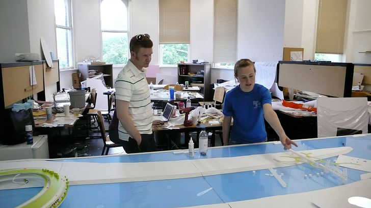
In the end the project is a hybrid in between a masterplan and large scale architectural interventions… which is often the way we work in our projects… if an assignement is to small to be interesting we boost it by englobing concerns that immediately relate to the task, if it’s too big we design in a way that the future of it is somewhat not left undefined, as it can sometimes happen in too generic planning projects…
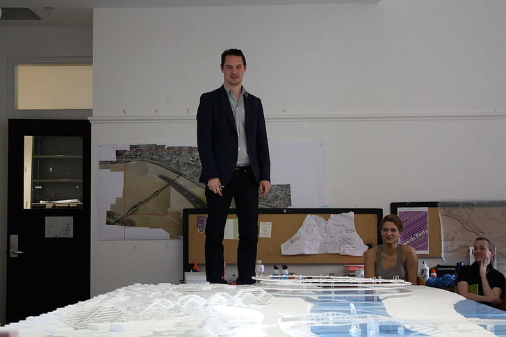
we’d like to be able to bring in an enthusiastic take to everything we do and at least manage to maintain that through the tedious process of masterplanning… so we drop a lot of exciting elements in to generate further enthusiasm and ambitions…
How did the students work together on this project? Was it purely collaborative or did the students take on individual or group roles?
It depended on the students and on the timing… after the first semester we had a review with Michael Speaks and composed what we thought were the strongest few projects and the teams that could achieve them… mostly according to who was already doing what, but in some cases we took ‘exec’ decisions change a chemistry that didn’t seem to work out… it was proposed rather than imposed and everything worked out well…
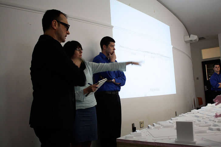
Further on while we sharpened our knives on each projects and even re-organised the divisions of projects the students formed new groups and some went solo… this was initiated mostly by myself but of course shared and proposed rahter than imposed... things worked out once more… along the course of the studio I also decided to appoint, within the group of students, the role of an editor and the one of a coordinator…
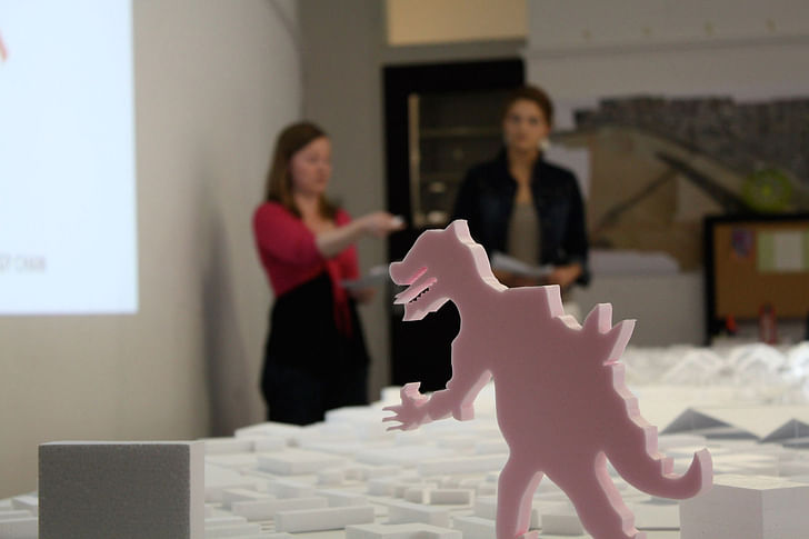
At the beginning it created some frictions among the students that felt these roles were disturbing their freedoms… which was absolutely not the intention: it’s important in groups to find who has leadership, editorial, organisational power… this can make or break a project. I wanted the students to understand that, beyond their own project concerns… this project could only succeed if the overall masterplan/design set was fulfilled…
Describe the roles of three studio instructors (Julien, Gary and Jason)
Gary and I shared the year lead of the whole studio. Jason, followed both semester as the ‘on site’ supervisor, keeping up with the joined decisions taken during our monthly visits…

Gary took on the first semester with a more background and analytical agenda… it allowed the students to understand a set of values, methods of organising an agenda, a point of view, a strategy… and to research precedences and the city itself… this turned out both useful and difficult during the second semester… which we expected: it was useful since knowledge was there and methods of acquiring and articulating knowledge were well in place…
What were lacking or at least weakened were the mechanisms of how you turn an intention, a value, a contextual understanding into a design/product/project… each of my trips were moments for taking decisions, sometimes harsh ones, but always necessary ones, to manage the project up to the finish line… we also established an email update system that would first give me full updates of the projects every Monday and then as it got more dramatic timewise, every day… this was of course very demanding but my experience with groups is that when the overall base is well reflected, the more short exchange there is, the more efficiency and speed of action you reach…
More images of the final project, and photos from the final review and exhibition opening, continue below...
83 Comments
That is a sick ring-road/object.
Love the large scale-modeling..
nice job!
wanted to say it looks very PLOT/BIG/JDS but than
I saw your instructor-list :)
We've already started a conversation over here. It's great to get more backstory on the semester's process, though. And more pics!
as a uk architecture alum, i'm extremely excited about this studio. beautiful project and presentation. keep up the good work.
jaclyn whitaker
university of kentucky
barch 06
the project is a refreshing large scale urban design approach for an american city. this is really a stunning riverfront model as depicted in the maquette.
since we are used to associate this typology with expos and sports events, project's program around the proposed real economic models such as revised car industry, vocational schools etc.., make it sustainable, at least as an idea. nice touches...
in my opinion, this prototypical business and infrastructural quality supplies the project with meat and bones, instead of familiar sole dependency on the 'development-tourism-culture trade' triptych.
there might be discussions around that and branding of cities.
what would louisville be branded as such?
i'd prefer non such. just because i'd like to see things standing on their own merits, instead of a board room created speculative and faster profit marketing pitch, like how they decide the new and meatier burger in the jack-in-the-box executive meeting, soon to be replaced by a newly designed green hot dog.
it is time for capitalism to get humble and more honest with the people, if it is at all possible.
on the physical design;
after reading few comments by posters on the listed architectural influences (ie.; plot,big, denmark, holland, oma, rex, and so on,) i have to say all influences are welcome, as they were carefully synthesized by the students and their teachers. these are all very well connected pieces with imaginative destinations and possibilities. the project's creativity does not hinge on those firms and individuals.
louisville have been touch and go with great projects lately.
this particular project is sure to leave imprints in the minds of citizens and the developers and that is no small feat for a studio project from the academy.
design schools everywhere need to provoke and incubate more urban development ideas.
i 'like' congratulating the teachers, but i 'love' congratulating the students for the project.
sure there are mechanical, technical issues, but in fact, this is a massive 'idea' project, as displayed.
Good job guys..loved, the way lighting has been incoporated into the model..
This is a beautiful model.
Unfortunately, I find the scheme unrealistic, repugnant, and embarrassing. The reality of what is proposed is tragic. There is no sense of real functioning urbanism, but rather large discs and circles that seem to hover above the ground plain and do . . . what? Where is the sense of scale? Where are the spaces that are being made? Where are the buildings surrounding parks, the street furniture, the people who would actually use these spaces . . . As architects it is our responsibility to create beautiful, well functioning urban spaces that expand on the best parts of a place and help to further define it. This project fully detracts from the beautiful parts of Louisville and in fact only succeeds in destroying the best parts of the place that already exists.
If your students really want to understand urbanism, they should read about great urban spaces that exist, or beautiful and successful built waterfronts, or begin to understand space making and place making. I suggest Great Streets, Civic Art, Collage City, etc, just to name a few.
These ideas, combined with simply rehabilitating the beautiful existing buildings in the city, would yield far better results and a pleasant urban experience that people would actually enjoy and use.
I find your lack of sensitivity revolting - and a mere repeat of poor planning and urban renewal theories from our disastrous past.
I agree with the previous comment by joochill. This project ignores every documented failure it copies and every documented success it rejects. If this were ever to be built, not only will this be an embarrassment in the near future when the avant garde arbitrarily alters what it deems to be the zeitgeist, but it will be an engine for social disfunction. What should have been a beautiful waterfront will be turned into green discs in the sky, sharp, angled plains, with what appears a whimsical Godzilla...if only we could be so lucky.
It often frustrates me that architects of this sort (by which I mean those that deliberately design and propose destructive projects - this stuff is only different from the modernism that destroyed our cities in the 50s, 60s and 70s in that is is curved and colored green instead of rectilinear and brown)feel they must destroy places that are already nice. What is worse still is when they are professors, and teach their students this sort of destructive design philosophy. Why not teach them principles of urbanism and how buildings support or destroy the health of cities? Why not teach them what this same line of thinking did to their nations cities in the latter half of the 20th century? Why not teach them to heal our cities with solid blocks of urbanism and functional buildings? It is so very frustrating.
These students need a trip to Rome, a nearly untouched traditional city that is beloved by all who go. Then, a trip to London, where the ravages of modernist architecture from post WWII on can be seen for what it all is.
Shame on those who designed this. I mean that. Shame on you, but worse shame on your "teachers". Read Court and Garden by Michael Dennis, or the Fall and Rise of Great American Cities by Jane Jacobs. Educate yourself. Become an intellectual, and resist with all your might the thoughtless urge to be one who apes what is seen on the pages of Record. Instead, understand precedent, and the glorious history of architecture all cultures had before the onset of the Second World War.
the problem i have with above comments is that, rather than looking at the idea, they already 'know' what is otherwise good for us...
kind of arrogant, dictatorial and uniletarally parental!
first one even pre emptives the reaction by saying the model is beautiful.
how can the model be beautiful, if the ideas it conveys and proposes later deem to be tragic by the same author?
if i were the authors of the study, i would take above comments as badge of honor!
you can't only look at the model. the model is sort of an overview/schematic of everything that was proposed. during the public presentation of the work, two slide shows with sections, plans, perspectives, etc indicated the texture and material consideration that went into the efforts of these students. they are now compiling all of this material into a document.
it's true the model doesn't show much nuance, and it doesn't acknowledge the existing fabric (for which much of what was proposed was considered an infill strategy. don't assume that the model is all there is.
The model is beautiful because it lights up and is well crafted. The scheme, unfortunately, is a total disaster - and this kind of education will only work to DESTROY our society as we know it. How many places have YOU been to like this that you really like, and really enjoy? Please let me know. i would love to go there and visit to see for myself.
People - real people - enjoy spaces, with nicely detailed waterfronts, parks, old buildings, benches - urban public space. This proposal IGNORES all of these important things that make great space!
Was Daniel Burnham arrogant? Make no small plans . . . . Was Frank Lloyd Wright arrogant? They knew what we needed too - and man did they deliver unlike this project.
What I suggest is that you open your mind to our criticism and get even just one of those books, open it up, and try to understand what successful architecture and urban space look like.
Architects like these - who fetishize their own ideas and think nothing about the urban quality of the built environment have continued over time to ignore the context with inappropriate projects and have made our homes - our cities - our neighborhoods - far worse than when they found them. Have you seen the Seattle Public Library - and how that building destroys any idea that the street is a SPACE?
Good day.
i read all those books you mention and have been to cities you suggest and more, have a good understanding of burnham's plan for chicago and very familiar with wright's works...
you have a problem and fear of looking at things you don't know.
if we are only interested in things we 'know', there would be no progress sir...
M. Ayyuce, don't take intelligent criticisms so personally. What joochill and I seem to be saying is that there is power in the limits we as architects must work in. There is beauty in the meaning we as architects can impart to our designs. There is joy in the creation of urbanism and urban spaces where human culture exists, evolves, and thrives. The key problem to your thinking is the misunderstanding of object and space. You ought to read Crisis of Object: Predicament of Texture, which can be found in Collage City, a book I believe Joochill has mentioned. Though I realize that those who are addicted to the mimicry of what the high priests of the avant garde dictate through their whims and pseudo intellectual "writings" (SMLXL comes to mind...) you must understand that projects like this are destructive to the urbanism. You must. There is no space created, there is no thoughtful addition of urban texture added to the existing city, there is no thought to how this will be used. Let's leave out how this would be detailed architecturally, though one imagines, based on how poorly all modern buildings age, this project and its hovering circles will not be as pretty as its model in...shall I say the months to come?
Please try to shed the attitude of the misunderstood polemics you have armed yourself with. What joochill has said, and what I have said are really quite important to your education as a designer. Don't be so afraid to learn from the past. Throwing insults and calling me arrogant makes you look sort of silly. It also looks as though you have admitted defeat in this particular argument. If you can describe the actual benefits to the city of Louisville that could possibly come from this proposal, hats off to you. I can describe perfectly well what a small infill park surrounded by well detailed traditional rowhouses would do. Likewise, I can describe what a large scale park in the American Landscape tradition can do for a city and its people. But please, let me know what circular ramps hovering over an existing lift bridge and a patch of grass with large circles cut into it will do. I honestly would like to know.
one more thing,
there were no precedents for burnham's plans and most of wright's works at the time they were issued.
you are quibbling. and just dislike certain architects...
That comment is completely insane! Do you not think that Frank Lloyd Wright studied historical precedents? Or that Daniel Burnham never opened a book and studied a building? Do you really think that there were no precedents and they started from scratch? What have you been taught?
Classical architecture . . . traditional Japanese architecture . . . the renaissance . . ancient Rome?
I guess Baroque Architects too came up with their buildings without every looking at another single historical precedent. Architects can be innovative within a language of what has been done - and what was successful and what was not. It is a process of building on and learning from the past - not blatantly ignoring it or making a tenuous inappropriate connection so that you can feel good about making something you think is "cool".
This, I fear, is the major downfall with your process. Great architects over time have studied and learned from the past - not merely just the opening of a book and saying that they "read" these things without understanding them - and then going and digging circles in the ground that ignore everything they supposedly "read".
Orhan, everything comes from something. To posit that Burnham had no precedent he looked at is absurd. There was a tradition of urban planning in this country for hundreds of years before his plan for Chicago. Savannah GA, New Haven CT, the 1811 grid of New York, Philadelphia PA, Buffalo NY, Annapolis MD, Washington DC and on and on and on the list can go. As for the Wright, he still saw construction as an art and if pressed, could make a good urban building.
You ought not accuse people of being afraid! I think joochill rather is understanding! Fear of the unknown is not what he is expressing. It is entirely known and understood, I imagine. I can understand that as well. I don't want Louisville looking like Beijing. Really, if you want to see the inevitable conclusion of where this sort of one liner, oh so uber original momentary whim leads, go to Beijing. It is shockingly ugly, and then your eyes can rest on the most lyrical and beautiful old building not yet destroyed by the anti-progress of modern architecture. Enough of our world is ugly and inhuman enough. Don't feed the fire.
You are not critical enough, I fear. At the end of the day - what will it be like to be in those circles? Spatially? Personally? Will Louisville be a better place? Really? Ask yourself that.
how do you assume that these people who worked on the project didn't study history?
you want louisville to look just the way you like it. do you want that with olives?
It isn't that they didn't study it, they may have. They surely didn't understand it, and then they were misguided by their irresponsible professors. Add to this their lust for the hero worship all are fed today, and it proved obviously irresistible to do such a lazy, thoughtless job that expressed nothing of shared value. Nope, instead we get an irresponsible Ode To Us project that will be a failure.
looks like nobody understands anything except you two...
With olives? What does that mean? Did they grow olives in 19th Century London? Or in Washington DC in the 1930s when they built the spectacular Jefferson memorial? Did Jefferson plant olives in Charlottesville in 1800 when he designed UVA? No, of course not. They were using a timeless architectural language expressive of humanist ideals. What a stupid argument! I am sorry, but I see you are a grown man with a practice in LA. I thought this was a student arguing with me! Oh dear...well, there you have it.
Do you want the olives?! This project is a copy of some awful Dutch nonsense. Shall you have this proposal for Louisville with Gouda?!
Looks like the only one that does is you. But there are lots of people who understand. My wife, not an architect, understands. How do I know this? When she asks, "Why do so many architects make such ugly buildings?" I know she understands. When she wants to buy a house in an old section of Washington DC in an old rowhouse that is beautiful (just blocks from supposedly precedent-less Union Station by Burnham!) I know she understands. What can I say to her question then? How do I describe the 20th century to her? How do i describe the shift from the use of technology in building to building to express a technology? How do I justify "Ornament is Crime?" How do I explain the destruction of SW Washington DC to build a nightmarish Corbusian landscape? There is no explanation. That is not the progress you claim to understand. That is the destruction of civilization.
i was born and raised in a city that is 8000 years old and i guess with different sense of history in relation to ancient grid.
yes i am a perpetual student as well as a professor of architecture.
i thought i was talking to couple of drunks and that's why i asked if you want your martini with olives...
oh. corbusier did a master plan for my hometown, izmir.
Well, yes, I'd love olives, thank you.
Do my arguments really seem as if I were drunk while I was writing them? Your arguments grow thin. When the pointless insults start to fly, I check out.
For the record, you still haven't explained how a green disc floating in the sky makes Louisville a better place. Growing up in an 8000 year old city doesn't get you off the hook. This would look just as terrible over the Bosporus.
the thinking behind the form and function of the 'green disc', as re-stated by me:
a new ford production plant, replacing (?) the existing louisville plants with a new, more easily re-tooled and sustainable plant, reintroducing this level of industry to this historically industrial part of the downtown. the plant’s location and elliptical form were generated by its ability to tie into available infrastructure (immediate access to the shipping channel, the freeway, and the freight rail lines, all of which the plant would bridge), provide public access across the channel, and accommodate a test track and green space on the roof and a full production line spiralling down through the facility.
cbone, check the thread here for my description of the other elements in the model. posted at 06/06/09 5:23.
Please - I ask you one question:
Explain why and how this is a good space, or a good intervention. You are a professor and I am one as well. So please - teach me.
joochill and CBone: as Steven Ward said above: The model shows a god's eye view of the design. At that scale, and via photographs, it's impossible to see design on the level of street furniture. There is other design documentation that we aren't seeing here.
You don't know that the students didn't also look at these interventions on the street-level scale of place-making in this project. The big ovals accomplish place-making through being a regional icon. As a project like this gets built, the fine-grain detail down to benches and handrails is what makes it great or not.
Students should have the opportunity to design all scales of projects during their education. This is a year's worth of work; even in the professional practice of architecture one could not, in a year, do an overview masterplan for a huge portion of a city that studied not only existing physical conditions but also economic factors, local history, and cultural specifics AND produce a design down to a street bench that would reflect the breadth of that study.
As far as answering how is this a good space or good intervention, I'll pose a comparison: Think of the Eiffel Tower. Iconic on the skyline, intimate on the ground plane. An all-around urban success. Could this project not - if built, and thus subjected to the demand for realistic detail that a construction project requires - be a similar success?
it has been pointless insults from the get go as far as your comments concerned.
i love it when people unload their words like, stupid, shame on you, revolting, apes, etc., etc., and when i hold the mirror to their face, they accuse the other with profanities. good going partners... you have just proved that you are only interested in dictating but not learning.
i have no inclination to teach you. because, it seems like you know everything...
your description of beauty and other niceties only limited to you and your cohabitants. your ideas are claustrophobic and not necessarily open for discussion.
i don't think you are a very engaging professor since you have no interest to see other possibilities.
by the way, bosporus is in istanbul and i am from izmir (symrna.)
my first post was my initial review of the project.
if you are unable to see spatial qualities in it, and keep repeating about the disk and disk, you are already showing how wide your perspectives are. there are more spatial narrations in that project than anything else. in fact, that i found a little open to further editing, if i may suggest.
you are comparing different values and systems onto different concepts to begin with. your relationship with history is very conservative and does not include a theoretical depth. i recommend you give a chance to somebody like foucault to begin with when it comes to history. because you subtract the time from your historical interpretations which is reducing it to simply recording and archiving. history is not only limited to things that were done yesterday but includes the discussion for the future and more interestingly, the present.
see you at the tennis club...
A. Thank you Orhan for not answering my question, as you have clearly proven my point.
B. If you consider me to be "unteachable" it does not speak highly to your skills as a professor. I was being sincere about really wanting you to explain this to me, and answer my question.
C. I believe in theories and concepts that make space without ruining cities. This proposal is slammed onto the waterfront and on top of the grid of the city. It snakes around a beautiful old bridge to which it does not highlight and does not respond to. These circles are aspatial and have nothing to do with the surrounding city – the context – what exists now. Can you show me a sketch – and idea – about how these things interact with the existing buildings, the streets, the grid, the people?
D. Good professors critique. They critique their students, they teach them – and they let them know when they have a terrible or destructive idea that could ruin a city. This project is an example of the professor and students being all about the idea (architecture fetishism once again) without caring in the least about what really exists. My proposal is to combine students ideas with the existing context, in a way that respects the city that Louisville has become and does not desecrate it.
E. Once again – have you ever been to a giant spiral floating above a river, or a giant hole in a park, or above a city grid – where you have really enjoyed the space that you were in?
F. Clearly the problem here is architects such as yourselves who are so disconnected from the existing, and what people use and like – and what people really experience . . . That you give us all a bad name. You need to listen to people – not be so “above” them to design what you think is a stimulating intellectual idea – and then not actually care who likes it or how it will be used. How it will be REALLY used. Who really likes giant spirals above rivers and holes in the grass? Maybe you should have a glass stair too that floats in the water and connects to the sky somehow? I think that would fit in with this scheme well. I say this because that idea is not based in reality – and that is what I fear about this type of architectural education. In case some have not noticed – we design and build in the built environment. There are many basic concepts that need to be incorporated into these early schemes – things like gravity, grids, transportation, structure, space-making – and of course ideas.
When have I thrown an insult like "I thought I was talking to a couple of drunks"?
Can you picture this over the Bosporus even though you are not from Istanbul? I can. And I am from Buffalo.
I don't play tennis, though enjoy working on your swing.
I am as politically liberal as they come, so let's put that slander to bed right now.
There is one thing you've written that I agree with, though. You wrote this: history is not only limited to things that were done yesterday but includes the discussion for the future and more interestingly, the present.
Boy is that ever true. Good thing the the Ancient Romans took Greek architecture that preceded it by 500 years and altered it to fit their increasing understanding of technology and their own evolving culture. Good thing the Renaissance and Baroque architects did the same. Same could be said for early 20th Century American architects. Penn Station was a modern building, built of steel and for a modern purpose. Yet the language of the architecture was universal, and American at the same time. To look at another example, Sullivan's work grew from that of Richardson, who before him learned from Furness. Wright obviously completes this evolution. When looking at the work of those these students are copying, the only thing we can say is that there is a pressure to be absolutely unique, and I do not mean that in a good sense. Any successful idea of urbanism is absent. Any suggestion of timeless architecture is absent. Their is no timelessness evident, the worst crime of all in this destructive proposal.
See more in next entry...
As for your insistence on icons and objects (clear evidence of your fundamental and potentially devastating misunderstanding of urbanism) I will use Liberty Bells terrific Eiffel Tower issue. That iconic, beautiful phallus is surrounded by giant circles floating over the Seine...oh wait! It is surrounded by blocks of urban fabric. That is why it is successful, and spectacularly so. If it was instead located a bit to the east in La Defense (must be a favorite of yours, professor from LA) I suggest it would be less successful. When all the other fabric buildings do their job, object buildings can stand out wonderfully, if it is appropriate for them to do so. What texture will allow this icon of floating spirals to stand out? And why would they want it to? Is this not the central question?
The suggestion that joochill has claustrophobic ideas is not at all true. His ideas of urbanism and architecture seem to me to encompass ideas that will produce successful urbanism. Your implication that to argue with the holy zeitgeist gods is closed minded is quite the reverse. It is both radically progressive and open minded. He is just speaking truth to power as it were that, yes I'll say it again since we are discussing this project, green discs, parks that look like circuit boards, and godzilla statues will in no way produce good cities.
It has been proven time and again that discreet spaces and solids blocks of texture make cities and towns. Objects in a landscape do not. If you don't know that, then I pity your students. That is not an insult.
This is: I hope you live in one of your own houses.
so that you know,
i spent entire semester and a half beginning september of 1979 until march 1980 with few of my classmates chasing the works of furness, richardson, burnham and root, sullivan, wright, and than moving onto kahn and venturi... in the back roads of illinois, pennsylvania and add to that new york state and anything in between like columbus indiana and the amish towns of ohio not the mention the slums of dc and new jersey, all the while i was reading the newly published delirious new york, which broke down the manhattan grid so brilliantly and humorously.
i was mostly intoxicated by not only martinis and whiskey but the beauty and the complex contradiction of the architecture i was seeing for the first time as a nomadic young student from california by the way of turkey.
this kind of a curiosity was unusual for a group of students from a school otherwise known with bends toward science fiction and futurism...
particular works of furness had the lasting reference in my mind as a student when i have visited his lesser known train stations in pennsylvania. highlight of the semester was crashing for two weeks in monadnock building in chicago when it was empty of tenants except the ground floor and i had the privilege of seeing the attic space in sullivan's auditorium...
i still refer to them as i get older years later.
surprised?
clearly, you don't hold a monopoly on the above mentioned knowledge. and i suggest you don't jump on conclusions so fast as to any body's background and / or education as an architect. your elitist attitude is very revealing for your short comings in regard to your inability to read other types of architectures you seem to dislike and superficially dismiss.
what i find useless in your so called critique of the students' work is your relentless dismissal of certain aesthetic and assumed wrong doing of what amounts to an honest investigation of certain urban application by group of young students.
this is a student project with experimental ideas and research leading to some provacative conclusions.
just because you find it different than your views of what makes a successful urban environment, does not render them wrong.
this doesn't need to be about any of us. it's about a series of 6 projects that were set next to each other. these projects don't exactly amount to a master plan - and weren't meant to be. they're 'thought experiments' (as prince-ramus put it in the review) and they are based on compelling ideas about how to catalyze and order an underutilized/underinhabited part of the city.
there are existing neighborhoods that occupy SOME of this area, though much of it is acres of open concrete pavement outside of the floodwall and therefore - unless occupied by a large scale infrastructural-based project that raises it up - uninhabitable. the projects' response to the existing neighborhoods was to propose infill projects in the empty lots. there would be a dialog/integration of historic structures with new structures (the vocational/educational program structures), the new structures of a consistent type-form just as the historic structure are (shotguns, mostly).
as i noted before: you unfortunately don't have access to them right now but there ARE drawings that describe exactly the scalar responses - the texture - that you're missing. don't condemn the projects just because you aren't seeing all of the pieces.
as an engaged louisvillian, an architect, and a sometimes-instructor, the value i see in this is that it is a series of projects proposed to reinvigorate a part of town that is on very few locals' mental maps of the city. the projects are visually compelling and developed (in both model AND drawings) to a level that laypeople can understand what's proposed. a couple hundred people - most NOT architects - showed up for the presentation and the materials shown and work described allowed for a discussion of socio-economic conditions of residents, economic growth, race, education, and support for the arts. people who have been waiting for this neighborhood to get some attention for 30+ years were vocal about their appreciation of the work.
the projects stand on their own as projects. it's not proposed that these will be built starting tomorrow. jpr's 'thought experiments' comment was apt - and he asked questions similar to yours about the intentions behind the formal development and the imposition of an overarching design vision on a community (albeit in a more generous way...)
and THAT'S the value of these projects for education. these students had never done projects that considered this urban-scope scale before. but the students did the work, learned a lot from the research, got the crits, and faced the public. it was an opporunity i think will serve them well and it also got louisville to take notice.
thank you steven.
Please, do tell me where I jumped to conclusions about you, your background, or your education! Your implications and suggestions about me and what I am like outside of our discussions on architecture are fascinating. None of them thus far have been true, though I do note all that you accuse me of you yourself are guilty of. That is fine.
There is only one set of principles (read that again...PRINCIPLES) to follow that create good urbanism. The options are illustrated in a simple choice. It is as follows:
Paris
v
La Defense
Which do you teach your students? Which type do you live in? I am no elitist. This non elitist is being attacked by several parties over his opinions! I am not threatened by your common attitude. You are threatened by the radical nature of mine. Nor did I ever claim to hold a monopoly on anything at all, nor did I behave in any way that would suggest I think that.
I come from an educational background that intelligently rejected the holiness of modernist thought. From Colin Rowe on down to my professors and even past employers, all have the same understanding of urbanism. In 30 years, when the Hilarious!! author Rem and his Hilarious!! destruction of downtown Seattle streets in the form of his cancerous library get torn down both physically and in the popular press, I will think of you, and wonder if you have been swayed by whatever current fashion you mistake for understanding into thinking the building is an ugly failure.
I hope these students aren't ruined by the egomaniacal design philosophies they have been taught at Kentucky.
Now if you'll excuse, it is time for my Martini. I will do my best to forget what my eyes have seen today in the form of student work and in the non-critical discourse I have been subjected to. Since it was baseless, free of content, unoriginal, pathetically beholden to fashion, and easy to predict, it should not be too tough.
very well mr. CBone. enjoy it.
nobody subjected you into anything. you just thought you were going to slash UK/CoD student work with your wooden sword, that's all.
in your first post, you 'shamed' everything. you are not baseless...
here is my urbanism. and it is not limited to trend and free of content as you claim.
and;
with a wry smile on my face, "i want the 'shippingport' installed in izmir."
As a student in the above mentioned and heavily criticized architectural studio, it has been difficult (though sometimes amusing) to read the many reactions to our project. Thank you for your attention.
I thought we as students should be hurt or angry at the criticism, but as this discussion continues, I find encouragement: our projects have served as vehicles for the discussion of architectural theory, urban development, and the future of Louisville's West End. In that goal, we were wildly successful.
I do not think that any of my peers or I would argue that the buildings proposed in the model were fantastical. I will only defend that the intelligence we spent an entire semester compiling is not immediately perceived in our built example. Please do look for this intelligence in the upcoming publication we are compiling.
It is unfair to pass judgement on the educational institution of UK/CoD after seeing one model produced by one studio. I was initially tempted to throw insult back at the severe and naive accusations lain against us, to prove that I indeed know, have studied and visited the recommended urban examples listed above. But I would prove nothing. I would invite another round of fresh comments that elevate the author but teach little. Instead, I want to thank all of the readers, attendees and commentors of this project. Our academic explorations have reached an outside public, and this is an incredible achievement.
A seasoned architectural student knows that criticism is easy to find. A smart architectural student (or professional) can direct that criticism away from obvious points of controversy (which allow critics to climb onto their platforms and fight underlying, sometimes barely relevant battles) toward a focused and relevant issue that the student is able to process. We are not idiots. We are students.
I now suggest that future criticism offered react to the ideas that we propose, rather than the shallow (though beautifully crafted) representations of those ideas you see in the model. I understand that those ideas have not been made expressly available to our public; this is a tragic mistake that we have undoubtedly learned from. I thank you for the strong reactions--both positive or negative. How will we learn if we do not try.
Student:
Ideas are very important, and of course you must try. That being said - you should learn from the mistakes of the past. The scale of what is being proposed in this model hints that it is a 2009 version of the 1950's urban renewal that destroyed cities and had no bigger better ideas about thoughtful, careful, community oriented urbanism. While I would love to see your drawings, much of what I suggested above can be inferred by the mere scale and design of the model. That is what Mr. CBone and I can tell. These big, scaleless, non-gridlike moves that must be 100% original are not expanding and developing on ideas about great streets, great blocks, great communities - that wonderful cities and towns are made of. If you can prove that wrong in your drawings then please show us.
It is my hope that we all as architects can understand what is great about what exists and what is not - and then expand on what is successful, but not overshadow it with self-centered egotistical schemes that are "feel good" schemes - that are done because the "idea is interesting" or "dynamic". Get into a real city, find what works - and next time you have an urban design intervention - make blocks, make beautiful streets and boulevards, make hardscape piazzas, grids, urban spaces, parks, etc. There are so many wonderful buildings and cities that exist - so instead of recreating the wheel - learn from them, tweak them - and start with those next time.
Thanks for restating your point so well, joochill. I fear you may be accused of philistinism for not rejecting all things traditional, but if you are, ignore it, and keep doing what I am sure is lovely work.
Orhan, your wry smile is no smile at all, but actually an ironic smirk. As you brag about "your urbanism" you promote the very modernist ideas both architecturally and urbanistically that have destroyed so much of the world.
What is my wry smile communicating? That the photos you provided of "your urbanism" prove that good urbanism can't so easily be ruined by bad architecture, but bad urbanism cannot be saved with good architecture. "Your urbanism" is the former.
I will note once again though that not one example have you (or anyone) provided of a great urban condition designed with any architectural theory from the modernist or current Zeitgeist-y era. We both know why. They don't exist, but your egotistical adherence to object worship won't let you admit it. Or is it that you lack the skill to do any traditional work...
La Defense, my man...La Defense...
Language confusion prevented the completion of the Tower of Babel. Only through a new invention of language, through new writing, building, and thinking, will it be possible to finish it. The mayor of Vienna has said he can no longer pursue contemporary architecture projects. If he were to continue to support such projects, he would run the risk of losing votes since the residents of Vienna are not particularly fond of modern architecture. In fact, nothing terrifies Vienna's inhabitants more than the sight of modern buildings. Step by step, architecture is becoming one of the most controversial topics of our time and is beginning to replace the fine arts as the thorn in the flesh of society. This discussion disregards society's loss of three-dimensional forms of expression through the rejection of contemporary architecture, which not only results in the horrifying destruction of creativity and energy, but also, sooner or later, in the speechlessness of the third dimension. Uncomfortable, precise, and self-confident energy will continue to be destroyed until the point is reached where anticipatory obedience occurs.
-Wolf D. Prix, "The End of Space Is the Beginning of Architecture. 1993
joochill, CBone, please don't be the mayor of Vienna.
cbone, i'd propose that two design firms that have built their careers on ideas - corner and diller/scofidio/renfro - have just completed exactly the kind of urban modern experience you seem to be looking for.
from all accounts, the material use, path configuration, plantings, furnishings, and the various vistas and spatial conditions they've realized at the high line are a great example of modern urban design at the detailed level - texture, nuance, spatial variety, and pedestrian scale.
that's one kind of project. this is another. this was necessarily, given the time constraints, a big-picture exercise: how to propose projects that are of the scale and potential impact to act as catalysts in an area that is underutilized. what was needed was destinations. better yet, workplaces and places of education - allowing nearby residents to work and play in the same neighborhood.
if any of this were ever taken further, the fine grain you seek would have to happen. that's not what it was about. (it's actually admirable that there were attempts to make images describing what the character of the places might eventually be.)
--
the high line existed - an existing condition the designers were able to use beautifully.
paris also existed. in fact, many of the positive experiences of paris were predicated on huge destructive acts - the cutting through of the boulevards meant the erasure of one (populated) urban condition in favor of another. same can be said of central park - residential areas distasteful to some were simply replaced.
the shippingport projects are the reintroduction of activity where there is very little. and the site is a large scale condition: the scale that exists is that of highway, flood wall, river, shipping channel with locks, rail yards.
benches aren't going to make people show up.
Both joochill and CBone are couple of knuckleheads. I would not take either one so seriously in regard to this project.
Where do you guys teach your limited ol' boy urbanism courses? Just because they came up with something you don't get, stop calling students "apes".
Orhan is the official ghostbuster once again. Good job!
you shouldn't have op-ed.. but thanks anyway.;.)
hmm... i don't know about being k.heads. but they both sound the same. only programmed to recognize what they approve of. cities like nyc, dc, rome and paris, these are their limited models for cities.
this two have also been very mean to group of students. almost like predators.
the studio work speaks for itself and that is all i will say in addition to my first post above.
also, i was very serious about shippingport, louisville installed in izmir. municipality of izmir has been considering similar in spirit proposals. and they have the density to support it.
i encourage this project presented to them. there are some very similar transportational needs, conditions and scale. they lost 2015 world expo to milano, the other finalist. they are still looking for inspired ideas like this one.
i am considering of covering UK/CoD project in an upcoming editorial in arkitera with the izmirport bend.
there is also hadid's and fuksas' kartal projects in istanbul and both very relevant to shippingport, louisville..
Knuckleheads. That's fantastic. Why does it seem so lighthearted and also so demeaning? As though they were two kids that just broke something-
After their swipe at a bunch of students, as though the future of urbanity depended on it, they deserve the knucklehead comment. This has been educational for me to read, but tiresome for sure. Good looking model though-
Love the name calling and everything guys, terrific! The bullying just means you have no cogent argument. I also enjoy the twisting of my language to imply I was doing the same when I wasn't. The verb "To Ape" means to slavishly copy without thought. I wasn't calling anyone an ape, which is noun. Also, whoever wrote "benches aren't going to make people show up" misread everything joochill and I have written. Never said that would be true. Your could crowd your entire floating circle with benches, and no one would show up. Why? No place there. Place. Reread that. Place...as in place v placelessness.
Also, that in these various posts, "good ol' boy urbanism" was used as well as a quote from "The End Of Space is the Beginning of Architecture" seriously only proves my point. You are all fundamentally deluded about what makes a city. It is not nor has it ever been arrogant gestures of personal interest and fashion. But, if you all want to pursue this type of nonsense while demonizing those who disagree, have at it. I hope you avoid all that good ol' urbanism though, and leave it to people who enjoy a public realm, diversity, public art and the like.
For those who don't know what Hadid "designed" for her project in Turkey, here is a link.
http://www.arcspace.com/architects/hadid/kartal_pendik/kp.html
All it really is? An historicist recreation with arbitrarily curvy streets of Corbusier's Plan Voisin. Check out the contrast in her figure ground with the traditional city it ruins - perfect example of not understanding what the difference is between space and object. But, as someone who wrote "The End Of Space is the Beginning of Architecture" is being taken seriously, this conversation can really go no further. You guys are blinded by your religion.
Call me all the names you want. Deep down inside, we both know what you really feel. You crave that good ol boy traditional urbanism. You privately desire an old row house. You yearn for a glorious old neighborhood unsullied by the arrogant intrusion of what you practice, or hope to practice. Honestly though, enjoy living in your creations.
Block this user
Are you sure you want to block this user and hide all related comments throughout the site?
Archinect
This is your first comment on Archinect. Your comment will be visible once approved.