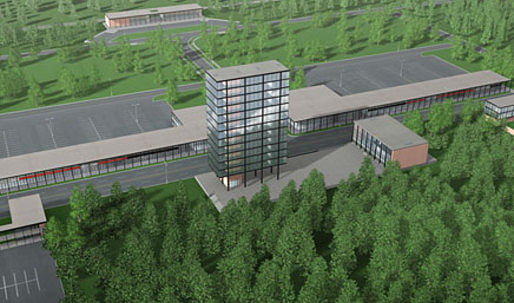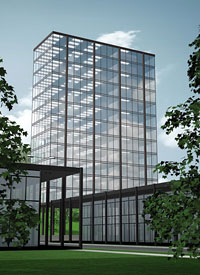

In 1955, Canadian uranium magnate Joseph Hirshorn commissioned Philip Johnson to design a plan for an entire town in Ontario, Canada. The project was never realized. Public Spirit , an animated tour of this Utopian town, debuted at the prestigious “Directions” exhibit in the Hirishhorn Museum on November 7th, 2008.

↑ Click above image to view high resolution video
Joseph Hirshhorn is best known as the man whose collection fills the Hirshhorn Museum in Washington, DC. But few people know about Hirshhorn's ambitious 1955 plan to build a Hirshhorn Museum in the wilderness of Canada as the centerpiece of a Utopian "town of culture"
The town of Hirshhorn, Ontario was designed by Philip Johnson according to a progressive modernist program. Special attention was paid to aesthetics; Hirshhorn requested "the most beautiful small town in the world." Public Spirit communicates the excitement and optimism of the town project with an emotionally uplifting mix of animation and music. Public Spirit is a wall sized animation, part of a larger installation piece with research about the town of Hirshhorn, and a scale model of the office tower.
This project was commissioned by the Hirshhorn Museum. All design and animation was done by Sticky Pictures.
Archinect: Describe your collaboration with Terence Gower on Public Spirit.
Sticky Pictures: Terence is a video artist and architectural afficianado. He discovered the plans for the Hirshhorn by Philip Johnson and needed a creative and production team to partner with in order to realize his goal of creating this Utopian town to exhibit at the Hirshhorn Museum in DC. Our role was to find a visual direction for the project including an editorial flow, town layout, environmental elements and all production aspects.
What resources did you have to recreate the town of Hirshhorn?
Alexandra Kiss was contracted separately by Terence to do the bulk of the modeling for the buildings. Many photographic references were supplied by Terence. Many of the textural elements were created from original photographic elements taken by us specifically for this project. Some of these textures were very period specific such as "aggregated concrete" and more challenging to find samples of. Other than that it was up to the team here at Sticky Pictures to realize Hirshhorn.
What were some of the most challenging parts of this project?
The biggest challenge of this project turned out to be the environmental aspects. Man made objects such as buildings are relatively simple compared to nature. There's probably more complexity in one tree than the entire town. When you start building an entire forest....well you get the idea. Architectural rendering often use 2-D cut outs of trees to solve this problem. However because of the elaborate 360° camera movements in some of the shots we needed to use 3-D trees in order for them to not look like cut-outs.
Other than that the duration of the finished piece and the need to render in HD meant that rendering was a huge time-factor in the project.
Artistically, coming up with a color palette that was both subdued, and period specific was also challenging.
What tools (hardware/software) did you use?
Maya, After Effects, Photoshop, Illustrator
Directions-Terence Gower, Public Spirit is on display from November 5, 2008 to March 22, 2009 at the Hirshhorn Museum and Sculpture Garden .
Sticky Pictures is a Brooklyn based design and animation house specializing in 3D and 2D digital animation. With experience in live action, illustration, and cell animation, as well, out full skill set is ready to accommodate the various needs of our client. We are about making the smart choices that best illustrate a brand's indentity. Our goal, to create a kick-ass visual experience that viewers want to see again and again.
Michael Darmanin the founder and creative director started Sticky Pictures after working in the motion graphic industry for over 10 years, here in NYC and in Australia his native country. Now he has been freed to paint the town.
On a more personal note we are a company with a green edge. We believe green is not a fad, but rather a commitment to our world. Our work practices are green from recycling, to the eco-frendily furniture we built, to how we commute to work. For us, green means integrity in all actions.
15 Comments
That's a depressing little town...
if these renderings were made 10 years ago I would find them acceptable. or was that artistic direction to such low grade renderings.
either way its good thing this didn't get built, the low grade renderings do the low grade modernism a tribute.
"The biggest challenge of this project turned out to be the environmental aspects. Man made objects such as buildings are relatively simple compared to nature. There's probably more complexity in one tree than the entire town. When you start building an entire forest"
this qoute says it all about the period of the architecture...and the level rendering skills here.
i almost want to ask, Sticky Pictures tell me this was intentional? Sticky Picture please tell me this low level rendering crap was an artistict decition? if not you have a lot of catching up to do with say Spline3D or DBox...
ok I checked out Sticky Pictures...I check out your website...
it's clear now that the renderings were artistic in choice.
so let me get this right theoretically, and i think this is important point...
low grade renderings...i.e. no GI and purely ray tracing with not very good glass reflects the ideologies of Johnson during modernism?
what I am saying is, I could of modeled and done that animation in a week, but I am not saying Sticky Pcitures does bad work...I am saying was
the INTERNATIONAL STYLE that freakin' easy? and that freakin' cheap lookin'.
and can all students now forever jusity their low grade renderings as artistic choices?!?!?
to summarize by rant
Sticky Pictures is talented and welled skilled as per their webisite. This animation is amazingly cheap and crappy, and does all the justice to the International Style, which was essentially cheap and crappy. Johnson's best project was a stolen idea, he owed Mies. So I congratulate Sticky Pictures on rendering the true quality of this architecture.
hey, eigenvectors, next time just think it.
Shit happens and the brains speaks I wish I could stop it.
hey, eigenvectors, next time just spell check it.
What a terrible place to be. The renderings- whatever. Why is it always about renderings and never about ideas? Any idiot can learn a computer program, who cares about a display of digital prowess more than the sordid reality of bad architecture? Or the fantastic reality of good architecture? As long as we're dealing with abstract representation, couldn't the discussion be a lot more exciting than a lead-in that sounds like a computer nerd finally getting a leg up on everyone else after that prom incident? A conversation about the artistic intent of bad renderings is about the most dull discussion that could be had about architecture I think.
k.w., i agree. but talking too much about rendering quality means you don't have to explain that you are still in school, or work for a boutique, etc.
this project is just like Johnson's campus for a school in Houston, so it is kinda sorta built.
where's winston smith's place? i need to return his ratmask.
kw & isla you missed the point....by a long shot.
based on both of your comments my drunken' critique seems a bit to advanced for your simple "so it is kinda sorta built." & "As long as we're dealing with abstract representation"
in plain and simple terms...
the renderings suck. the architecture sucks. the mentiond of HD is hilariously ironic for "abstract" presentation. bravo for making it appear as would be - sucky. get it?
if Sticky intended this the way it presents, they're artistic genius's, if they didn't don't tell people the obvious: "3D trees have more vertices than a Phillip Johnson"
which once again is a brilliantly funny statement about the dumbness of the international style and a prediction of it's ultimate failure and moreover why k.w.perry doesn't get it....
abstract representation...?!?!? exciting...real architecture?
wake the fuck up dude.
i see better renderings done in maya by sciarc students..
no honestly..
Johnson will always live in the shadow Mies. Those renderings are crap Where they done in out-of-the-box rhino with a directional light or what?
elgenvectors please read arktek's comment again. I think we all agree with him. Also, "genius's" & "dumbness" aren't real words. Also, I agree with some of the stuff k.w.perry wrote. Also, get over yourself.
Peace.
still drunk. still right. still unthunked.
Block this user
Are you sure you want to block this user and hide all related comments throughout the site?
Archinect
This is your first comment on Archinect. Your comment will be visible once approved.