
ShowCase is an on-going feature series on Archinect, presenting exciting new work from designers representing all creative fields and all geographies.
We are always accepting nominations for upcoming ShowCase features - if you would like to suggest a project, please send us a message.
Enel Contemporanea, the art sponsorship program of Italian utility company Enel, recently opened its third installation created by the American artist Jeffrey Inaba, in Collaboration with Luca Peralta Studio, Rome, Italy, at Rome's Policlinico Umberto I, the most important hospital in the Italian capital and one of the largest in Europe. A multi-functional medical structure which was at the cutting edge when founded at the end of the 19th century, today it is often the subject of debate and controversy.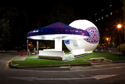
↑ Click image to enlarge
This is being countered by a gradual but significant process of renovation. The artistic project is focused particularly on the waiting and transit areas, used every day by large numbers of people. Within the delicate and complex social context that a hospital represents, the artist offers different kinds of space where patients, passers-by, visitors and doctors can enjoy moments of relaxation.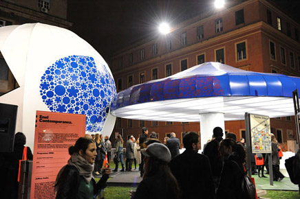
↑ Click image to enlarge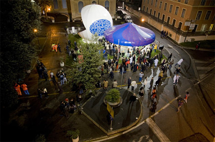
↑ Click image to enlarge
Colors, lights, geometric shapes and various environmentally friendly elements give the hospital a new, dynamic energy. Through art, waiting becomes potential energy, transmitting positivity and bringing an element of comfort to an architectural space normally seen as a temporary and highly emotional environment.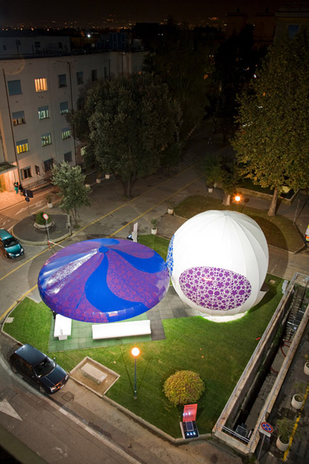
↑ Click image to enlarge
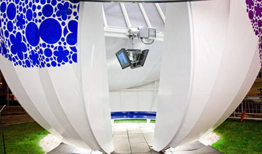
The solar PV system generates more than the energy needed for the electricity to run the lights and the monitors and DVD player inside the sphere. The project uses a sustainable system but it is also intentionally accessible in form and image (Alice in Wonderland mushroom meets solar ray chomping PacMan).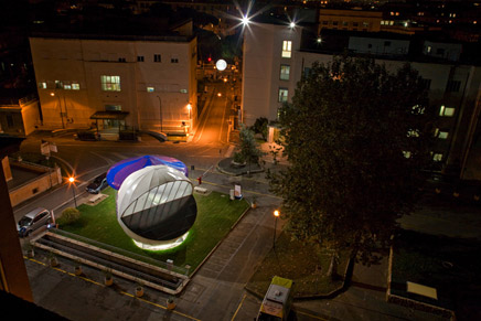
↑ Click image to enlarge
Jeffrey Inaba
Jeffrey Inaba is founder of the architecture and cultural consulting studio INABA based in Los Angeles, which operates across architecture, art and urban design with a special focus on research and social issues. He is also Director of C-Lab, the architecture and communication research group of Columbia University and the Features Editor of Volume Magazine. From 1997 to 2003, together with Rem Koolhaas, he co-directed the Project on the City at Harvard University's Graduate School of Design. He recently exhibited work at the New Museum of Contemporary Art (New York), Walker Art Center (Minneapolis), the Fondazione Sandretto Re Rebaudengo (Turin) and will participate next month in the show, BIG, INABA, MAD, MASS: Four Urban Proposals for Ansan, at the Gyeonngido Museum of Modern Art in South Korea. He lives and works in Los Angeles.
1 Comment
"it is also intentionally accessible in form and image (Alice in Wonderland mushroom meets solar ray chomping PacMan)."
I am interested if anyone has thoughts about this, seemingly, radical step towards representational architecture?
Let's not be too hasty and say its a direct step back 30 years toward the days of Gehry and Oldenburg collaborations, this would not be performative enough. But there seems a renewed interest in literal quotations to communicate contemporary feelings and use of form appropriation to do architectural work.
The Mushrooms single column in the center allows for entry into the pavilion from multiple sides, ie no singular front. While the pac-man's form signified the consumption of the suns rays, and deflects direct sunlight (passive solar) from entering the gallery. What also interests me is the way the two forms are joined. He uses a Koolhaas move, see the section of the Cardiff Bay project. Koolhaas merges 3 distinct forms through a continuous section. Here two referenced forms are architectural through their combination by the threshold entry into the sphere. He not only finds a way to enter a sphere, something Fuller himself had a hard time doing, but also consciously left the two forms intact with complete indifference, it looks so simple so easy, but this is a very controlled and interesting project.
Going back to my first question, how do the current projects of Greg Lynn (Slavin House, Bloom House, and his Toy Furniture) "stack up" in both their referential qualities and engagement with art, see Jeff Koons' Popeye Series?
Block this user
Are you sure you want to block this user and hide all related comments throughout the site?
Archinect
This is your first comment on Archinect. Your comment will be visible once approved.