
On the evening of January 28th at a packed Williamsburg Music Hall
, David Iseri and E. Sean Bailey of Konyk
faced off against Paul Kim and James Adams of FXFowle
in LVHRD's 4th annual Master-Disaster Architecture Duel
- an event that mixed spectacle with architecture and alcohol. The winner's ikOnyk
proposal and energetic presentation were imbued with the theatrical spirit
of the night and convincingly won the favor of the crowd.
Once online voting confirmed Team Konyk's victory I caught up with the triumphant designers for a discussion about LA, NYC, their place of employment, and their experience with LVHRD's ARCH DL IV.
Aaron Plewke: For starters, Sean and David, tell us a bit about yourselves.
E. Sean Bailey: Born and raised in Toronto, Canada. Completed my undergrad at the University of Toronto in Architecture and Art History - a double major bachelor of arts. Then moved to Connecticut for grad studies at the Yale School of Architecture - no pause in between. Now living and working in Brooklyn.
David Iseri: Born in Tokyo, raised in Sacramento, CA region. Just completed my bachelor of architecture at Cal Poly, San Luis Obispo. I just finished undergrad, like last June. Moved to NY in July, and like Sean, now live and work in Brooklyn.
AP: David, what compelled you to make the move from the other coast?
DI: It sort of was the right answer to post graduation. I needed a change of scenery. In terms of architectural opportunities I think NYC is one of the best in the country, there are a huge amount of firms and a great variety of work being done. The most interesting architecture firms on the west coast are generally in LA, and I really can't ever see myself living there. San Francisco and Seattle were possibilities as well, maybe Portland too. I visited NYC in April last year and really liked it. I think in an urban sense I'm very attracted to the density. There's a lot of energy here, lots to do. I thought I might as well go for it while I'm young or whatever, cliché stuff. But I'm having a great time. Eventually going to grad school on the east coast appealed to me as well.
AP: Sean, did studying at Yale influence your decision to move to New York?
ESB: Yes, in that it's a very easy transition to make. Geographic proximity means that NY has a very strong influence on the school, with much of the faculty commuting from the city, and students heading down whenever they can fit it in their schedules. There is a strong network of grads in the city, which is an added incentive. Being the largest urban center in the country also helps - that there is such a strong architectural culture in NY means that it is appealing for a young architect. I was strongly considering LA, but don't even have a drivers license, and so speculatively this seemed like a dangerous plan - I do, however, think that more interesting work is being produced there (in LA) than anywhere else in the country.
AP: LA? Why do you think that is?
ESB: I think there are a few variables that make this so. LA is a very wealthy large city, meaning that there is a market for architecture and architects. LA is a young city, meaning that context is constantly being refreshed. There aren't the swaths of landmarked neighborhoods that one finds in places such as New York. There is land in LA, meaning that architects are able to produce buildings. There are also streams of architectural thinking that have been accepted in LA that have yet to fully transition to the east coast, in part for the above reasons. It helps that architects such as Gehry and G. Lynn make LA their home, and have encouraged a younger generation to pursue what might seem on paper a less critical architectural discourse.
AP: If either of you is interested in addressing it directly, I'll paste here an excerpt from Nicolai Ourossoff's recent critique of Renzo Piano's addition to LACMA. What do you think about the point he's making? Does his statement resonate with your own thoughts on the city?
[excerpt]
Over the last decade or so, buildings like the Getty Center, Walt Disney Concert Hall and Caltrans Headquarters have added a new civic dimension to the city's architecture. They have also exposed a longstanding battle over the city's identity, between those who revel in its informality and those who seek to raise its status by following more traditional architectural models.
On one side are people like Mr. Koolhaas who believe that Los Angeles's emergence as the greatest experimental laboratory in 20th-century American architecture was rooted in a rejection of worn-out East Coast traditions. From this point of view the most important architectural achievements — from the streamlined department stores that rose on Wilshire Boulevard in the 1920s to the residences designed by Rudolph Schindler, Richard Neutra and Mr. Gehry — sprang from an effort to come to terms with the city's strangeness, its urban sprawl, its embrace of car culture, its mix of natural and artificial landscapes. The most inspiring recent architecture has tended to build on that legacy while taking a more enlightened view of local and environmental concerns.
On the other side are those who embrace East Coast models as an antidote to the city's ethereality and all that freedom. Such repressive conservatism is driven by Old World anxieties about mixing high and low as well as a nagging sense of cultural insecurity. And in many ways it seemed to crystallize in the travertine geometries of Richard Meier's staid 1997 Getty Center, a $1.3 billion cultural fortress that looks down its nose at the city from atop an exclusive Brentwood hilltop. Cars are banned from its precincts.
[/excerpt]
ESB: Sure, identity plays a role, but I don't think it's necessarily a situation of security vs insecurity. Comparing LA and NY is like comparing an 18 year old to his 40 year old father. While dads are sometimes cool - Ruphus Humphrey on gossip girl was the lead in an 80's rock band!! - they're inevitably going to embarrass you when you bump into them while on your hot date with the new girl/boy/bombshell at school.
DI: Sean is on a roll. I'll be brief because I do agree with many of his sentiments on LA = Gossip Girl. But I don't think I can romanticize the city the way a lot of these architectural texts do. Lack of identity, urban sprawl and car culture benefiting the informality of the city and experimental architecture going on in the city are things I agree with; but aside from all the great new architecture and cool firms, I don't think it's a haven of awesome. I don't like driving around in LA. It's endless and pretty monotonous; sometimes it makes me want to die. I guess my qualms with LA are pretty typical, and there are definitely merits to the place, but again, I'm enjoying New York.
AP: How did you guys end up working at Konyk?
DI: I was looking for a small design firm doing a wide variety of interesting projects, where I could be pretty involved with all phases of design right from the start. I didn't know much about Konyk's work before coming here, but the firm appealed to me for many of the previously mentioned reasons. Nothing really exciting about how I ended up here, Craig
was hiring.
ESB: I did a competition with Konyk when I first moved to the city after interviewing with the principal. This is what ultimately led me to accept a job here. I enjoyed the process, and the relaxed nature of the environment, and it was of a scale that appealed to me. I anticipate opening an office at some point in the future, of a similar size, and so it's been invaluable to jump straight into the running of projects and to be exposed to all of the facets of the design process, and the running of an office.  WHORL building. Competition entry for a new office building in Preston, UK.
Image and text courtesy of Konyk.
AP: What kind of projects are you working on at the moment?
ESB: At present I'm working on a church and a brownstone remodel in Park Slope.
DI: Currently I'm working on an artist’s colony in Greenpoint. It's an old 3 story brick building and we are gutting all the interiors and building a new building inside the old shell. The church in Tribeca uses a similar concept. 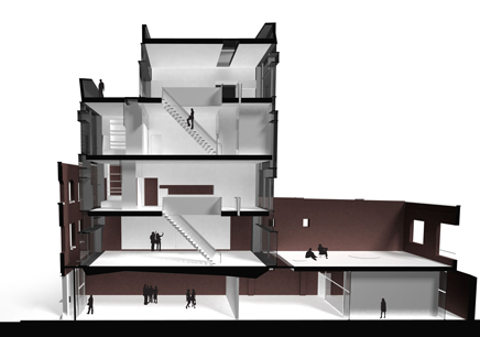
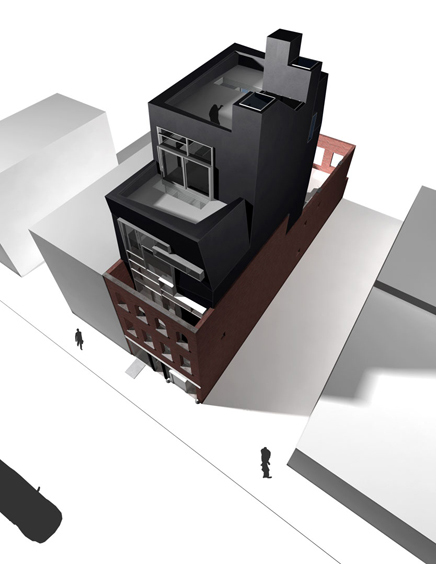 Freeman Street Artist's Colony, Greenpoint. Images courtesy of Konyk.
Click here to enlarge: 1
| 2
AP: What else can you tell us about Konyk?
DI: Most of the work that Konyk is known for was designed by a lot of other people before I arrived. I think that currently one of the more well known projects is the UP!house
, a prefab design that was featured in the Design Life Now
design triennial. Our office is small (there are currently 5 of us), we're in Dumbo and it's a fun part of town, very noisy. It's a friendly atmosphere in the office. I like the playfulness of a lot of our designs. Recently the projects seem to be buildings within buildings in concept.
ESB: In my opinion it's a firm that succeeds on the design front because all of its members are entirely vested in design - both as a professional, and as a creative pursuit. There are no cad monkeys in the office, and we would all like to think that we have a pretty good eye for design - if a bit eclectic at times. We have our hearts in it.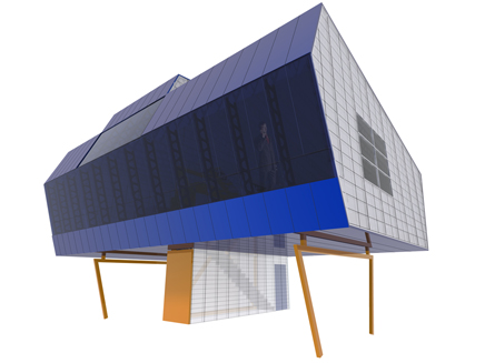 The UP!house was commissioned for dwell magazine’s dwell home invitational of April 2003. The UP!house is an investigation into a prefabricated architecture that borrows from the world of industrial design, specifically automotive design and production techniques. With options ranging from power windows to home theater entertainment packages, the UP!house is an attempt to make the purchase of the single family house more akin to that of the latest model Jetta.
Image and text courtesy of Konyk. Konyk's studio. Image courtesy of Konyk.
AP: So how did you end up in the Duel?
ESB: I think that LVHRD scoured the city for participants as most of my friends were contacted in some form or other. I think we were just quick to reply. David and I reluctantly agreed to it without really knowing what it involved.
DI: The Wednesday before the duel, Craig received a phone-call from the LVHRD people. He asked us if we wanted to be in an architecture duel, Sean and I were confused because neither of us had ever heard of such a thing, but didn't say no, and the rest is history.
A little piece of theatre: before the duel, I think it was the day after we confirmed as part of it, two LVHRD gentlemen came to our office, one dressed as a lumberjack and presented us with some kind of declaration of war which Craig had to sign, which was then to be delivered to FXFowle. It was presented to us in a lumberjack's glove. Craig was out of the office when they showed up.  MC Lumberjack. Photo by Susan Surface
Click here to enlarge
AP: Did you do anything to prepare for the big event?
ESB: We didn't prep all that much since there was very little time between being contacted and the actual event. We did some research into sustainable technologies, specifically technologies we felt could be utilized in an arctic climate, we read up on the oil pipelines, and we imagined potential narratives relating to the clues that had been dropped. We also entered the competition with a sort of wish list we hoped to incorporate into the design if possible.
The rest of our time was spent making t-shirts. This involved getting advice from the boys at American Apparel on outfits they thought would make us both extremely visible and appear confident, but also make us seem pathetic enough to arouse sympathy from our audience - we didn't want to look like douche bags.
DI: For a week Sean and I would be working at our desks and periodically ask each other if we should have a meeting to prepare, but that didn't happen until the last minute. We had an impromptu meeting the night before the event, which didn't amount to much except shirt design (we bought the shirts some night before that), the day of the event and spray painted our shirts, poorly. We spent a little bit of time on the Internet before the event looking up various crises and catastrophes in Alaska and thought about how to avert them. I looked up FXFowle's website sometime during the week before then; it sorta cracked me up because I didn't realize our firms were total opposites.  James Adams and Paul Kim of Team FXFowle. Photo by Susan Surface
Click here to enlarge
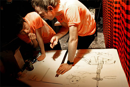 E. Sean Bailey and David Iseri of Team Konyk. Photo by Susan Surface
Click here to enlarge
AP: On the night of the duel, did all of the press presence catch you off guard? I figured there would be some bloggers there, furtively covering the event, but I was a bit surprised to see the crews from Metropolis and Bloomberg with their big cameras and fancy microphones.
DI: Definitely, at least initially. It got easier as the night progressed.
ESB: Yes, the amount of press did catch us off guard. We knew that LVHRD
would be catching everything on camera, and that Archinect
would be there, as well as another independent film maker, but Metropolis
and ArchRecord
were news to us. I think the first round of interviews loosened us up enough that we were not fazed during further interviews.
AP: An independent film maker? Is this someone you knew before the event?
ESB: Craig had worked with the filmmaker in the past at some point, and David was familiar with his work from a previous workplace.
DI: I think the independent film maker was with Bloomberg or they were the same thing. Howard Silver, he's a friend of Craig's, they previously worked together.
AP: David, do you know anything else about this independent film?
DI: No, other than Howard Silver is directing it. I know he made documentaries for SITE
back in the 80's. He said the coverage of the duel will probably be only about 1 minute long in the final cut for the whole film. I think the project/film is called "Bloomberg Muse."
AP: Did you guys (or Craig) have a hand in selecting your rival, or was it arranged by LVHRD?
ESB: No, we had no hand in the choice of the rival.
DI: We had nothing to do with selecting our rival, LVHRD did all the arrangements. Although we knew almost immediately from LVHRD we were dueling FXFowle.  The battlefield. Photo by Susan Surface
Click here to enlarge
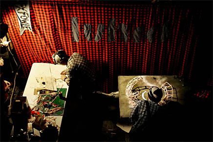 Team FXFowle. Photo by Susan Surace
Click here to enlarge
 Team Konyk. Photo by Susan Surface
Click here to enlarge
AP: You mentioned earlier that LVHRD dropped some hints about the design brief before the event and that you had your own wish list that you wanted to pursue in the competition. Was there anything in the video brief that altered the notions you had going into the duel?
ESB: When LVHRD announced the duel they had posted an article on the Alaskan pipeline, so this gave us some indication of potential briefs. We knew that in past years there had been an emphasis on sustainability, and so from the beginning we had a pretty good idea of what types of ingredients might come in handy at the actual event. There was also the emphasis on animals and lumberjacks prior to the event, so we surmised that helping out endangered wildlife might come into the equation somewhere. The brief ended up catering exactly to our speculations, and so we were able to implement most of our wish list - this included the solar tower, raising the ground, reinstating the permafrost through active means etc.
DI: Not strongly, the video brief was nice to finally know the program, which informed most of what we designed. There were definitely hints of the Alaskan pipeline as well as the future prior to the event. We were told what material we would be using the night before (straws) and we were pretty sure that it would represent the Alaskan pipe line, so none of that was a surprise. We also got to see the bases we would be working on the Friday before the event, and I definitely had desires to use the base in the model, nothing specific, but try to take advantage of the great foam and flocked landscape they presented us.  David Iseri of Team Konyk. Photo by Aaron Plewke
AP: That struck me as an intelligent use of the given resources. After seeing that I half-expected you guys, or FXFowle, to use the boxes that the straws came in too. Was there any typical tool or material that you wished was on hand?
DI: We did use some of the boxes, only as a base for the solar tower as it was pretty unstable when we built it, but in hindsight you're definitely right a lot more of those boxes could have been used as well. I would have killed, (or maybe like given a lot) for a foam cutting tool of some kind. Even a steak knife.
ESB: We were more concerned with the adhesives, than the ability to model with further materials. They had only provided us with glue guns and tape, and the glue guns were useless because the straws were too smooth for them to grip onto, and the glue got so hot that it risked melting them. Another issue was the length of the power cord on the glue gun. At one point we had to rip the lights from their sockets in order to get some slack in the cord, just to be able to glue on top of our landscape. I think that the model was extremely fragile in the end as a result of this, and the tape definitely did a much better job of sticking the straws together. Before the duel we had requested the ability to use double sided tape, but this request was denied.
AP: Can you give us a synopsis of your proposal for the Alaskan Wildlife and Research Center?
ESB: Our basic proposal was to recreate an arctic climate of the year 2008 in the year 2029, in order to provide an environment for displaced wildlife. In order to achieve this, we proposed actively and passively cooling the ground around our research centre by harvesting energy through sustainable sources, including the solar tower, and wind turbines, and funneling almost all of this energy surplus into active cooling strategies - strategies that are currently utilized on the Alaskan pipeline to maintain stable foundations. Passive strategies included cooling wells which sucked colder temperatures from underground and brought them to the surface, which constituted the legs on which the center rested - these could also be used to actively cool below the surface. We also anticipated that the arctic climate would work in our favor during certain parts of the year, so while the solar tower would be redundant in the darker months of the year, it was during these very months that the climate was already at its coldest - the tower in these instances might function as a cold air reservoir. Beyond these concerns, by pulling the ground on top of our building, we were able to create micro environments for captive animals, land for food growth, and vegetation to filter the carbon produced be the center's inhabitants. Staggering these plots sectionally allowed us to create barriers between these zones - a landscape of plateaus at various elevations. We utilized the pipes themselves as wind collectors by fitting them with wind turbines. In plan the center resembled a donut, which was a means of harvesting winds from every direction. There were also some cheeky strategies employed that we anticipated might prevent further human development around the center. There have been several instances lately in places such as the cape, where wealthy land-owners have protested the harvesting of wind energy offshore, as it is a blight to their views. We thought, what better deterrent to the wanton development of the region surrounding our research center than a two thousand foot tall solar tower - A polar bear friendly smokestack.  Team Konyk's model. Image source: lvhrd.org
DI: I think we wanted to pack as much carbon free efficiency together at once in order to help preserve the arctic climate and habitat. The prompt itself was a wildlife station in the future, a monument built out of the Alaskan pipeline. So, assuming that there is an environmentally appropriate way to move 800 miles of pipeline across the country is pretty ridiculous itself (maybe fuel cell technology). We knew the pipeline is fairly large in diameter (4'-0") so we stacked sections together and filled each with small wind catching turbines. These pieces of pipe were honeycombed together to create a structure that could be used for housing as well, as there could be voids in the honeycombed pipe structure. Built on top of this was the wildlife refuge type place (using the landscape). We wanted different heights to create different levels to the artificial landscape so each level would contain a different type of animal, (we didn't want the caribou mixing with the polar bears unless it was for research purposes). This was all lifted off the ground to preserve the permafrost, and energy generated from the wildlife center could be used to cool the ground below as well. The actual wildlife free roaming zone was the landscape beneath the center. The other energy generating element was the solar tower which doubled as an observation tower. We had another not so important side effect of the solar tower as an object to ward off eco-tourism. Apparently Alaska has recently been having a problem with this, as developers are destroying large parts of the wilderness to construct enormous mansions. The solar tower would counter the eco-tourism by blemishing their bedroom views of the wilderness with an enormous smokestack. Sean Bailey of Team Konyk presents their proposal. Photo by Susan Surface
Click here to enlarge
 Paul Kim of Team FXFowle presents their proposal. Photo by Susan Surface
Click here to enlarge
AP: I appreciate the insertion of some clever commentary into the narrative. Deterring tourism seems like a totally legitimate strategy for this sort of situation. Were you generally pleased with your proposal?
DI: In terms of the design generally I was very pleased with the outcome considering the 30 minute time frame for the overall design. The execution however was pretty ridiculous with the tools we had. I was not prepared to cut foam using open scissors, and that was physically tiring. I don't know if the open bar helped us or not. We made a big mess, tearing the foam base apart which played to our advantage with the crowd I think, although that wasn't planned. There was blood. We were given 90 min to construct the model and I think we managed our time pretty well; we even finished 5 minutes before the extra 5 minutes were given. The 90 minutes went by in a blur though; we were focused and very busy. I know that we could have made a much nicer model given some more appropriate tools, but the rawness of the model really pleased me, because it looked hectic and absurd. I liked our presentation overall as well, Sean was really chatty, which was good because I think I sound like an idiot on the microphone, we didn't cover everything but managed to explain most of the aspects of our design.
ESB: I was generally pleased with the proposal. We made an attempt to pack as much into the design as possible, so that every move was both formal, but also contributed to our environmental goals. The end model wasn't quite as refined as we had hoped it would be, but many of the tasks took a lot longer than we had anticipated, and so sacrifices had to be made. It did fairly accurately match our sketches though, and I was quite enamored with it by the time it came to the unveiling _ a sort of ugly/beautiful monster on legs _ I think it definitely provoked some visceral reaction from bystanders, whether that be one of wonderment or of repulsion. As for the presentation, I'm not sure whether we were fully able to communicate the complexity of our aims, but I was mostly happy with it. I can remember a roar of cheers at the final pronouncement of "PERMAFROST!" Konyk supporters show their love. Photo by Susan Surface
Click here to enlarge
AP: What do you think of the spectacle that LVHRD created? Do you think they're making a positive contribution to design culture and to the architecture community (locally and via the Internet) with these events?
DI: I appreciate that the spectacle was well produced. Video prompts, secret location, decorating, website, etc. It made it a lot easier to get into it. 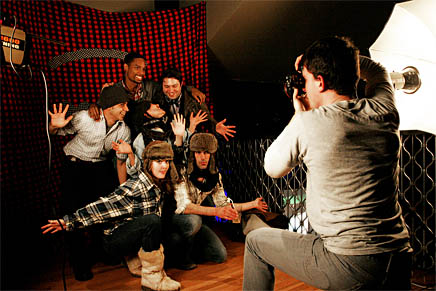 Photobooth. Photo by Susan Surface
Click here to enlarge
ESB: I generally am a fan of any sort of event that creates giddy excitement about design. Architectural celebrations are typically muted and demure - dirty martinis, cheap white wine, and mini hamburgers if you're lucky. Simply put, it was a refreshing detour.
DI: Like Sean, I think it's a nice change of pace especially for an architecture related event. It's a spectacle of building, which doesn't get much exposure in our field and with the general seriousness involved with the architecture culture as a whole it was fun to do something like this.
Creative Commons License 
This work is licensed under a Creative Commons License
.
/Creative Commons License
Aaron Plewke is an associate at Deborah Berke Partners. He designs and manages projects in all sectors, distilling each client’s needs into unique, transformative solutions. Aaron began practicing architecture in 2005 and has worked in Florida, St. Louis, and New York, on projects ...
13 Comments
i think the duel would have been better if it had involved guns...burr vs. hamilton style.
"LA is a very wealthy large city, meaning that there is a market for architecture and architects."
does that comment mean that only wealthy people/cities are able to have interesting architecture?
i think that designing for budgeted, or even minimal budgeted projects is ten times more challanging and interesting than doing work for rich people.
these guys are pretty cliche too.
"does that comment mean that only wealthy people/cities are able to have interesting architecture?"
no
"these guys are pretty cliche too."
ouch.
DaleCooper - Sean's answer seems perfectly reasonable to me. You are certianly entitled to your positions and opinions, but please save the insults and bring something more useful to the conversation.
I don't think i was insulting anyone, I'm sorry you felt that way. I was just pointing out that one of his statements was a bit....naive.
i was referring to the "cliche" comment. as i said, you're entitled to your opinion. it would be great if you could qualify your position a bit more.
ok, since i'm being given the hard press for everything i write.
I think it's quite cliche, the sotry of people finishing their degrees and then moving to New York, with high hopes of becoming the next great designer . I did not mean anything good or bad, just pointing it out.
Does that qualify it enough for you, AP?
hi dale, I'm esb. As stated in the interview I moved to ny for a few reasons, and in large part because this was an easy transition. By no means was this an attempt to dissuade archinecter's to turn a blind eye to the rest of the design world. My position was mostly based on circumstance, but I am very happy I made the move, and have been having a great time socially and professionally since moving here. I don't know that I'm in any position to claim to be the next great designer, but design is something I am very passionate about. I had initially omitted the part in the interview about some day wanting to run my own practice, but decided that this was generally a positive message for my peers.
thank you for providing more details. i appreciate everything you are doing, and wish you all the best. perhaps my 'confusion' was due to the poor reporting of this. either way, i applaud you and all your future endeavours.
You know you've made it when strangers prematurely dismiss you on the 'Nect. It's like a rite of passage; welcome to the profession!!!
Actually that's one of the beefs I have with so many architects - why so serious, why so immediately down on everything, why so quick to dismiss?
Consider the circumstances:
*These people had an hour and a half to make a design proposal and build a model out of many drinking straws.
*Last year, the teams had 25 lb of cheese instead of straws.
*The audience was asked to dress in costume as either lumberjacks or woodland creatures.
*Everyone was drunk.
*The project brief didn't include the specification "Provide genius, culturally sensitive mixed income residences, while simultaneously curing cancer and making babies laugh."
It's ok to be lighthearted sometimes. There's no need to read class warfare into a 2 sentence response! ;)
This conversation would have ended much cooler if DC was all, "You're still a naive little prat, esb" rather than suddenly apologizing and sneaking AP's insult in there. Stand by your grump, dude, stand by your grump. I want to see more confrontations like this.
http://www.youtube.com/watch?v=IwwztaZUkUw
ok, well if it makes you feel any better, i think this "article" is a waste of time, written about a bunch of self absorbed narrow minded loosers.
dalecooper, you must have a lot of time to waste if you read the entire thing then started a discussion about it!
i liked the article. i'm a little tired of hearing about this event but i enjoyed the discussion with david and sean, both of whom are in a very similar position to myself.
Great article! For the record, though, this Metropolis reporter has neither a big camera nor a fancy microphone.
Block this user
Are you sure you want to block this user and hide all related comments throughout the site?
Archinect
This is your first comment on Archinect. Your comment will be visible once approved.