
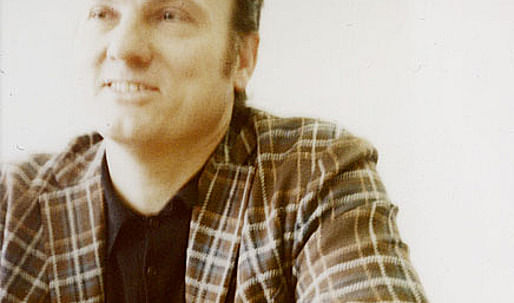
A conversation with Willem-Jan Neutelings about the tradition of architecture and the way iconography should be applied in architecture.
by Michiel van Raaij
An old profession
“The axis Columbia – AA – Berlage Institute is the axis of evil,” Willem-Jan Neutelings laughs. Then serious again: “For ten years the American architecture schools, in combination with a couple West-European schools, have promoted the idea that new means give birth to a new architecture. I find it evil that this is being explained to the youth, because the youth doesn’t understand how architecture works anymore, and that keeps on getting worse. There is no writer that would say, that because books are now typed on computers, he makes a different literature. But that is what architects say.”
“The Mercedes-Benz Museum is a building of which one says it is because the flows of the public have been studied, or because the computers have all designed it, or because the French philosophers have thought it that way. But one could also say it emerged because Ben at one moment drew a beautiful charcoal sketch. All that is not important!”
“These are all decoys to position oneself in a contemporary debate, but the essence is that Ben van Berkel is just a Beaux-Arts architect, because he handles the architectural instruments incredibly well. We all use a very old set of instruments, in the sense that a building is driven by composition, tectonics, partie and pochet, arrangement, light and dark, material skills, all those matters that make up the classic, 5000 year old methodologies to design architecture.”
“We are now planning to create a school, in the office, where we invite old teachers to explain color-theory, composition, or perspective, because nobody knows that anymore. They all have knowledge that is completely useless to create architecture.”
The argument of Willem-Jan Neutelings was an answer to a question I didn’t ask. Mr. Neutelings has a mission, and takes every opportunity to educate it.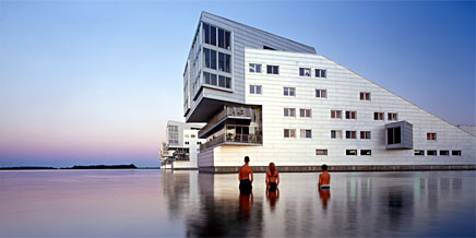
Neutelings Riedijk - Sphinx Housing (Copyright Jeroen Musch)
In the past years Willem-Jan Neutelings and Michiel Riedijk, partners in Neutelings Riedijk Architects in Rotterdam, have become the leading architecture intellectuals in the Netherlands. The surge came on all flanks: An oeuvre with consistent innovation, coupled to a series of high-profile projects all located in the Netherlands. Then there is the book ‘At Work’. And the final strike was a number of polemic lectures that were everywhere applauded. At the ‘Architectuur 2.0’ conference last October a thousand Dutch architects made an (almost standing) ovation to Mr. Neutelings. The advocated message? You just read it: after the end of theory, after all emergent blobs have popped, the tradition of the architectural practice is back.
Instead of hoping for a revolution that will never come, the agenda has refocused on a cultural conservatism. But, “our call for tradition is not about style, it’s about methodology”, Mr. Neutelings assures me.
Highly significant is the reoccuring pointing by Mr. Neutelings to the nineteenth century, not by coincidence the moment just before Modernism interupted that tradition. It was also the moment representation blossemed like never before in the neo-styles. When studying ornament and iconography the nineteenth century is the place to be, even though it looks like a paradox: Look back to move forward.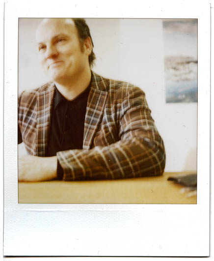
Willem-Jan Neutelings (Copyright Hidde van der Lijn)
The thin line between the banal and being misunderstood
The question I did ask was: Since the nineteenth century the themes in architectural representation have broadened enormously, as shown in the work on Neutelings Riedijk. The exterior cladding of the Shipping and Transport College in Rotterdam refers explicitly to the stacked containers in the harbor. The interior features ceilings like sails, windows like portholes, and a lecture room with square, red ‘life jackets’ for acoustics. It’s a building that echoes maritime industrial products. How can that still be connected to the tradition of our profession?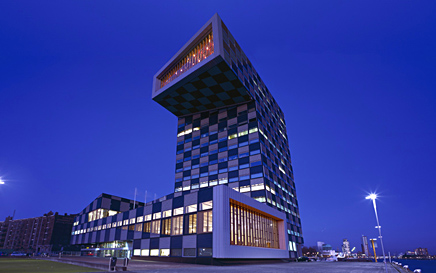
Neutelings Riedijk - Shipping and Transport College (Copyright Jeroen Musch)
First Mr. Neutelings denies: “Let’s say that when the old Greeks used an Acanthus-leaf for a theatre, it was just because they were inspired by an Acanthus-leaf. Nothing has changed.”
But then he agrees: “The themes are different. A writer still uses the same grammar as 150 years ago, but he writes a book about a very different theme, because different things are happening now.”
The metaphor of the writer is smart: Iconography translates as ‘image writing’. That’s is the direction I aim for. In the contemporary debate I think three positions on the use of iconography can be distinguished:
First there is Charles Jencks who advocates the ‘enigmatic signifier’. Only an icon that allows multiple readings grasps and keeps the attention of the public. Take the Swiss Re tower from Norman Foster: Is it an egg, a cigar, a dick, or a gherkin? That is success, Mr. Jencks says.
Then there is Alejandro Zaero-Polo who put back the old element of ‘truth’ in representation: A façade should not just be an image, but should represent, in honesty, what kind of construction and organization a building has. Iconography should have a ‘double agenda’. His Yokohama Cruise Terminal applies the image of the Hokusai wave, a tsunami, in such an integral way that it enhances the flow of passengers, and the load-bearing steel structure. Iconography, organization and construction should come simultaneously, Mr. Zaero-Polo says.
After the Yokohama Terminal Mr. Zaero-Polo has not realized a similar integral building – it’s an agenda that seems too ambitious. Neutelings Riedijk on the other hand seems to represent a far more pragmatic approach: The appliance of a singular, deliberately chosen iconography for the form and texture of a building, without a direct connection to the construction or functional organization behind the facade.
“I don’t know”, is all Mr. Neutelings says. He likes to think of himself as just an architect. But later on, when I ask him about the criticism of being too literal when applying iconography, an answer does come up:
“I agree, that is our lack of talent. It is important that the meaning is layered. In general, one takes out the things with a very singular meaning. That also goes for a book, a film, anything. Pieces of art that are rich with meaning last longer.”
But the example of the urinoir of Duchamps Mr. Neutelings then puts forward immediately poses a difficult question: How to recognize a ‘layered’ object? How to distinguish layers?
“It is true that some of our buildings are a bit too… thin, in the sense that they don’t succeed in touching all those layers. Sometimes that is because the commissions are just too limited to live up to that ambition, but sometimes it is also just because we can’t do better. That’s the way it is.”
That would prove my hypothesis of a specific position on iconography wrong: Neutelings Riedijk aims for the enigmatic signifier, described by Charles Jencks, but wasn’t talented enough to realize it.
As Mr. Neutelings talked further though, a more unconscious concern with readability comes up, a concern that contradicts the idea of the multi-layered iconography: “The funny thing with buildings with a lot of layers… Our Tax office in Apeldoorn is very layered, but because of that a lot of people find it hermetic and hard to understand. So it happens that currently, in our image culture, an easier understandable form is faster absorbed.”
“I don’t say that’s better”, he adds. But you hear him thinking: We want our buildings to be popular, to be part of society – without becoming totally uncritical, or fully banal.
And wasn’t the Acanthus leaf in Greek architecture a singular iconography, abstracted though it was?
How Aldo Rossi has limited the number of icons
“The misunderstanding of our time is to think all buildings should be icons. We don’t think that. A building should only be an icon when it’s nature allows it. The reason to actually want iconography is, because it is an important building, you think it could have a specific expression, and should not conform to anonymity.”
The icon in the view of Mr. Neutelings is connected to the idea of the monument, of the (public) building that - because of its form and position in the city - does justice to its important program: “Iconography is never a goal in itself, but always a result of the commission. On the sly I have to admit we mostly don’t strive after that kind of commissions, but that is something else.”
When I say that reminds me of Aldo Rossi, he just knots. It is like that. “One of our secrets at the office is that Michiel Riedijk has studied by Aldo Rossi.”
For me that is a revelation. Was it Aldo Rossi who theorized the icon so it could emerge?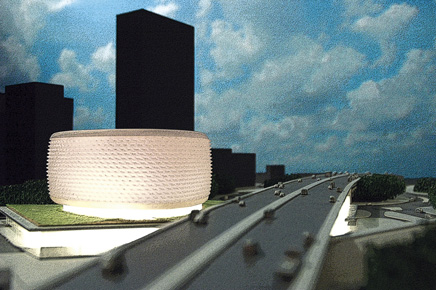
Neutelings Riedijk - Porte de la Villette (Copyright Neutelings Riedijk)
In search of the right expression
The most mentioned word in the interview is ‘nature’: The nature of the building, its character, its essence. The iconography of a building should represent that nature.
As an architect Mr. Neutelings doesn’t theorize the representation in architecture, but talks more on how he designs the iconographic thing: “We want buildings to have a great sculpturality, one that could possibly represent something. Iconography is in the first place tectonic.”
“In the case of the Shipping and Transport College the iconography has to do with the fact that we didn’t want the expression of school - because is not really a school; we also didn’t want the expression of an office - because it also isn’t really an office. It is an institute that has a lot to do with maritime business, where inside stands all kinds of equipment to simulate that. So we wanted to try to make an object that would connect to the harbor, that would appear like a harbor building, that would be familiar with cranes, silo’s, warehouses. Those buildings are in themselves more expressive, have weird forms, curious cantilevers, or large beams. Because that is the nature of such architecture.”
“The iconography of our buildings doesn’t express the function, it doesn’t display how the building works”, Mr. Neutelings further explains, “We search for an expression that connects to what’s inside, but also links with the context. For instance the harbor.”
In the case of the Shipping and Transport College those two representations match: It’s a harbor building in the harbor. It’s the kind of ‘reinforced’ strength in image that features the best work of Neutelings Riedijk.
The chosen reference, like the harbor, is abstracted into architecture by tuning it with functionality and building technology, but also by following the irrationality of the sculpture: “We do that by making a lot of models, to try a lot of sculptures, and choose from that.”
In four steps:
0. If it is a contemporary monument,
1. You have to make a distinct building,
2. That represents the nature of the building in its form and cladding,
3. While still connecting to the context,
4. And following the logic of the sculpture.
That’s how one designs an icon.
15 Comments
Interesting....
I never thought of Iconography in this context before. Creating a building that is contextual (referencing it's physical or non-physical environment) results or is made easier through the use of an Iconic image or Iconography.....
Usually, i think of the icon as being non-contextual, dropped down into anywhere, to create an identity for a program. Here the idea is articulated that it doesn't create the identity, but rather represents the one that already exists?
Is that right?
If so it is an interesting take. One that i think is perhaps a more critical approach to the Icon than has been previously taken, at least by me.
is it really that simple?: I = 0x1x2x3x4
certain things can be iconic, and not necessarlity in a positive connotation. the reflective dimensions of "time" and "social context" play immense roles in the creation of an icon. isn't that the true nature of an icon? --that it represents an ideal?
an example of an accidental monument is the berlin wall, [representing Rossi's definition very well]. it survives to tell a cautionary tale, reminding people of the state of the world at the time of construction [and de-construction]. in this case it represents the opposite of the ideal.
but when taking the eiffel tower into consideration, there was and is almost zero function as a useful building [this can be argued of course-not counting the current restaurant at the top]. its function is solely artistic, representing a time of mankind's progressive ideology within the medium of iron and form. but it still aspires to something higher in the collective human psyche. something intangible...unknown.
wouldn't an aspect of time-lessness enter here? this is not to say that a structure is meant to last forever, but that the idea[s] it represents is revered by mankind forever. this would narrow down the true icons to a slim few eh? ...and would spark a debate of what is monumental [or possessing such qualities], and what is truly iconic.
how can a structure continue to be iconic when it is of no more use to
...humanity as an idea? ...a culture as a symbol?
the pyramids are useless today as an inhabitable "building", but still serve as an icon to an historic culture that once used it as a tomb. and what was the idea that the pyramids revered? DEATH. an idea and unavoidable [both individual and collective] event that transcends the human existence and will forever be unknown to us on earth. that's about as iconic as it gets. and the test of time has been proven since they still remain.
wasn't it Alvar Aalto that said "a building can only be deemed 'good' if it was still stood 50 years later"? this was not only a foreshadowing of our "living in an instant" society, but if people [not to mention architects] can't predict the future, how can we deem what is iconic [or not] in a present tense setting?
sorry for the long-winded post. the notion of 'icon' conjures up so many images/ideas.
this feature is a definitely a great theory evolving out of a discussion with the architects. it would probabaly be more interesting to keep the discussion going in person and not just in blog posts.
Yes,
I guess for me i was struck by the idea of Icon as responsive somehow to the demands of context.
I have always criticized this tendency for its anti-contextualism..
As for the computer. Not that it is useless, but..
I do think he makes a point about the realness of education. In the sense of crafting a building. Facades' and scripts do not a program make.
now, all architectural icons of the last 2000 years are in some way contextual, it is just not always the build context the are referring to.
and who said, build icons are already great architecture?
and isn't icon-architecture now nothings else than the standard demand of the client?, and isn't icon-architecture now anythings else than just great for the architect's publicity demand?
one should better start to think about the non-inconic...
Instead of hoping for a revolution that will never come, the agenda has refocused on a cultural conservatism. But, “our call for tradition is not about style, it’s about methodology”, Mr. Neutelings assures me.
something else is being provoked here as the definition of 'icon' is used in the article as a signifier.
Orhan...
Good point. I guess that was what fascinated me about the arguement made re: Iconic as contextual..
It seems it goes to a larger point. Wherein a return to "traditional methodology" is emphasized over a script generated or tech heavy building, which although of the moment, may not be addressing larger and mor ehistorical questions of practice..
"...a building is driven by composition, tectonics, partie and pochet, arrangement, light and dark, material skills, all those matters that make up the classic, 5000 year old methodologies to design architecture.”
A building should perhaps be driven by the user...
It is also interesting that this article written by Michiel van Raaij, who he himself admits that "...to resort to iconography as an alternative to a coded or indexial language is a kind of primitive choice".
Oh, the rumblings of past theoretical doctrines are now again knocking at the back door of architectural practice. Some would say theory is dead and has been dead since perhaps the last “post-ism” came screaming across the desks of direction-less architects looking for a new style...a new reason to create.
It would seem the last thing architecture needs is a set of new ideologies dusted off from the past to serve as an emplacement for a profession that is yet to fully pull it’s head out of the ass of Derrida.
I’m not suggesting theory is useless and shouldn’t be duly noted, knowing your history is an important part of growing up. Charles.S. Pierce is famous for his theory on semiotic relationships and signs.
“because the indexical sign is understood to be connected to the real object, it is capable of making that object conceptually present.”
He wrote in length about how the Icon is one of three typologies that signify an object.
The theory, the knowledge it is all very interesting and does enlighten motives in all spectrum’s of life and science. It does not, however provide for a very convincing argument for a new direction in architecture.
I’m not sure I have an answer to replace Mr. Jan Neutelings argument for iconography. I do believe that a direction for architecture lies not in the mimetic, or with an architecture as some expression of current technology--architecture should avoid allegiance to all of these inflexible ideologies.
It must be said that developing technologies can not be ignored, with them we now can not only create an object (Icon), but we can efficiently create variants of that object and new possibilities of that object based on it’s defined parameters...
To me this discussion can be boiled down to one of simple ontology, finding a subject, a relationship, and an object to talk about.
“What exists,”
“What is,”
“What am I,”
“What is describing this to me,”
I love the enthousiasm in the reactions here, and like to answer at least some of the question that have popped-up here.
The presented 'formula' here is caricature of the method Neutelings Riedijk applies, but not less true. It is also not the only way to make an icon, but merely a way that - as it happens - proves to be a successful one.
I am curious what you guys and girls think about a described 'axis of evil' and about the supposed loss of skill. Iconography is just one of those skills. Computers help in our work, but are very often confused with skill itself. Simply put: do we need a more practical education?
P.S. The quote above ascribed to me by a.m. is not by me, but by Alejandro Zaero-Polo.
Michiel, my apologies for the misquote.
Metamechanic, what positive pedagogical or professional ground can be gained by flipping back the pages of architectural education?
What is good about further diminishing the architects role in this world and promoting not more accountability, but less. In my mind a student, an architect need to "justify" their intuitive noodlings. If as an architect you feel otherwise, the door into the art world is wide a very inclusive.
Metamechanic you are right this new BIM and parametric knowledge such as Gehry Techs Digital Project needs to be more integrated. Perhaps the reason firms are hiring these kids is that they have the best shot at advancing this new knowledge. I'm sure if the firm left it to the older guys to figure out the new technology...there wouldn't be a new technology. It remains to be determined which technologies will end up becoming the ubiquitous CAD programs and whether or not it will be a paradigm shift...we'll have to wait and see.
Shall we all just admit that looking into a blank canvas of some high minded contemporary artist is just too much to take...we don't understand...Of course I'm being factious.
I would offer that the reason that we are disgusted by the blank white canvass or the Akron museum by Coop Himmelblau is because the conversation is usually full of high minded verbose chatter or the polar opposite. It does not help the conversation to enter into jargon that is unproductive, nor does it help to admit ignorance by looking only as deep as the surface.
I would argue that the "The Ren" building offers a similar jargon based obstruction to an issue of producing space.
I don't know about Neutelings-Riedijk. It's too simple for me, almost cartoonish. A harbour college that looks like stacked shipping containers, an earth-sciences building that looks like covered in dirt, a TV and media centre is clad in blurred tv images. No offence they make nice sculptures, but I expect my architects to come up with something more than the first (obvious) idea that springs to mind while being faced with a client/project.
sorry michiel, you were yust too easy - or too impressed - in this conversation...
were is the 'evocation'-thing or -theory of neutelings?
the richness of the buildings of neutelings-riedijk in my opinion cannot be reduced to a simple 'guide to produce the iconic', don't you think?
architecture is beautiful no matter how you slice it!
Block this user
Are you sure you want to block this user and hide all related comments throughout the site?
Archinect
This is your first comment on Archinect. Your comment will be visible once approved.