
Seifert, Foster and London’s Corporate Legacies
It's customary for the historic architect to make a grandiose declaration of their bequest to history. Hence the declaration in Christopher Wren's St Pauls that 'if you seek my monument, look around'. Norman Foster was once asked what he thought his legacy would be. 'The extension of the airport typology' was his reply.
After around 30 years during which their only contributions to the London landscape were at its furthest peripheries (a factory in Thamesmead, and the Stansted airport), the 21st century has seen the 400-or-so strong firm of Foster+Partners appear all over the city. Not only the most famous monuments--the 'Gherkin' of Swiss Re, City Hall (perhaps one of the few not for a corporate client), the Millennium Bridge and the new Wembley Stadium, but innumerable other appearances. A remodeling of the old art deco Marconi building, the Speerian Great Court at the British Museum, offices for Citibank and the huge HSBC tower (recently sold for £1billion) at Canary Wharf, glassy offices at London Wall and Moorgate, a 'City Academy' (that is, a state school under private ownership), various luxury flats, a plan for the redevelopment of the Commonwealth Institute, Sainsburys' headquarters in Holborn, the list goes on. Accordingly, people have started to talk of Foster in terms of the great shapers of London--Wren, Hawksmoor, John Nash. However there's another precedent for this rash of building, and one rather less romantic--the firm of R. Seifert and Partners.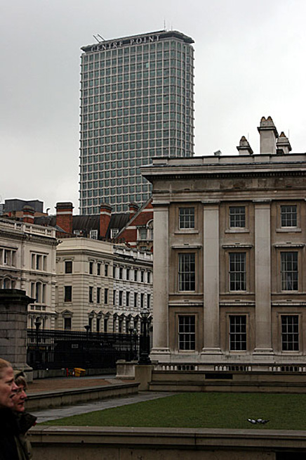
Centre Point , London, UK, 1967. Architect: R. Seifert & Partners.
Photographer: Ludwig Abache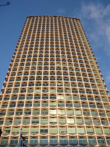
Centre Point, London, UK, 1967. Architect: R. Seifert & Partners.
Photographer: Anne Ward
'Colonel' Seifert was an incredibly prolific designer, for mainly corporate clients, of skyscrapers and more modest office blocks. Look at the London skyline from Waterloo Bridge and you can pick out numerous blocks of his--Centre Point (the only one to be listed), King's Reach Tower , London Bridge Tower, The Natwest Building , a couple of lower 'half-rises' in the square mile--and further afield, dwarfing suburbia, are towers in Croydon , Tolworth and elsewhere. Yet this dominance of the skyline, in which he is rivaled only by Wren, has never translated into any sort of popular affection . Indeed, at least five of his towers have been demolished, including Drapers Gardens , an elegant split tower which he claimed was the favourite of his works, while his King's Reach Tower is being 'Alsopified ' with bright colours and a few extra stories. There’s not much sign of any of the others being listed. Is this, one wonders, the fate that might be waiting for Foster?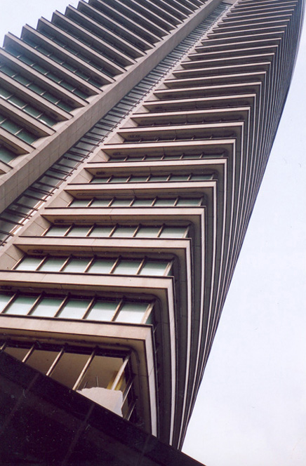
Draper Gardens, London, UK, 1967. Architect: R. Seifert & Partners.
Photographer: Owen Hatherley
This is especially pertinent as Seifert, like Foster, was once the very epitome of the dynamic and futurist. As a direct alternative to (what was perceived as) the worthy architecture of the British Welfare State , Seifert's mid-1960s buildings, beginning with the 1964 Tolworth Tower, are best understood as a kind of 'Pulp Modernism '. Perhaps they work as an analogue to the cranky English Futurism of Pop producer Joe Meek , with whom they share a spaceage aesthetic, and even a similar choice of titles: Meek's 'Telstar ' (for The Tornados) or Seifert's now demolished 'Telstar House '. In this early period the dominant influence would seem to be what Venturi and Scott-Brown called the 'Braziloid': the rippling concrete brise-soleil of Niemeyer and Costa , transplanted to the rather different climate of the UK, promising an architecture of sun, sex and outer space. Seifert’s unsung job architect on these was George Marsh, whose style in fact seems to differ greatly from Seifert's own, much as the Gherkin has been claimed by Ken Shuttleworth .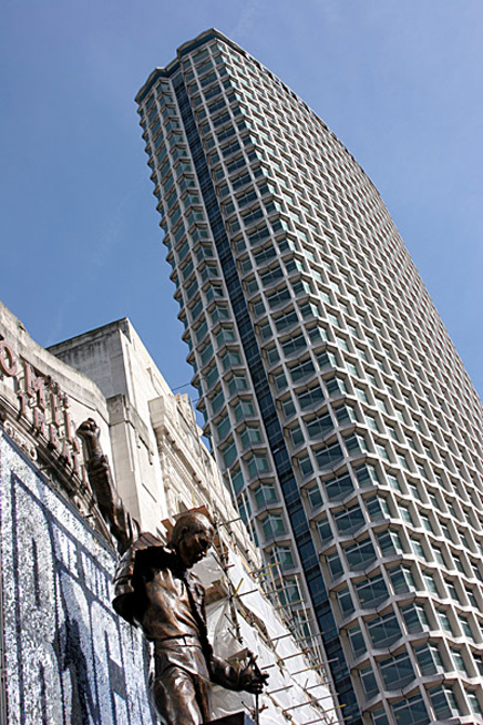
Centre Point , London, UK, 1967. Architect: R. Seifert & Partners.
Photographer: Ludwig Abache
The finest of these early towers might be Space House on Kingsway in Holborn. A cylindrical tower of op-art concrete brise-soleil, linked via a bridge to a lower block facing the street, in its modest way this is Metropolis-meets-Brazilia amidst Edwardian London. Most fascinating are the pilotis, sculpted concrete creatures like mechanoid thighs poking out at the corners of the building. A more fervently domineering version of this was the once notorious Centre Point, a speculative tower in (as the name implies) the very heart of the West End. The history of this is murky, to say the least--it stayed empty for over a decade due to the extortionate rent. Meanwhile its gesture at public space, the fountain at its front, must have been responsible for countless road fatalities, blocking off pedestrians at one side of an extremely busy intersection. 1 Kemble Street "Space House" , London, UK, 1966. Architect: R. Seifert & Partners.
Photographer: Anne Ward 1 Kemble Street "Space House" , London, UK, 1966. Architect: R. Seifert & Partners.
Photographer: Anne Ward
For all that, it's easy to see why it's listed. The ideas of Space House here stride out on a grand scale, with huge, cyclopean sculpted pilotis to make Niemeyer himself envious. The death-trap fountain meanwhile is a great idea in the wrong place, a piece of abstract calm in a restless area. A glazed bridge links the tower to smaller office complexes. What, despite its idiocy as urbanism really impresses here, is that we have Modernism as excitement: no Miesian eternal classicism, but a pulpy, pop art futurism. A few other towers were built in this mode, the Sheraton Hotel in Knightsbridge, a lowrise block in Bloomsbury and 'Number 1 Croydon', a cylinder of incongruous dynamism that found its way onto the cover of soon to be Sex Pistols designer Jamie Reid 's proto-punk zine Suburban Press. This is the alien landscape punk responded to.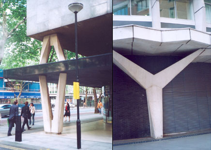
1 Kemble Street "Space House", London, UK, 1966. Architect: R. Seifert & Partners.
Photographer: Owen Hatherley
1 Kemble Street "Space House", London, UK, 1966. Architect: R. Seifert & Partners.
Photographer: Owen Hatherley
The firm's 1970s work is harder, like cylindrical tombstones. Two very similar towers seem to exemplify this. King's Reach Tower is a sort of grey-brown pipe, sombrely looking out over South London, while the Natwest Tower takes a similar style and makes it almost Gothic, the shining steel making it seem more a weapon than a place of work. In an act of supreme favour-currying, Seifert designed the ground plan in the shape of the Natwest Bank's logo. Which was rather pointless after they moved out, scared off by an IRA bomb. The tower is still the tallest structure in the City of London . Subsequent Seifert buildings didn’t even have these towers' brooding power, settling instead for a timid historicism – he even designed a little castle in Camden for a boat club, which is a world away from 'Telstar'.
Then they started coming down, one by one. Is there any lesson to be learnt from this? Did the race for a quick buck that was so marked in Seifert's work stand in the way of aesthetics, or was he just a casualty of Britain's desperate revivalist shift in the 1980s? Either way: the last architect to be 'the new Wren' suffered a rather ignominious fate. Yet isn’t that built into the schema of the speculative architect anyway? The towers make their money, then they're fit only for the TNT or the wrecking ball. Maybe Foster's edifices will start toppling in 20 years or so, perhaps not. Yet, and curiously for a man who started off working with Buckminster Fuller , but now serves as the glassy sheen on an increasingly terminal capitalism, Foster's precedents would suggest that only fragments of their original excitement can be taken from their ruins.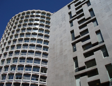
1 Kemble Street "Space House" , London, UK, 1966. Architect: R. Seifert & Partners.
Photographer: Anne Ward
Creative Commons License
This work is licensed under a Creative Commons License .
/Creative Commons License
8 Comments
I suppose a lot of what makes a tower successful comes down (literally) to the streetscape. While I have both a soft spot and an academic appreciation of those awesome Y-shaped pilotis and their many cousins creating an open ground plane, these buildings do tend to be the "alien landscape" mentioned above.
And yet: (I was just at John Hancock in Chicago last week): when I compare how 30- to 40-year-old towers relate to the sidewalk with how he rash of 1980's towers do, I don't see a lot of difference, except that the 80s stuff seems to have less of the hand of a "designer" - which Seifert's work definitely has - and more the hand of a corporate-approved bland and maximum lease space.
Does anyone know how the Gherkin meets the sidewalk?
I love how the gherkin meets the sidewalk, a lot of open public space that allows for users & fans just to hang out around the whole "object" within a friendly scale and a really cool way in which the honeycomb meets water and light at the base
i am a fan :o)
Actually, I tend to find that up close the gherkin feels somehow geometrically improbable, like it's about to fall down on you: which is an interesting feeling when you know it isn't. But in terms of streetscape it really doesn't get any more disastrous than Centre Point, alas...
Owen, I've always felt the same way about the Citicorp tower in Manhattan - I hate how dangerous it feels standing underneath those hanging corners!

Of course with it, the possibility of it tipping over was very real!
i didn't know seifert's name, only his buildings. so thanks for that.
kemble street building, and centre point too for that matter, feel to me a lot like czech cubist architecture. maybe some cultural importing going on?
As a capital city I think london has probably the worst tall buildings in the world. shame really. Cities like shanghai and some major cities in third world countries have much more interesting tall buildings than london.
Oh and for LIBERTY BELL. the gherkin actually hits the side walk vertical glass meets horizontal pavement. boring ......
Centrepoint is an important building, people can say what they want and many do, but it's a landmark piece of architecture. The glass bridge to the east is has great early structural glass detailing. The pool is awful I admit. That whole plaza should be rethought, St. Giles High Street might do being pedestrianized. Perhaps TFL could be convinced to remove the bus depot under the bridge to another location. Either of these moves would connect this dead plaza back to the city surrounding it.
Block this user
Are you sure you want to block this user and hide all related comments throughout the site?
Archinect
This is your first comment on Archinect. Your comment will be visible once approved.