
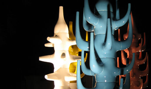
The distinction between art and design is certainly becoming more and more of a vague science. Last week, Miami played host not only to ArtBasel, but also to its little sister art fair: DesignMiami . Under Zaha Hadid’s amazing Elastika installation in the Moore building deep in Miami-’s design district, eighteen galleries curated mini-exhibitions of architectural elements, furniture, and various objects d’art. The traditional rules and customs of fine art were in full effect here, making us wonder if the traditional retail environment still holds court in the world of high design.
by Zoë Coombes
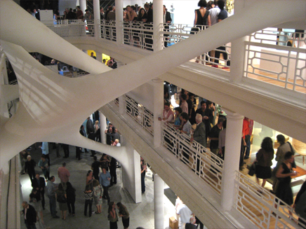
Elastika, Installation by Zaha Hadid.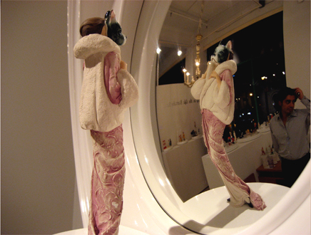
“You Sexy Bitch” by Barnaby Barford for David Gill Gallery, 2006.
The Vernisage, or pre-viewing night, was so well attended by the could-be-retirement-age, art-collecting set that for a moment the vestibule became a quasi-battlefield with security. “Step Back! … Please, Lady, if you don’t step back you won’t get in!” threatened a very flustered, very metrosexual volunteer in charge of controlling the crowd. If it were possible to be starving for furniture, I secretly thought to myself, this may be how one would act. Luckilly, the crowd inside was a less panicked, and perhaps due to the ubiquitous open bar on every floor- a little more rock and roll.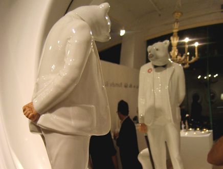
“No Regrets Old Man” by Barnaby Barford for David Gill Gallery, 2006.
While at the previous night’s opening of Art Basel (the central art fair held in Miami’s convention center), visitors were greeted with a Donald Judd just inside the main entry, here in Design Miami’s brightly lit vestibule, visitors were met with the also-beautiful, albeit much more commercial work of art, the Audi R8. Giving some justification to this shameless mix of cars and intellectual aspirations was the fact that Audi designer, Frank Lamberty was there on hand to discuss how surface normals were manipulated in order to control the automated rear spoiler’s air flow. If you are in need of digital design tutoring, this is the man to learn from.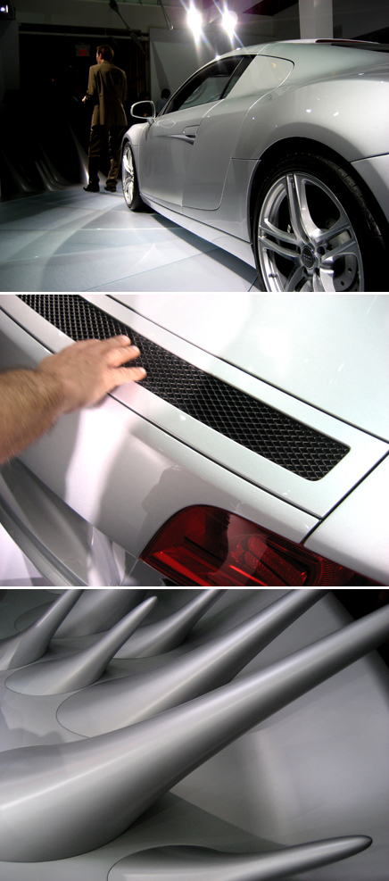
Audi R8.
All this, however, was just a lead up to the real breadwinning focus of the fair- the galleries beyond. Printed on small tags dotting the walls and floors next to the work on display, was a repeated phrase: ‘Limited Edition’. Gallery Kreo of Paris makes this kind of specialized commissions their signature. On display, was one of the ridiculously elegant ‘Cloche’ lamps designed by super-brothers Ronan and Erwan Bouroullec. Each was numbered, signed and produced by Gallerie Kreo as a edition of only eight- unless of course you were willing bravely enter the true genesis of the project by purchasing one of the two uber-limited prototypes of the cloche lamp, also available for sale.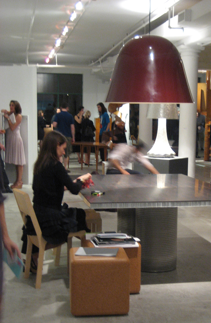 Suspension ‘Cloche’ Lamp by Ronan and Erwan Bouroullec for Galerie Kreo. Paris. Gallerie Kreo is directed by Clémence and Didier Krzentowski.
Aurelie Julien of Gallery Kreo said, “We do not do these limited pieces, so that a furniture company can pick them up and put them in to mass production. However, we would be very happy if someone were to see the work and want to contract the designer to make a mass produced variation.” “Galerie Kreo sees itself as a laboratory-space dedicated to the research of the artists involved” says their website. It remains to be tested if Vitra’s muscular production facilities could match the paint job Kreo was able to contract from small Parisian workshops.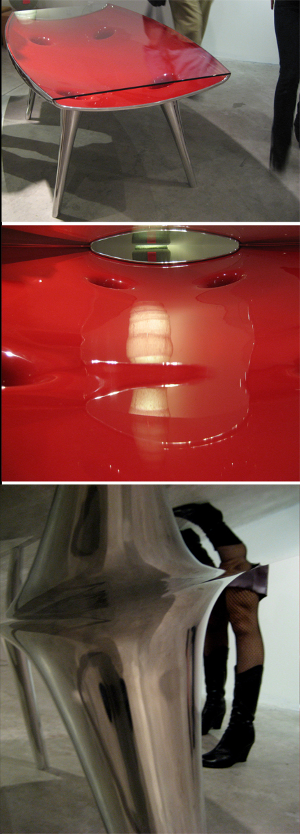
‘Chop Top Table’ by Marc Newson for Galerie Kreo.
One indication of Kreo’s success was the Yahoo Finance report that revealed that all twelve of Gallerie Kreo’s Marc Newson Chop Top tables sold for $170,000 within the first 20 minutes of the opening night. The other Marc Newson product for sale in the building was the Lockheed Lounge exhibited by Sebastian + Barquet on the third floor, closer to the HSBC private Banking Champagne Bar. Tagged with an asking price of two and a half million dollars, the Lockheed didn’t sell. Whether or not this is too much to ask for a 20 year old chair, we should note that another Lockheed recently set a record for the highest price ever paid for a piece of furniture when it closed at $968,000.oo at a Sotheby’s auction.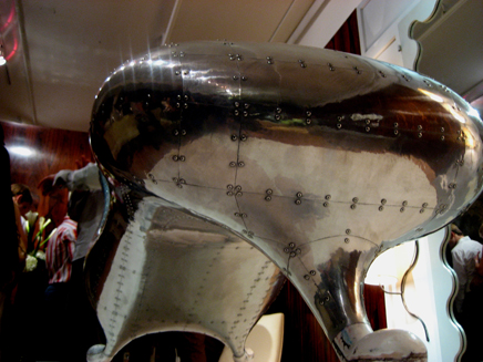 ‘Lockheed Lounge’ by Marc Newson. C. 1986.
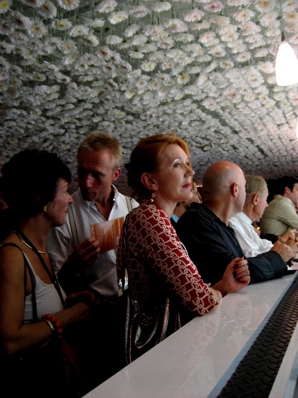
HSBC Private Banking generously provided the Veuve Clicquot. form their website: “HSBC private Banking recognises the importance and dedication with which Design Miami/ approaches design. These values are reflected in our own philosophy: “Assume nothing.” Our institution exceeds expectations through our novel approach to age-old financial solutions that allows our clients the best of both worlds.”
Back on the ground floor, Gallerie Patrick Seguin, which with their display of Jean Prové brise-soleils, held the most explicitly architectural installation of the show. The antique shutters were carefully installed in an interior drywall frame- abstracting them from their original African, outdoor setting. By some measures, a gallery setting is an unusual place for Prouvé’s building elements to end up considering that the man worked so optimistically within the limitations of modular mass-production. Nevertheless, it is the natural ravages of time that have now made these Prouvé pieces into collectables. This is also what made it so stressful to see these antiques sitting so closely to still-sweating and all too-easy-to-tip, glasses of sponsored Sky Vodka. Nevermind…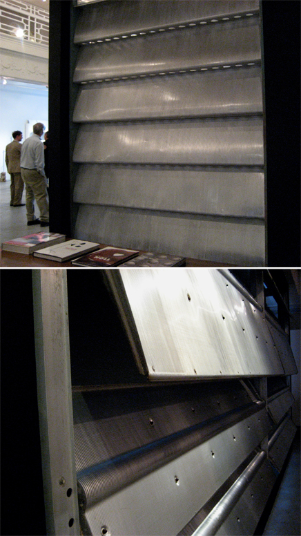
Jean Prouvé. Brise-Soleil at Gallerie Patrick Seguin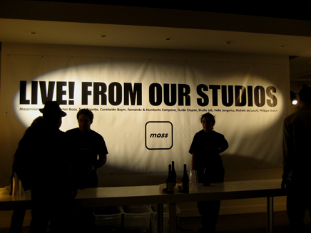
Moss of New York. Installation: ‘Live! from Our Studios’
Established & Sons of London and Moss of New York- two much more explicitly commercial enterprises, also set up temporary installations in the neighborhood. ‘Live! From our Studios’ said the Moss vinyl graphics, invoking the feel of experimental charrette. It should be noted that within this increasing trend to associate Design with Art, Moss has always been eager to exhibit within the conventions normally associated with a museum (think of the white steel, and glass cases in their New York store, and their public museum ‘we are open to everyone’ attitude of display). Established and Sons, on the other hand, with no showroom yet, is quickly becoming an art world darling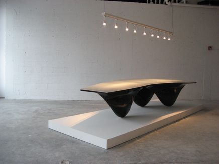
Aqua Table by Zaha Hadid for Established and Sons of London.
Zaha Hadid’s Aqua table produced for Established & Sons , made their ‘Limited’ collection recently very famous when one of the prototypes sold for $296,000.oo at December’s Phillips de Pury auction in New York. While we aren’t used to talking about the health of the secondary market when it comes to furniture- perhaps we should. On display in Miami was another of the Zaha Aqua set, available for tapping and stroking as the fingerprint evidence suggested. Set down on a raw concrete floor, the very gallery-like Established and Sons display was diffuse, and its four precious items on display felt dear.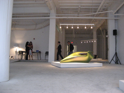 Established and Sons of London. Installation: ‘Limited’.
So what happened to post-war enthusiasm for our systems of Mass production? Are the record sale prices and presence of HSBC lending booths proof that the American public is finally wants design? Perhaps more importantly, are designers gaining more influence or control by making small runs of exquisite work?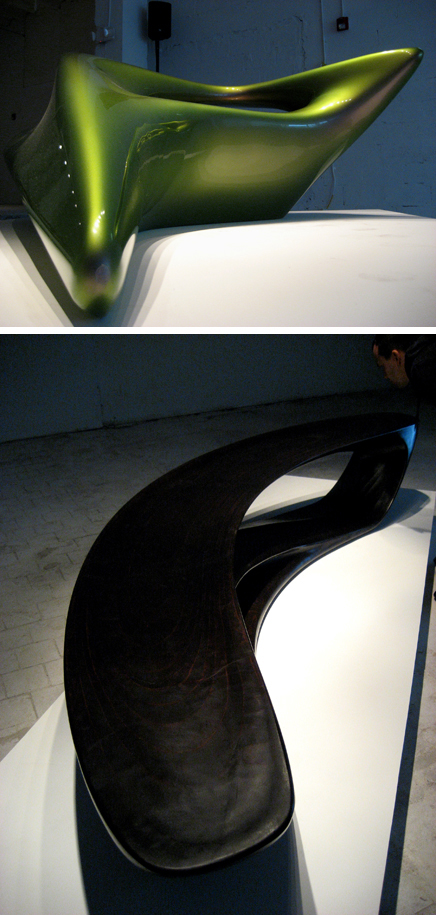
For Established and Sons: The Drift Bench: made of ‘painstakingly hand carved and dark-stained beech plywood” by Amanda Levete of Future Systems Architecture. And the ‘Seamless Collection’ by Zaha Hadid.
We leave it to you, dear Archinect reader, to decide…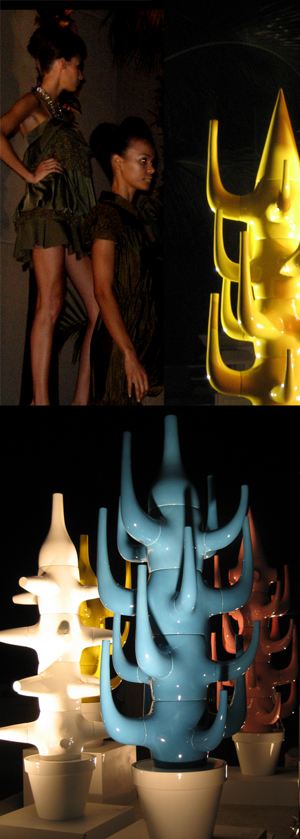
On a more philanthropic note, Jamie Hayon staged a breath-takingly stylish silent auction atop the Ritz Carleton’s beach side pool. On the Auction block were his Ceramic Cacti, ornately titled, ‘Digital Mediterranean Baroques’ for which all profits went to the Susan G. Komen Breast Cancer Foundation. Also appearing were a set of Synchronized Swimmers and Moschino’s new line for summer. This is what we wish South Beach always felt like…
Closet by the Campana brothers at Moss . Formerly, Gerrit T. Rietveld’s 1934 Zig Zag chair. Now retitled, ‘Smoke’ and burnt by Maarten Baas . Preserved with clear epoxy. At Moss .
Layers: Textil-based furnishings with accompanying decorative objects’ By Hella Jongerius Hella Jongerius . At Moss .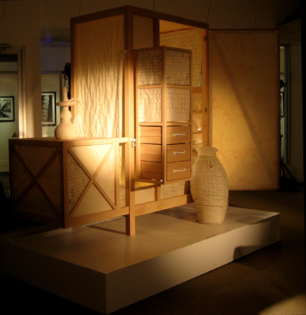
Layers: Textil-based furnishings with accompanying decorative objects’ By Hella Jongerius Hella Jongerius . At Moss .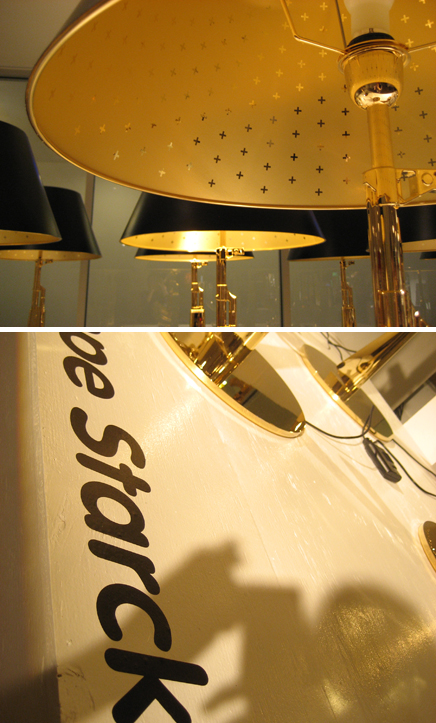
Phillipe Stark Table Gun. Body made of Die cast aluminium finished in 18K gold. At Moss .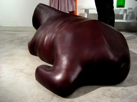
‘Vache Luzy’c. 2005 by Julia Lohmann for Galerie Kreo . Installation by Contrast Gallery of Shanghai, China.
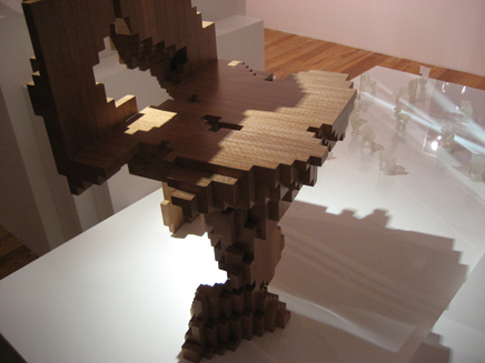
Philippe Morel’s computational chair phurniture .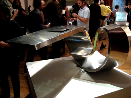
Max Ingrand. Desk from the Peugeot Showroom c. 1966 . At Sebastian + Barquet .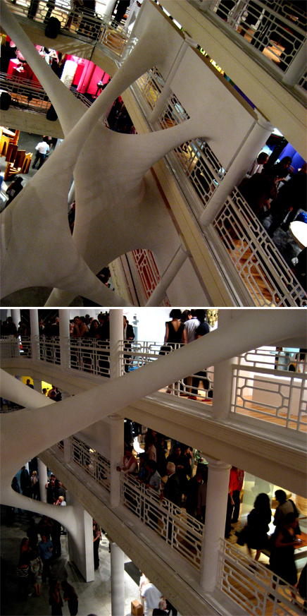
“Elastika is site-specific installation which aims to mutate The Historical Moore Building built in 1921. The existing building has two major implied architectural moves: horizontal circulation on layered mezzanines and four storey vertical columns that stretch upwards to embrace the central atrium.
Pushing the envelope of current spacial concepts, we have instilled a dynamic tension within this existing Cartesian layout. Oblique ‘stretches’ span the space like chewing gum establishing a plastic/elastic connection between different floors. Creating a new understanding in complex geometry and fluid architectural order.
The design and installation of the installation has only been made possible through the latest advances in technology. Its form was generated on complex geometry software (using a nurb surface modeler). This design was then sculpted by CNC milling to enable manufacture.”
- Zaha Hadid Architects
Zoë Coombes is Cofounder of the NYC based design studio Commonwealth and the Espeis Archetype Gallery in Williamsburg, Brooklyn. Commonwealth, a Product Architecture studio, participates in collaborations with other disciplines such as graphic and product design. Their research and production results in one of a kind collector items that attempt to relate the architectural scale to the more intricate realms of product design through objects d'art.
Creative Commons License
This work is licensed under a Creative Commons License .
/Creative Commons License
3 Comments
can you give some information about third photo under Audi R8 heading? is that a part of the car? i mean that metallic pricky surface.
It's not (sorry about the confusion). That is part of the pod area that was created to showcase the R8. Those spikes are facing outward. See pic. above closely.
yes, what David says is true- those gray spikes were part of the display around the car. They all faced out so that it was as if the car was sitting in the middle of a splash of liquid projecting out. It was made out of a matte silver plastic and I have absolutely no clue as to who or what created the istallation. There were some beautiful, integrated lights above as well...
Block this user
Are you sure you want to block this user and hide all related comments throughout the site?
Archinect
This is your first comment on Archinect. Your comment will be visible once approved.