
In the early '80s, the method for cleaning the mobile graffiti art galleries that were New York City's subway trains involved saturating them in a bath of sulfuric acid - a solution similar to what plumbers use to unclog industrial drain pipes. This method as an attempt to rid the trains of graffiti ultimately created an even bigger eyesore by replacing formerly intricate, rainbow covered metal finishes with a pinkish ooze of acrylic runoff.
This practice of graffiti removal is referred to as “the buff” by graffiti artists - an abstract term that refers to either those who perform the act, the medium used in the act or the act itself.
While graffiti art has increasingly become a mainstay of global pop culture - as evidenced by its inclusion in ad campaigns for popular products such as Altoids, Mountain Dew and the auto company Scion - traditional graffiti art is practiced with the understanding that it will, sooner rather than later, get painted over by civic authorities or other graffiti artists. It is a form of expression existing solely in the moment, and it's even possible to imagine that a graffiti piece isn't fully complete until it's been painted over.
The co-opting of graffiti by mainstream advertising intends to sell products by branding them with the last vestiges of authentic “underground cool,” but instead exposes the reality that graffiti art and advertising are one in the same: egocentrism that proliferates on any available surface in public space; an assault on the senses; an invasive, pervasive shouting match for attention.
Contemporary artists such as Shepard “OBEY” Fairey adopted the tactics of both graffiti artists and advertising campaigns, augmenting the graffiti artist's spray can with self-adhesive stickers and wheat-pasted posters. And the formal expression has changed: the letter form has been replaced by icons and logos that often maintain the supergraphic scale of traditional graffiti art and billboard ads.
As a result, the presumption is that the genre of graffiti art has either been expanded or subdivided, with artists such as Shepard Fairey, Barry McGee, and Banksy among others, being branded “street artists” instead of as graffiti artists. As advertising, their posters and stickers now promote a larger empire for some of these street artists, who, in addition to their art, often sell toys, T-shirts, handbags and cell phone jackets featuring the icons and monikers they developed. These products have a long shelf life, though the street artists' posters and stickers in the urban landscape can never escape the eventual buff.
Though it's assumed that street and graffiti art are interchangeable concepts, street art may actually have a dubious relationship with the history of graffiti art, which is solely concerned with the evolution of the stylized letter form. Street art practices by Banksy in particular deploy illustration methods of surface, perceptual and spatial distortion that circle back to the late ”˜60s before superscale graffiti pieces in New York, when architects such as Cesar Pelli advocated the application of painted supergraphics as a means to solving design issues on the cheap.
During this era, niches of architects and designers began experimenting with supergraphics and the camp of Architect Robert Venturi's roadside Las Vegas to emulate the spatial effects of architecture. These designers distorted perspective with stripes and arrows, emphasized wayfinding and movement sequences with surface designs, joined community groups to paint illustrative graphics over blighted buildings, and played with scale by using billboarding tactics (such as the giant tiger tail built on top of Chicago's Humble Oil terminal in 1967). In 1968, for example, painted design motifs featuring diamonds, skewed stripes and circles created by Pelli were used to transform the exterior of the old Consolidated Building in downtown Los Angeles into the California Jewelry Mart.
In 1962, Robert Venturi, then part of the architectural firm Venturi & Short, designed the interior of Philadelphia's Grand's Restaurant with stenciled floor-to-ceiling letters of the restaurant's name, juxtaposed with a floor-to-ceiling mirror that reflected the letters' reverse image. For Venturi, the qualities of letter graphics were consistent with the motifs of conventional decorative objects like furniture and signage. Less than a year later, the restaurant interior was redecorated by its dissatisfied owners. Even the noble efforts of Robert Venturi could not escape the buff.
By 1970, this Supermannerist, supergraphic movement had waned, or had morphed into Pop and possibly graffiti art, but the blissful damage of these efforts had been done: The idea that the city could be made bright, even witty, through the judicious application of paint instead of new construction became another tool for developers who previously advocated demolition as a method of urban renewal. Focusing on this premise, the buff can be viewed as either the first stage of street art and urban renewal, or the last. Either way, the buff is the most powerful force in the urban landscape, for both artists and architects.
While the buff is the brutal enemy of graffiti, a Los Angeles-based street artist has turned the notion of buffing and the conventional motifs associated with graffiti art into a witty retort to the buff, even adopting the term “buff” in his moniker: The Buff Monster. His art humors the omnipresence of the buff and foregoes the tight edges of graffiti in favor of wheat-pasted posters and colorful murals filled with cherries, breasts, ice cream and building-sized dollops of a pink ooze that resembles acrylic runoff.
His icon is a silly cartoon character with a witty smile, often depicted with ears that look like scoops of ice cream, rounded feet like roller-skate wheels or cherries, and an overall bubbly body shape. Observable throughout Hollywood, downtown Los Angeles and Venice Beach, The Buff Monster evokes an equally cheeky smile as the one it presents. The artist behind the Buff Monster came to Los Angeles via Hawaii for college - receiving a BA in Fine Art with a minor in business from USC, he was recently the creative director at BPM Magazine- and his sassy character's presence has since been felt in San Francisco, New York and across the Pacific in Tokyo. His street art is particularly iconoclastic of Los Angeles perhaps because its message is noticeably apolitical: The Buff Monster is deliberately whimsical, cheeky, absurd and ultimately an expression of ego.
I caught up with the street artist responsible for the Buff Monster high above Sunset Blvd in Hollywood to discuss pink ooze, product placement, iconography, supergraphics, why graffiti sucks sometimes, his unique views on urban renewal, and how porn, ice cream and Los Angeles influence his work. Like most street artists, the moniker he uses has become the name this twentysomething adopted for himself - he, the street artist, is the Buff Monster.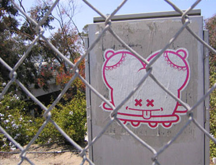
Which came first, the character or the moniker Buff Monster? And what were you trying to achieve with the character as an icon?
Buff Monster: I came up with the character first, but immediately named him Buff Monster. With icons, it's important that they're immediately accessible: You have to be able to get in enough reference that the viewer can have their own take on it. I wanted something simple, versatile and fun. With the character, I knew I'd be able to draw it very easily, at any scale and any proportion. It was versatile enough that I could make a million different characters from it and draw it with a million different faces. It was everything I ever wanted... and it looks kind of like a condom, or a boob.
There's a cuteness aspect to the Buff Monster character - you can't help laughing a little, smiling and having a positive reaction. This is very different from the common reaction to the street art that attempts subversive confrontation. You managed to get around that. How did eliciting a cheeky reaction surface as an agenda?
BM: Hopefully, graphically, [I achieved] aspects to the design of the Buff Monster that are immediately familiar but also new - it should exist as part of a language that you're already familiar with: Hello Kitty, the Smurfs, Powerpuff Girls. Everybody has an understanding of this [family of] visual language in popular culture, and the idea was to tap into that in a new way. Also, I'd say that it's not necessarily fair to blanket all street art as confrontational. Some of it is, [particularly traditional graffiti] which is usually a terrible blight, but certainly some of it isn't. To some degree, street art can be considered like a gift for the city, something created to make the environment more interesting. Instead, consider thinking of street art as a candy coating on the city.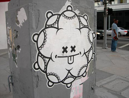
Is that what you were trying to achieve with your motifs: the nipple, breast, cherries, ice cream, the labia? A candy coating for the city?
BM: Yeah. It may seem cliché, but using the candy-coating analogy: If you think about parts of the city that are really dull, shitty, gray places, then street art becomes this amazing burst of color, suddenly changing the environment. So I looked at that idea very loosely, and then established it more concretely, and then [specifically] as ice cream, cherries, etc. The imagery of the Buff Monster character is very vague. I didn't want to dictate the interpretation. I like that the motifs can be interpreted as tits and cocks and cherries and ice cream, but kids can look at it and not be threatened by it. It wasn't something that would cause parents to hide their kids from it. I wanted it to be fun.
There's a sense of paradox to the Buff Monster, because not only is it street art that is buffed, but it calls itself the Buff Monster, even though it doesn't buff anything. The character is rarely posted over other graffiti or other text. In some ways instead of buffing nothing, you could say that it buffs “the nothing.”
BM: I had been thinking about graffiti and how it related to its context. Graffiti exists in two phases: There's the doing part, and then there's the [subsequent] painting over - the buff. So when you're doing graffiti, you're very aware that it's going to get painted over. That's why, when you're looking [for places] to put up street art, you look for a spot that's high and difficult to get to, or you look for a spot with other graffiti already there, because [these are reasons to] believe it's going to last longer. But I never saw [street artists] addressing the buff. The buff is the most interesting part, because the buff is more powerful than anyone. So I thought it would be interesting to address that and champion it.
Take the “Buff Monster Says: Don't do Graffiti” poster, for example. For me it's funny, and I knew people who knew my work could look at it and laugh because it's clearly a piece of [vandalism, even though] it says, “don't do graffiti.” Graffiti writers hate it, because they think I'm telling people to not do graffiti, or that I'm anti-graffiti, but I'm not... and at the same time I am: I have a love-hate relationship with graffiti.
I don't consider myself a graffiti writer anymore. Graffiti is a very specific thing: It's painting your name - however stylized you want it to be - everywhere. It's done for a very specific audience: other graffiti writers. I see graffiti as a very limiting thing to work on, and if my only audience [would end up being] graffiti writers, then that's extremely limiting. So I wanted to do work in the streets that addressed a broader audience, which led me to use posters. But with the Buff Monster posters, [contextual details] are missing, like a time and a date - things that tell you what the poster's referring to. And I can do posters in the middle of the day, because posters are a lot less threatening than a spray can.
You moved to Los Angeles for college from Hawaii. How does Los Angeles as a city feed directly into the work you do?
BM: Have you ever heard that joke, “Los Angeles is 80 miles wide and two inches deep”? I think that's funny, and my work can be a representation of that in a weird, crazy, sexy, glam way. Perhaps if I was from here, I might see the city differently, but coming from a small place like Hawaii, I would find myself downtown in the industrial district around Alameda Blvd, and it was rad, because there's a history there, and random things would happen that happened nowhere else. It's crazy! There are awesome one-of-a-kind things that I'd find, like the flattened spray cans I do paintings on: each one has its own story and its own history. It was amazing to immerse myself in those ideas - the history and the culture of contemporary LA, of Hollywood, the movie industry, and the culture of image in this city; and there's the porn industry here, too, which is crazy, and also inspiring. These things feed into my work. Image is key, even today, and graffiti and Hollywood are about image, about making things bigger and prettier, like when I take a spray can that's rusted and ugly, and adorn it with beautiful pinks and metallics.
So there are tactile and historic aspects to the objects the Buff Monster targets?
BM: The boarded-up building, for example, is interesting for me. I love the boarded-up parts: pieces of plywood layered at different angles. I think that stuff's rad. I try to have the posters in places that have something unique about them, some history.
That's curious, because, to some degree, with the boarded-up building, or the power boxes that you poster, they provide more examples of “the nothing.” Not nothing like blight, because “the nothing” isn't an example of blight, it's an example of “the boring.”
BM: Yes. It takes a specific eye to notice them, to notice things you're referring to as “the nothing.” Most people drive by and don't even know these things exist, because they're not looking for them. I find them fascinating, especially old signs, barbed wire, telephone poles. I love taking photographs of boarded-up buildings - crazy things which have nothing to do with graffiti. I enjoy flattening them in the viewfinder, removing the depth. It's more of that [“two inches deep”] flatness stuff, I suppose.
They say Los Angeles is experienced at 50mph from the driver's seat. As a street artist, you have opportunities to see perspectives of the city that are particularly unique, on foot and from 50 feet in the air. Talk about particular aspects of Los Angeles that only you and other street artists get to enjoy.
BM: The views from the tops of billboards are amazing, and they're views that people will never get to see! But you're right, everyone drives here, so the flattened spray cans with the Buff Monster characters on them that I nail to telephone poles largely go unnoticed. And that's fine, of course. But on the flipside, I definitely want people to see the work, which is why I do the posters at intersections, often on power boxes. You get a captive audience: You're sitting in your car, you have a minute, you're looking around, and suddenly, there's the Buff Monster.
You were commissioned to do toy figurines, which became quite popular. Were you surprised that the motifs you were already playing with translated so easily to commercial toys that cater to the adult kid?
BM: No. It seemed natural. Take the Hello Kitty empire, for example. Hello Kitty makes toys, everybody else should make toys. The Buff Monster wasn't inspired by Hello Kitty, but with the Hello Kitty character, it can become product in millions of ways: Purses, backpacks, erasers, charms, pencils, cellphones. So, for me, why not also have a toy?
Do you see the Buff Monster proliferating as far as something like the Hello Kitty empire?
BM: Of course! I'd love it to go on forever, and at the end of the day, I'd love the Buff Monster to be the next Hello Kitty empire, but I have to be willing to come to grips with whatever compromises I'm willing to make for that to happen, because certainly a lot of the imagery I work with isn't mass-culture friendly - it's a little too sexual, or a little too crazy or a little too illegal.
I like to work at two different scales: I like to have mass-produced T-shirts that are affordable, and also have paintings that are really nicely detailed, rare and fun, but pricey. I don't want to be super-exclusive with my stuff. It's a weird thing, because on the one hand, I put my stuff everywhere in the streets, so everyone can “have it” and see it, [and then on the other hand,] owning it can be the exclusive part. My heroes - Takashi Murakami, Shepard Fairey, Andy Warhol, Keith Haring - as much as I love their work, they're my heroes because of the empires they've built. Like them, I'm trying to be patient and avoid going after the quick buck. Takashi Murakami, in terms of a business model to follow, makes more sense for me than Hello Kitty. And also, Hello Kitty doesn't yet have a theme park. Walt Disney had the idea to make Mickey Mouse into a theme park. I think it would be rad to have a [Buff Monster theme park, with a] big, giant Buff Monster Cloud Coaster.
Let's talk about pink. You have a tremendous amount of experience working with the color pink. One of your mantras is “Pink is Power.” How is pink power?
BM: One of my biggest inspirations is heavy metal music. I almost exclusively listen to heavy metal. And metal can be considered this incredibly masculine thing. There are guys on stage wearing all black; it's loud and aggressive. For the audience, it's really empowering. But really, the most masculine thing you can be is feminine. So, pink, the idea of pink as femininity [due to] color associations we were given as kids, is enormously empowering.
Is there ever too much pink? Can something become oversaturated by pink?
BM: No. Pink is so much fun to play with. You can never have too much pink, because really, too much pink is the perfect balance of pink - it should always be too much. There are two very specific shades of pink that I use. One for paintings and one for the street art, and both of them I mix myself.
There's a saying about Miami: “Paint works really hard in Miami.” Again, making a distinction between blighted and boring, paint is often considered the cheapest solution to cure blighted areas of the city. What effect do you think a candy coating of pink would have on urban blight?
BM: I guess I doubt that they would use the right shade of pink. Again, for example, when [the clothing manufacturer / chain] American Apparel moved into downtown Los Angeles, they painted the entire warehouse building this shade of coral pink, which I guess was cool, but for me it was really ugly, because again, it was the wrong shade of pink. It was as if to say, “We're here now,” but all the coral pink served to do was demonstrate that fact that the area was being gentrified.
So the wrong shade of pink can exemplify gentrification, and the perfect shade of pink can exemplify empowerment?
BM: Yeah, exactly! [laughs]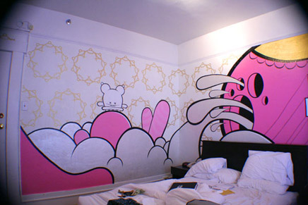
Above: Buff Monster room at the Hotel Des Artes, San Francisco
You've also used pink heavily in interiors, like your commissioned room for the Hotel Des Artes in San Francisco. The Buff Monster's imagery is so sexually charged, so I'm curious whether the ways people would use the room impacted how you approached the design.
BM: I knew that the hotel room would be the first space I'd get to design where people would be having sex, so if I didn't address that, for me, it would be weird. The room is pretty small, and when I first arrived there, I thought I was going to do a bunch of small, detailed work, but then I thought maybe it doesn't need small stuff; maybe it needs really big stuff. So I designed a mural that was too big for the room: There's a boob shape squirting pink fluid painted on the wall, and it's so big you can't even see the nipple part. There's bold text above the bed that says, “Lick it up, bitch.” The hotel wanted to paint over it a bunch of times, because they were worried people would find it offensive, and the hotel didn't really think it made sense, or that people wouldn't get it. But in the context of the Buff Monster, [it made sense, but] I wanted to go further, like make it the Buff Monster Love Suite, with Buff Monster shelves with condoms, and lube and dildos. For me, that's the room I'd want to check into, and actually I stayed there last week.
Are there particular interiors you'd enjoy designing in the future?
BM: I'd love to do a strip club, of course. I think that would be pretty amazing. Or a candy store, or an ice cream store like a Baskin Robbins. I should look into that, because I'd love to get commissions from ice cream companies for retail design. Now that I think about it, I'm not really sure why they don't commission me to do their stores.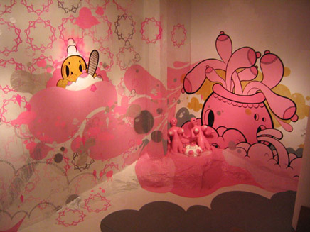
Above: Interior from Buff Monster's “Lick it Up” show, Los Angeles
You've also done installation art for gallery spaces. Tell me about the ways in which total environmental immersion in pinks, ice cream scoops, nipples, boobs, whipped cream and cherries affects the audience.
BM: I feel I haven't achieved [the effect of] total environmental immersion yet. In my last gallery show, I installed a pink boob fountain, with a pink boob ball made entirely out of pink boobs squirting pink fluid in a pink pool full of pink blowup dolls. It was cool, and people were into it, but what I really wanted to do was take it to the next level, where everyone entering the gallery gets covered in a spraying pink fluid. Of course I didn't do it, because obviously people have really nice clothes, and I haven't quite established myself in a way where doing something like that is okay. I think people definitely understand the humor in my work. In terms of total immersion, I'd want people to say to their friends, “You know, tonight I'm going to the Buff Monster show, and I'm gonna come home pink and wet, and it's gonna be rad!”
You're still young.
BM: Yeah, there's still time! [laughs]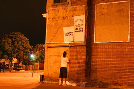
Interview by Marlin Watson.
Non Sequitur is an ongoing series of features that chase down ideas and practices from points inside and outside the discipline of architecture and highlights their relationship to an elusive center.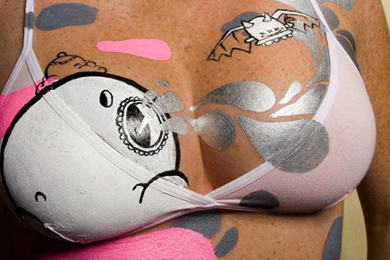
Creative Commons License
This work is licensed under a Creative Commons License .
/Creative Commons License
8 Comments
Viva Non Sequitur series. Way the go BM. Powerfull boobs indeed.
I for one truly enjoyed this very informative and current feature. Great interview.
yes sir^... i especially like the extended introduction...
...delightfully unexpected and clever. BM's readings of culture and cultural associations are incisive...and his response resonates.
Buff - your a criminal and if I caught you doing that to my building I'd break your fucking hands.
"graffiti art and advertising are one in the same: egocentrism that proliferates on any available surface in public space; an assault on the senses; an invasive, pervasive shouting match for attention."
good one, Marlin. Evilplatypus should break the heands of ClearChannel and Gannet Outdoor instaed
kiss my ass. Im tired of this fake-ass art school shit. The time and place for this vandalism is way past. Now we sit here and let these smart ass punks deface our private and public properties and defend it as art or something new we never looked at before? You can throw your pseudo-scientific babbling excuses all you want but the fact is one group pays for space the other steals and defaces space and when i catch one of these fuckers they'll be tasting krylan..
whatever.
10pm, I hate Gannett too but there is a distinct line between paying for use of a space and putting something there illegally.
That said, I'm the proud owner of several works by Philly street artists and I totally support wheat paste postering as an art form and social protest form. I prefer that it go on public infrastructure over private property, but putting graffiti on a plywood covering on an abandoned building can hardly be said to be damaging anything.
Fantastic introduction and interview, thank you, and the whole notion of the Non-Sequiter series is wonderful.
Only one comment, and it is a bit off-topic: why does it have to be "Lick it up, bitch?" Lick it up is non-gendered, but bitch to me still isn't: it's female, and thus renders the licking part gendered and dominant in a way that I'm not comfortable hearing from a stranger who decorates my hotel room. Leave off "bitch", and I love it.
I don't ever see "bitch" being owned by women in the same way that "queer" is proudly owned by homosexuals. If anything bitch is more owned by gay men than by women of either stripe.
Just my opinion.
yeah im pissed too cuz i paid to fondle those breast s and this guy gets to paint his pepto bismal spongebob rem and stimpy lookin sheet on those fountains for freeeee.
Block this user
Are you sure you want to block this user and hide all related comments throughout the site?
Archinect
This is your first comment on Archinect. Your comment will be visible once approved.