
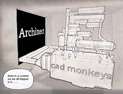
Architectural representation has always maintained a need to confront not only the story of its making, but also the story of its operation. It is one thing to represent how architecture is to be built and quite another to represent how it is to be used. Often this representation is relegated to perspective, or a series of perspectives. This remains the static image of the product yet to become, typically serving as, what is appropriately called, the money shot . It is a perfect moment, complete with the right people wearing the right styles, walking in the right direction, with the sun at the right angle, and the right material tone and textures. It is the unborn project's idealized self. However, what if part of the design act were also to know what those people were thinking, where they were before they entered into that rendering, and how the project came about?
The comics of Archigram and the masques of John Hejduk seem to come closest to embedding the design act simultaneously within the story of its making and its operation or use. What role does narrative have in architectural acts today? Is the fantastical cinematic quality of the lifespan of a work an overlooked potential design act?
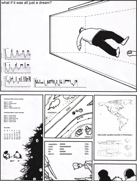
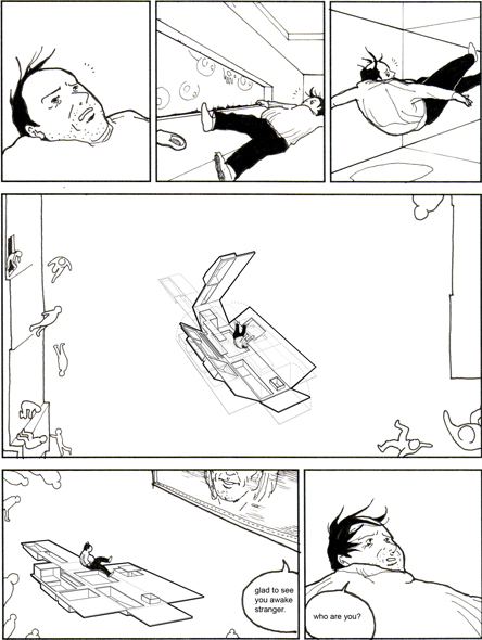
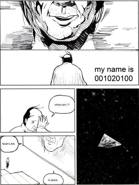
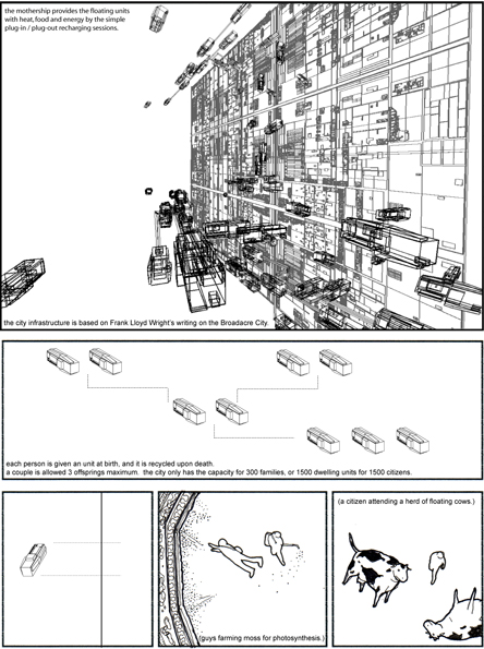
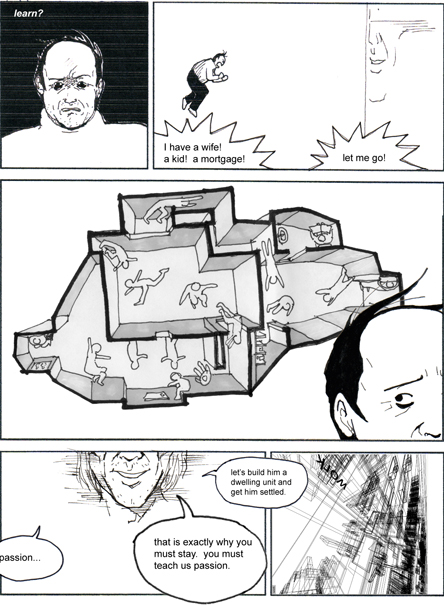
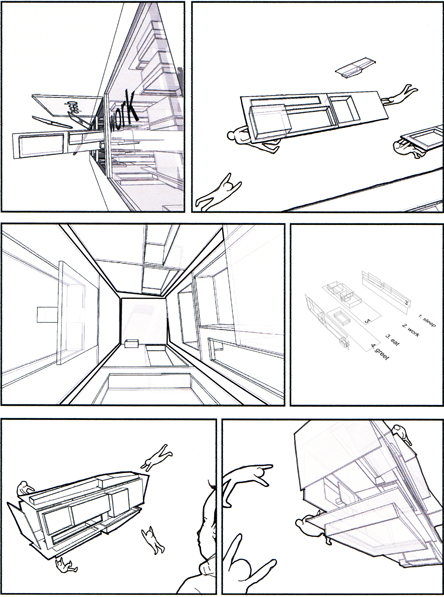
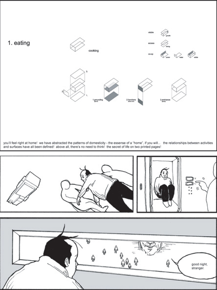
Below is a project by Jimenez Lai , an M.Arch candidate at the University of Toronto , called Abstraction of Living that simultaneously designs the work, its mythology, and its narrative. It is the result of the Howarth-Wright Fellowship that took place at Taliesin/Taliesin West. Following is a short dialogue with Jim on February 11, 2006.
-- Mason White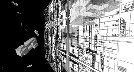


--------------
MW: Jim, are you one of those kids that grew up obsessively reading and collecting comics?
JL: Yes, it was kind of an obsession, but I was not that interested in North American comics. Almost all of my purchase focused on Japanese Manga.
MW: What Manga did you follow?
JL: They are all kind of lame, in a way, but all beautifully illustrated. I first began reading Doraemon as a child. Written and illustrated by Hiroshi Fujimoto, the story is about a cat android who has traveled back from the 22nd century to help a kid from the 4th grade, Nobita Nobi. Doraemon had a 4-dimensional pocket that stored all kinds of extremely inventive gadgets - i.e. the anywhere door that takes people to places instantly, or the take-kopita that allowed people to fly with a propeller on their heads. The entire comic book is like a collection of unrealistic industrial design assignments put in practice.
Then I started reading Dragonball as an adolescent. Created by Toriyama Akira, episodes were produced on a weekly basis from 1984-1995. The story is about the life of a superhero, son-goku, an alien child who grew up on earth with an innocent heart and an unyielding spirit, always fighting evil. I was particularly taken by the fantastical technology setting that the author envisioned. For example: the capsule that compressed objects (like houses or cars) into a pocket-sized items, the gravity-defying kami-house that sat on a 4-kelometer high stick of a tower, and the time and spirit house that slowed time from advancing so a person can focus his/her study for a year (within an infinite white space) in the time of a day.
As kind of a grown-up now I have been fascinated by Inoue Takehiko's Vagabond . Inoue's drawing and composition techniques are far more sophisticated than that of Toriyama's or Fujimoto's. The depth of character development is also far more complex and mature than anything else I had paid attention to(except for perhaps Urasawa Naoki's manga Monster .) Vagabond is about the struggles of a talented samurai who spends his youth obsessing over being the best swordsman of the world. The frames of the manga paced the story in very clever ways, I spent quite a bit of time reading the story over and over to try to understand what the author did.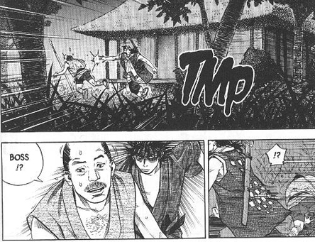
MW: This takes us easily to the Abstraction of Living project you completed recently - fantasy, travel, utopia, and community in graphic novel form. Is Bob (the stranger) a kind of Manga-like hero?
JL: Bob was a difficult decision for me. Many of the Manga main characters are your ideal superheroes: smart, handsome, hardworking, etc. At the beginning I designed a really handsome passionate guy with very few flaws.
However, weeks after I had worked with a retired professor John Wyatt, I decided that this tragic hero should display all the weaknesses of men. Bob began as a man with no name - he is physically unappealing, has a low self-esteem, short-tempered, timid, negative, small-minded and, most important of all, Bob is selfish. He is the opposite of the Manga hero.
MW: I guess Bob is more an everyman. So, in using the graphic novel as your medium, would you align with or distance yourself from other representation techniques of utopian visions, such as Garnier's Cite Industrielle, Howard's Garden City, FL Wright's Broadacre City, or Archigram's Instant City? I mean, obviously Wright's Broadacre is prominent in your project, but it seems that the urban masterplan as a finite figure is less important to you than the social vision of land and space as unitized and equal - one acre per family. In what way were you critical of Wright's vision? And, what place does utopia have in contemporary urbanism?
JL: Some of the frames in this short comic book have graphic similarities with Instant City . To be clear, this project is by no means a vision of an ideal city . It began as a study of nostalgia, homelessness, modernization and modernity. In a country where almost half the families already have an acre, I am actually trying to render no place into context. The comic book is an excellent means to illustrate such an unrealistic vision of no place , setting up opportunities for a narrative, some single-frame images, and characters to draw readers into this made-up story.
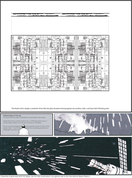
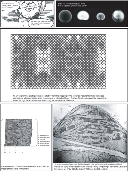
Still, I do want to make a few points about Broadacre City: Frank Lloyd Wright never really took into account that space and natural resources are both finite variables. We are witnessing such an impact: wealthier citizens are sprawling into sub-divisions, downtown cores are emptying out and are full of the poor, and cities are becoming increasingly ineffective in controlling energy consumption. Taking Broadacre City to space, flip it on its side and making it an Ark are ways to signify that spaces and resources are finite figures. It is a world where every man a dwelling unit and every man a pointlessly boring job until the citizen dies.
MW: Really, I meant utopian more as in autonomous urbanism or an enclave. In a way, your choice of the word ark seems best, as it makes reference to both transport and domesticity. And, the Broadacre reference serves you well because transport and infrastructure was also a significant portion of the fantasy. Not only did you get an acre, but you also traveled around in your personal helicopter. But, the reason I bring up these utopias, is that, although sprawling, these historic visions suggest an internal logic and order that simultaneously recognizes the individual in tandem with the collective.
Maybe lets talk a little more about the novel part of the graphic novel. How do you tell a story of an architectural act in this format?
JL: Since most studio projects make up fictional, imaginary programs on existing sites, all architects should be able to make comic books about architecture. Inherently, architecture schools have always encouraged and educated students to compose a layout they can speak to in the crit. At every deadline, students present something they made-up. They produce narratives on their large plotted formats without consciously doing it. I am simply expanding upon this representational idea and laying out a story in a set of palatable frames and pages on sheets of paper.
MW: Seems like this also offers you freedom to work simultaneously as an architect, a screenwriter and a narrator. Also, can you say a bit more about about the your chosen context outer space and the idea of a conflation on plan and elevation?
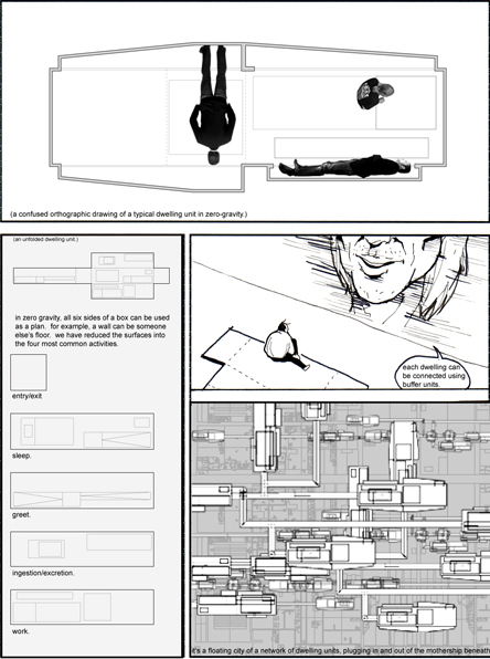
JL: I was interested in the idea that you can flip the building around and treat elevations like plans. Without gravity, all surfaces can be occupied as plans. In essense, the distinctions between orthographic drawings become obsolete.
16 Comments
i wish i could say more than fucking amazing, but i am too busy kicking myself in the fucking ass. nothing motivates me more than seeing work like this. makes Jones look like an amatuer.
FANTASTIC STUFF! i second the notion put forth by betadinesutures that nothing motivates/inspires me more than viewing some great work...thanks for sharing your unique perspectives...
Jiiimmmmmyyy!!!!! Sweet stuff. I enjoyed the interview thoroughly, hats off to Mason for such an engaging dialog....
I'm J-Lia's biggest West Coast Fan.....Encore please
badass!!! this is fuckin' dope! i love it! it is inspiring!!!
Excellent! This should be an Archinect publication!
i agree. i would love to get a print copy of this.
well done... his site has some great photos as well.
super.
Very nice work. Maybe a movement is developing: link
So fantastic I can't stand it!
I see the influence of Chris Wares.
GORGEOUS.
and yes this is definitely part of a movement that you might trace to Wes Jones' use of comics and print techniques...and CJ Lim.
but for student work this is way sophisticated...incredible.
great seeing you here Jim!
Very cool work, Jimenez! I'm a manga junky too! Nice to see a fellow architect / otaku...
One of the things I find really fascinating is that there is a space "in between the frames", the in-between that happens in the imagination of the reader that separates one frame to the next... There are some pretty interesting things happening (in your work and in comics in general) in the way one frame relates to the next, how those bars, that empty "gutter" can be played with to manipulate time, movement, space, tone, distance, and actually force the viewer to participate in the work... The fact that it is the empty "in-between" forces the viewer to make an imaginary projection to connect the frames... It's different from a slide show for example, somehow I feel like it's both spatial and temporal, more free, less controlling, less relentless than slides...
The images themselves are also very cool, very imaginative, they make me think of Marcos Novak's virtual architectures, the idea of architectures that are free from gravity, that respond to the occupant's desire... But here, it seems like Bob is both consuming, and consumed by, the virtual architecture. Some of those images make me think of things that may really be coming down the technological pipeline: 3 dimenional operating systems... Like imagine if the next generation "windows" were a 3D environment, and if we all had wearable pc's- they would be as common as cell phones, eventually we're basically part cyborg, if we shuffled information in huge virtual drawer like filing systems that were projected onto the spaces around us... a personalized urbanism.
Fucking wicked!
Bad ass!
Block this user
Are you sure you want to block this user and hide all related comments throughout the site?
Archinect
This is your first comment on Archinect. Your comment will be visible once approved.