
California is home to public and private educational institutions that offer architecture, landscape architecture, interior architecture, and urban planning programs — not to mention the myriad of community colleges providing notable two-year programs. In 2002, the AIA Los Angeles and a group of LA-based architects, architecture faculty, and design collaborators launched the first 2x8 Exhibition at the A+D Museum in the Bradbury building. Fast forward 19 years later, the 2x8 Exhibition has become the foremost student-focused architecture exhibition and scholarship event in Los Angeles.
Archinect has been a frequent supporter and media sponsor of the 2x8 Exhibition and Student Awards Program. While last year's exhibition and awards ceremony was conducted virtually, the current iteration, 2x8:Assemblies, features a collection of outstanding student works, enthusiastic exhibition designers, and a community of supportive architects, design professionals, and visitors.
On November 6th, the AIA Los Angeles, Architecture for Communities Los Angeles (ACLA), and the 2x8 Committee showcased their 15th iteration of the 2x8 Student Exhibition. After a tumultuous year of virtual events, lockdowns, and remote learning for students across the globe, California architecture students were celebrated with a unique showcase of selected works.
2x8:Assemblies Opening Ceremony. Video time-lapse courtesy of 2021 exhibition design team (Martha Kriley, Kyoung Eun Park, Chieh-Ting Chuang, and Yushan Men)
This year, the 2x8 Exhibition presented projects from 19 California-based architecture schools, featuring work that represented the institutions' architecture, interior architecture, and landscape architecture departments. In addition to student work, the 2x8 Exhibition also awarded scholarship prizes to eleven students. Broken into three cash prize categories ranging from $5,000 to $1,500, each awarded student was presented their prize at the 2x8 Exhibition's opening ceremony. Student winners were selected by a distinguished panel of jury members consisting of Rebecca Rudolph, AIA (Co-Founder, Design, Bitches), Melissa Shin, AIA (Co-Founder of Shin Shin), and Joshua Foster Assoc. AIA, NOMA (Founder of JAF Creative Solutions).
First-place winners received the Assembly Award and a cash prize of $5,000 each. According to the jury, each project exhibited examples of how architecture and community can "come to life." The Assembly Award was presented to three students: Airene Joanne B. Dizon of Cal Poly Pomona for NOOKS & CRANNIES, Sanyukta Bhagwat of California College of the Arts for their project ACDU'S AS A 'SOCIAL ACTIVATOR, and Alena Nagornaia of California Polytechnic State University, San Luis Obispo for PIXELATED DENSITY.
Second-place winners were awarded the Engage Award, and each received a cash prize of $2,500. According to the jury, students in this category were selected for their "clear presentation of how spaces will feel, attention to program concept, and functional design that blends with the site." The Engage Award was presented to Andriani Sugianto of California Baptist University for FAIRMOUNT SCHOOL OF ART AND ECOLOGY, Nichole Na of Otis College of Art & Design for NOURISHING COMMUNITY CENTER, and Marilyn Linh Pham of California State University, Long Beach for THE HOPE CENTER.
Lastly, third-place winners have been presented the Affinity Award and received a cash prize of $1,500 each. For this prize category, the jury selected five student winners for their variation in design approach, "articulation of environment, strong analysis of site and condition" as well as strong interior detailing. The Affinity Award was presented to Camille (Khanh Linh) Thai of Southern California Institute of Architecture for HYPERNATURAL CONSONANCE, Anna Grubinski Ossyra of Woodbury University School of Architecture - Interior Design for MATERIALITY OF THINGS, Lizbet Romero of Woodbury University School of Architecture for ORNAMENTS OF DISPOSAL, Angel Terrones Calvario of Cal Poly Pomona for LA PLAZA COMMUNITY CENTER, and Areil Hovsepian of Pasadena City College for HOUSE OF CAMARADERIE.
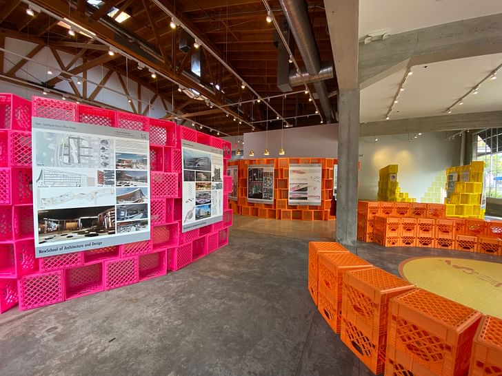
Besides the student projects, the exhibition also featured a site-specific design titled PORO-City. This colorful modular crate system was designed by Martha Kriley, Kyoung Eun Park, Chieh-Ting Chuang, and Yushan Men, winners of this year's 2x8 Exhibition Design Competition.
Archinect connected with the design team to learn more about the installation process and the idea behind their concept. The group shared that their design methodology focused on being easy and quick to assemble. Thanks to volunteers' help, the team was able to construct each section in less than a day. The group shared: "COVID has kept many of us indoors, so it was great to get together at Helms Design Center for the exhibition."
Katherine Guimapang: In the preview set diagram images I saw, there were a variety of milk crate configurations (ie: shelving, wall set, and display). Were there any changes in how these crates were configured during the final phase of the installation?
PORO-City Design Team: The final installation maintains a modular approach similar to our original proposal. After determining the location of the exhibition and working with a crate mock-up, we refined our design into three types of smaller modules. We used a series of small straight walls instead of curved walls and incorporated an alternating crate pattern for additional stability. Due to the viral milk-crate challenge from Tik Tok, and to discourage climbing on the walls, we also made the decision to treat seating as a separate element rather than integrating it with the exhibition walls.
Video time-lapse of installation courtesy of the 2021 exhibition design team (Martha Kriley, Kyoung Eun Park, Chieh-Ting Chuang, and Yushan Men)
When I visited the exhibition space over the weekend, what struck me was the vibrancy and color of each milk crate configuration. Do these colors have a specific significance?
Our vision for this exhibition was to exemplify the ability of people to create the extraordinary from the mundane. Showcasing milk crates, which by their nature are utilitarian objects, celebrates this resourcefulness. The bright and unexpected colors further elevate and transform the material and show it in a new way. Each color — orange, yellow, and pink — is located within a different area of the exhibition space. As visitors explore the gallery, a single color dominates the field of view, while other colors peek through. The combination of bright colors and porosity makes the assemblage enticing to approach and exciting to engage as a place of discovery.
The colors also challenge traditional neutral museum displays. Rather than fading into the background, they create a figure/ground effect that boldly frames the student work. The atrium uses only white crates, blending into the existing white walls. The contrast between spaces helps guide visitors to the more colorful primary exhibition space.
What were your final takeaways as this year’s design exhibition team?
After graduating during the pandemic, it was great to have a project that helped us connect with other young professionals around Los Angeles. We were inspired by the project brief, which called for a design that could be distributed at indoor and outdoor sites throughout Los Angeles. We wanted our design to be recognizable regardless of its location, and to create a space while connecting to each unique neighborhood. We settled on a kit-of-parts construction using milk crates as our primary building material due to their adaptability and recognizability. Assembled as undulating porous walls, crates frame views and emphasize the experiential relationship between exhibition and site. The stacked brick pattern recalls the textures of breeze block walls, iconic surfaces of the LA landscape. The final result is a welcoming and vibrant exhibition in an array of vivid colors.
We wanted our design to be recognizable regardless of its location, and to create a space while connecting to each unique neighborhood. — 2021 2x8 Exhibition Design Team
It is so rewarding to see hundreds of people engage with the space — sometimes in ways we didn’t expect. Visitors not only viewed the exhibited student work on the crate walls but also used the crates to hold beverages, cell phones, and bags. A display podium became temporary award storage. A circular seating area became an impromptu dance floor. And finally, a half-wall designed as a photo booth unexpectedly became a children’s nook. Its proximity to an outlet allowed them to play video games, while the holes in the crates allowed their parents to keep an eye out.
While each 2x8 Exhibition design must satisfy creative ways to exhibit student work, the materials used must also provide a “second life.” How will these milk crates be used after the exhibition is finished?
Our goal is to donate the milk crates to organizations across the Los Angeles area. We hope the crates can continue to be adapted, reconfigured, and reused for many years to come, and we are excited to see the vibrant and colorful crates continue to appear as recognizable symbols of LA’s creativity.
For future 2x8 Exhibition designers, any tips or helpful advice you’d like to pass on?
Next year will be the 20th year of the 2x8 Exhibition. We hope the designers will take this opportunity to continue ACLA’s mission of making design accessible to communities throughout Los Angeles. Our advice to future designers is don’t be afraid to ask for help. We reached out to former professors, 2x8 committee members, and vendors. This is a great learning experience, and people are very supportive and willing to give advice. We also suggest building a mockup as early as possible!
The 2x8 Exhibition is still on display at Helms Design Center in Culver City. Their last day for public viewing is on Saturday, December 4 from 11 AM to 3 PM PST. Unable to visit the exhibition? Click here for a virtual tour of exhibited work.
Follow the 2x8 Exhibition on Instagram to stay up to date on programming details and future events.
2x8 is an annual non-profit program that functions as a student exhibition and scholarship fund, and design competition. It was formed with the intention of introducing student work to the Architecture, Engineering, and Construction industries. Each year, the exhibition is given a unique name and theme, and we encourage the schools to choose work that represents that theme. This year’s theme regards the dialogue surrounding Community in Los Angeles and other urban centers across the country in the face of Covid and all things socially distant. The name, 2x8:Assemblies, refers to a group or community of people, and also to the process of building where disparate parts become a whole. Students submit presentation materials and 3D models that respond to the theme with innovative solutions.
Katherine is an LA-based writer and editor. She was Archinect's former Editorial Manager and Advertising Manager from 2018 – January 2024. During her time at Archinect, she's conducted and written 100+ interviews and specialty features with architects, designers, academics, and industry ...
1 Comment
Great feature on the 2x8 show! You should also check out the SoCalNOMA show "Not Now, But Right Now!" next door at the Helms Design Center too. Open Wednesdays through Sundays until December 17th. Projects by over 30 architects and designers of color. https://helmsbakerydistrict.co...
Block this user
Are you sure you want to block this user and hide all related comments throughout the site?
Archinect
This is your first comment on Archinect. Your comment will be visible once approved.