
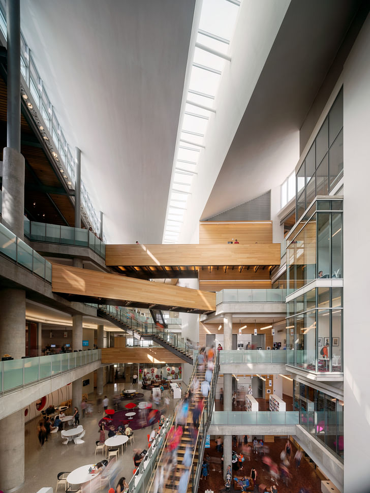
In recent years, public libraries have taken on a renewed prominence in American cities as vital community spaces that provide access to a growing array of necessary amenities and services, including internet and other technologies, air conditioning, continuing education opportunities and so much more. Increasingly, despite—or perhaps, because—of the fact that our day-to-day lives are becoming ever-more digitized, libraries are reasserting and expanding upon their fundamentally social and public character, a tendency that is being reflected more and more via the architecture of these facilities. The Austin Central Library, completed in 2017 and designed via a joint partnership between Lake | Flato and Shepley Bulfinch, represents an example of this emerging library-as-social-condenser model. The library, anchored by a collection of generous public spaces that include a six-level central atrium, roof top terraces, and reading porches, acts as a new node for Austin's growing downtown communities.
Archinect spoke with Jonathan Smith, Associate Partner at Lake | Flato to discuss the library's design, including its grand central atrium, as well as the other approaches the designers took to, as Smith explains, "connect people with the outdoors and make this building an essential part of every Austinite’s routine."
Can you describe the approach your team took with regards to the design of the outdoor spaces on the project, especially in terms of the planted rooftop terraces, the outdoor “porches,” and the connections to the site?
From the beginning we knew we wanted to connect people with the outdoors and make this building an essential part of every Austinite’s routine.
We designed the library to embody the great outdoor spaces and casual culture of indoor/outdoor living that characterizes Austin. The design team wanted to leverage this incredible site overlooking Lady Bird Lake and fronting Shoal Creek by placing an entry off of Shoal Creek to encourage a seamless connection between the creekside recreation and the library. We located the outdoor reading porches and the roof garden to catch the breezes off of the lake so they are comfortable year-round. The client was very receptive to these non-traditional library spaces. Since opening, the outdoor spaces in the porches and the roof deck are some of the most popular and well-loved spaces in the building.
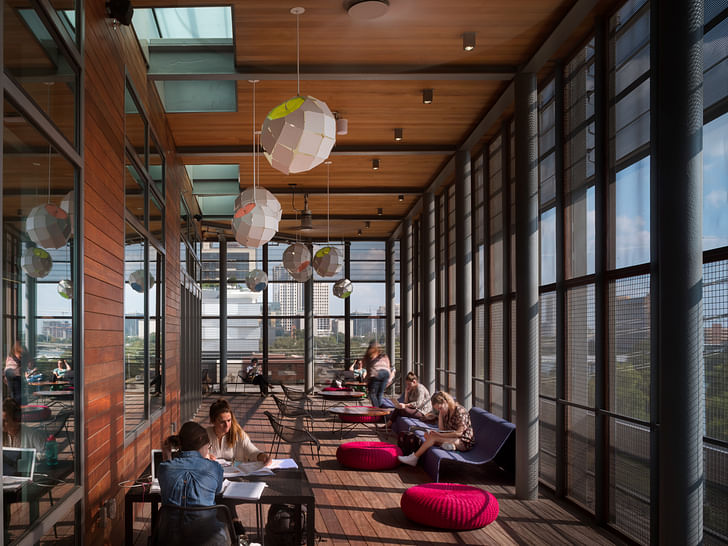
Since opening, the outdoor spaces in the porches and the roof deck are some of the most popular and well-loved spaces in the building.
What is the type of stone used on the facade and how/why was this material selected?
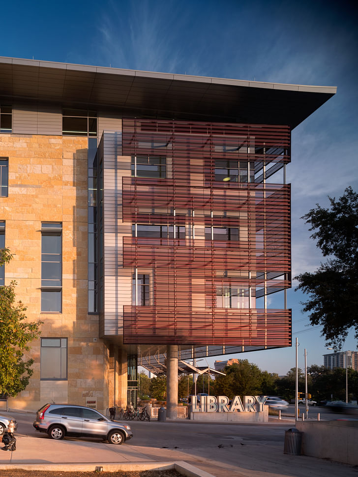
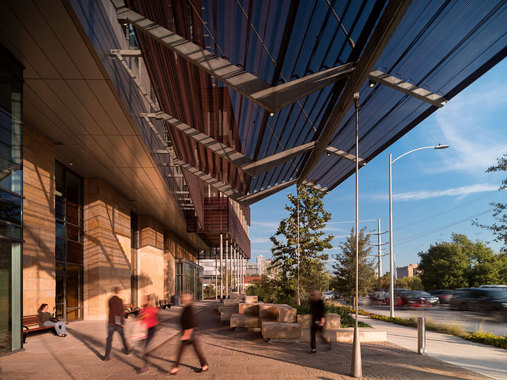
The team wanted the building to respond to its context and place, and we looked to local materials and craft when making early decisions. The exterior stone is roughback Lueders Limestone which was selected due to its durability, beauty, and its local availability. The team detailed the stone with large blocks and with bands of similar hues that recall the sedimentary nature of the local limestone.
The library is anchored by a six-story atrium that brings light deep into the building; Were there any difficulties in getting the design of the space approved with regards to fire code or other regulatory considerations? Can you share interesting technical aspects for the design of the space that helped bring it into being?
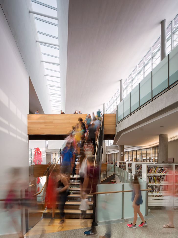
The library’s six-story atrium was designed as a way to harvest daylight deep into the building as well as create a large civic “living room” for Austin. Aside from the atrium’s aspirational goals, the regulatory goals were also a significant hurdle. The atrium houses the building’s smoke evacuation system, and the team needed to locate some very large fans to evacuate the smoke in the event of a fire. The fans were placed behind louvers at the top of the atrium.
During construction one of the biggest challenges of the atrium was that it had to be built and punch-listed from the top down, as the entire atrium began full of scaffolding to frame the underside of the atrium ceiling.
During construction, one of the biggest challenges of the atrium was that it had to be built and punch-listed from the top down, as the entire atrium began full of scaffolding to frame the underside of the atrium ceiling. We created a physical model during design and countless digital models to test, but eventually we had to take the big leap and build it. This meant that we couldn’t get a true sense of the atrium until it was complete. We didn’t know how well the light quality and acoustic properties really worked until it was too late to fix them, as the scaffolding would have to be taken down to experience the atrium. The whole design and construction team pulled together and made a huge effort to get everything right and that is what you see in the atrium today.
The physical model was critical in shaping the library’s 128-foot-long skylight, and it reinforced the design of the library’s six-story atrium.
Please describe the ways in which the Austin Central Library is “a building shaped by light.”
We began the job with a goal to be the best day-lit library in the country—Frankly there were times in the job that this goal kept me up at night. During the design process, the integrated team created a four-foot-tall scale physical model of the library’s six-story atrium and took it to a local park, tuning and shaping the roof for optimal, glare-free natural light conditions. The physical model was critical in shaping the library’s 128-foot-long skylight, and it reinforced the design of the library’s six-story atrium. The finished building provides daylight for more than 80% of regularly occupied spaces in the library, which beat our ambitious original design goal of 70%. I knew the atrium was really working when I was there one day before opening and I could sense a cloud moving across the summer sky inside the building. The atrium does give the building a real sense of life as it reflects what’s happening outside; it’s different at different times of day, times of year, and during weather events. I really enjoy how even the inside of the building connects you to the outdoors.
What did your team learn about libraries and library design during the course of creating this project?
I have much more respect and care for the operations side of the library. As a society, we ask libraries to serve a lot of needs for a wide array of the public, while typically underfunding them. People use these institutions every day and that takes its toll on these well-loved buildings. Consequently, libraries need to be designed in such a way that they wear well over time.
I have much more respect and care for the operations side of the library. As a society we ask libraries to serve a lot of needs for a wide array of the public, while typically underfunding them. People use these institutions every day and that takes its toll on these well-loved buildings. Consequently, libraries need to be designed in such a way that they wear well over time.
I am particularly proud that we designed event spaces (indoor and outdoor) that the library can rent out and generate funds that yield valuable operating revenue for the Austin Central Library to sustain its core mission. The building has added return on investment within the district, decreased the operation cost to the client, and increased the bottom line of the library’s funding.
Did the project institute any innovations in library design?
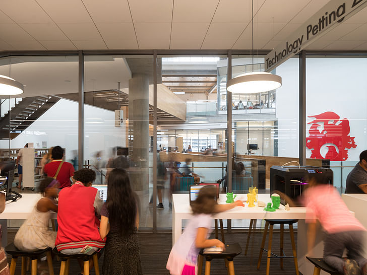
When we began the project in 2009, we did not live in a ubiquitous smartphone and co-working world. I think our team did a good job of predicting the immediate future by putting some great free co-working spaces in the building. We hope that the library will incubate the next great wave of Austin startups and reinforce Austin’s entrepreneurial spirit. Our ultimate goal was to provide enough flexibility in the building for the library to continue to evolve over the coming decades.
there are thousands of people living around the building in a bustling downtown neighborhood, many of whom have kids that now have library cards and consider this building as part of their routines.
Can you describe the design of the children’s library?
One of the most asked for and talked about programs during the early public meetings was a space for children and teens. The team designed this space to be a gregarious, fun, and outgoing space, which led to the playful curving wall of round windows. We placed the children’s area in a prime location on the third level and provided a large outdoor screened porch facing the lake for the kids. When we began the project, the neighborhood around the library was still largely empty lots of prior city infrastructure (a former water treatment plant and a former power station) and now there are thousands of people living around the building in a bustling downtown neighborhood, many of whom have kids that now have library cards and consider this building as part of their routines.
Viewed one way, the library's atrium design, with it's soaring volume and open staircase, symbolizes a sense of openness and public accessibility; But as several recent building controversies have shown, using staircases as a visual and programmatic focus for a public building can project unintended biases against users who cannot fully experience those architectural elements. How do you balance these competing concerns—and constituencies—when designing a project like the Austin Central Library?
The library’s atrium staircase was designed to encourage active behavior, add life and activity to the atrium, and reduce energy consumption through a reduction in elevator use. As a side benefit with the majority of people using the stairs, it has cut down on elevator wait times for those who rely on them. I believe the stairs have been a success in Austin. For example, I recently saw two small siblings waiting for the elevator with their parents look at the staircase and then grab their parents by the hand and happily drag their parents up the stairs.
The stairs would not be a success in Austin if the design team had not spent a great deal of care working out the other ways that strollers, wheelchair users, and others move to their destinations in the library while experiencing the atrium. We did this by locating the elevators overlooking the atrium so elevators users still engage with, and activate, the atrium.
The stairs would not be a success in Austin if the design team had not spent a great deal of care working out the other ways that strollers, wheelchair users, and others move to their destinations in the library while experiencing the atrium. We did this by locating the elevators overlooking the atrium so elevators users still engage with, and activate, the atrium. Also the many bridges that criss-cross the atrium enable everyone to be in and over the atrium. The bridges themselves led to a lot of discussion during design about the portion of the public that are afraid of heights. Consequently, the bridges that are the only way across the atrium were made of solid wood—they were originally glass railed—the guardrails are taller than code, and they are wide so users can walk down the middle if they need to.
For me personally, this project widened the array of design criteria I think about in public buildings and how those addressing those concerns can make the project stronger.
Antonio is a Los Angeles-based writer, designer, and preservationist. He completed the M.Arch I and Master of Preservation Studies programs at Tulane University in 2014, and earned a Bachelor of Arts in Architecture from Washington University in St. Louis in 2010. Antonio has written extensively ...
3 Comments
Interesting design concept. I think a great challenge that architects face in the 21st Century is being able to multi-function typical institutional buildings such as libraries and make them a more dynamic part of the landscape.
So much to like here, inside and out. Thanks. Basically it's just a box, but one that has been opened up to space and light and varied with surfaces and divisions. So much movement, energy. And it provides a model in itself of meaningful community activity, hard to find elsewhere.
Was just here this week. I think it does its job as a public library well - generous lighting, sensible circulation, soaring atrium, good acoustics, and a variety of spaces for reading, meeting, etc. What I found a bit lacking was the material cacophony. Not that the materials aren't harmonious or that there are far too many in the pallette - its just that the parts don't seem to make up a singular whole - unlike, say, the Snohetta libraries or even OMA in Seattle. Now one could debate the merits of a singular material style or the benefits of certain aesthetics, but it seems the use of relatively off-the-shelf material products lent the Austin library a cheaper vibe than its bespoke cousins - despite its excellent design. Of course, this is probably due to VE and budget.
Block this user
Are you sure you want to block this user and hide all related comments throughout the site?
Archinect
This is your first comment on Archinect. Your comment will be visible once approved.