
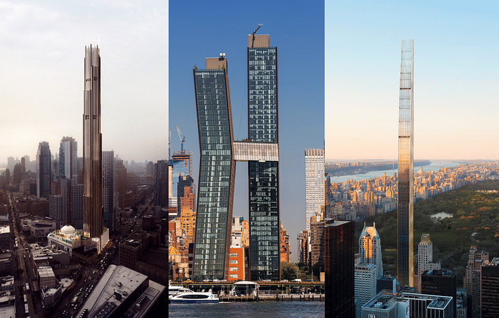
One doesn’t need to visit New York City in order to understand that the city’s skyline is undergoing drastic change, both within and—increasingly—outside of Manhattan.
In an attempt to better understand the micro- and macro-forces at play shaping the city’s skyline, we’re taking a look at three recent distinctive tower projects designed by SHoP Architects in partnership with JDS Development, Property Markets Group and Spruce Capital Partners, including: 111 West 57th, a spindly supertall under construction on Billionaire’s Row; the American Copper Buildings, two metallic skyscrapers overlooking the FDR expressway; and 9 DeKalb, a forthcoming supertall tower set to become Brooklyn’s tallest building.
Together, along with a forthcoming set of acrobatic high-rises slated for the Brooklyn waterfront that SHoP has also had a hand in crafting, the featured buildings highlight several of the dynamic conversations taking shape within the realm of skyscraper design, as issues of extreme height, massing, historic preservation, and environmental performance play out across the city’s (and the world’s) evolving skylines.
New York City’s constantly growing skyline has reached new and dazzling heights during the second decade of the 21st Century.
The steady stream of neck-straining renderings for the row of supertall towers on the southern edge of Central Park, for example, has created what some have called an “accidental skyline” shaped in part by tricky real estate maneuvers, the exploitation of zoning codes, and piles of cash that nearly rival the heights of the towers themselves. On Manhattan’s western edge, the Emerald City-like Hudson Yards development has sprung up over the last half-decade as an equally controversial set of sky-piercing buildings, their slanting, chiseled forms broadcasting ostentatious luxury, corporate retro-futurism, and America’s frothy economy all at once. The ever-multiplying clusters of residential and office towers taking shape in downtown and northern Brooklyn, in addition, have extended western outposts of the city’s world-famous skyline, while the relatively staid high-rises in Long Island City, Queens, as well as those located across the Hudson River in Jersey City and Hoboken, indicate that New York’s decade-long post-recession growth spurt is reshaping the entire region rather than merely a few choice neighborhoods.
As incredibly tall buildings have advanced and proliferated across the New York area, the conventions of skyscraper design have been somewhat upended. Monolithic glass curtain walls are becoming less common in new proposals, for example, as designers work to incorporate concerns over environmental performance and facade modulation into their work. At the same time, street-level design has grown more rich and people-friendly over the years, with landscaped plazas and pedestrian retail designs back en vogue, as well. Simultaneously, as land-use and zoning regulations have been massaged into submission via a proliferation of re-zoning initiatives and clever lot arrangements, and as a result, towers have sprung up that dive into existing historic structures, hang daintily over them, or land neatly right beside them, challenging the conventions of historic preservation thinking, both on the street and across the sky.
All told, New York City’s skyline, always shaped by the interlocking considerations of aesthetics, finance, and gravity, is alive and growing.
Central to this transformation have been the efforts of SHoP Architects, an architecture firm founded in 1996 and based out of Manhattan’s Woolworth Building—a tower that itself stood as the tallest in the city for nearly two decades after being built. In recent years, the firm has undertaken an increasingly aggressive building spree across New York City (as well as regionally and across the globe) that is beginning to give form to a collection of unique and forward-looking skyscrapers. The office, headed by a multi-partner team with experience in design, real estate, and other building endeavors, works methodically to iterate its way toward convention-defying works of architecture, often partnering directly with developers and builders to craft these dramatic and provocative buildings. Such is the case for the collection of projects showcased here, all three of which are developed in partnership with JDS Development, a development office that has taken on managing the construction of the projects in question, working together with SHoP to bring distinct ideas into built form.
The firm’s recent crop of skyscrapers lays testament to this inventive spirit while also pointing a way forward for the skyscraper typology, which after nearly 200 years of trial-and-error and several eras of signature-driven development, has found a certain type of architectural stability in some offices. Not so at SHoP, where the inventive spirit that drives the architects is a restless one that is also constantly searching for (and often inventing) new challenges to address. It’s at this rarified intersection that the unique conditions of building in today’s New York City shine through.
For instance, as one might imagine, finding suitable land to build on is a very complicated task for developers and architects working in New York City. A related but not-so-well-appreciated concern has less to do with land and more to do with floor area, namely, how much of it can be built above any given parcel. Over the decades, New York City’s zoning code has grown more stringent, limiting density, height, bulk, and other factors for many areas across the city while protected status has simultaneously been extended to increasing numbers and groups of structures. According to a 2016 analysis by The New York Times, for example, zoning changes have made it so that close to 40-percent of the buildings on Manhattan no longer meet zoning code and would be illegal to build if proposed today. To boot, according to the New York City Landmarks Preservation Commission map, 1,400 individual buildings and 34,000 structures located within 141 historic districts in New York City are now historically protected in some way.
At the same time, over the last decade, city agencies, first under Mayor Michael Bloomberg and more recently under current Mayor Bill deBlasio, have systematically and strategically up-zoned large swaths of existing neighborhoods to balance out some of the building potential lost over the decades.
This complex arrangement has set the stage for a series of unique design constraints, while fueling an increase in the phenomenon of gerrymandered properties that allow developers to swap air rights, tax incentives, and easements as necessary in order to assemble favorable building conditions that can best maximize profits. The development at Hudson Yards, for example, is one recent and notorious arrangement. On a smaller scale, individual historic properties that command lots of unbuilt floor area capacity but can’t be torn down also play a central role in fueling development patterns, and so, many of the city’s newest and tallest structures actually spring out from relatively smaller and more humble structures from previous eras.
The arrangement has given birth not only the supertall skyline on the edge of Central Park but also the interesting and sometimes quizzical ways these buildings meet the ground.
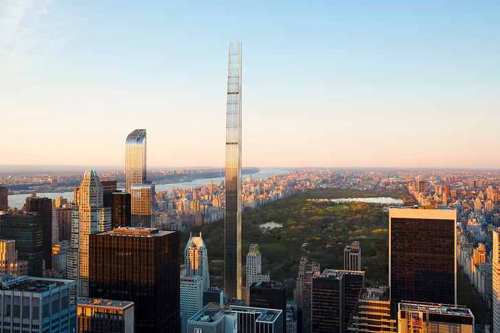
That is certainly the case for 111 West 57th Street, SHoP’s terra cotta and gold filigree-wrapped 1,428-foot residential tower on Billionaire’s Row. The 300,000-square-foot building, designed by SHoP and developed by JDS, Property Markets Group, and Spruce Capital Partners, rises beside the historic Steinway Hall, a 16-story “restrained neo-Classical style” structure completed in 1925 by architects Warren & Wetmore, the designers behind New York’s Grand Central Terminal. The Steinway building, wrapped in buff Indiana limestone and articulated with a four-story, colonnaded top decked-out in historical motifs, served as the headquarters and showroom for the storied Steinberg & Sons piano company until 2016. Located just across the street from Carnegie Hall, the building’s basement “piano bank” was widely known as a one-stop-shop where notable musicians came to select performance instruments for their New York City concerts. The building was landmarked in 2001, according to the Landmarks Preservation Commission, and cannot not be torn down, so after the group of developers acquired the property, plans eventually centered on a scheme that touches down softly beside the building.
The arrangement became both a prompt and a challenge for the designers behind the project. As a result, the distinctive supertall tower that rises from the inner portion of the lot meets the street in an 85-foot-tall glass and bronze atrium squeezed between the Steinway building and another historic neighbor. According to Greg Pasquarelli, a SHoP founding principal, “The building is designed with a high-quality facade that reads on multiple scales, has texture and beautiful materiality, and breaks down the scale of the building.” The tower dives into the historic building at its base, where SHoP has performed “a complete restoration from top to bottom” of the Steinway structure.

For a firm that specializes in some of the biggest, boldest, and most formally inventive contemporary building complexes, SHoP also approaches materiality with a unique perspective by often deploying materials that transform over time or that are shaped through complex manufacturing processes to convey increasingly complex detailing. 111 West 57th is no exception. “For this project,” Pasquarelli explains, “we thought about taking a beautiful, historic New York material [Terra Cotta] and seeing what its limits are using today’s technologies. We’re using computers to fabricate new shapes and forms: The design rotates in these moire patterns that include shadows and light modulation to create a connection to New York’s past without being historicist or nostalgic at all.” Pasquarelli adds, “We managed to make it into a completely contemporary building despite these ties. We spent more than a year developing the system, prototyping, and building visual mock-ups so that we could push the limits of what you can do.”
“We thought about taking a beautiful, historic New York material [Terra Cotta] and seeing what its limits are using today’s technologies. We’re using computers to fabricate new shapes and forms: The design rotates in these moire patterns that include shadows and light modulation to create a connection to New York’s past without being historicist or nostalgic at all.” —Greg Pasquarelli, founding principal, SHoP
In certain sections, the writhing terra cotta panels cantilever up to 18-inches off the building’s concrete core, a detail that lends the east and west facades depth and a sense of richness. Ultimately, there are 26 different terracotta panel types painted using six different shades of cream within the facade, details that subtly match the limestone of the original Steinway Hall. When stretched across the full height of the tower, Pasquarelli explains, “These elements are mixed together to create order, richness, and texture” against surrounding buildings.
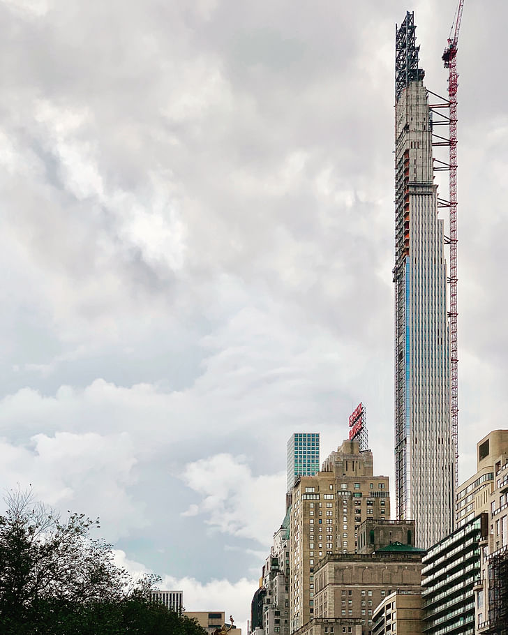
But the surface-level details conceal something that the construction photos lay bare: Concrete, and lots of it.
Simon Koster, a principal at JDS Development, explained that the project’s construction required a series of gymnastic acts designed to allow the Steinway building to remain in use during construction. So, while the piano recitals and office functions hosted by Steinway Hall went on undisturbed during the day, workers drilled underneath the building, removing subsurface bedrock at night. According to Koster, JDS and SHoP worked hand-in-glove to design and plan the building’s construction sequence, navigating the “tedious” complexities of clearing space underneath the historic structure to make way for the new tower’s foundations, a process that eventually included re-structuring the historic building as well by supplementing its existing masonry construction with new concrete beams and girders.
“Architects can have these wonderful, fanciful ideas,” Koster, a trained engineer, explains, “and so many companies battle with these architects to reign them back. We do the opposite: We push them to see how far they can go.” Koster continued, “Our in-house construction team has its own expertise working on innovative projects, so when we get a design proposal, we say, ‘Okay, that’s really different—Let me get back to you on how I think we can do that, let me see how close I can get to precisely what you want.’” That can-do attitude allows JDS to partner with design architects like SHoP so that they “go further than they would with their other clients,” Koster explains, adding, “we also start super early on designing every building system—the structure, the facade, etc. Our approach is to say, ‘Let’s make sure that we’re building one good idea on top of the next,’ because too often there’s not enough feedback and conversation between design and construction.”
“Architects can have these wonderful, fanciful ideas, and so many companies battle with these architects to reign them back. We do the opposite: We push them to see how far they can go.” — Simon Koster, principal, JDS Development

An equally intense example of the close working relationship between JDS and SHoP comes from the pair’s American Copper Buildings, two conjoined high-rise apartment towers that hug Manhattan’s eastern coastline. The two towers, both wrapped in gridded expanses of copper panels and blue-green curtain walls, meet at their midsections, where a two-story skybridge containing a lap pool, building lounge, HVAC equipment, and other amenities connects the buildings. Unlike the Steinway project, the American Copper Buildings are built over a blank site that, despite being clear of buildings, offered its own complex technical hurdles. The site’s East River-adjacent location, for example, meant that the team was building in a muddy, flood-prone pit that had to be “de-watered” on a continual basis. “We knew anything could go wrong” during construction, Koster explains, highlighting the multiple contingency plans created for the construction sequencing that would ensure the project’s completion.
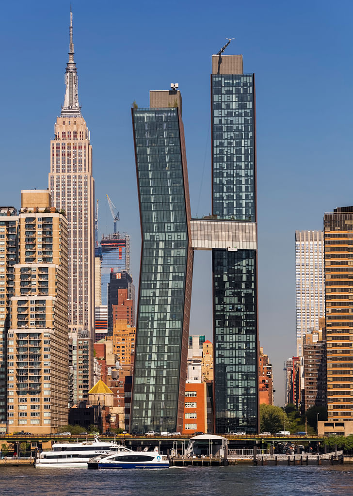
Though visibly arranged as two interlocking towers, it’s hard to tell whether the buildings exist as separate structures, as a singular monolith, or what. The truth is somewhere in between. Below ground, for example, the towers share a single foundation that runs approximately 50-feet below the street. “We built each foundation separately, however,” Koster explains, “and then came back and filled in the structures above.” The maneuver allowed the construction team to focus on each foundation section exclusively as it was being built, and helped to make de-watering the site more manageable during that complex process. Ultimately, the two separate towers were built in sequence, with the western tower going up first and the eastern following after, another failsafe mechanism that would allow the team to complete either building individually in case something went amiss on the site or with financing.
“We built each foundation separately, however, and then came back and filled in the structures above.”
After each tower reached its final height, the connecting bridge went in via mix of prefabricated and on-site building methods. “We didn’t want to build that bridge entirely off-site and have it only sort of fit,” Koster added. At the end of the day, the bridge actually cantilevers from the west tower entirely, notching into an eight-foot-wide slip joint created within the eastern tower to receive the connecting structure. The design means that all three elements “don’t always move in phase with one another,” according to Koster.
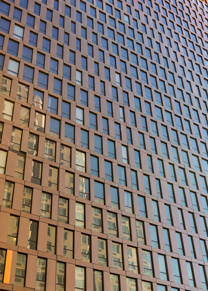
Today, with the towers completed, it’s possible to swim from one building to the other. Along the upper terrace of the bridge, adjoining units are offered private outdoor spaces, as well. The complex, stacked, and interlocking programs the tower complex embodies represent SHoP’s “urban planning in section” concept, a running preoccupation that drives the firm’s work. Pasquarelli explains, “We don’t see buildings as just an object; We don’t see buildings as something that ends when it hits the ground, either. For us, the interesting thing is urban planning on the ground plane and urban planning in section as the building moves toward the sky.” To help fulfill this aim, along the ground, the project features a fanciful landscaped plaza designed by SCAPE that is filled with stepping stone-studded water features, trees, and lots of vegetation that work to collect and hold stormwater that falls on the site. Ultimately, Pasquarelli adds, “We design habitats and communities and mixtures of programs that don’t only make their connective tissue at the ground floor.”

Equally as important as how these buildings meet the ground is how they scrape the sky.
Like at 111 West 57th, where the architects have designed a gradually stepped tower topped by a feathered crown, SHoP’s 9 DeKalb Avenue supertall tower in Brooklyn represents an attempt by the designers to meet the sky gracefully and in a way that is reminiscent, though not strictly derivative of, historical precedents. In the case of 9 DeKalb, the first supertall tower slated to rise outside of Manhattan, the designers rely on a series of optical tricks to simultaneously minimize and heighten the tower’s geometries.
The tower is situated on a roughly hexagonally shaped piece of land that sits beside the Brooklyn Dime Savings Bank, another local landmark, this one built in 1908 by architects Mowbray & Uffinger. The existing bank, designed as a proud temple front complex, was greatly expanded during the Great Depression by the firm Halsey, McCormack & Helmer, a transformation that cemented the bank’s status as the largest savings institution in Brooklyn, according to the LPC. The building, faced with marble and topped by a giant dome, is considered one of the burrough's great neoClassical buildings.
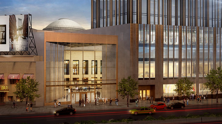
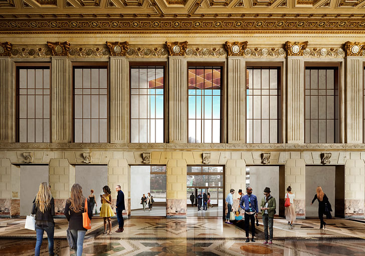
Rising around the historic building, the proposed tower’s massing is inspired, according to the architects, by the City Beautiful movement-inflected geometries and treatments echoed in the Dime Savings Bank. And like tall buildings from that pre-glass curtain wall era, it features a mix of solid and glazed treatments up its entire length. And so, as the tower rockets up from its quasi-historicist base, thin, tightly packed bronze ribs give the impression of expressed vertical structure while the tower’s otherwise monolithic smoked glass panels create a different sort of opacity that again, motions toward 1930s-era architecture without directly copying or recreating it. The approach, according to Pasquarelli, hearkens both to the 1930s and to today’s more climate-conscious design methodologies. “The all-glass skyscraper is something that doesn’t make a very good neighbor and is not very sustainable, either,” Pasquarelli says, “Older buildings perform well because they don’t have many windows.”
“The all-glass skyscraper is something that doesn’t make a very good neighbor and is not very sustainable, either,” Pasquarelli says, “Older buildings perform well because they don’t have many windows.”
But beyond performance, the tower’s design strives to articulate a contemporary vision for what a world class skyscraper might be now and “for decades to come,” as Pasquarelli explains it. The approach is perhaps different than the one pursued by the firm on Manhattan, where in addition to SHoP’s tower, 18 other skyscrapers are currently planned to rise above the height of the Empire State Building over the next few years. In Brooklyn, where a cluster of 400 to 800-foot structures are planned, ambitions for the burrough's fledgling skyline are comparatively modest and even-keeled. As such, the design for Brooklyn’s tallest, according to the architects, should reflect a certain timelessness “rivaling in height and character the storied towers of Manhattan.”
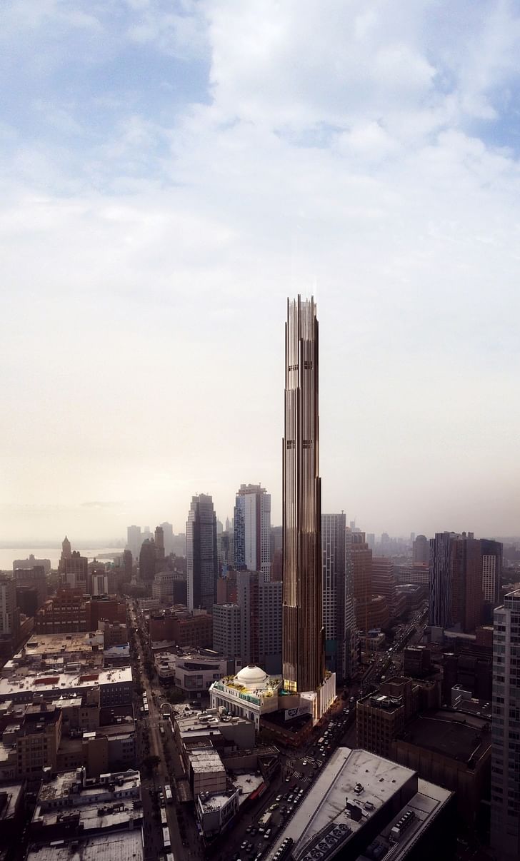
“SHoP has always felt there is value in a certain amount of solidity to our buildings,” Pasquarelli continues, “We’re not designing giant, taught, blue-glass boxes thrown together and assembled in a composition.”
And it’s true: though the tower is organized more conventionally than the American Copper Buildings—the existing building is set to be converted into a new retail lobby to support the tower’s 425 apartments and 150 condominiums—the form is anything but off-the-shelf. The tower’s crown and setbacks, according to the architect, are marked by finial-topped parapets designed to soften the building’s uppermost geometries, creating a fuzzy blur of a building that appears both old and new at once, simultaneously anchored to the ground and taking flight. While the tower’s lower levels are tightly packed with bronze detailing, the elements fall away as the bulk of the building diminishes, creating more open upper levels where the finials extend beyond the building’s roof to mark the tower’s crown.
One thing is for sure, it’s not a simple glass box, and that’s the point: As Pasquarelli explains, “We are pushing for forward-thinking, contemporary buildings that have solidity.”
Antonio is a Los Angeles-based writer, designer, and preservationist. He completed the M.Arch I and Master of Preservation Studies programs at Tulane University in 2014, and earned a Bachelor of Arts in Architecture from Washington University in St. Louis in 2010. Antonio has written extensively ...
2 Featured Comments
This article gives me hope. Its refreshing to hear discussion of the basic necessity to use less glass to help buildings use less energy and address the climate crisis. Solidity is a crucial design topic, which needs to be embraced and discussed more - awesome to see SHoP doing that.
The example buildings in this article take steps toward responsible design, but they still appear to be to glassy to get close to necessary performance levels. We need buildings like the winners of NYSERDA's Buildings of Excellence competition (many of which target Passive House energy use or net zero) to limit global heating and give future generations a chance.
love SHoP as one alternative to boring glass. Their design has a lot of retro elements, but opens up the conversation to many possibilities not taken by most developers. What other alternatives are out there? It seems like we are just emerging from a 30 year dark age
All 7 Comments
most of it's not the absolute worst architecture (barring Domino Sugar Master Plan, which is plain ugly af) but why do they always choose the most boring materials and color palette?
Most of these designs suggest a desperation to be different without any creative instincts.The last great architecture in Manhattan is the Guggenheim.
It all looks sooo ugly. It's amazing that this is what we produce given all our knowledge and wealth.
i have to agree with you. i love excellent contemporary architecture, but all of these are disproportionate and awkward.
This article gives me hope. Its refreshing to hear discussion of the basic necessity to use less glass to help buildings use less energy and address the climate crisis. Solidity is a crucial design topic, which needs to be embraced and discussed more - awesome to see SHoP doing that.
The example buildings in this article take steps toward responsible design, but they still appear to be to glassy to get close to necessary performance levels. We need buildings like the winners of NYSERDA's Buildings of Excellence competition (many of which target Passive House energy use or net zero) to limit global heating and give future generations a chance.
love SHoP as one alternative to boring glass. Their design has a lot of retro elements, but opens up the conversation to many possibilities not taken by most developers. What other alternatives are out there? It seems like we are just emerging from a 30 year dark age
The crooked building needs to be closer to the healthy one so a chiropractor could wrap it as a splint.
Thanks for this, Antonio. It goes a long way explaining NYC's funky skyline. I suppose it is partly the consequence of preservation efforts, with unintended and unanticipated results. Most unanticipated was growth, and the growth of speculative development.
Run the clock—you have to wonder where all this is going, what the skyline will look like x years from now.
Justin Davidson's Magnetic City, especially his chapters on skyscrapers, is a must read.
Ginger and Fred:
great dancers, horrible architecture memes
Block this user
Are you sure you want to block this user and hide all related comments throughout the site?
Archinect
This is your first comment on Archinect. Your comment will be visible once approved.