
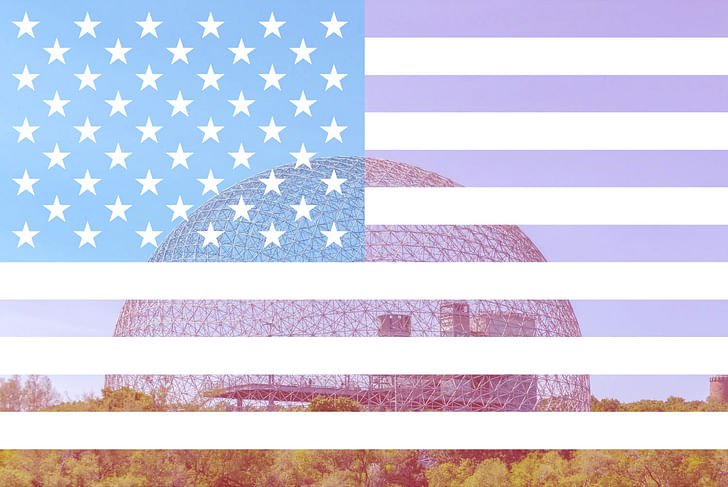
As the United States of America once again celebrates the anniversary of its declaration of independence, we're surveying some of the patriotic displays of architecture from World's Fair expositions throughout the decades. From aspirational beginnings as a young nation at London's Great Exhibition in 1851 to the iconic, Modernist structures of an emboldening superpower, all the way to the thematic, multimedia mega-pavilions of the contemporary age, US Pavilions across time reflect and have helped shape perceptions of America to itself and the world.
We have selected ten pavilions from various historical epochs to offer a passing glance at some of the more noteworthy American pavilions.
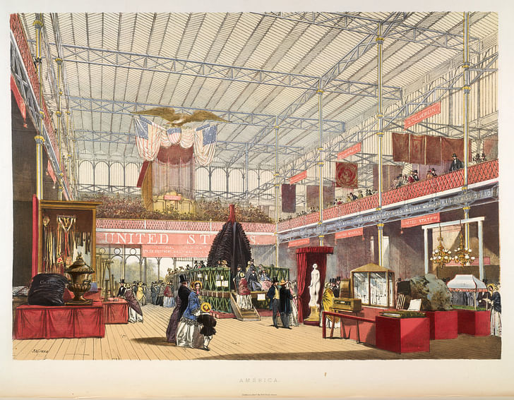
1851, The American Display at the Great Exhibition, Peter Force
In its eight months of operation, more than six million visitors attended “The Great Exhibition of the Works of Industry of All Nations,” an event known more simply as “The Great Exhibition.” Sited in London’s Hyde Park, the exhibition was held in the Crystal Palace, an interiorized version of some of the more familiar event spaces of the time, like marketplaces and the bazaars. The exposition was arranged as a museum of potential investments, with the intention of, in the words of a then-contemporary newspaper article, “exhibit[ing] all the productions of nature and art, and a universal competition to bring out all the powers in man in whatever concerns his material welfare.”
By 1851, America was known as a powerhouse of invention and industry; for this reason, the curators of the Great Exhibition provided the country with an enviable position at the end of one of the major hallways within the Crystal Palace. Because America had not yet developed an architectural style it could comfortably call its own, the American Pavilion instead focused on its more familiar symbolism and decoration, most notably featuring a massive statue of an eagle holding the Stars and Stripes set against red and blue drapery. In 1851, America demonstrated its global worth through monumental design and unmistakable iconography.
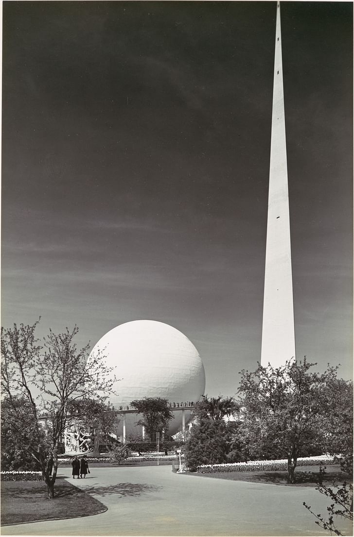
1939, Trylon and Perisphere, Wallace Harrison and J. Andre Fouilhoux
The 1939 New York World's Fair symbolizes the historical transition from the depths of the Great Depression to the yet unforeseen, but inevitably looming, advent of the American wartime economy. Organized under the banner of "The World of Tomorrow," the event was expected to bring much needed economic stimulation to New York City while promoting good neighborly relations between the U.S. and a record number of attending nations—some of which would fall under Axis occupation mere months after the fair's April opening.
At the center of the enormous fairgrounds in Queens stood two monumental modernist structures: the Trylon and Perisphere, an ensemble known as the Theme Center, which quickly became the event's trademark. Designed by architects Wallace Harrison and J. Andre Fouilhoux, both structures were true engineering feats of their time and intended to rival the Eiffel Tower, the iconic landmark of the Paris Universal Exposition of 1889. The 610-foot Trylon spire was connected to the 18-story-tall, 180-foot-wide Perisphere orb which housed Democracity, a giant diorama of the utopian city of the future. Strategically placed fountains and mirror surfaces made the Perisphere appear floating weightlessly in the air.
Neither the Trylon nor the Perisphere survived the test of time. While the fairgrounds in Flushing Meadows Park would welcome visitors again at the 1964–1965 World’s Fair, the Theme Center structures were likely scrapped to make armaments for World War II.
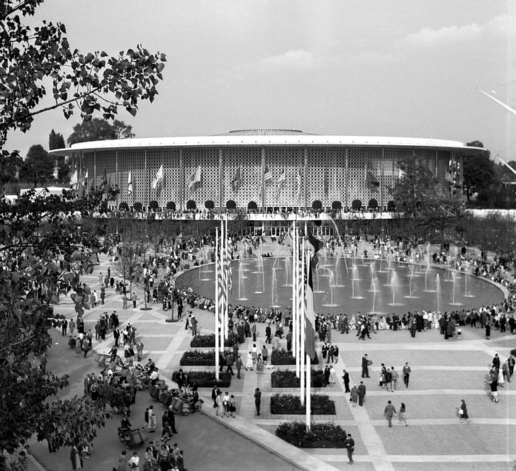
1958 US Pavilion in Brussels, Edward Durell Stone
The 1958 Expo in Brussels was a notable affair, since it was the first World's Fair that took place after the end of World War II. Nineteen years after the previous World's Fair in 1939, the goal for the 1958 Expo, according to Culture Trip, was to rejuvenate the global climate while showcasing a new image for Europe and other nations recovering from the war. Considering the recent international warfare that had taken place, the U.S Pavilion was to showcase a structure that would celebrate all 48 American states as well as the recent progress made in space exploration, film, and pop culture. With the recent creation of NASA and the start of the Space Race, the U.S. used the 1958 World's Fair as a chance to highlight new technological advances while creating a welcoming place for visitors to relish in the nation's "democratic vitality and romance," a line noted by the American architectural press of the time.
According to Twentieth Century Society, the pavilion itself contained four exhibits highlighting technological and cultural accomplishments. The pavilion was designed by Edward Durell Stone, an American architect responsible for prominent buildings like the Museum of Modern Art in New York and the U.S. Embassy in New Delhi. Stone’s pavilion was spacious in its design, featuring a series of cylindrical structures as well as an adjacent structure raised on stilts. Known for his ornate and decorative aesthetic, Stone designed the facade of each building with elaborate metallic screens. The main exhibition building featured a translucent roof that resembled a giant bicycle wheel comprised of structural cables. In turn, each building housed a particular U.S. cultural feat of engineering or design, including fashion installations, a large electronic computer, a color television studio, and a film portraying "the American Way of life."
1962, US Science Pavilion, Minoru Yamasaki
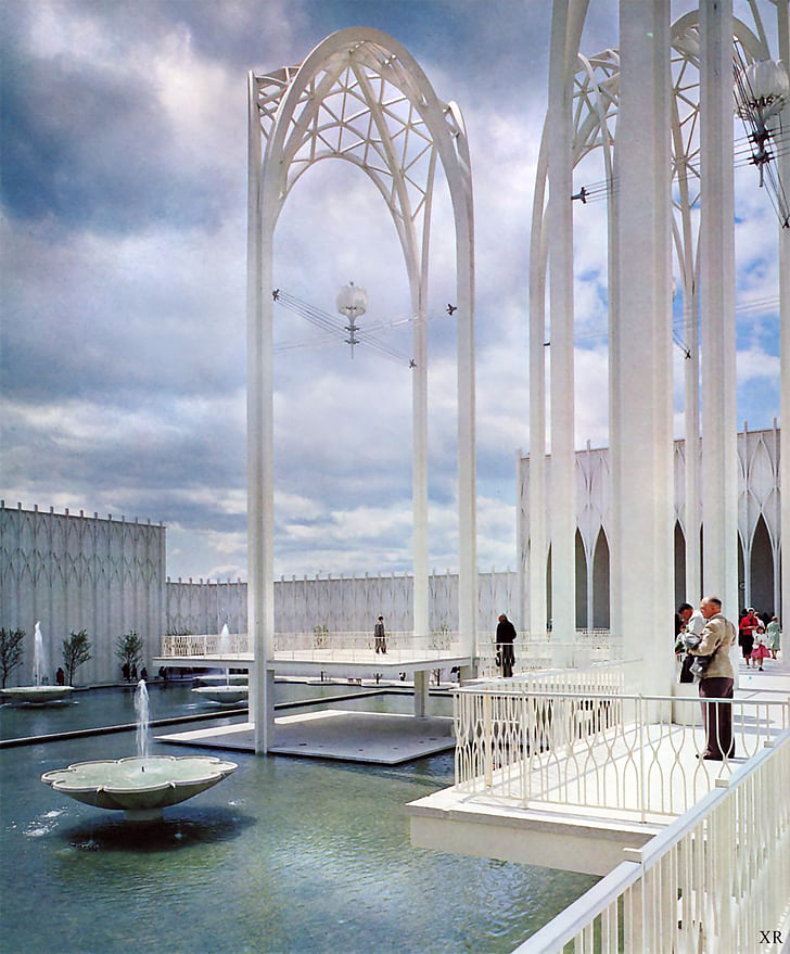
In the early years of the Space Race, and with Seattle's growing reputation as “an aerospace city,” the 1962 World's Fair gave the United States a chance to show off to the world that it was “not ‘behind’ the Soviet Union in the realms of science and space.”
Designed by local architect Minoru Yamasaki, the U.S. Science Pavilion—now known as the Pacific Science Center—is a “space-gothic complex of six interconnected buildings” where visitors could explore exhibitions on science, outer space, and the future. The complex surrounds a public reflecting pool, while visitors were welcomed to the complex by the now-iconic set of arches that still gracefully tower over the forecourt.
1967, The US Pavilion (Montreal Biosphere), Buckminster Fuller
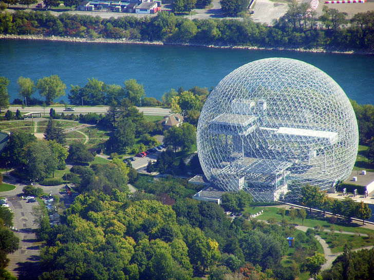
With an overall attendance of over 50 million within a six month period, Montreal’s Expo 67 is considered the most successful World’s Fair to date. Firmly in the middle of the “Space Race,” the fair took place two years before American astronauts would land on the moon, the United States responded to the theme “Man and his World” by choosing Buckminster Fuller, visionary architect and recent Time Magazine cover subject, to design a geodesic dome that appeared on the landscape like a world of its own making. The installation colloquially received the name “Biosphere” after the closing of the 67 Expo for its otherworldly design.
With a diameter of 250 feet, the acrylic-lined dome housed a seven-story platform structure featuring NASA exploration technology and other space-themed gadgetry signaling the country’s involvement in future endeavors. Unfortunately, the acrylic lining caught fire in 1976 and would not reopen again until 1990 when it was repurposed as an environmental exhibition space by the Canadian government.
1970 US Pavilion, Davis Brody
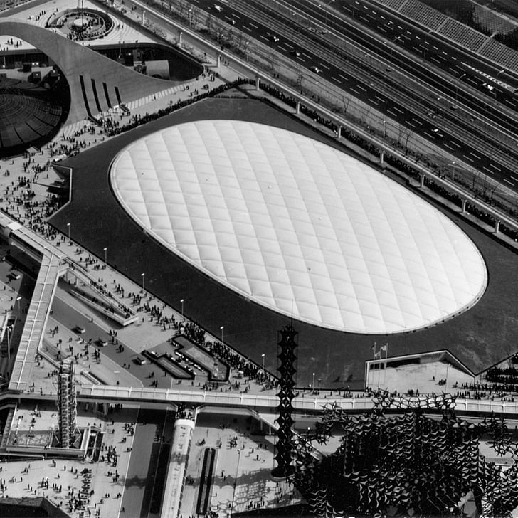
The United States Pavilion for EXPO 70 in Osaka, Japan was designed by architects Davis Brody, graphic designers Chermayeff & Geismar, and design engineers David Geiger-Horst Berger as a partially-submerged, 100,000-square-foot exhibition hall.
Topped by a clear-span, 262-foot by 460-foot air-supported cable roof, the pavilion represents a superlative work of Space Age design. According to Columbia University, the dome’s steel rope structural system is arranged in a diamond grid pattern with high-strength steel cables supporting sheets of 3/32”-thick Mylar fabric. When properly tensioned, the dome rises a slight 23-feet in height between its perimeter and the highest part of the structure. Created from plastic sheeting developed to resist high-temperatures for use in astronaut suits, the pavilion’s focus on new materials, economic structure, and highly-engineered configuration reflects the era’s precision-guided ethos. The structure continues to hold the record as the largest clear-span, air-supported roof ever built.
1985 US Pavilion, Fumihiko Maki & Associates
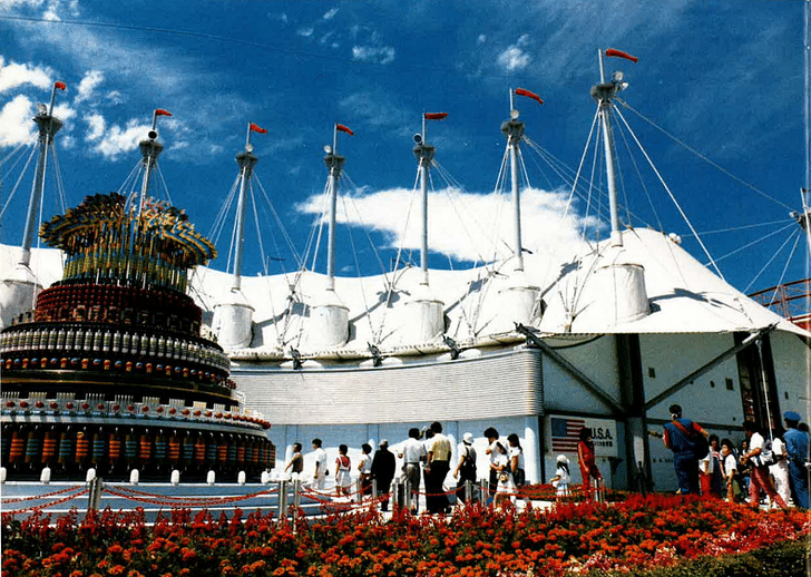
1985 was filled with political and cultural influences that profoundly impacted the theme and structural design of the U.S. Pavilion. With the World’s Fair taking place in Tsukuba, Japan, the U.S. decided to focus on the nation’s growing interest in science, technology, and artificial intelligence during the expo. Designed by Japanese Metabolist architect Fumihiko Maki, the pavilion was seen at the time as a hub for “techno-wizardry” and computer science. As corporate funding increased over the years, U.S. Pavilions functioned as displays for the American companies to showcase their innovative contributions, as was the case here.
Maki’s pavilion consisted of two plazas and three other buildings that included a theatre, corporate pavilion, and theme pavilion. One of the pavilion buildings was designed as a white masted structure topped with a series of fabric polymer roofs. Resembling a cross between a space station and a “big top” tent, the exhibitions housed within each structure showcased America’s formidable innovations in computer science and artificial intelligence. The interiors of the pavilion buildings were much more ornate than its Space Age-industrial external structure. For example, one eye-catching element was an illuminated light fountain that stood just outside the buildings to enliven the complex.
2010 US Pavilion, Clive Grout
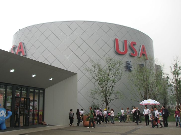
Visitors, who strolled the 2010 Shanghai fairgrounds and confused the USA Pavilion with a suburban car dealership, may be forgiven: the gray steel exterior of the 60,000-square-foot pavilion really didn't have much to show for, and its architect, Clive Grout, a Canadian, somewhat agreed with that notion when he said in 2010 that "we have not felt the need to do an architectural handstand to get attention."
The pavilion's true brilliance was its efficiency and capacity to handle large crowds—3,000 people an hour in relentless cycles of 500 every 10 minutes. An average of more than 41,000 visitors per day passed through four spaces located within the building. Dedicated to the theme "Rising to the Challenge," the pavilion’s offerings included a welcome hall, a "Spirit of America" pre-show, a main show featuring the technologically advanced 4-D film "The Garden," and a post show display area.
Responses from Chinese visitors were generally positive, and the pavilion became one of the most visited national attractions at the Expo, receiving 7.3 million visits. The American Expo presence was not received so enthusiastically by Western critics, however: criticism aimed mainly at the fact that the national pavilion had been solely funded by private financial contributions from a large number of multinational corporations (so called "marketing partners").
Secretary of State Hillary Clinton, who visited the pavilion as the most senior U.S. official, tellingly summarized the experience: "It's fine."
2015 US Pavilion, Biber Architects
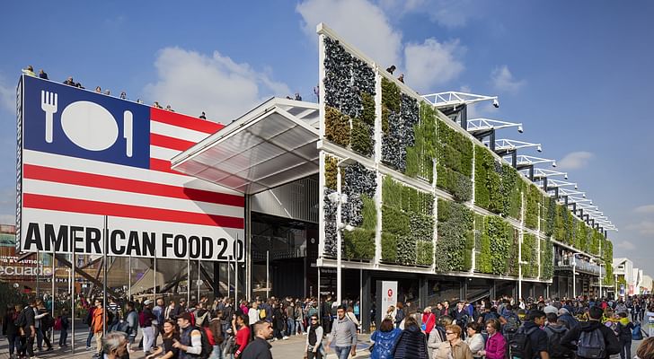
Created in tandem with the 2015 Milan Expo's overall theme of “Feeding the Planet, Energy for Life,” the US Pavilion showcased America's diverse food cultures. The pavilion design aimed to convey openness, transparency, and accessibility, and was built from sustainable elements. New York City-based Biber Architects, with support from architect Andrea Grassi, made a big impression—in classic American fashion—with their 44,000-square-foot, multi-level design, making it one of the largest pavilions at the Expo. Thinc Design created an interactive exhibition that let visitors explore the vast “American Foodscape”.
The pavilion also hosted foreign delegations, public programs, a vertical farm, food trucks, the James Beard American Restaurant, and more.
Listen to our conversation with James Biber about the pavilion...
2020 US Pavilion, Fentress Architects
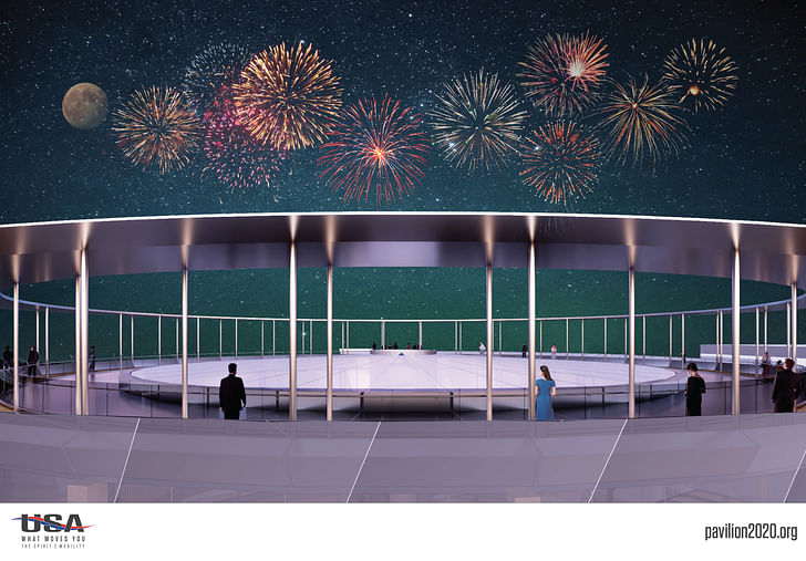
In 2018, Denver, Colorado-based Fentress Architects was selected to design the US Pavilion for the Expo 2020 World’s Fair in Dubai. The effort, led by Fentress and Pavilion USA 2020, a consortium made up of public sector entities, including the United States Department of State, seeks to engage the past and future of technological innovation in the United States. Operating under the theme of “What Moves You,” the architecturally-subdued pavilion will host exhibitions highlighting a series of mobility innovations created in America that include automobiles, space vehicles, and even, high-tech prostheses.
Crafted as a multi-story cylindrical exhibition hall topped by a covered terrace, the structure will be wrapped in diagonal metal panels that will allow the exterior of the pavilion to serve as a projection screen for nighttime visual displays. Inside, a multi-story atrium will punctuate peripheral exhibition areas where collected displays will show off the technological innovations. With an eye toward the future, the pavilion is also set to host a live demonstration of Virgin Hyperloop One’s test pods.
The pavilion will debut at the Expo 2020 on October 20, 2020.
1 Featured Comment
It would be interesting to trace the development of content versus container over the years. Should the architecture define the visitor experience or should the visitor experience define the architecture? Is the pavilion designed as an architectural statement and then fill it with whatever will physically fit or do we define the thematic message and envelop it with a responsive structure?
All 2 Comments
I’ve stood inside bucky’s Dome some 10years or so ago and it’s just marvelous.
It would be interesting to trace the development of content versus container over the years. Should the architecture define the visitor experience or should the visitor experience define the architecture? Is the pavilion designed as an architectural statement and then fill it with whatever will physically fit or do we define the thematic message and envelop it with a responsive structure?
Block this user
Are you sure you want to block this user and hide all related comments throughout the site?
Archinect
This is your first comment on Archinect. Your comment will be visible once approved.