
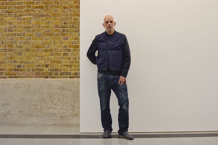
For our series Iconic Buildings, we speak to people who live or work in buildings of architectural significance. Is the exposure to an architectural wonder on a daily basis a source of inspiration or simply part of the backdrop?
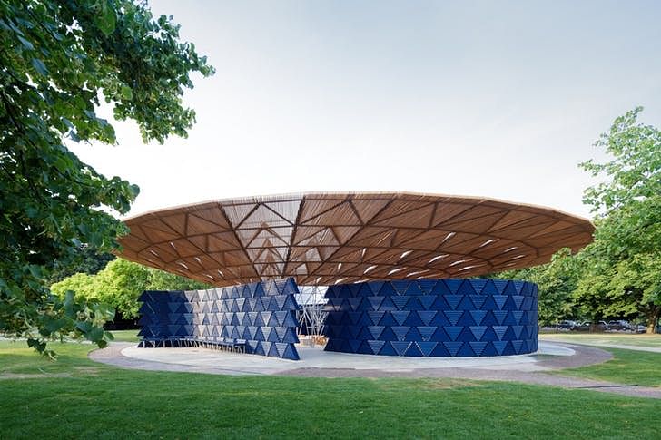
In the spring, before this year's Serpentine Pavilion designed by Francis Kéré was installed, we went to visit Mike Gaughan who is Gallery Manager at the Serpentine Galleries in Kensington Gardens.
What is your role at The Serpentine?
I am Gallery Manager. I guess the role differs from institution to institution but here, at the Serpentine, I am responsible for organising the crating and transport of artworks to the exhibition spaces and the organisation of all installations. This involves working with technicians and contractors in addition to other people who might have specialist skills to install particular pieces of art, audio-visual works for example, it could be anything. So it is a very varied role.
How long have you worked at The Serpentine?
35 years – a very long time! I was here before this building (the Serpentine Sackler) became a gallery, not long after the Serpentine was converted into an exhibition space. The very first job I had was as an invigilator and technician.
I had visited the Serpentine as a student because I was studying art in the city and I came here and loved the building and location.
Did the building influence your decision when accepting the job? Do you enjoy working in an iconic London Building?
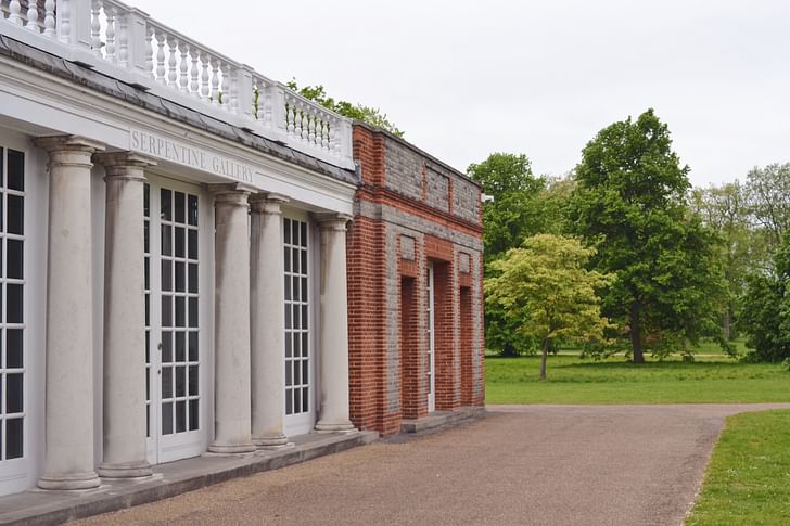
I had visited the Serpentine as a student because I was studying art in the city and I came here and loved the building and location. It is a very beautiful space and I especially love the symmetry of the [original] Serpentine Gallery building; the spaces are quite small and intimate and I love the way you can draw a line through the centre of the building and the left half is a perfect reflection of the right half. You also have the domed ceiling which is about 8 meters’ high and very grand after walking in through the small rooms. It’s always been a popular space with artists and a particular feature I enjoy.
What do you like most about The Serpentine? Do you like the architectural design of the building?
The ceiling (in the north gallery) in the Serpentine Gallery is really impressive. It’s a plaster layer of the ceiling which is suspended on very thick rope to beams above it – it looks pretty immaculate from the floor but it’s not a modern building and is a very old technique.
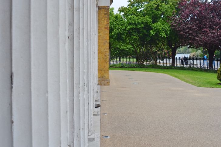
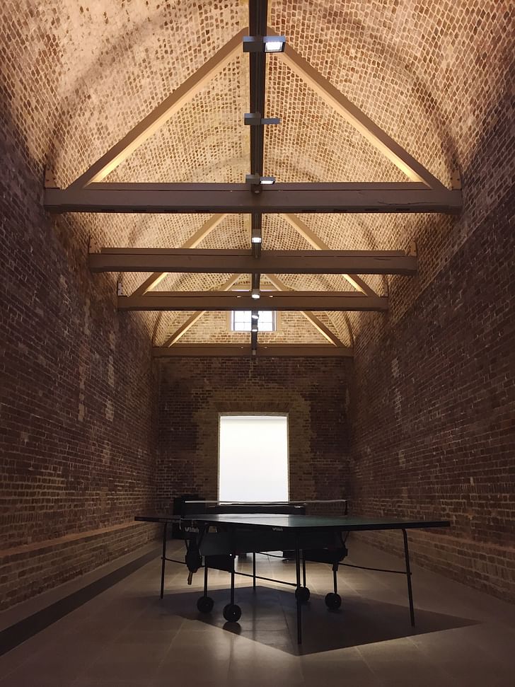
Also, the Powder Rooms at the Serpentine Sackler Gallery, quite unique in terms of other exhibition spaces given their astonishing transformation. It used to be for storing ammunition – though I never knew the building like that. But when it fell out of use, it was taken over by the Royal Parks who had their offices here and used the Powder Rooms as their storeroom.
When we were given the go-ahead to use them, the place was transformed. The main space didn’t really exist prior, there was no doorway, it was previously an open courtyard and the Powder Rooms were surrounded by a walkway, it was all open space. Now it looks like it’s always been here, I think that’s pretty remarkable.
Do you have a favourite lunch spot?
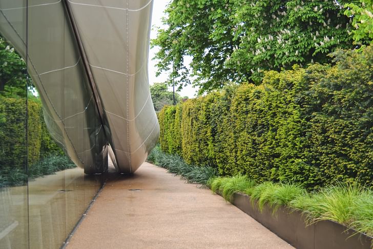
Anywhere in the park! There are plenty of spots to go and relax if you need to be reflective. Sometimes in the summer, I have lunch in the temporary Serpentine Pavilion commission. It’s always particularly nice to go into when it’s not too busy.
What time of year do you most enjoy The Serpentine?
Springtime, entirely because of this location. This is obviously a difficult spot for public transport so after the winter, walking to work in the rain when spring comes and everything starts to bloom, it's a very beautiful time to be here. Everything is fresh, everything is blossoming – people are happy!
How does the building affect your job?
Well, it affects my job because it offers a lot of challenges. In the Powder Rooms, we are not allowed to drill anything into the walls because it has listed status so we have to find methods and solutions of presenting the exhibition in ways the artists or we want to. Quite often this means building false walls – which means we have to run everything by a structural engineer and make sure we are complying with all the health and safety rules. Then, of course, we have to make sure it still functions in the way we need it to for the artists and make it look as good as we can make it.
This space is very, very interesting for artists who like to work with installations and some of our most successful shows here have been with artists who have used the unusualness of this space. Ed Atkinson and Rachel Rose are two artists in particular, who just clicked into this space very quickly I think. Rachel Rose, a filmmaker, made a blue carpet that went around the whole of the parameter space that led into the Powder Rooms and in one room the carpet was black and in the other, it remained blue. Lined around the edge of the carpet were loudspeakers, and she just had two films, one in each. In the south room, the soundtrack was relayed to all the speakers on the outside so when you walked around the boundaries they led you around the space, into that room. The scale of everything worked really well.
What are the most significant changes you have seen to the space and gallery during your time working there?
When I first started working in the original [Serpentine Gallery] there were no climate controls in the gallery and no security. Originally it was only opened in the summer because there was no heating. Then it was so successful, it received a grant to implement heating and turn it into a working gallery. At that time, in the seventies, there were very few galleries in London, certainly very few commercial spaces, unlike it is now, and the interesting thing about the contemporary art world was that it didn’t have the profile that it does have now. People didn’t really go to galleries– there was a kind of antagonistic feeling. It existed with temporary heating from about 1973/1974 and the renovation took place in the late seventies when we got the chance to dig under the existing building, a significant project, and create a basement. We weren’t allowed to spread the footprint of the gallery so we had to dig down!
There were a couple of additions that were made within the structure of the building and the main entrance was also reversed. There was a portico that then became an education space and it was all in an attempt to try and keep the aesthetic of the original building, using the same type of door and proportions of the windows, making sure the outside looked no different. And then, of course, building the Sackler Gallery was a huge change!
Is there anything you don’t like about the building?
I would really like some more storage space (laughs)! There is very little and it’s quite a pressure, the priority is on exhibition space and that has to take precedence and obviously, you have to house all the people who make everything happen. There is one office at the back and one in the basement – meeting spaces are few and far between and we have to juggle meetings between the two buildings.
The Serpentine Bridge between the two galleries complicates things too because it can only withstand a certain weight, so, if people need to drop work off at both galleries they need to drive first to the Sackler Gallery and then drive all the way around the park and back, to come in the Alexandra Gate. No one would know about these difficulties or realise when viewing the exhibitions. Then the insurance of artworks, publicity and fundraising – it's a huge, huge amount of work and organisation.
If you left your job at The Serpentine, what would you miss most?
I’d miss the challenges; sometimes the job can be incredibly stressful, keeping to budgets and meeting deadlines. But we work with a variety of people, we are always working with different artists and each brings along something that you may not have had to deal with or do before, so that is always quite stimulating and I would really miss that.
And, working with such a great group of people. It’s very interesting to see how collaborative the process is. In art galleries, events, films and theatre, it always looks – and I always forget this when I go to other spaces – like it’s just there! But the amount of time and energy and masses of detail that’s not known by any members of the public who come into the space, I find that fascinating.
Which of the past Summer Pavilion's was your favourite?
I would like to start off by saying what I think has been the most successful in terms of the brief, and that is the SANAA Pavilion in 2009. It was very, very beautiful, very open and clean! It was incredibly sensitive to the surroundings, it worked very well both in sunny weather and in wet weather; the roof shifted levels from being quite a way above you, then moving down becoming almost like a table or bench which would collect pools of water when it rained.
The pavilion that is my absolute favourite was by Peter Zumthor. He made a large black box that sat on the lawn but when you walked inside you were confronted with this sort of cloistered area and garden which was exceptionally beautiful, the scale of it and the angle of the roof was just astonishing.
This worked really well because the shape of the roof looked like puddles of water. It was very symbiotic in that way. When it was sunny it would reflect light, so it had this sort of duality. It also looked like it was a temporary structure – some of them could almost be buildings and while those structures have been fantastic, I like the idea of a pavilion that acknowledges where it is and that it is just there for three months.
The pavilion that is my absolute favourite was by Peter Zumthor. He made a large black box that sat on the lawn but when you walked inside you were confronted with this sort of cloistered area and garden which was exceptionally beautiful, the scale of it and the angle of the roof was just astonishing. You never heard traffic and whether that was his intention or not, I don't know, but it was a very peaceful place to go and sit. Many times I would go in before the gallery opened and I would be the only one there; you became very aware of the sky. It looked so simple from the outside but I think that was the deception. So, that just slightly edges the SANAA one for me, purely for the experience of it.
Ellen Hancock studied Fine Art and History of Art at The University of Leeds and Sculpture at Mimar Sinan Fine Arts University in Istanbul.Now based in London she has a keen interest in travel, literature, interactive art and social architecture.
1 Comment
This detail!
"The Serpentine Bridge between the two galleries complicates things too because it can only withstand a certain weight, so, if people need to drop work off at both galleries they need to drive first to the Sackler Gallery and then drive all the way around the park and back"
Block this user
Are you sure you want to block this user and hide all related comments throughout the site?
Archinect
This is your first comment on Archinect. Your comment will be visible once approved.