
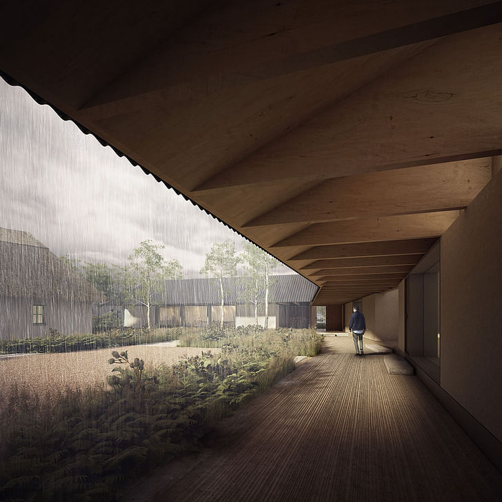
I’m in Peckham, South London, just across the road from Camberwell College of Arts, to meet IF_DO, a young practice run by Al Scott, Sarah Castle and Thomas Bryans. The trio met in 2002 at the University of Edinburgh whilst getting their MA in Architectural Design, and in the two years that their fledgling studio has been in practice, they’ve caused a stir with a thought-provoking manifesto and renderings that were displayed at the Royal Academy Summer Show. All that, without having yet embarked on a building of their own creation.
Also this year, the studio took part in a panel at London's Design Museum of emerging architects in practice, became a RIBA chartered practice, and joined the London School of Architecture’s network.
We start off talking about Brighton. Previous conversations I’ve had about Brighton had revolved around its poor infrastructure, and IF_DO tend to agree. Castle teaches at the university and the practice has recently been involved in setting a brief for students. The practice came up with a brief which was very much to do with urban policy; the students were instructed to design a new conference centre for Brighton.The studio is at the point where creativity, energy, enthusiasm, passionate ideas and principles are the currency
“Brighton has got a terrible conference centre,” notes Castle. “It’s a city by the sea; there are lots of urban issues, there is no public space. The conference centre has got no real positive engagement with the public: in fact, there's just one small foyer area that you can get into that's about as big as our office, and nothing more. The project was about us getting the students to understand the problems that buildings like that can create if they are not designed with care.”
Scott picks up the story: “The students started off with small interventions and then by the end of term they were designing a conference centre of their own, which was more about addressing urban problems in the areas around buildings as much as it was about creating internal spaces. Architectural education can fail quite massively on that when it makes it too abstract, because it doesn't ground that in their response to a problem that's in the here and now. It's about designing change for a real environment.”you have to get people to love buildings, to cherish buildings and that’s where art does become really important
IF_DO’s manifesto points to their agenda of creating “inclusive environments”, what does this mean?
“What we want to achieve is to have projects that have a significant net benefit to the location in which they are situated; socially, economically and environmentally,” explains Bryans. “To have an impact on a site, on a place, that brings something very positive to the residents and the climate and the environment and everything else, that’s something we try to do with all of our projects.”
The young age of the practice means that at the moment their output is very much in the project stage. The studio is at the point where creativity, energy, enthusiasm, passionate ideas and principles are the currency, rather than bricks and mortar. “We’ve no built work yet,” explains Bryans, “so we don’t have a portfolio; so, you’re either young and interesting, or you’re cheap, or you’re both, which is even better, or you’ve got some really strong ideas and principles, which I think we have.”
These strong ideas and principles are, at the moment, rendered as artist impressions. We discuss the role of art in architecture, vis-à-vis the Venice Biennale and Serpentine Pavilion. Is the contemporary architecture scene attracting too much of a ‘Sunday afternoon’ crowd, one that seeks cultural entertainment?When it comes to visualisation, you are selling a certain kind of feeling.
“In some ways that’s what Venice is about, yes,” says Bryans. “Part of the conversation with the public has to be about creating beautiful, provocative interesting things, and that’s what the Serpentine Pavilion is, it’s effectively a folly—it's just a beautiful thing that's just there for the summer. But in terms of community, sustainability, to use that word, I think beauty is really brilliant because you have to get people to love buildings, to cherish buildings and that’s where art does become really important, and these things do become important.” Scott notes, “Anything that brings about the process of designing a building for communities to the public eye and helps to explain the process has to be good.”
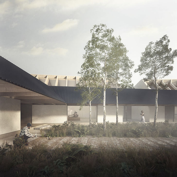
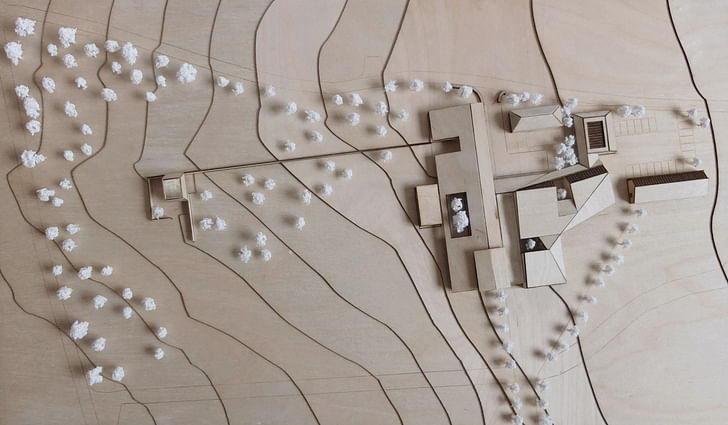
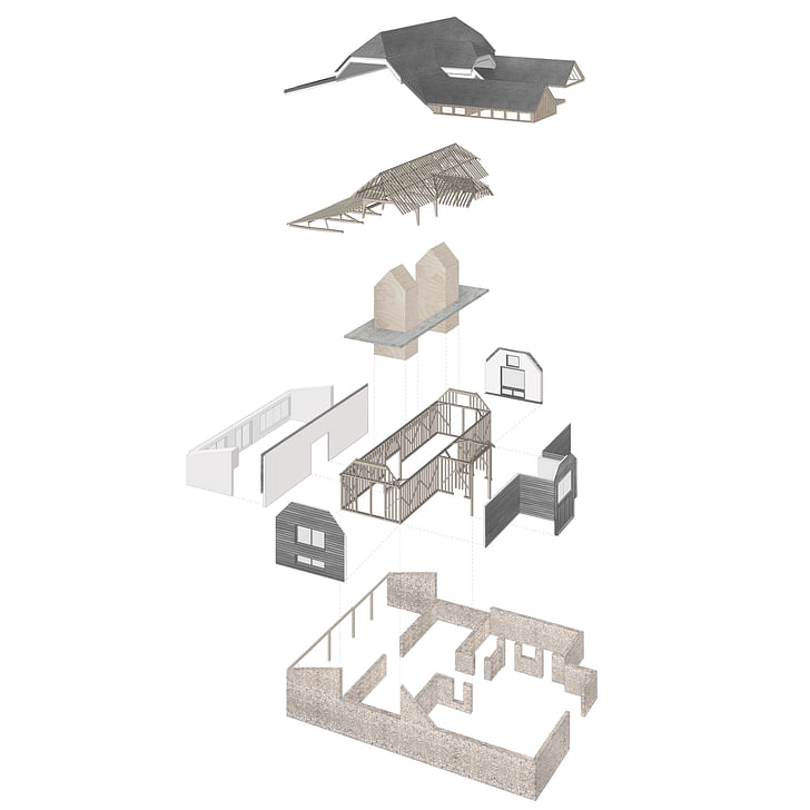
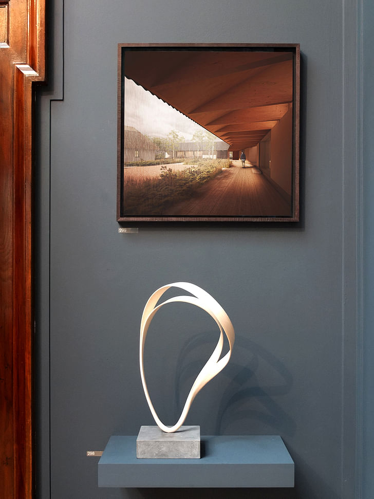
The public eye gazes at the Royal Academy Summer Show, the largest open submission exhibition in the world. IF_DO submitted an image of a masterplan for Joseph Walsh Studio, a furniture designer and maker, based in Cork, Ireland. The studio had been working on a holistic growth strategy for the site and submitted the results to the show. “Co-incidentally Joseph also submitted a piece of furniture to the RA as well and we both got accepted so we’ve now been hung alongside one of his pieces, which is quite nice because there is obviously a dialogue between the two," says Bryans.
How does art direction of visualizations aid the architectural process? Castle explains, “We directed it, just as a kind of setting the scene. There was a conversation as to where we were in the courtyard. The fact is, that working with art direction is part of being an architect. When it comes to visualisation, you are selling a certain kind of feeling.”
how can you build on a greenfield site and yet create something that is more environmentally friendly, more environmentally diverse, more sustainable than it was before?Bryans continues: “What’s interesting about going through a process with those visuals is that we worked with a studio called Forbes Massie, who we would say are probably one of London’s best visualisation artists. What’s interesting about going through that process is that it forces you to make some decisions about that building such as materiality, texture, shadow gaps, all of those things…”
Is there a relationship between the type of sculptural furniture design that Walsh makes and that of an architect? “The relationship between architecture and a house, and a furniture designer and a chair, is that there is way quicker job satisfaction in chairs,” laughs Castle, before adding, “Walsh’s furniture is so complex that it is akin to architecture, the work that goes into it with maquette modelling. The work is really impressive and vast in scale at some points, not every piece, but given the size of it and the way you interact with it,” Scott observes. “It was quite nerve-racking, presenting a design to a client that has got a really strong sense of design, and incredibly rewarding that he is so supportive.”
So far this year, apart from the Royal Academy Summer Show, the studio has been part of a panel on Emerging Architects at Design Museum, awarded chartered status by RIBA and became part of the London School of Architecture’s Practice Network. What then, for the future?
“I suppose it’s about social and ecological ambition," says Bryans. "We are working on a couple of bigger projects, for us at any rate: one is a site of 16 houses in Suffolk on a greenfield site, between other areas of housing. But here is a question, as to how can you build on a greenfield site and yet create something that is more environmentally friendly, more environmentally diverse, more sustainable than it was before? How can we turn it into something more?"
And for the distant future? “We want to be creating things that have a benefit beyond the boundaries of the site,” says Castle. “If you come back in ten years and we have some projects that demonstrate that we have created benefit, that we’ve questioned things through thoroughly, that we’ve carefully considered the impact that we have on the world—then I suppose, we’ll be pretty happy.”
Robert studied fine art and then worked in children's television as a sound designer before running an art gallery and having a lot of fun. After deciding that writing was the overruling influence he worked as a copywriter in viral advertising and worked behind the scenes for branding and design ...
1 Comment
That first rendering recalls for me the Zumthor Serpentine. With the misty courtyard and darkened passageways. Yet there is a very different feel to the physical model later.
Also, would be interested in reading interview with studio Forbes Massie. Particularly if as it is said, they are truly "one of London’s best visualisation artists."
Block this user
Are you sure you want to block this user and hide all related comments throughout the site?
Archinect
This is your first comment on Archinect. Your comment will be visible once approved.