
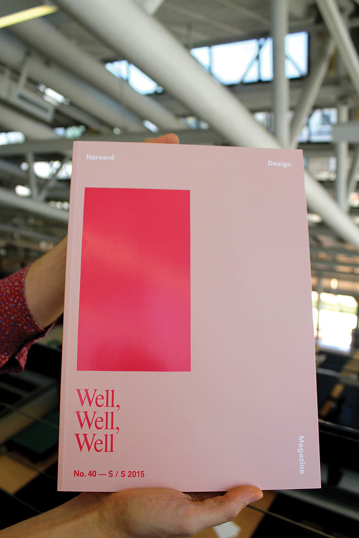
“Well, Well, Well”, the fortieth issue from the Harvard Design Magazine, explores the tricky business of designing for health, and provokes considerations on the flip-side of neglecting to do so.
Cities are major vectors for health. While so much of city living can kill you – by infrastructural failure, racial planning policies, pollution, disaster unpreparedness, or just a misplaced sign – the aim is always to try to and anticipate health issues in design. But hitting the mark can be more complicated than we realize.
Trying to precisely isolate what makes a city healthy, and therefore its citizens healthy, is a messy business. Combined with the perpetually fluctuating idea of what constitutes "health", designing for health in cities is subject to shifting ideals. Grappling with this “landscape of health and illness” is the focus of “Well, Well, Well”. Like the refrain of the doctor studying an intake form, or the self-congratulating boss chiding an underling, “Well, Well, Well” suggests a tone equal parts nervous preoccupation and “look what the cat dragged in” – plus, the chanted theme of “wellness”. We create cities, and are therefore responsible for any harm or health they bestow on us.
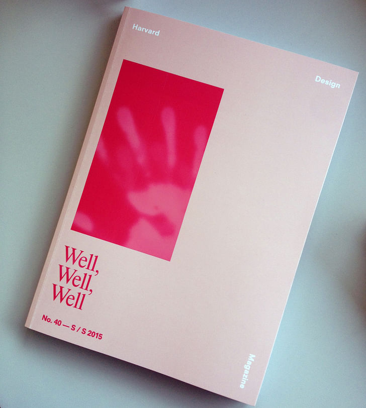
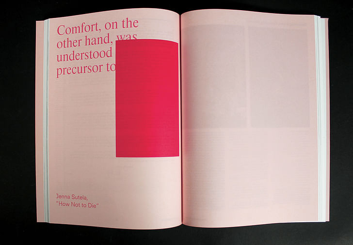
Our featured Screen/Print excerpt from “Well, Well, Well” is by over,under principal and architecture professor Mark Pasnik. His piece, “Concrete Therapy: Paul Rudolph’s Architecture of Mental Health” uses the confounding Erich Lindemann Mental Health Center in Boston as a set piece to discuss mental health policy in Kennedy’s U.S. alongside the dominating structural trends of architectural design, from its construction to present day.
"Well, Well, Well" is the spring and summer issue for 2015. The Harvard Design Magazine is a non-profit publication from Harvard's Graduate School of Design, and has been published twice yearly since 1997.

Concrete Therapy: Paul Rudolph’s Architecture of Mental Health
by Mark Pasnik
[endnotes can be viewed in the image gallery at the end of the piece]
Paul Rudolph’s Erich Lindemann Mental Health Center building—one component of Boston’s partially completed Government Service Center—has confounded observers since it opened in 1971. Historians have had little success synthesizing its character, employing seemingly contradictory adjectives to describe it: astonishing, imaginative, gratuitously graceful, overpowering, dizzying, sensuous, exaggerated, restless, rugged, and heroic.1 In a sensationalizing hatchet job on the building in Metropolis in 1999, critic Philip Nobel wrote of its “harrowing possibilities for unhinging the minds of those unfortunates inside,” claiming that “Rudolph made the building ‘insane’ in order to express the insanity within.”2 Today it stands caged in chain-link, a temporary measure to protect against low handrails that fail to safeguard the building’s occupants from the dangers of its sectionally layered spaces. After nearly 45 years of service, parking has overtaken the Rudolph made the building ‘insane’ in order to express the insanity within"Lindemann’s dignified, street-side public plaza, while planters, once fertile counterpoints to its concrete architecture, now lie fallow, victims of cuts in maintenance budgets.
In many respects, the building today is as much an essay on Rudolph’s brilliant conceptions of theatrical space and urbanism as it is an astonishing first-hand account of a 1960s vision for progressive mental health, crystallized in immutable concrete. The formal configuration grew out of a highly particularized program, developed with Rudolph’s desire to bring rich spatial experiences and material qualities to those receiving medical care. While several firms were commissioned in 1962 to design the larger complex of what was to be three buildings dedicated to state services, Rudolph ascended to the role of coordinating architect, which allowed him to test his predilections for monumentality at a grand civic scale. He was reacting against what he saw as the failings of the dominant language of the International Style, with its principles of functionalism and universal space.3 In the Lindemann and throughout his later work, Rudolph instead aimed to create a humanizing architecture, responsive to urban conditions and engaged with the “psychological effect” of expressive and emotionally moving space.4
Rudolph was particularly faithful to the Lindemann’s program, adhering closely to the given space allocations outlined by the New York firm Becker & Becker Associates under the guidance of Dr. Harry C. Solomon, the Massachusetts commissioner of mental health. Solomon envisioned a more open and progressive center that would treat patients from a community-based “catchment area,” rather than through the practice of remote institutionalization and rigid supervision that had characterized previous decades. This effort contrasted visibly with the bare-bones functionalism typically considered adequate for most public facilities"reflected the larger national agenda of the Kennedy administration’s New Frontier Program and, in particular, the Community Mental Health Act of 1963, which granted states federal funding to establish local mental health facilities where patients could be treated near families, jobs, or other support networks.
The Lindemann was composed of several general activity spaces—child guidance, a nursery, family therapy, individual therapy, group therapy, occupational therapy, inpatient care, as well as administrative and research facilities. Much contemporary criticism surrounding the building focuses on its circulation patterns—a consequence of the deft way in which Rudolph handled the required adjacencies and separations for these elements—an already intricate system that was later confounded by changes in security standards and use. Independent entrances were originally established for various programmatic components, some of which had their own internal circulation networks. Many of the spaces were accessed from a primary entrance on the upper plaza level of the larger complex’s courtyard (an entry now closed and replaced by a far less grand parking-level entrance). Child guidance and the nursery both had their own entry points from the parking garage along with independent circulation routes. Classrooms in each opened to a playground terrace, a strategy characteristic of the building, the building discourages the idea that people are not worthwhile."which provided several specialized outdoor spaces for defined patient communities. Of all the entries, family therapy was the most circuitous. Arriving at the plaza from an immensely long, winding flight of outdoor steps, families then would ascend a second flight on a smaller switchback stair, all before getting to a door.
The facilities were elaborate, many fitted with custom features and built-in wooden elements specific to their program needs. Occupational therapy spaces included woodworking, plumbing, and electrical shops, a café, and even a theater and model apartment, allowing patients to establish skills and engage with society in meaningful ways through training. Inpatient children were housed in an area that had its own dining hall, suite of bedrooms, and outdoor play area. Athletic facilities included a pool and gymnasium on the ground floor, which were at one time open to the public.

Historian Timothy Rohan explains that the building is a “product of great care and expense [… which] contrasted visibly with the bare-bones functionalism typically considered adequate for most public facilities.” He further notes that “such attention to the patients’ environment suggested [Rudolph] felt a true regard for them.”5 As director of the inpatient unit when the center opened, Dr. Frank Paolitto expressed a similar sentiment about the care invested in the architecture: “the building discourages the idea that people are not worthwhile.”6
By the time he designed the Lindemann, Rudolph had become “unhappy with the limitations”7 of the International Style’s principles, many of which had guided his earlier works in Florida. Rudolph gave monumental spatial presence to the Lindemann’s complicated civic program, but in ways that also hamstrung it.Alongside his concrete projects, he developed an intensified critique of the movement’s ideals of universal space and its “paucity of spatial concepts that satisfy man’s psychological needs.”8 Jim McNeely, the project architect, recalls that “when [Rudolph] got a program like this, he lapped it up. He really paid attention to the function of the building as it was programed, ignoring the fact that the functions of buildings change constantly.”9 In essence, Rudolph gave monumental spatial presence to the Lindemann’s complicated civic program, but in ways that also hamstrung it.
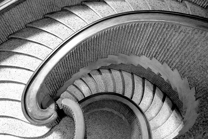
The Lindemann’s powerful exterior and many of its figural interior elements are defined by poured-in-place concrete with the same bush-hammered, corrugated surfaces Rudolph had used in his 1963 Art and Architecture building at Yale. Colossal piers, almost baroque stairs, and cylindrical towers containing building services all heighten the exterior sculptural drama. “Every material has its own intrinsic values and uses,” he explained. “Poured-in-place concrete is a continuous material” that, at its essence, is “plastic.”10 This quality enabled Rudolph to develop sinuous forms, curvilinear walls, and emotive spaces, which, based on personal experience, he believed would carry psychological and therapeutic benefits for The chamber prompts the type of emotional responses he found absent in the era’s functionalist abstraction; it is particular rather than universal space.patients.11 Curved seating, for instance, was meant to reinforce socialization and a sense of community. Rudolph felt interiors should be composed of enclosing rooms that were dynamic and emotional—what he called “used space formed to satisfy people’s psychological needs.”12 These “caves,” to use his term, stood in contrast to the preponderance of the “gold-fish bowls” he saw at midcentury.13
The building’s chapel, located on the top two floors and added late in the design process, is a remarkable example of this kind of thinking: expressive yet intimate, defined by fluid walls, scalloping panels, elliptical elements, arcing benches, and curved handrails—all sculpted from concrete. Natural light enters the room from above, the side, and below, as if to demonstrate Rudolph’s singular capacity to integrate space, material, and light. The chamber prompts the type of emotional responses he found absent in the era’s functionalist abstraction; it is particular rather than universal space. Despite the persistent belief that it has been sealed shut, it is still used today for small gatherings of staff and patients.
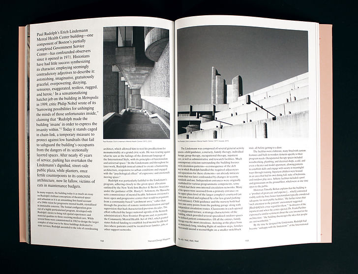
At its opening in 1971, critical reception of the Lindemann and Government Service Center was often dichotomous: admiration for the ingenious architecture paired with concerns about the complex’s appropriateness. Ada Louise Huxtable of the New York Times called it a “brilliant tour de force” while confessing its “drama may have been a little overwrought for its purpose.”14 Jean Dietz of the Boston Globe quoted the director of clinical services, Dr. Raquel Cohen, speaking of the “dynamic tension” between the “highly creative forms” and the staff’s ongoing work demands.15 Ian Menzies of the Globe named it the “Hub’s most fascinating building,” while noting “it is all but unbelievable that this is a state building, in part a hospital.”16its “drama may have been a little overwrought for its purpose.”
Though birthed under what was, in the Kennedy era, a cutting-edge approach to mental health services, today, the building has become constrained by its purpose-built nature. Security concerns have required entrances to be changed and closed, rendering circulation patterns even more labyrinthine or outright untenable. Shifts in mental health strategies, reductions in government funding, and further deinstitutionalization have led Rudolph’s building—unable to adapt—to become increasingly anachronistic. McNeely summed it up: “probably the Miesians who designed universal space came out better in the end.”17 The sad reality is that the patients might have been better served with less-is-more, rather than Rudolph’s rich and idiosyncratic vision of more.
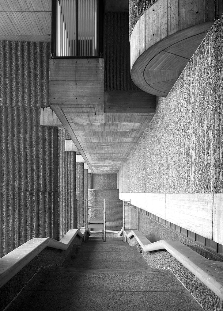
While critics such as Philip Noble place blame squarely on Rudolph’s shoulders—going so far as to suggest the building’s “insidious” spaces can be held responsible for patient deaths—the Lindemann’s most pressing challenges have always been in the political arena.18 It is a Great Society building that, because of delays in construction, opened in a neoliberal era. Almost from the beginning, the Lindemann’s status as a “refuge”19 for patients was challenged by insufficient staffing related to cuts in state mental health funding, especially an “austerity ceiling” instituted in the 1974 budget, which meant “essentially no new programs” could be developed.20 With staffing cuts came the leasing out of spaces in the building to private nonprofit organizations. In the early 1990s, privatization policies advocated for by the William F. Weld administration further eroded the facility’s ability to create a safety net for its patients.21
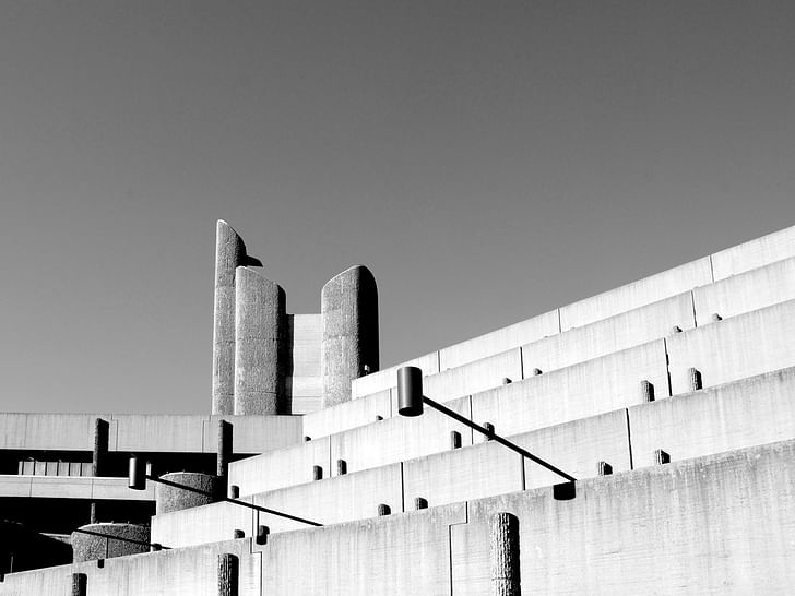
But this is no eulogy. My colleagues and I have worked with students at Wentworth Institute of Technology across departments and in conjunction with a dozen other institutions, agencies, The sad reality is that the patients might have been better served with less-is-moreand organizations, to study the larger Government Service Center’s potential future—supported by the state agency that owns it, the Division of Capital Asset Management and Maintenance.22 The problems are clear: it needs upgrades to its systems and improvements to meet contemporary codes, it lacks sufficient density for the growing real estate pressures on the land, and the government services contained in the complex would likely perform better in less-centralized settings with multiple facilities. In the future, new mixed-use programs and interventions, thoughtfully intertwined with the existing Government Service Center, could increase its capacity and vitality, while transforming its incomplete urbanism.
Today, in its unfinished state and after decades of use, we are hardly equipped to verbalize the range of impressions the Lindemann’s particular space makes on us. If symptoms of the building’s poor health are overwhelmingly evident, its diagnosis has yet to be made and its course of treatment yet to be determined. In this gap of time, Rudolph’s profound architecture remains suspended between a powerful vision of rugged permanence and the rapidly changing landscape of the world around it. Long live the Lindemann—but let’s find it a new life.

Also featured in "Well, Well, Well":
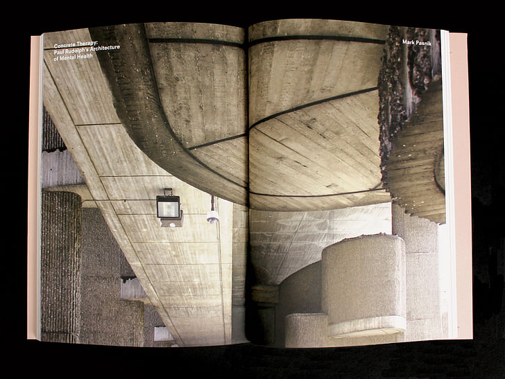
Screen/Print is an experiment in translation across media, featuring a close-up digital look at printed architectural writing. Divorcing content from the physical page, the series lends a new perspective to nuanced architectural thought.
For this issue, we featured Harvard Design Magazine's 40th issue, "Well, Well, Well".
Do you run an architectural publication? If you’d like to submit a piece of writing to Screen/Print, please send us a message.
Former Managing Editor and Podcast Co-Producer for Archinect. I write, go to the movies, walk around and listen to the radio. My interests revolve around cognitive urban theory, psycholinguistics and food.Currently freelancing. Be in touch through longhyphen@gmail.com
No Comments
Block this user
Are you sure you want to block this user and hide all related comments throughout the site?
Archinect
This is your first comment on Archinect. Your comment will be visible once approved.