

For an event modeled after that type of sexual encounter usually associated with spontaneity and non-commitment, there sure was a lot of hype leading up to "A One-Night Stand for Art and Architecture" (One-Night Stand LA). On Instagram and IRL, a veritable fury of buzz surrounded Saturday's bacchanal-inspired evening and the foil-wrapped condoms emblazoned with sharp, serifed lettering that served as branding. Then again, in an age in which most one night stands are likely prefigured by the image-curated, textual courting of Tinder or some other dating app, maybe this sort of foreplay comes with the territory.
In fact, it was precisely that tension between anonymity and self-promotion that served as partial impetus for the event's conceptual framework. Anthony Morey, one of the primary organizers of the event (along with fellow architects and designers Ryan Tyler Martinez and William Hu), related that they had been inspired by the way people were familiar with some of the contributors' work via Instagram while remaining unaware of their actual identities. The connection to a one-night stand isn’t a big stretch. After all, the experience of the image-sharing platform is often characterized by equal parts intimate voyeurism and a casualness that verges on callousness under the weight (or lightness) of the our rapidly-diminishing attention spans. For every descent into the rabbit hole of the tagged-photo tab, there are a hundred images that the brain barely even registers.
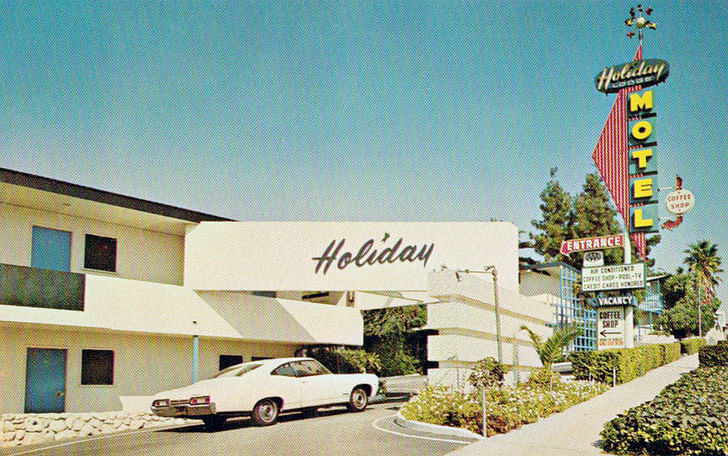
The event’s organizers had secured the entirety of the Holiday Lodge Motel near Los Angeles’ MacArthur Park, For every descent into the rabbit hole of the tagged-photo tab, there are a hundred images that the brain barely even registers. an ideal location to serve as a starting point for many of the young attendee's Saturday night out. In many of the rooms, architects and artists had constructed elaborate installations. Attendants flitting in and out of the rooms’ created a constant sense of movement and activity, keeping the night feeling lively for much longer than your typical art or architecture opening. And, for the most part, the array of very ‘gram-worthy installations seemed to work well for both passing glances and more studied examinations.
Outside of being a fitting thematic choice, the location had other, more pragmatic perks. The large, dingbat-esque motel not only represents a nostalgic and beloved vernacular in the city, it also had a large courtyard that spaciously accommodated the equally-large crowd. Even if you weren’t one of the lucky ones who arrived early enough for the free booze, a liquor store in walking distance (a rarity in many parts of town) served as the secondary node for a near-constant stream of bodies. And the fact that motels have a bathroom in every room was noted repeatedly. Leaning against a low-slung wall embellished with a projection of blinking eyes, one attendant whispered conspiratorially, “And they were able to get the rooms for, like, only $40 bucks each, or something!”
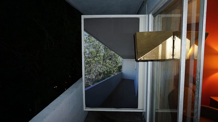
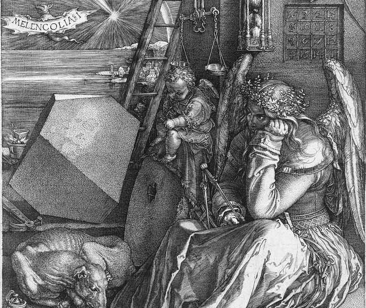
"What's really impressive is how actually collaborative the project actually was," a current SCI-Arc student, familiar with the organizers, told me. This was a sentiment echoed by Morey, who asked me to not focus on any single installation and instead on the night as a unitary event. The rooms did come together, albeit less as a singular unit and more in terms of a sort-of contemporary picturesque, a heterogenous mix of ideas each pushing and pulling against the other. Only a couple seemed to directly invoke the sexual vibe of the evening’s name. An installation by Ivan Bernal featured robots writhing under the sheets of the room’s queen-sized bed, illuminated by the evocative glow of red lights. What's really impressive is how actually collaborative the project actually was The effect was akin to that sense of technologically-induced unease commonly referred to as the “uncanny valley.” For some, Bernal stole the show. A collaboration by Duygun Inal and Ben Warwas included photographs of elements of the room superimposed on their physical counterparts, accompanied by individually-printed cards on “The Advantages of Being a Woman Architect.” A playful appropriation of the famous Guerilla Girl work, the gesture was paralleled by a nod to Albrecht Dürer’s Melancholia in the form of gold lamé reproductions of the engraver’s enigmatic “solid.” Paired with a wall text invoking the motel room as both location and cultural signifier of the sexualization of young women, the installation provoked a near-physical sense of disorientation – of being lost in a brew of displaced references – and, for me, proved the most thought-provoking of the night.

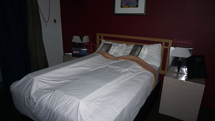
Other installations were situated more directly within the discipline of architecture. Morey hung prints on two bespoke wooden-frames, one that hugged the bed and another facing it. Almost every element in his installation was made from wood – from carved wooden models that you could write on to a 2x4 placed over the bathroom sink. A motel room is somewhere between too-boring-to-be-noticed and too-graphic-to-be-stomached Downstairs, TALL, a collaborative duo comprising Kyle Branchesi and Shane Reiner-Roth, replaced the various elements of the room – lamps, alarm clock, human couple, bible – with mylar-wrapped blocks adorned with cartoonish representations of their references. Accompanying the metonymic objects was a brochure entitled “Museum of the History of the Motel” that included quotes from Robert Venturi and Denise Scott Brown, Claus Oldenburg, and Fernando Pessoa – making clear their allegiances. Like these figures had done before them, TALL skillfully cast light on the presence of objects normally obscured by the shadows of ubiquity. One line read, “A motel room is somewhere between too-boring-to-be-noticed and too-graphic-to-be-stomached.”

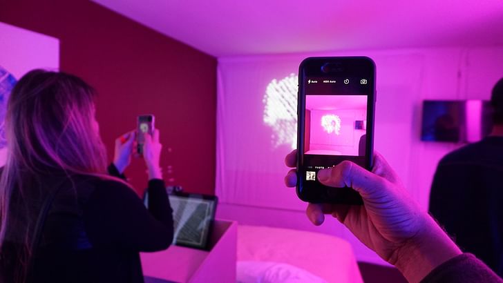
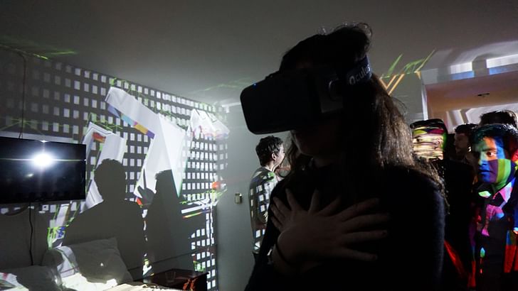
Uriel Lopez collaborated with the visual artist Peter Vikar for an installation the reconsidered the act of seeing in the digital age. On the walls, a series of images by Vikar rendered in blue ink were barely legible – that is, until you held up a smart phone when, seemingly magically, a face would appear. Lopez had created a real-time iteration of the effect using a drawing pad, a camera, and a projector. The other dramatic feat of technical ingenuity belonged to Mike Nesbit, who filled his room with a digitally-mapped projection that shifted across the walls and awe-struck faces of attendants. In the corner, their bodies dangled like marionettes as, one by one, they abandoned physical orientation to experience a VR-replication of the room via an Oculus Rift.
After passing through all of the installation-rooms, I made my way out into the courtyard. Everyone I talked to agreed the night was a success – but they were too busy figuring out their next move to elaborate at any length. While the event was certainly infused with desire, arousal never really built up to release “I mean it’s really impressive,” one young architect said, “but it kind of feels like it missed the mark, you know?” As I watched people shuffle into waiting Ubers, I think I understood what he meant. On their website, the organizers had written, “Critics may come to call the idea as ‘mental arousal and release without emotional commitment or future involvement’.” And, indeed, One-Night Stand LA was provocative, impressive, exciting. Almost every installation was not only visually-stimulating but also incredibly thoughtful. But, ultimately, the night felt more like a preface or an introduction than a truly, singular event. All the build-up (and planning necessary to pull it off) had divested the night of approaching radical spontaneity (along the lines, perhaps, of last century’s ‘happenings’). Instead, while the event was certainly infused with desire, arousal never really built up to release. That being said, here’s one critic who’s quite content to wait for the future has in store for this bright, young constellation of architects – in fact, I’m looking forward to it.
Writer and fake architect, among other feints. Principal at Adjustments Agency. Co-founder of Encyclopedia Inc. Get in touch: nicholas@archinect.com
1 Comment
Nicholas, I am one to like provocative efforts like this, but why does it come off to me as if this was my mom explaining sex to me? From the pure white condom wrapper, to the safe, and relatively un-sticky installations, the whole effort seems to suffer from a puritanical nostalgia. Where are the closed circuit televisions, the oft rumored illicit video cameras, where is the risk? Sex, after all, is a risky/risqué proposition, and this suffers from too much prophylaxis, and not enough, well, sticky situations.
Block this user
Are you sure you want to block this user and hide all related comments throughout the site?
Archinect
This is your first comment on Archinect. Your comment will be visible once approved.