
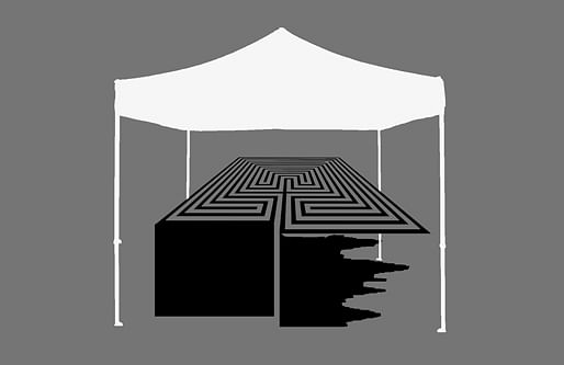
In his 1942 short story “The Library of Babel,” Jorge Luis Borges describes a universe consisting of a potentially infinite library of adjacent hexagonal rooms. Convinced that the library contains every imaginable ordering of twenty-five orthographic symbols, the inhabitants of this universe search incessantly, and futilely, for meaning amid the endless shelves. While an individual art fair is never actually infinite, its labyrinthine rows of cubicles can appear endless.
Like Borges’ library, a typical art fair consists of a number of nearly-identical rooms containing (seemingly) unlimited reconfigurations of possible forms, marks, lines, and pixels. Rather than Borges’ hexagons, the booths of an art fair are usually square, delineated by three walls opening on to a hallway. This is because the repeated rows of cubicle-like walls serve as metonymy for the white cube of a gallery, the dominant exhibition space of art since modernity. In turn, the white cube is a stand-in for an ideal of empty space not far removed from the film trope of a white "void" as a representation of death or some "other" realm. In the repetition of this double-removed and imaginary referent, the art fair seems to attain towards the infinite.
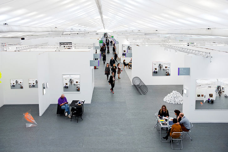
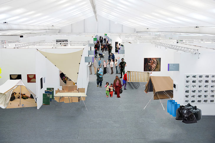
In reality, art fairs are much more akin to a hybrid of an office space, a party tent, and a trade show. As viewers and buyers migrate from booth to booth, the potential for meaning in any individual art object becomes subsumed in the swarming crowds, the champagne bars, the staggering enormity of capital contained within. At an art fair, one must participate in a fiction in which architecture is experienced as the semblance of another form instead of in its actuality. This function is only possible because the white cube has become so prescribed by the post-modernity development of art that it is no longer even actually necessary. This is a history of autophagy: the drive to carve out an isolated space for art viewing now threatens the objects themselves.
Art fairs are akin to a hybrid of an office space, a party tent, and a trade show.
For the most part, art fairs remain banished to the shadows of simulation that parallels their formal description: they are accepted as a proxy of the experience of a gallery or museum but not taken seriously as unique, spatiotemporal situations themselves. Other times they are actually reviled. For some, art fairs and their attendants’ parties and peripheral events often feel like an encapsulation of not just the fallaciousness of any art world claims to political legitimacy, but also the disturbing suspicion that art has become merely its market and that aesthetic values have been unilaterally replaced by financial value and cultural capital.
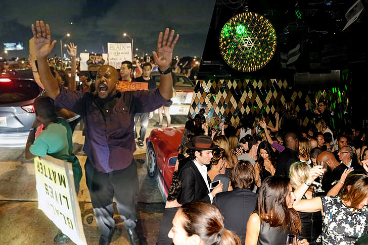
For example, just a few weeks ago, demonstrators temporarily shut down one of Miami’s most important highways. Like in many other cities across the US, they were protesting police brutality and systematic racism, organizing around the memories of Mike Brown, Israel “Reefa” Hernandez, and countless other young men of color who were recently killed by members of a policing system that remains seemingly immune to adjudication. Meanwhile, an estimated $3 billion worth of art objects were feverishly bought and sold amidst a veritable orgy of celebrity, wealth, and excess at the annual Art Basel Miami Beach. Across Miami’s brimming field of infrastructure and water, these two events were separated by only a series of thin walls – mere fabric in some cases. Included in the festivities were shows like “Zero Tolerance,” organized by MOMA PS1’s celebrity-curator Klaus Biesenbach with “works combine elements of political demonstration and celebratory parades to create art of a charged and ambivalent nature, responding to concerns specific in place and time.” The apparent division did not go unnoticed. On one side, a protest movement defined by its symbolic, even aesthetic displays of vulnerability and precarity: hands lifted in surrender, bodies strewn on the ground as if dead. On the other side, a Janus-faced behemoth of money and power that maintains claims to sociopolitical relevance while simultaneously producing such extreme displays of wealth and exclusivity as to make a 19th century industrialist blush. Across Miami’s brimming field of infrastructure and water, these two events were separated by only a series of thin walls – mere fabric in some cases.
While inevitably including works by artists aspiring to political commentary, for the most part art fairs unabashedly serve as marketplaces. As Pat Hearn, one of the founders of Frieze, stated, “The art fair is simply an effort to move the product in whatever way possible.” Art fairs are the cultural equivalent to the pop-up store, a form of temporary urbanism that mirrors larger shifts in economics defined by the increasing freedom of capital to flow across geographic terrains enabled by neoliberal policies of deregulation and connective technologies like the internet, among other forces. Art fairs are the cultural equivalent to the pop-up store. Like the temporary boutiques, theaters and cafes that seemed to proliferate after the crash of ‘07, art fairs only temporarily set down on a site and the wealth generated or exchanged rarely remains long enough to have any effect on the otherwise crumbling urban economy. Similar to how Owen Hatherly described pop-up stores, art fairs are “urban placeholders, there to fill the space until the market picks up.” Moreover, because they explicitly cater to a international class of hyper-elite wealth, they can feel like brazen displays of the inequity that currently (and historically) defines the global economy, and recently entered into mainstream discourse after events like Occupy and the 2012 elections. In this sense, the walls of an art fair seem to be used primarily to signify that this is a place where capital be exchanged – whether in the form of canvas, clay, steel, acrylic, video or consumer items placed on pedestals.
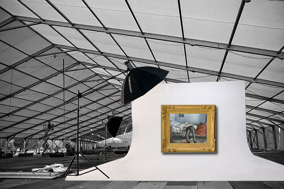
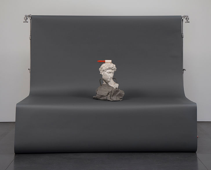
Alternatively, the walls of an art fair could also be understood as photographic backdrops, providing the bare minimum needed to reproduce an object as jpeg, so that it can be bought and sold online, often without the participating parties ever experiencing the work in person. Today, art works may never even enter into a space large enough to be seen after they were first exhibited and photographed; instead they are often shuffled from climate-controlled storage unit to climate-controlled storage unit. And for the casual art viewer, works are increasingly experienced first (if not exclusively) online on sites like Contemporary Art Daily.
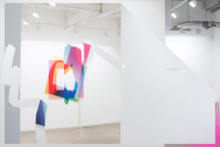
The nebulous category of “post-internet art” tends to capitalize on the apparent usurpation of the screen over physical space in art contexts. An artist-cum-theorist associated with this post-internet “climate,” Artie Vierkant coined the term “image-object” to describe “the work of art [that] lies equally in the version of the object one would encounter at a gallery or museum, the images and other representations disseminated through the Internet and print publications, bootleg images of the object or its representations, and variations on any of these as edited and recontextualized by any other author.” The proliferation in recent years of art works that utilize the so-called photographic-seamless – a large piece of paper used as a blank background for product shots and portraits – references this new relationship between an object and an image. The art fair appears as oriented towards the construction of generic space through the anesthetic repetition of white walls. This relatively old apparatus for creating an illusion of “pure” or “empty” background space parallels the experience of a browser window as the apparent literalization of the modernist ideal of extensio, or the abstract conception of purely mathematical space (which is to say, a non-place space). But just as an image of a shampoo bottle surrounded by blank nothing requires metal stands and lights and a studio, the grey checkers of Photoshop are supported by large data centers and the plants that power them. Today, contemporary art works require a white-walled room, or a simulation of one, in order to take on life on the internet. Seemingly, it is not entirely coincidental that the retail giant Amazon recently patented their specific photo-seamless set-up: objects are thought to sell better when they appear generic, which is to say, estranged from the particularities of place. The art fair appears as similarly oriented towards the construction of generic space through the anesthetic repetition of white walls.
Despite this orientation towards genericity, it is wrong to denigrate the art fair as a non-architectural space (or that there has not been thought-provoking works generated specifically for them, such as Shanzhai Biennale’s recent project for Frieze London). In the first place, they are often designed by certified, if not well-respected, architects. Far from non-architectural or even non-academic, the contemporary art fair emerges out of the long and convoluted development of modern art exhibitions. The history of art since modernity is a dance with architecture. The history of art since modernity is a dance with architecture, moving away from art as a type of architectural ornament, to its isolation in the frame; then beyond the frame and into the gallery, and even (to a degree) beyond place itself. Moreover, art fairs cannot be thought of as merely catering to the rich; a lion’s share of the attendees of these events are students and artists and writers and even people entirely unattached to the art industry. And, simply because fairs are a significant component of the circulation and presentation of art today, we must attempt to take them seriously as a significant stage for art-viewing, regardless of the unease they may provoke.
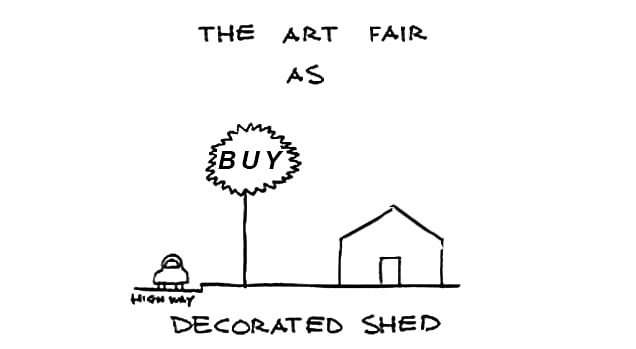
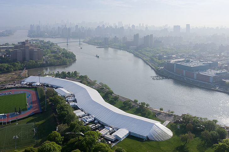
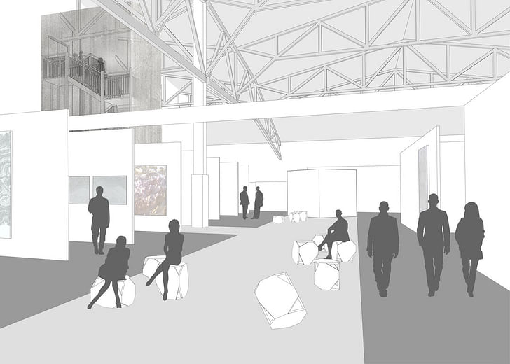
For the most part, the architecture of the art fair can be split into two primary typologies: the White Tent and the Hermit Crab, although both can admittedly be present at a single fair. The former, such as Frieze London in Hyde Park, consists of the circus-like construction of a large hall or series of individual halls that are only in place for the duration of the event. Basically, the White Tent is a (un)decorated shed. But, while seemingly simple, White Tent structures can often be quite ambitious projects, in particular considering the constraints of their temporary program. At a New York iteration of Frieze, the SO-IL Architects-designed tent was purportedly the largest temporary structure ever built in the U.S., snaking some 450 meters along Randall Island. The tent even had its own Twitter account, @FriezeTent, mainly full of humorous brags about its size like, “Wondering what I've been up to since @FriezeNewYork 2013? I played the role of Ark in Darren Aronofsky's biblical blockbuster NOAH.”
On the other hand, the Hermit Crab typology refers to the temporary takeover of an existing building that is not normally used for the display and sale of art works, such as with the use of hotel rooms by NADA (New Art Dealers Association), a periphery art fair of Art Basel Miami Beach. Such parasitic or interventionary events often still require architectural construction, but this consists primarily of interior design, chiefly the organization of walls and booths. New York’s Armory Show intentionally invokes the legacy of an older example of a Hermit Crab exhibition: the 1914 International Exhibition of Modern Art which was held in one of the vast spaces of U.S. National Guard armories and helped introduce European modern art to American audiences. The present day Armory Fair is a significantly different event – resembling its precedent only really in name – and is housed mainly in Pier 92 and 94 along the westside of Manhattan. On their website, the Armory Fair notably places itself within both a greater urban as well as art historical context as a means of legitimation. For the 2014 iteration, architecture firm Bade Stageberg Cox designed the interiors and organization system for the fair. According to the Armory website, they “activated” a series of “thresholds” – the entrance, the VIP lounge, the stairway connecting the modern and contemporary sections – supposedly in order to align “passage and a place of entering or beginning,” with the “erasing” of geographic boundaries that occurs in such an art fair. Interestingly, in this case, the stated conceptual strategy of the architects falls in line with the predominant characteristic of art fair design: namely, the auto-erasure of architecture.
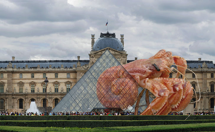
Hermit Crab architecture has defined the spaces in which art has been viewed since the onset of modernity. The Louvre, generally considered the first public and modern art museum, was, obviously, not constructed for the purpose of displaying art. The original medieval fortress was expanded (and deconstructed) slowly over several centuries and continues to be reconfigured today. The use of the Palais du Louvre in Paris to display art to the public is usually considered to have begun in the aftermath of the first French Revolution, granting the institution of modern art a properly revolutionary origin. The French Revolution would help to establish politics as a component of artistic production’s self-image. Actually, the Louvre’s transition from a royal palace to a public museum has been slow and episodic, properly beginning with Louis the XIV and the first Salon (note: which can, incidentally, be considered the first modern art exhibit – the two histories are deeply entwined), and continuing to its current merger with a mall. Moreover, its revolutionary moment consisted not of doors flung open by the eager masses, but rather a relatively quiet affair, largely overshadowed by a concurrent festival celebrating the insurrection that occurred that day the previous year. Still, this association with the French Revolution would help to establish politics as a component of artistic production’s self-image, as well as aspirations, since then.
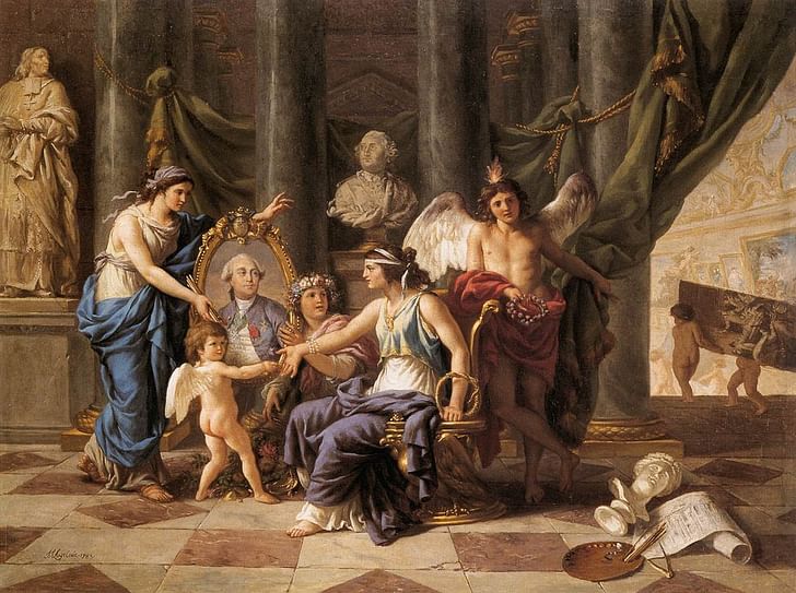
Art and media theorist Boris Groys writes specifically about this origin narrative, citing the reprogramming of the Louvre by the French revolutionaries as a major determining force for the functioning of art since modernity. He contends that rather than following the overthrow of a regime with a wave of iconoclasm – as was typical in other historical revolutions and conquests – the French revolutionaries “defunctionalized” or “aestheticized” the sacred and profane objects belonging to the Old Regime. Groys continues, “The French Revolution turned the design of the Old Regime into what we today call art, i.e., objects not of use but of pure contemplation. This violent, revolutionary act of aestheticizing the Old Regime created art as we know it today.” While during the ancien régime, the paintings and sculptures were not properly art in Groys’ modern sense. Rather, they served financial purposes as well as symbolically buttressed the nobility’s power. With the opening of the Louvre to the public, this symbolic function was dissolved; or, more accurately, was diffused to the public qua the new ruling class. Groys articulates that the Louvre, as a building, was also aestheticized in its conversion into a museum, opening up its potential to be read formally as (mere) architecture, divested of its symbolic attachment to the monarchy (although one could argue that the symbolism was actually diverted to the bourgeoisie and its institutions rather than divested).
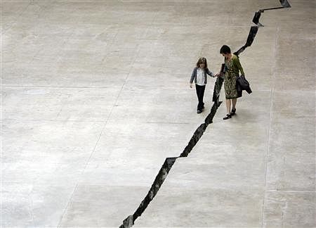
A more contemporary example of a Hermit Crab museum is the Tate Modern in London. Originally a power station, the building was converted into a contemporary art museum by Herzog & de Meuron at the turn of the new millenium. Replicating Groys’ analytic structure, the museum could perhaps be symbolically read as indicative of the triumphal replacement of Fordist capitalism by neoliberal economics in the UK, the economy of manufacturing by flexible accumulation in London, the laborer by the consumer (or precarious worker) in the city’s Zone 1. Space prescribes as much as it accommodates. After all, the museum emerges from the aestheticization of the space of industrial production. Interestingly, the Tate is known as one of the first spaces that could accommodate the emergence of large scale, often immersive installations. But the space prescribes as much as it accommodates; many of the exhibited works have been site-specific, which is to say designed specifically with the Turbine Hall in mind as their location, such as Doris Salcedo’s extraordinary Shibboleth.
Central to the continuation of this process for over two centuries is the change in the value of an art work. The aura of art works manifests in the continued insistence that a work must be experienced in person. In his essay “The Work of Art in the Age of Mechanical Production,” Walter Benjamin contends that what today are called “fine art” objects have inherited an aura, or quality of special significance, from their ritualistic origins and their intimate connection to ruling powers. The aura of art works manifests in the continued insistence that a work must be experienced in person, and therefore in the control of the individual and institutions that possess it. While Benjamin looks towards photographic reproduction as a possibility for the democratization of art, the power of the aura is still located in the architectural space of the gallery, considered the de jure site for the viewing of most works. While we may experience art through the browser more often than in person, it's still fair to assume that most people would say they prefer experiencing the work in situ to its pixelated transmission.
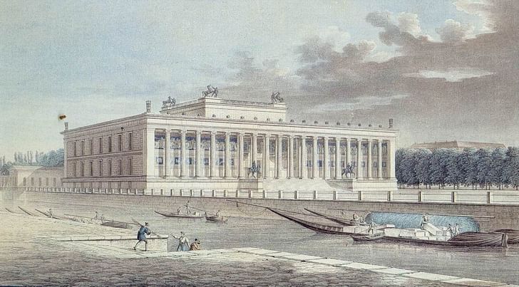
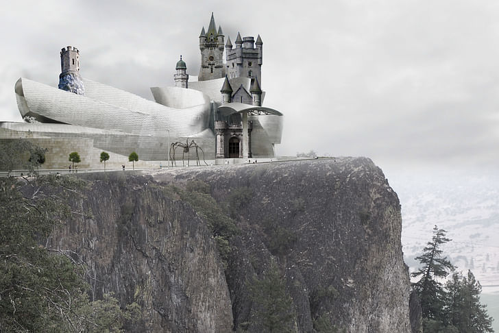
Running parallel to Hermit Crab museum history is the evolution of buildings specifically designed to house art, let’s call them Art Palaces. A likely beginning in that history is the Altes Museum in Berlin (incidentally originally named the Königliches Museum or Royal Museum). Commissioned by Friedrich Wilhelm II, a strong proponent of humboldtian ideals, the museum was designed in the neoclassical style by Karl Friedrich Schinkel, espousing a historical connection to Greek democracies. If the Louvre is a metaphor for one narrative of the revolutionary emergence of bourgeois capitalism, then the Altes Museum is the perfect metaphor for a non-revolutionary narrative of transition. Later, it was used by the Nazis as a propagandistic backdrop before being damaged towards the end of the war and later reconstructed by Hans Erich Bogatzky and Theodor Voissen. Connective lines could be drawn from the Altes Museum to contemporary projects like the Bilbao Guggenheim, the new Whitney Museum, etc. In their designs, these new museums also rhetorically suggest cultural-political ideals of their time, whether in angled sheets of metal or in cardboard and wood. Here, the architecture speaks metaphorically, acting like the theoretical version of Venturi’s duck (deconstructive duck?). Once could say that just as Schinkel’s museum did not actually institute democracy, so-called deconstructive architecture does not actually deconstruct architecture in the Derridean sense (as he himself alluded), but rather only resembles or literalizes a metaphorical version of deconstruction. For some, such as the performance artist Andrea Fraser, the expressiveness of today’s Art Palace can overshadow the work contained within. In her 2001 video piece Little Frank and His Carp, Fraser has an erotic encounter with the Bilbao Museum as she listens to an audio guide rave about its architecture.
While bearing the inheritance of both the Art Palace and Hermit Crab traditions, the art fair is more directly related to the exhibition than to the museum. A genealogy of museums would necessarily require the inclusion of exhibits, which is far too ambitious a project for my word count. But it should still be noted that exhibitions emerged alongside museums, and their histories are intertwined. Simultaneously, they are directly linked to the rise of world fairs and expositions. The Salon des Refusés of 1863 is an important marking point of the development of modern art in that it was perhaps the first time a space was carved out explicitly for works that rejected the orthodoxy of art academies. It could be argued that, early on, exhibitions outside of museums became the site in which the future of art was fought over, while the museum would later enshrine that future as past.
While exteriors may vary, it is only due to the interior art space’s gradual homogenization that the art fair can operate as it does (that is, through semblance). In his seminal 1976 book Inside the White Cube: the Ideology of the Gallery Space, Brian O’Doherty investigates the historical emergence of the gallery space through transitions in stylistic periods of art. O’Doherty traces the movement from salon-style exhibitions to the hermetically-sealed environment of a white cube gallery through the struggle against the frame, from a device to enclose a world rendered with illusionary perspective, to abstracted and spatially-aware artforms such as conceptual and performance art. We have now reached a point where we see not the art but the space first."O’Doherty writes, “The history of modernism is intimately framed by [the gallery] space; or rather the history of modern art can be correlated with changes in that space and in the way we see it. We have now reached a point where we see not the art but the space first.” From Malevich to Rothko, a litany of modern artists attempted to created transcendental work that required presentation in places disguised through white paint as pure space. Seemingly, only then could the work itself be considered in necessary isolation. But, in a strange reversal, O’Doherty notes that by nature of this very attempt at relegation, the placed-ness of the gallery actually steps into the foreground. Artists of that time – including O’Doherty himself, usually as his alter ego Patrick Ireland – actively investigated the place of art as they pioneered performance, video, conceptual art, institutional critique. They made works through and about the places they were in.
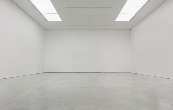
Today, in another turn, inside the architecture of the art fair it is the art object that seemingly renders invisible the place that both we and it temporarily inhabit. It is because of the art objects that we ignore the flimsy architecture surrounding it, that the place appears to us as an art venue rather than as a party tent or as a temporary car shelter. Assumedly, most works in an art fair – besides those explicitly commissioned by the organizers, ie. performances – were not intended by their artist to be backgrounded by swarms of people with iPhones out, or interminable rows of other artists’ works. If it were not for the cubicle-walls, an art fair would simply be a large, un-curated exhibit (or a depository of dollar signs). And when someone falls in love with a work of art or decides to buy it, they assumedly imagine it within another context, be it institutional or domestic (or as capital alone). The modernist horizon of an isolated artwork has been reached but only in our heads. If the artwork depends on the white cube as context, then when we are seeing it in an art fair is it still working?
The art fair looks like a glamorized refugee camp.
While diffused, the legacy of prior exhibitions spaces haunts the architecture of the art fair. In their Hermit Crab type, the art fair seems to illustrate the limitless geographic range of current economics, popping up in any variety of places in virtually every major city worldwide. Parallelling the emergence of so-called “sharing economies” and the diminution of accessibility to owning property, the exhibition of today can invade any space, but exits as soon as it came, without leaving substantial traces of economic benefit. In its White Tent – or constructed – instantiations, the ideology of the art fair is less immediately apparent, but parallels that of Art Palaces. If the Altes Museum represented the liberal ideals of the humboldtian era, the White Tent represents the current economic situation, in which precarity has been extended to nearly every class of people while simultaneously manifested in unequal striations. That is to say, it is not entirely coincidental that the art fair looks like a glamorized refugee camp. In the current economic model, the privilege that enables the bacchanalian festivities of an event like Art Basel Miami always comes at the expense of the refugee. Increasingly, it is no longer an automatic move for the ruling elite to wrap themselves in philanthropic or idealistic principles. Instead, they can inhabit the same typologies as the most marginalized people, but this does not go both ways.
If the architecture of the white cube gallery emerged alongside the aspirational ideals of its contemporaneous art, towards a sort of metaphysical isolation, the white tent was born out of the market’s transcendence over the object. But the distance between the rise of public art institutions, as the ideological apparatuses of a benevolent ruling class, and the white tent of the art fair, perhaps devoid of such pretenses, actually suggests a horizon of democratic possibility for art. Art no longer requires an architectural support to be signified as such. While not necessarily dematerialized (the art object is still often an object that is physically exchanged), art no longer requires an architectural support to be signified as such. For rather than the space demarcating the object, the objects now demarcate the place so long as they stand in front of a stage set. Art exists now in a strange truce, in which an object is used as the establishing point for a market as much as the market is used as the establishing mechanism of the object. The fragility of this market has been well-discussed; should it collapse, we will be left with art untethered from the ideal of space. Freed from the necessity of the white cube, the art object now has the potential to serve as the means by which a place can be collectively designated as significant. The stage just has to first be disassembled.
Writer and fake architect, among other feints. Principal at Adjustments Agency. Co-founder of Encyclopedia Inc. Get in touch: nicholas@archinect.com
3 Comments
hefty piece.
wondering, so now that the containers of art became art, the architecture, the art has moved on?
you should probably note the O'Dougherty qoute and thanks for the Derrida link.
Bravo. Dense but packed with great stuff.
Was this inspired by recent visit to an art fair? Be interested in more re: genesis and development of this line of thought...
On a related note, earlier this month the NYT looked into the growth of private "jewel-box museums" as a result of change to tax law, plus "Art is seen today as an equal asset class to stocks, boats, houses and jewelry, and people don’t want to give their assets away", whereas in past the same art would likely have been donated to an existing museum.
Block this user
Are you sure you want to block this user and hide all related comments throughout the site?
Archinect
This is your first comment on Archinect. Your comment will be visible once approved.