
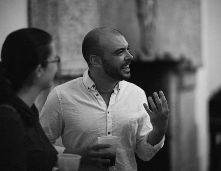
When it comes to sustainable design, it seems like most firms skew either green but boring, or exciting but radically inefficient. Paul Michael Davis Design in Seattle, WA handily straddles this schism, creating visually compelling, sustainable designs at an affordable cost. Founded in 2009, in the midst of a recession which pushed many newly minted graduates out of the profession, PMDD has since expanded to include an associate and an intern, and occasionally collaborates with independent firms. Notably, PMDD is developing several low-cost prefab housing projects that look like places you'd actually want to live in.
Part of PMDD's appeal is founder Paul's honesty and humor, which has resulted in his humanistic approach to architecture. Instead of a stereotypical embittered, glue-gun-burn-sporting developer drone, Paul largely designs what he wants to see in the world. He does we all approach our work with an automatic assumption of sustainability.this by engaging in an upfront cost-based dialogue with his clients, so that they remain open to innovative and environmentally beneficial design features. While many practicing architects simply accede to client demands, Paul constantly finds a way to remain a designer, and not merely a chatty extension of AutoCAD. This unusual relationship stems from Paul's genuine respect for his clients; he doesn't treat them as out-of-touch obstacles, but as intelligent people who simply aren't trained in architecture. This simple but radical distinction enables him to have a genuine back and forth with his clients, and to create work that elegantly balances the demands of beauty, ecology, and the pocket book.
Q: How much does the culture and climate of Seattle influence your design process, even if you're designing a project in, say, Miami?
A: Even though I lived in NYC and L.A. for several years, I was born, raised, and educated in the Seattle area, and its influence is very strong. People from Seattle feel really guilty if they forget their reusable grocery bags or don’t compost their apple cores. There is a similarly strong culture of sustainability here in the design community. We have folks here pushing the boundaries of sustainability as far as possible – net zero or passive houses, cutting-edge research into renewable materials and energy, etc. And a few steps down the sustainability food chain are designers like me and my office mates, DayDesignStudio and Five Dot Design Build. I think we approach our design projects with a general sense of responsibility to the environment and future generations. We share ideas, critiques, and a materials library, which really only has sustainable choices. We’ve eliminated all the unethically harvested rain forest woods, synthetic carpets without significant recycled content, etc. And I think we all approach our work with an automatic assumption of sustainability. We pretty much all are at the point where we only show our clients sustainable options, whether they are in Seattle or Miami, and whether they ask for them or not. We are all working on small projects, so the [sustainability] rating systems don’t make a lot of sense for us. But the larger ecological footprint of every design decision we make is always central to our choices.
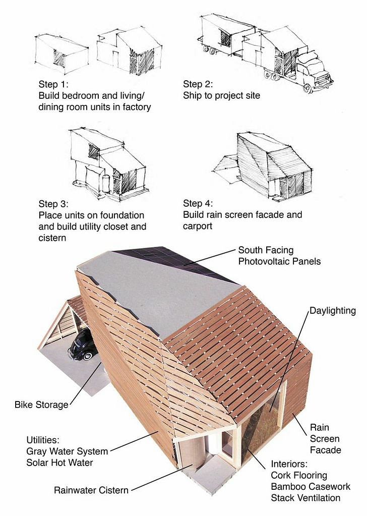
Q: Architecture seems increasingly to be split into two camps: the austere, low-income housing group, and the wildly inefficient but arguably gorgeous artistry of someone like Frank Gehry or Zaha Hadid. What's in the middle? How do you cater to that market, and how do you blend beauty with pragmatism?
A: I like the middle. I grew up middle class and I’ve wanted to be an architect since I was five. But I’ve always felt a little out of place in the architecture community, which still has this sort of “gentlemen’s profession” mindset sometimes. There’s a place for lofty form-making at the top of the economic pyramid, and there’s a very worthy effort by many architects to solve big problems like low-income housing at the bottom of that pyramid. But I've always loved Frank Lloyd Wright’s Usonian houses, and the Case Study houses because they offered amazing design solutions to people of moderate means. And I feel like the architectural community is partly to blame for the dreadful, tacky sprawl surrounding American cities. We don’t know how to engage the middle. My very first independent client was a developer of tract houses, and I took the project on with the hope that I could bring a few of the higher ideas and principles of design I’d picked up in school and fancy architecture offices to this more commonplace setting. the only thing I really aspire to in life and my work is honesty.Also, of course, I just needed the money. I don’t claim to have gotten anywhere near the success of a case study house, but I feel that the little development is better than it would have been with the tacky designs sold by the square foot from a website they would have normally used.
Q: How did you get started?
A: I got my office started with a developer spec house project that most aesthetically-minded architects would reject: it is not a great work of art. But I feel like it’s about 25% better, and the architecture is more creative, than what they would have done without me, which is buying stock plans from an awful place. And that’s been my approach – push my clients as far as they’ll go in the direction of honesty and contemporary design, and I feel like it ends up being about 25% better than what they would have done without me. So it’s a start. If I died tomorrow, at least I tried to push things a little in the direction of honest design that reflects our current times and conditions and technology and struggles. I want to keep improving. There’s this great scene in the TV series Six Feet Under, where Claire is having an existential crisis about not being good enough to really be an artist, and her boyfriend says “so then, you get better” (or something like that) and that’s been a good mantra for me.
Q: How did you begin to attract the kind of clients and projects you wanted to work on?
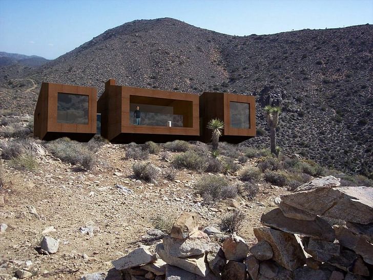
A: Here’s something I’ve learned as an upstart: if you draw it, they will come. My Claremont client found a rendering of what ultimately became the inspiration for their project, which was a combination of a design I did for my dad and stepmom, and my whole prefab fantasy. And then I was like: what if my dad and stepmom built my fantasy house in Joshua Tree and I could go visit them when the weather is shitty here in the winter? I made an amateur sexy rendering out of it, and amazingly some people noticed it and now I have a real project.
Q: What project would you love to work on next?
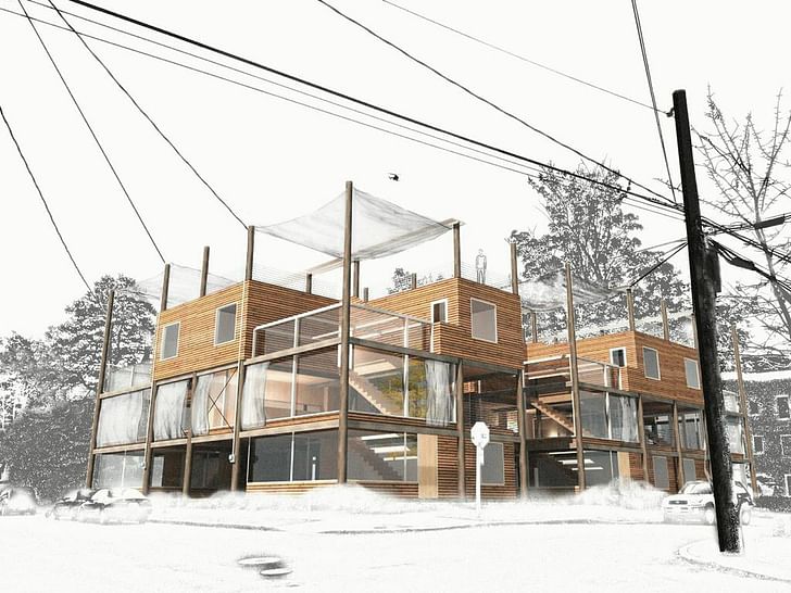
that’s been my approach – push my clients as far as they’ll go in the direction of honesty and contemporary designA: Seattle is in a boom cycle at the moment, and lots of the old single-family housing stock is being replaced with new condos, apartment buildings and townhouses. A lot of these are kind of awful, and people lament the generic new buildings everywhere. They are bland and derivative and have no sympathy for the existing neighborhood context. And they usually don’t incorporate any more sustainability than absolutely required by Seattle’s codes. So I’ve started working on another ‘manifesto’ type project in the Telephone Wire Townhouse design. The big idea of this project, I think, is context. It’s about embracing a part of our built environment that I don’t think has really ever been addressed before – the messy, tangled lines in the sky supported by decomposing, creosote-covered tree trunks. Architects are supposed to hate these. We photoshop them out of our renderings and work on subtle ways to conceal the location where services enter our buildings. But artists like Robert Crumb and Andreas Gefeller (especially his Japan Series), are way ahead of us here. I’m also reminded of Robert Venturi’s preference for “messy vitality over obvious unity” in the built environment. I feel like hiding or photoshopping the power lines is a lie about the built environment. As I mentioned, the only thing I really aspire to in life and my work is honesty.
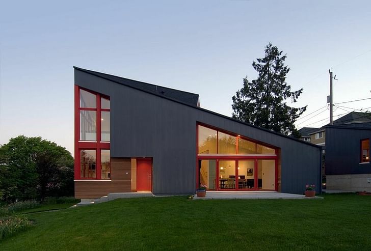
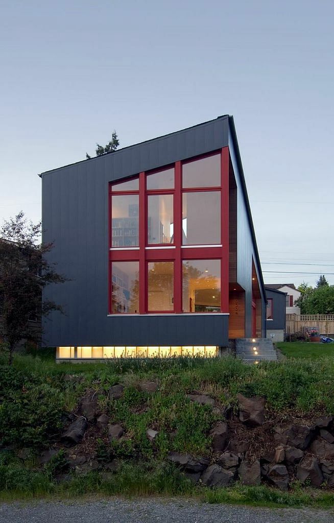
Q: You incorporate sustainable features into many of your projects in a way that is both sculptural and cost-efficient. Can you briefly discuss the Burke-Gilman house's features, specifically that low-maintenance steel envelope?
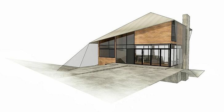
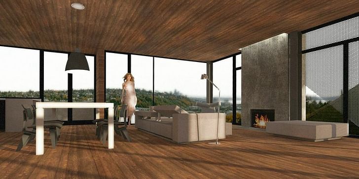
A: I worked on the Burke Gilman house while I was working for and collaborating with Dan Stettler, and it was a fun project for exploring sculptural forms and sustainability, and at times, the synergy of the two. The overall triangular form of the house, for example, is high and glassy on the southwest side of the house to capture as much daylight as possible in our gray climate, as well as take advantage of a nice territorial view. Unlike L.A., it’s often ‘greener’ up here to let light and heat in wherever possible, though we also designed retractable sun shades for the few weeks each year in Seattle when it is actually too hot.
The cladding on the house is a flush steel panel system, which will be virtually maintenance free for the lifespan of the house. There are lots of other sustainable nuggets in the house. We re-used the existing foundation of the house that was originally on the site, and exposed the old concrete in a few locations as a palimpsest. The house has radiant heating throughout, which is extremely energy efficient. There are rainwater cisterns in the backyard that collect runoff, and materials and fixtures throughout—if you draw it, they will come.bamboo floors, natural wool carpeting, super efficient tilt-turn windows–that are focused on sustainability.
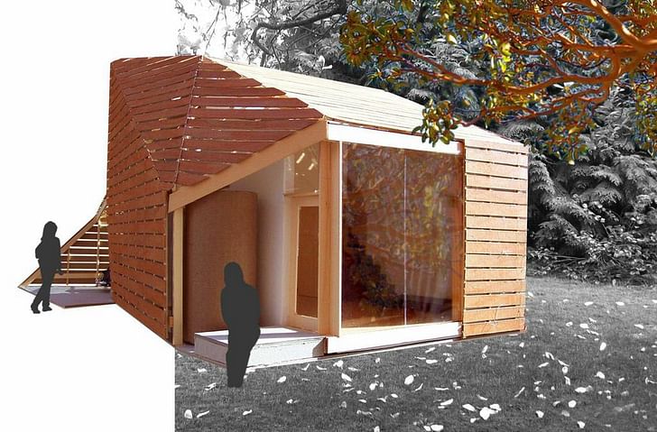
Q: What was your thinking behind the DADU (Detached Accessory Dwelling Unit) house?
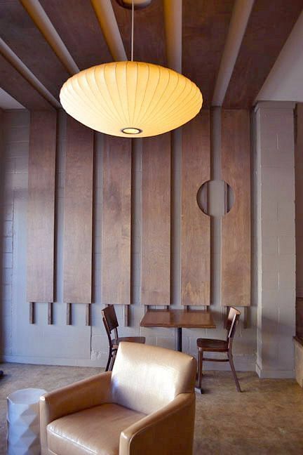
A: That project was sort of a manifesto. I used my mother’s house and yard in north Seattle as a site for an imaginary project that took advantage of Seattle’s newly passed zoning changes, which allowed for backyard cottages. It struck me as an ingenious way to bring more density into the urban core without the major investment and infrastructure associated with a full-scale real estate development. I used the design as a way to bring together a bunch of ideas I had about sculptural forms and sustainability.
Q: What's your take on pre-fab housing in terms of sustainability? What sustainable features would you like to see incorporated into these types of projects in the future? Roof gardens? Solar technology? Others?
A: I think a constant and probably swift trend toward sustainability is inevitable. The environmental and energy problems facing the world are serious and the building industry has to change, and keep changing as building technologies rapidly advance. Today’s solar panels will probably seem like Commodore 64s in twenty years. Prefabrication offers some great efficiencies in waste reduction, and technologies like wind and solar harvesting offer some real hope for energy generation. Locally, we have some pretty innovative things happening with rainwater retention, so we’re seeing lots of cool rain gardens and bioswales happening at a municipal scale. It seems to me that we will all be designing buildings which are completely passive in energy consumption, and give back to the earth more than they take in our lifetimes—I really don’t see how else we’re going to survive as a society.
UpStarts is a series of features on the foundations of contemporary practice. It will have a global reach in which practices from Europe, North America, Asia, and beyond will be asked to address the work behind getting the work, and the effect of cultural contexts. The focus will be on how a practice is initiated and maintained. In many ways, the critical years of a fledgling design partnership is within the initial five years, after the haze and daze of getting it off the ground. UpStarts will survey the first years of practice as a tool for tracking the tactics of the rapidly evolving methods for sustaining a practice.
Julia Ingalls is primarily an essayist. Her work has appeared or is forthcoming in Slate, Salon, Dwell, Guernica, The LA Weekly, The Nervous Breakdown, Forth, Trop, and 89.9 KCRW. She's into it.
3 Comments
in case your capacity for focus is 140 characters...or whatever...
"Instead of a stereotypical embittered, glue-gun-burn-sporting developer drone,"
"...finds a way to remain a designer, and not merely a chatty extension of AutoCAD. "
just sayin'.
Thanks, Olaf.
I like the telephone wire townhouse. I hope he goes further with the idea. Would be fun to see more work on buildings that use ordinary pieces of civil infrastructure as building components - guardrails, culverts, power pylons...
Block this user
Are you sure you want to block this user and hide all related comments throughout the site?
Archinect
This is your first comment on Archinect. Your comment will be visible once approved.